The symmetry of the columns created an interesting frame in the scene, but this happened by chance, because in fact my suggestion was just to enlarge the screen, center the characters and highlight them from the background ![]()
2 Likes
This is now both a great picture and a great thread! I am learning a lot from what people have contributed.
2 Likes
Helo! Take this in mind, these are some TWEAKS I’d do, some more personal than others, but you’re off to a good start!
-Focus on the contrast! While the shadows look good and all that, our art pieces can go through artistic lenses to allow us push the message to make it clearer. To check if the contrast is good enough I’d add a separate loose layer with black or white solid colour and put the “Saturation” Effect, I can hide the layer and make it visible as much as I want while continuing the process, I think it’s faster (at least for me XD). I think Marco Bucci - Youtube has lots of good tutorials for contrast and colour (“Essential Values for Painting, Lighting and Design” in this specific case)
-I’d put more emphasis on the details of the petals than the leaves : D So we can focus less on the details of the leaves and focus more on the delicate aspect of the petals, highlighting vulnerability and a fragile sense inside the artwork : ]
-As for the leaves, I’d use stamps like you did but I’d simplify the shapes, as for the stamp looks small in size (not a problem though! you can keep using it, just unifying the details). In the past point, the flowers look not so defined while the more detailed aspect of the leaves (in regards to the stamp size) take more eye attention and could potentially distract the viewer from looking at the rest of the piece, including the characters. What I’d do is use brush (with no stamp) and try to simplify shapes and shadows that the stamp made previously in the canvas ^^ (Here’s a piece of mine in which I applied this, in case you need reference: Morning Forest, I put the focus on the ones that need the attention and those who weren’t necessary I simplified them, making some levels of attention throughout)
-Pay attention at the size of the head (this is more for the sketch stage), if the characters are roughly the same size, take one of their heads, duplicate it and compare the sizes. A lot of illustrators don’t notice there’s a mildly noticeable size difference in the characters’ heads (I was guilty of that too XD)
You’re free to either take or leave any point, like I said, your artwork looks really good! : ] I’d have these in mind and correct these in a redraw in the future if I were you. Thanks to you for letting us help you : D After all artists need to help each other : ]
Also, what’s the story behind this? : O It looks interesting
1 Like
Hello. I think you are being a little harsh on yourself. I think it is a really nice and beautiful Artwork, so be proud because challenging yourself is the best way to move forward. There has been many comments with many approaches, I would also like to give you mine, but it is just that an approach keep it mind.
So first when I look at your Artwork the first place that my eyes see is the upper part of the statue, then my eyes wander a little to the leaves in the background and then my eyes go to the girl. But if I analyze the story of the Artwork is an emotional scene. For me I would like to present the crying girl first taking even precedent over the Statue (Maybe for you is different and you want to make the Statue the focal point of the scene, that is why that I said that this is my approach)
So yeah, the first thing that I do is define the Focal Point, what do I want the viewer to see first? and then direct the viewer eyes to the Next Focal points.
So how do you direct the viewers eyes to an specific point? The answer is CONTRAST!
But you can generate contrast in many ways. So let’s analyze the types of Contrast that I would use in this specific case to direct the viewers eyes.
-
The first is the composition. How are arranged the elements in the image, in this case for example the foliage and the column create a frame that directs the eyes to statue’s head. But I feel that there is too much empty space at the left of the image, so what I did was to crop the left part of the image, this way our subjects, the girl and the Statue are nearer the center of the composition.
-
The second is contrast through values. So like many have pointed out. There is lack of contrast in values , the zone that have most contrast is the head of the statue. But there can be more. How do you do it? you push the background back by adding atmospheric perspective. I pushed back mostly the leaves that are near the the head of the Statue that are competing for attention with the statue. But I mentioned that I wanted the girl to be the main focal point of the image, and the statue second. So what I did was to add contrast to the values of the Girl making the Darkest values like the hair and clothes darker, and the lightest values like the skin tone and the gold elements in the clothes lighter. I also separated the foliage in the foreground by making it darker.
If you look at the Images in B&W, the middle one you notice that the values of sky now are very similar to the values of the statue, and that the dark hair that the girl has stands out more.
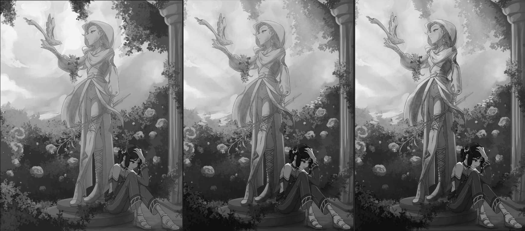
- The other type of contrast in this case will be the contrast of color in your case, everything has an orange and warm tint, so the characters and the statue lost themselves a little with the orange tint of the foliage. What I did in this case was make the color of foliage a little bit colder, more blues and greens. So the cold colors of the background contrast with the warm colors from our main subjects (The girl and the statue), but I added a little bit of yellow (warm tone) to the sky to mix it more with the colors of the statue, this subtracts contrast to the statue, because I want to make the girl the main focal point.

Another thing that I want to point out is the Lighting. I decided to change it from an overcast lighting to something more directional and strong that comes from the top corner and strikes the top half of the statue. It makes the scene more cinematic adding a little more mood to the scene. You can see that the top half of the entire piece is lighter and warm (That you can associate to hope and good feelings) and the bottom half is darker and colder (Adding that to the girl crying it adds a little more of drama).

So yeah I think it is a really good and interesting image I love the concept, the stylization of the characters and the story that it tells is really beautiful. I think that is why it got so much engagement from the Forum. So great work and really, be proud!
2 Likes
Thank you so much for going into such detail! Your picture “morning forest” looks so great, and I also loved your other drawings. You seem to understand colours and shapes very well and I’ll be sure to remember this when making changes to the picture. (Or just any drawing in the future, this was some amazing advice)
Edit: I completely forgot to mention the story. I’ve had the characters and story in mind for a while now but only now have I gotten around to actually try and put it in a drawing, which is also why I’m proably so upset that I don’t like it a lot. It’s about a leader in a desert city and the challenges her city faces. There is a part about her bringing freedom and beauty back to the city, after it had suffered a lot of challenges (hence the bird and flowers). But I’ve never tried to put so much “symbolism” into a drawing before, so this was quite the experiment!
1 Like
You’ve brought some lovely ideas to the table! This was also incredibly well structured, I loved reading through it. I’ve gotten so much great advice now, and I’ll add yours to the bunch! I’m quite looking forward to playing with all the different ideas and approaches that I’ve been given, and see what works best for me. A huge thank you! ![]()
1 Like
WOW this has become a fantastic thread!! So many gems of colour theory mentioned (I’m lacking in that area which is why it wasn’t addressed as much in my post).
I love all the different directions we had for the paintovers too. All the takes are so unique!
@npc I’m glad you liked my paintover! ![]()
You’re now set to create the ultimate Pokemon remaster when you revisit this in a few years time ![]()
1 Like
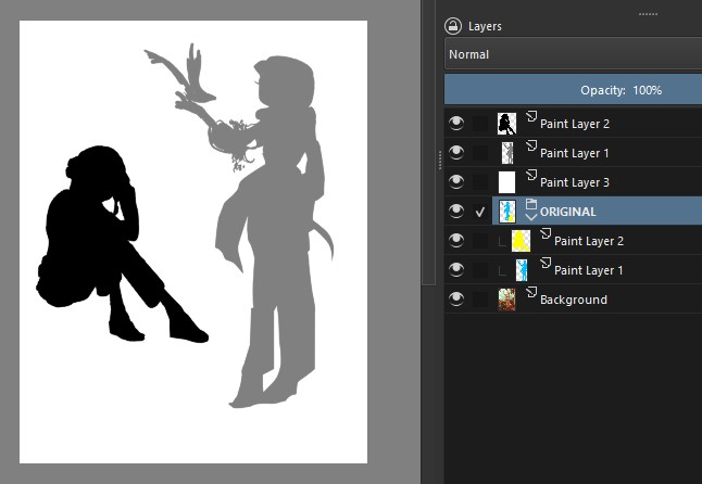
What I did next was based on a tip from a very old drawing course (1950 or earlier, maybe). I traced two silhouettes of the main elements of your art, the statue and the character:
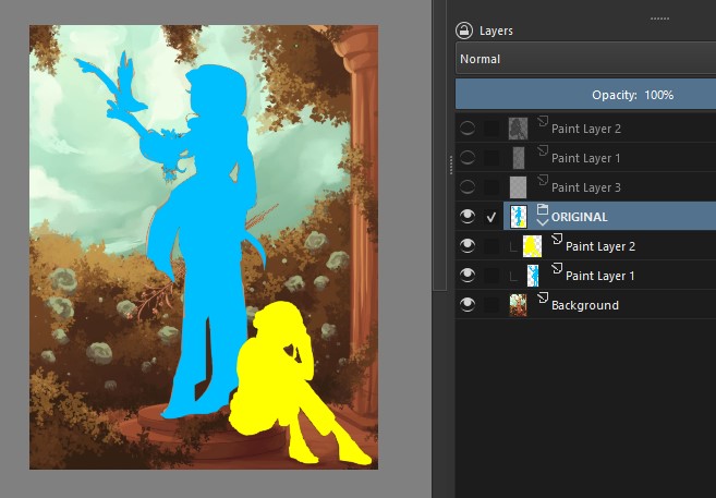
Then I moved the figures around to find a better combination between them. This combination highlights the character more… but the statue’s design gets lost, so it doesn’t seem ideal to me. I only included it to exemplify what I tried to do:
I assume that you wanted to show your character depressed and if that’s the case, her pose is great and that’s not the problem. I think the basic problem in your drawing is a question of “dominance”.
Shouldn’t the character be the basic, "dominant" element of your illustration? In the current situation, the statue is stealing the attention: therefore, it’s the one that needs to be changed.
Now… how to change it? You can do some tests with basic shapes and silhouettes. One solution would be to somehow leave the character in the foreground and the statue in the midground.
Or change the element: instead of a statue, make it as if it were a sculpted or painted mural: that way you can enjoy the pose (I don’t know if it will work, just try…)
2 Likes
Ohh, I love the idea of a painted mural! I won’t necessarily apply that to this specific picture, but I think it would make for a wonderful illustration in itself. I appreciate the advice on tracing and moving the characters around, definitely will come in handy, thank you!
1 Like
Ok! I think it’s still possible to use your art, in the composition it’s in (adjusting the colors as already mentioned), in two situations:
1) In comics - the illustration takes up a whole page and you “break” it into two or three frames: more or less like a camera that starts showing the top part of the illustration and goes down until it shows the character;
2) In a short promotional video - same idea, you make an animation with a camera movement.
2 Likes
Interesting. My impression of the statue was that it was wood. Some mighty nice carving to boot. Maybe in need of a few different stains to bring out some highlights.
Can you get that detail (hair, sticks) in bronze?
1 Like