FAT POST INCOMING, I apologise T_T
Your work looks great!! I especially love love looove the sky.
The feedback so far is also really good.
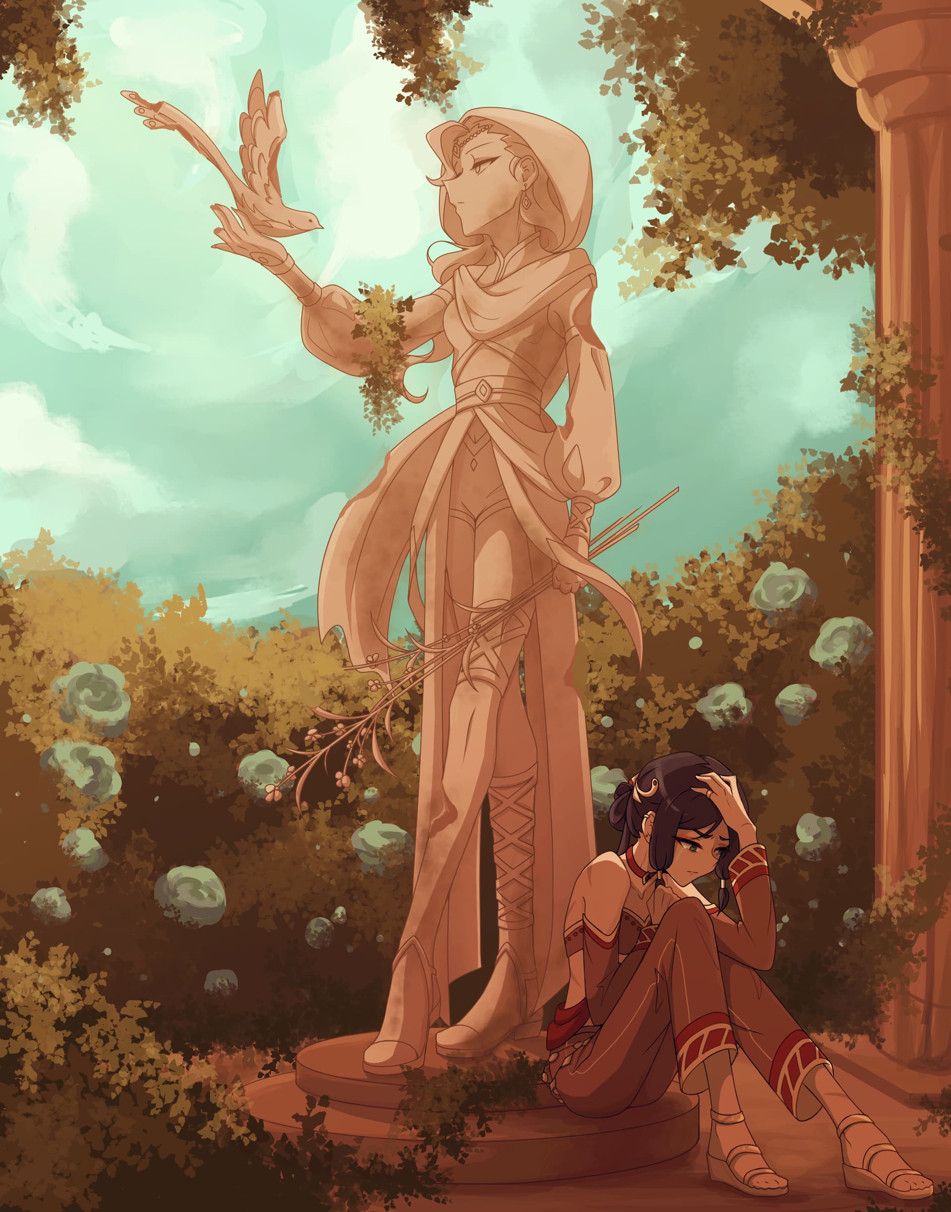
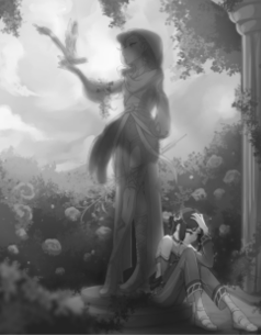
My question is whether you wanted the bird to be the focal point, because you have the circle shape around it (with the sky and trees) that traps the eye in there, not to mention the higher values in that area.
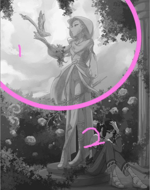
If you look at your painting in black and white (I normally do this with a pure black fill layer set to saturation mode - all my paintings have one of these sitting at the top), you can see that the main contrast areas are 1 and 2, where everything in 2 is glomped together due to lack of contrast.
What this means is there is little separation between the background, midground and foreground elements.
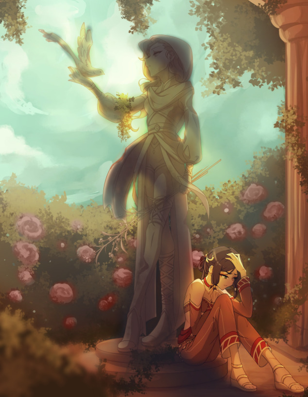
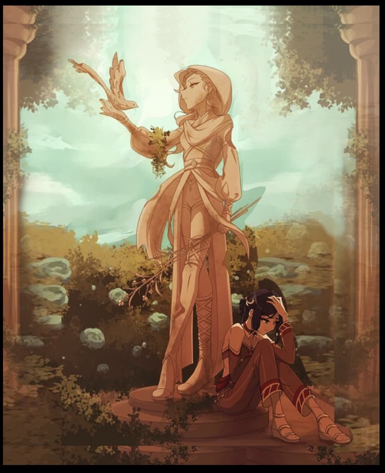
I tried my hand at a paintover, not everything is right but I hope you like(?) it. I’m no pro, so it’s a bit rough:
(forgive me for my airbrush sins, my tablet has decided to go on strike for some reason so I used my mouse…)
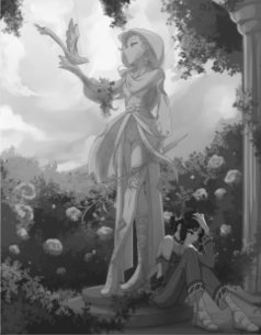
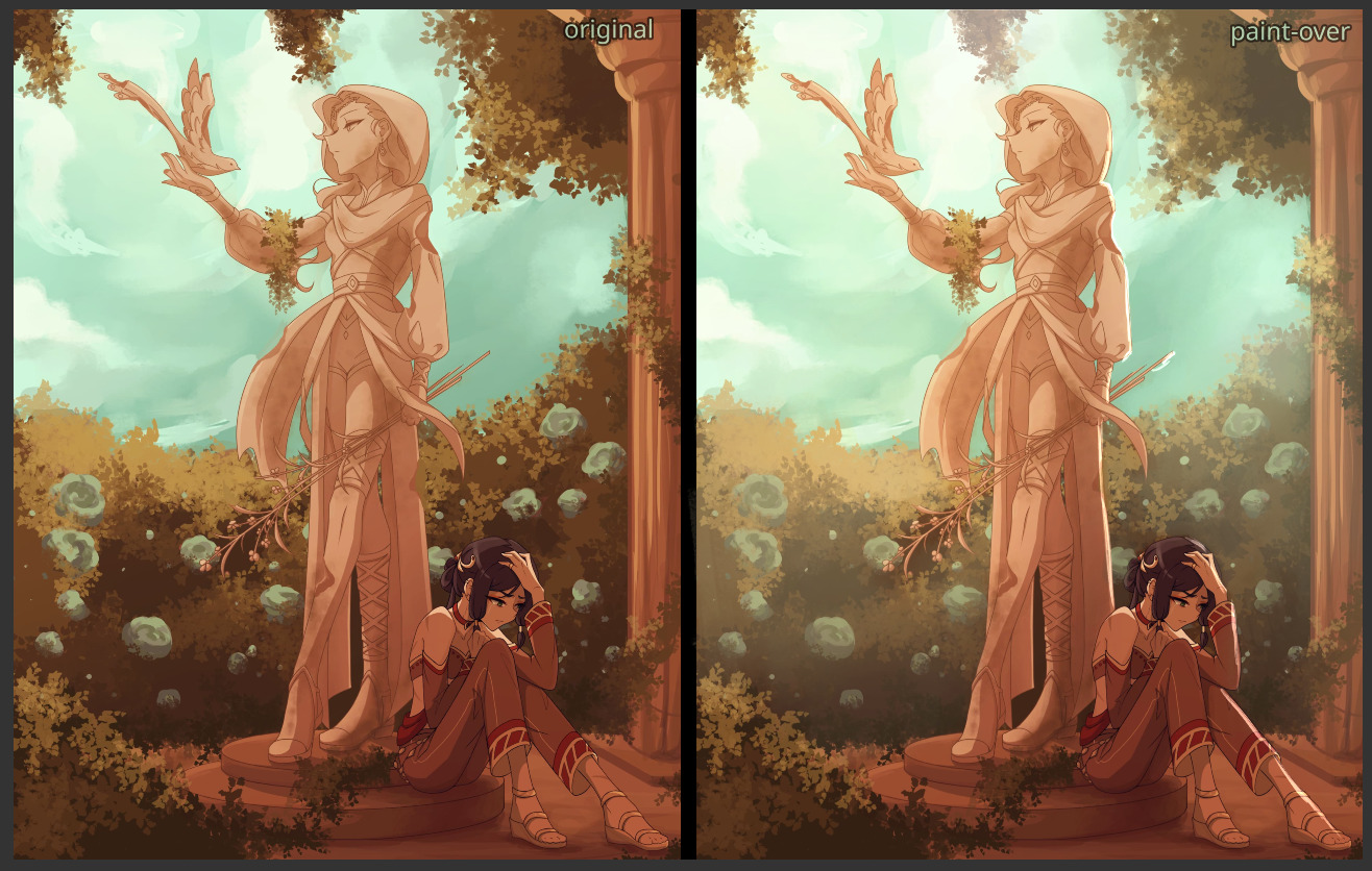
Thumbnails (before vs. after):
Maybe the big fat shadow on the statue as it blocks the light is not the brightest idea known to man, but I thought it helped lend some contrast to the brightened character.
Additionally, I added a few god rays to direct the eyes towards the character.
If you notice the blur on the front bush, that is because I thought it could use less detail to act as a contrast to everything else, defining it as the foreground (since i couldn’t really make it any darker).
That’s it for the composition, now I will talk about lighting and colour.
I noticed that the atmospheric fog thing (how the sky eats up mountains in the distance when you look over a mountain range in real life) is missing. The sky is a big fat light and objects reflect it, with the fog thing making objects have less value variation in the distance. It can be very important for defining your back/mid/foregrounds.
I added some of that to reduce the amount of value in the rose bushes in the background, so that the eyes are less distracted by it.
I agree with MangooSalade that the roses being the same colour as the sky is distracting, so I changed them to a red with a darker value to make them pop less.
Everything being quite warm is not a massive problem as long as you include other forms of contrast too.
I think that covers everything from me 
Your artwork is seriously very good and it will definitely be a major stepping stone in your art improvement journey, especially since you’ve noticed that some thing feels ‘off’. Your ability to convey a story and make the viewer feel something can’t be understated!
Don’t beat yourself up over anything, there’s too much to learn in this field!
Hope this helped! ^^
Edit: I also want to mention, there is a contrast with the amount of space around the statue compared to the character in the corner (the technical people call it negative space right?). That also contributes to the focus being more on the statue and bird than the character.
The character seems to have no room to breathe, compared to the statue. Symbolic, but it depends on if that’s what you want! 
The aim of my paintover was to put some more focus on the character, which is why I made the changes I did.