It’s a bit off-topic, but while I believe krita’s way is superior, there is a usability problem.
The layer docker is taking too much space.
Krita encourages its users to create nested group of nested group (it’s generally not a bad idea. From a CS major’s point of view, tree is a more expressive data structure than stack). But every nested level takes so space. You’ll quickly need a very wide layer docker to show the full name of your innermost layers.
In photoshop the groups don’t have a thumbnails that makes it s bit narrower. Photoshop doesn’t consider group to be a self contained unit like Krita where group is composited separately and then added to the layer stack, probably that is why they don’ show thumbnail for group.
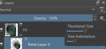
Also in Krita you can reduce the size of the thumbnails, which might reduce the width, In any case this is indeed off topic please make a new topic
Yeah, but I think it’s worth mentioned because I do believe most people who don’t like Krita’s layer logic don’t actually hate the underlying system. They don’t like it because:
They’re from PS for CSP and not familiar with Krita.
They need interoperability between Krita and PS, because their clients or co-workers use PS.
They are afraid of multi-nested layer group because they think it’s hard to manage.
1 is hardly a valid reason because every software needs some time to learn. 2 is arguably the most pronounced problem, and it has been discussed in other replies. I mentioned the layer indentation because 3 is probably easiest to fix (not saying UI design is easy… I mean it doesn’t change the fundamental logic).
I fully understand how Krita’s layer system works, and why they’re designed like this. It’s actually more consistent and powerful than PS. (fun fact, in PS API, clipping mask is called “group”. Why? Because when clipping mask is designed, they didn’t even come up with the idea of grouped layer!) I think our best bet is to improve the UI to make it less intimidating.
An even more far-fetched example is Blender. Blender’s node system is actually FAR more powerful than any layer system from PS/CSP/Krita, because it’s a DAG instead of tree or stack. But if you ask me to use Blender as a painting / photo-touchup app I’ll just cry in my bed.
Of course Krita’s layer docker isn’t as intimidating as Blender’s node, but I do feel a bit (no matter how much I used Krita) discouraged to create nested group and non-destructive masks because I know they’re going to take a lot of space and I’ll need to either sacrificed thumbnail or scroll a lot.
Well sorry for being off-topic… but in the meanwhile I think some UI improvement will make less people complain about clipping masks.
Yeah from inspecting the PS screenshot I guess they don’t consider thumbnail size. But for our design we must take into consideration thumbnail size. This are of design about layer indentation has been already discussion quiet extensively here I believe.
While I agree we should thrive to improve our layer docker and design is really time bound what may be good today may not be perceived good tomorrow. A design today may be called outdated in some years or months. But while making design we should not consider user lethargy to learn and adapt new system. Of course we should make it easy for them to learn but changing things because user assume we are clone or work similar to other software is far cry. We can make it easy for them by making them feel at home by adding some things that seem similar to their previous environment but it has its limit. I am not saying that it is the case in this matter but I am talking about the approach we should take in general.
The responsibility also lies in the user after all we can’t spoonfeed everything. This is just my opinion
I think since it’s kind of very personal, I would like if it was a slider like the thumbnails size. It would be like 10%-100% of the thumbnail width, maybe? Right now it’s around 100%.
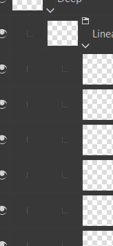
And the better mockup did include the lines that Krita already have, but an even better version I think, so the user would know better which layer is inside which group (in the second image here, it’s hard to see that the pink layer is inside the clipp-group, and it would be even harder if the B-group was more complex).
The pink layer is the base of the clipping and anything above is indented with respect to its edge with the bent down arrow icon. As clipping works with only one layer in Photoshop. The group is not relevant for clipping in photoshop so ignore that group
I would request @Y.H.Lai to add more broader and complete screenshot of PS layer docker to get an idea of how it does indentation across layer types.
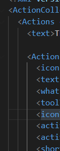
Agreed. Maybe something like this would be better:
(from VSCode)
Note the third line is slightly highlighted, indicating the indentation of the element where the cursor is. For Krita we can highlight the active layer’s indentation level.
It doesn’t take a lot of space, and at least to me it’s fairly clear which one is at which indentation.
It’s much more compact than Krita for sure. But I don’t think it’s necessarily the best design. One can argue it’s too crowded. It’s just for the reference.
It has different indentation for different elements for example we don’t show layer fx in expanded format. and we don’t show layer mask besides the layer thumbnail.
I’ve seen other people asking for this in the past, so maybe it would be something good to have. I can see how not having this option makes it difficult to have more complex layer stacks, because the horizontal space is limited, especially if you like bigger thumbnails.
Love the indentation lines idea. In a previous mockup in another thread I’d only thought to remove that tiny indicator because it was taking up space and was visually not very helpful, but making it connected like that looks so nice.