I’m having an issue where when I invert colours on an image in Krita, the results sometimes appear wrong to me. Any advice or explanation would be greatly appreciated!
I made a *.PNG image with these settings and then saved different version of that image:
Color Model:
RGB/Alpha Depth:
16-bit-integer/channel Profile:
High Dynamic Range UHDTV Wide Color Gamut Display (Rec. 2020)…
When I use the invert command on the original image, that has the “Image Color Space” of “RGB/Alpha”, the results are as I expect them to be, but when I change the “Image Color Space” of the original image to “CMYK” and repeat the invert command I get a strange result. What happened to the “yellow”, “red” and “grey”? Why is the “purple” the inverse of “black”?
I suspect “Image Color Space” or the specific PNG file format I’m using might have something to do with this, but I’m not sure. I won’t go into those details here yet, because the I want to keep this simple, but the more versions I save using different “Image Color Space” settings, the more confused I get at the inconsistency.
*edit
And now that I have uploaded the images in this post, I see that they all appear differently in my Waterfox browser than they do in Krita or the Windows 10 “Photos” app on my PC.
Labels:
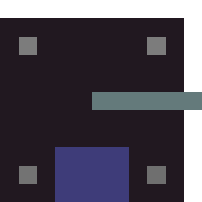
Image_001: Color Model:RGB/Alpha
Image_002: Color Model:RGB/Alpha, inverted in Krita
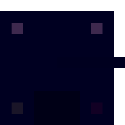
Image_003: Color Model:CMYK
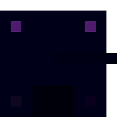
Image_004: Color Model:CMYK, inverted in Krita
CMYK is a color space for professional printing. It’s designed so that the print will look correct, but if you aren’t used to it, it looks funny on screen. Only use.this when uou know what you are doing.
If it looks different in you browser, the browser is probably ignoring the embedded color profile. Not all programs will read them properly.
In addition, many programs still don’t handle anything other than 8 bit integer very well. You can read more about the complicated mess of color management here
Hey Rebecca, thanks for the feedback. Perhaps I should have said that I studied graphic design and have used Photoshop, Krita and other graphic software for a very long time, so I have an understanding of what CMYK is and that potentially, any given program, monitor or other medium might display a colour differently.
I guess one thing I’m looking for is an explanation of why the inverse of black is some shade of dark purple and not white. I want to know why the inverse of red is something like black? That’s not how CMYK works.
I tried other “Image Color Space” settings but decided not to post the results as I’m less familiar with them than with CMYK.
Are you suggesting that in general only working in 8 bit modes is the way to go in most graphic programs, including Krita to avoid strange colour issues? Would that include Blender?
Maybe I will try repeat my experiments keeping everything the same except for settings, except for the bit depth.
Personally I do it that way to avoid compatibility issues. Rarely I use something different like 32 bit float for height maps for blender. You just have to be very mindful about bitness and color profiles as well, when exporting images. Browsers and things like Windows’ default image viewer, everything I’d call consumer grade software, doesn’t handle it correctly. Windows still has no global color management. So while everything looks normal in Krita, Blender or Photoshop, it gets weird when exported and interpreted by a software that can’t handle it.
It also has some Krita specific quirks, like some blending modes work differently depending on color profile and bittness (or don’t work at all). That’s different in Photoshop where internally everything gets converted to a uniform space/bitness and then back (which has it’s own issues).
I mostly paint for the web, so anything else than SRGB non-linear 8bit doesn’t really give me any benefits. When I do have something different I keep sure I export the final images to 8bit srgb to make sure it looks the same for everyone else.
I did a test inspired by your advice on bit depth, and saved 4 more versions of this file. I’ll describe the steps I took and then I have a question that I’m hoping someone can answer.
For the 1st image,
I simply converted the original RGB/a file, from this original post, from 16 bit to 8 bit. I also made sure that the option to save the file as an (HDR) image was deselected when I saved it, for this image and all of the ones in this reply.
For the 2nd image,
I used the first image from this reply and applied the “ïnvert” command in Krita and saves that.
For the 3rd image,
I went back to the saved first image, then converted it to CMYK and saved it.
For the 4th image,
I took the 3rd image, applied the “ïnvert” command in Krita and saves that.
For me there is a problem in the differences between the CMYK file and the inverted version of it. When I invert the CMYK version of this file, how the 2 black squares invert to a light purple, makes no sense. I would have expected something far closer to white.
And though I know that CMYK is capable of fewer colours than RGB, I find how the two bottom grey squares, are almost indistinguishable form the black is too extreme an adjustment. Is there something I’m not seeing?
What is good to see, is that for me the images are now at least displaying consistently across, Krita, Windows, Directory Opus and Firefox.
As already mentioned CMYK has a lot of quirks like not having a true black or how blending modes work. If you wanted to you could do the math yourself and check what the inverted colors should be. However there is a reason why people don’t work in CMYK when creating digital images anymore except maybe right before print and for soft proofing, there are multiple topics about it on the forum, like this one (and many more).
One of the many things is that it simply doesn’t work as intuitively when working with digital images (except maybe that colors mix kinda like in real life).
Maybe someone from the dev team like @halla can shed some light on it and explain in detail why the result is like that.
And the value of the components of that black after the conversion depend on the color profile.
The invert filter just does this: for each pixel, and for each color component in that pixel, subtract the value of the component from the maximum value allowed to ovtain the inverted color.
Imagine this simple and hypothetical scenario: you have this cmyk(0,0,0,255) black. The black component is set to the maximum and so the pixel looks black (usually the profiles don’t convert rgb black to those vslues). If you invert, you get cmyk(255,255,255,0). If you mix cyan, magenta and yellow in those proportions using the default profile you will get some dark muddy purple color. Something similar is happening in your case.
What is done in photoshop in some cases like blending modes and maybe as well in the invert adjustment is convert the cmyk colors to rgb, then invert, then convert back to cmyk. In krita you have to do it manually: convert the layer to rgb, invert, convert back the layer to cmyk.
Thanks Deif_Lou for the detailed response. From what I read, I guess the simple solution to my problem is to never work with any other colour “Model” than RGB/Alpha. Since I’ve already opened this can of worms, out of curiosity, I hope you don’t mind if I ask you a question or two.
1:
In the past I have almost always worked in RGB and then converted to CMYK just before printing. I have little experience actually executing colour altering commands while in any other mode, like the ones I see in Krita, namely Lab*/Alpha, XYZ/Alpha, YCbCr/Alpha. Should performing the same invert operation in these colour “models” produce values more consistent with RGB/Alpha than the ones I’m seeing here with CMYK/Alpha?
2:
You say: “And the value of the components of that black after the conversion depend on the color profile.” Taking this into account, is there a colour “Profile” you would recommend in Krita that has high colour accuracy when performing colour adjustment like inversion, for example? Is the default one good to stick to? It seems that if I convert the image Model from RGB/Alpha to “CMYK/Alpha” there are a completely separate set of colour “Profiles” for each “Model”.
Can I ask why you need the “32 bit float for height maps”in Blender?
Also, do you have any suggested default “colour “Model” bit “Depth” and colour “Profile” settings when making *.PNG files in Krita, for general use in Blender?
I used it for terrain generation a few times. Also used it for creating game-maps for Cities Skylines 1 (Although I think it only used 16 bit float).
Converting to CMYK is basically never worth it nowadays, most of the time the results are worse (even when printed on a CMYK printer because modern printers do their own color conversion already pretty good).
When you give your artwork to a professional printer, they have their own color management workflow and they normally expect sRGB files as input nowadays (because more colors). They also don’t really work with CMYK, that’s only a thing for normal office printers. Print shops (depending on the print method) have special color profiles and they often use 12 colors or more, not just 4. A professional print shop can give you their color profile and you can use it for soft-poofing (but not for painting). You also need a screen that can be calibrated to actually show it.
All of these usually have very specific use cases like YCbCr is primarily for Photo editing. They may give unexpected results when using them for painting because of the way colors mix and change.
RGB/A 8-bit integer sRGB-elle-V2.srgbtrc.icc is the default in Krita for a good reason. sRGB is pretty much what every software uses by default it is also the standard every screen is calibrated for by default. It is the de-facto standard of computer graphics color profiling. So, best go with this. Using other profiles isn’t even really worth it when you don’t have a professional monitor that supports that profile. Sure, Krita could make an on the fly conversion but then you could have probably used sRGB in the fist place.
(sRGB-elle-V2.srgbtrc.icc is the creative commons version of sRGB adjusted for modern non CRT screens)
Specifically for Blender, it will usually tell you exactly when it needs something different and when you know what you’re doing then you know when to use it. Like bump maps for example, normal maps or something, they usually use some grayscale floating point “graphics” but that’s not really image files anymore how most people would understand it.
There are a lot of topics about this on Krita-Artists, I strongly recommend reading what I linked already and use the search on the forum to find more.