i can agree with it maybe looking busy because of 3 color.
though we can maybe make one that is simplified but can be any color for merchs perhaps, i know merchs are pretty hard to match and one reason why the ever evolving logo design start being so boring uniform.
While the app icon remains- because it does stand out here lol.
I would hate to lose the instant recognition that only comes from consistency and time. Think of all the YouTube videos out there that clearly demonstrate Krita content simply by applying the logo to the thumbnail.
I went through 2 corporate logo changes in my career. It was very expensive to make the transition without losing the recognition we had built. We spent a lot on marketing to make the changes work.
It also helps finding your open applications in the taskbar. I remember having a theme once that made all the logos black and white and it was really hard to tell them appart with a glimpse of an eye. I really learned to appreciate colorful icons.
yep. for all the rave for going with readability and such. the ability to recognize something by the color in an otherwise busy taskbar whose icon shape is constrained to either rounded box or circle is much much appreciated. Also most app icons are one color so if you have 2 greens or 2 blue apps
Honestly until there is a huge wave of people not using Krita just because they don’t like the logo, I think it’s not even worth discussing. How many people even are there who decide against a software they need for their work, just because they don’t like the color of it’s logo or icon or something. Is this even an actual issue?
Perhaps the topic needs a slow down mode? Type slowly people .
In any case I moved this out of collaboration because this is just discussion and brainstorming here and not actual collaborative artwork thingy going on here.
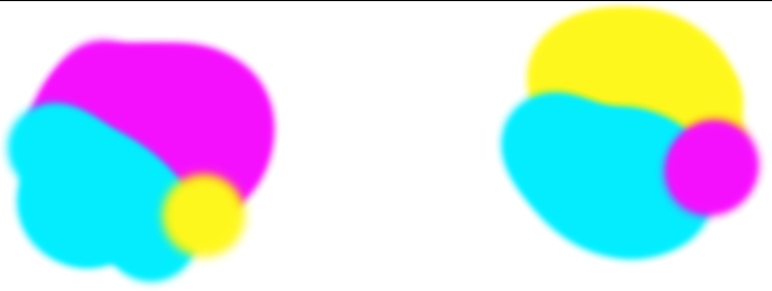
on a random note - does people really dislike pink for how much its marketed to girls, or how much girls like it, that they wont click an app that has like cyan/pink on even split? even though it has equal amount of cyan. Is pink just that overwhelming / or the hate of it that strong that the presence of cyan get totally negated.
I don’t get it… when i see krita . its pink/cyan to me. not pink only.
I totally understand wanting to make the logo more Hip, or more adaptable for merch/ shirts and multiple platform, but i cant really get why pink/magenta can be one of its color. can it be magenta/cyan if we are going two tone instead of 3. specially pertaining to magenta’s position in the CYMK.