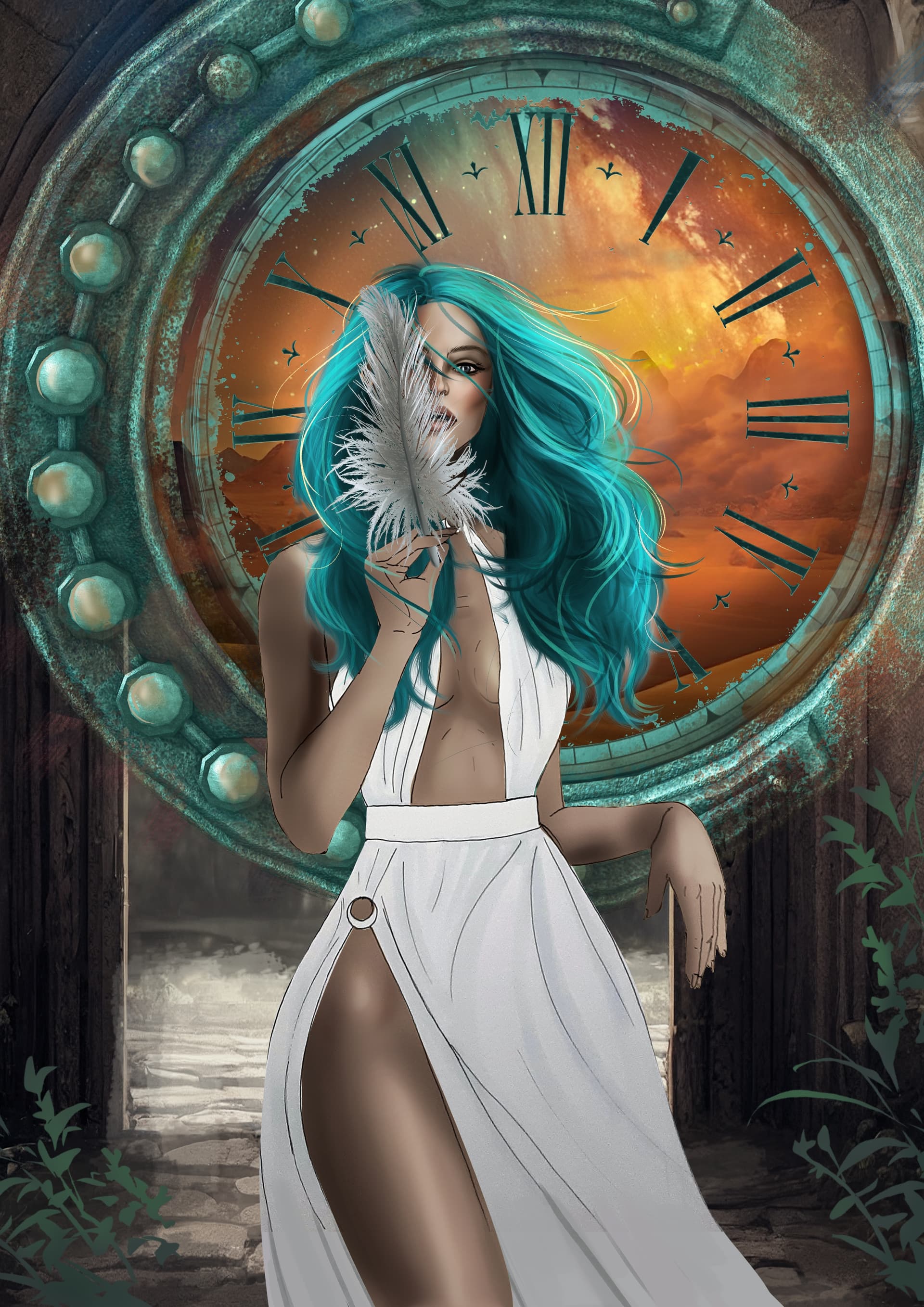
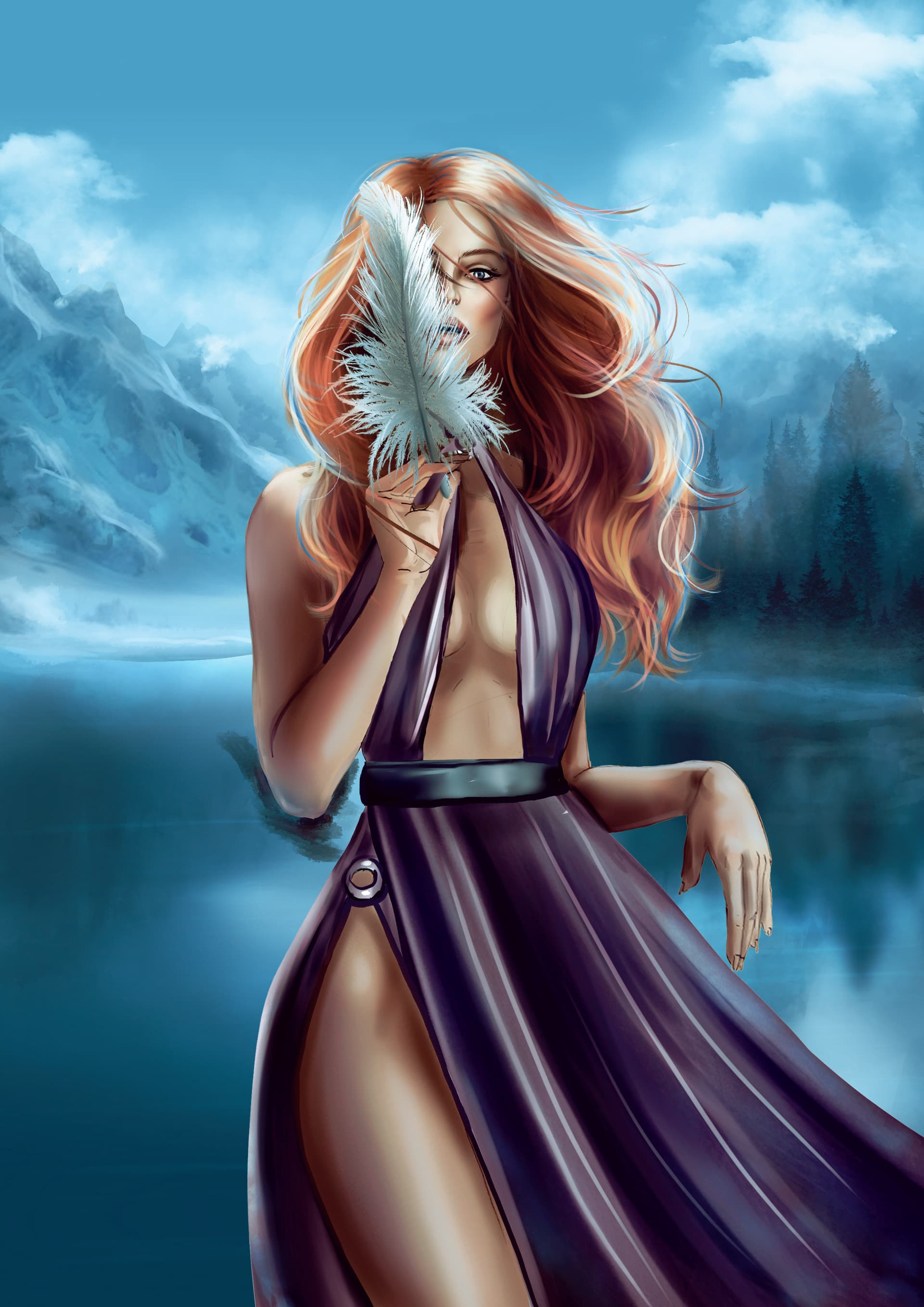
I feel like the background is really fighting with the foreground but I’ve tested (via photos for the concept) more htan a dozen images and I can’t find a background that works. Thoughts?
Do you think this concept is worth sticking with or should I keep the figure and completely change the background including the portal effect? Any feedback is greatly appreciated
edit: this piece is only about halfway done. Her skin and dress are very unfinished, her hair and face are mostly done pending final lighting adjustments depending on what background is chosen.
Its probably because the background has a lot more details. The character doesn’t have the same amount of rendering done, the dress for example is basically plain white almost no shading compared to the skin. That’s why the background currently sticks out and it looks like it doesn’t belong in the same piece. I’m sure that feeling will be gone when the rest of the image is finished. To avoid what you have I try to have the whole image at roughly the same level of progress the whole time.
Thank you! The dress isn’t done at all btw, it’s still just the sketch lines you’re seeing. I’m waiting on the final background choice to decide what colour/style to make the dress.
I know, my point is that the background feels off because it’s at a different level of progress already, it’s too far ahead and that’s probably the reason the whole thing feels off for you, currently.
Hi. Maybe try to Gaussian blur the background to reduce the detail and then see if it matches? Another option is to use the background as a reference and paint it. Then it should match the foreground better.
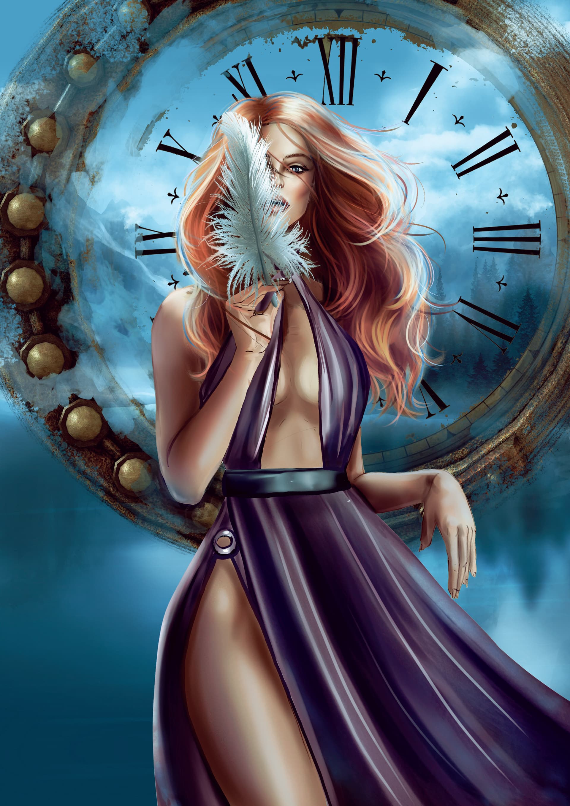
But yeah, it may be a bit too early to decide. Once you are further along you will have more information. In general, unless you have hyper-detailed style, then it’s probably best to reduce the detail in the areas you don’t want to draw the attention to (like the background). You have multiple tools to direct the sight, contrast, concentration, saturation, detail, etc. In your references the clock ring is very subdued, there’s hardly any detail in it (compared to the character).
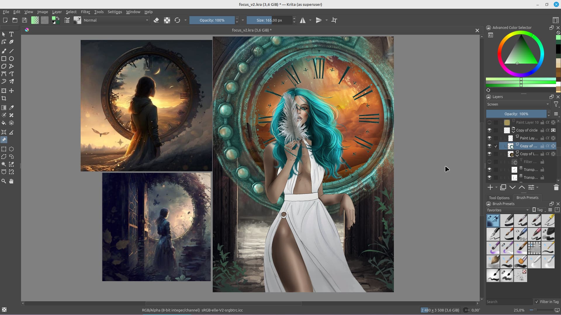
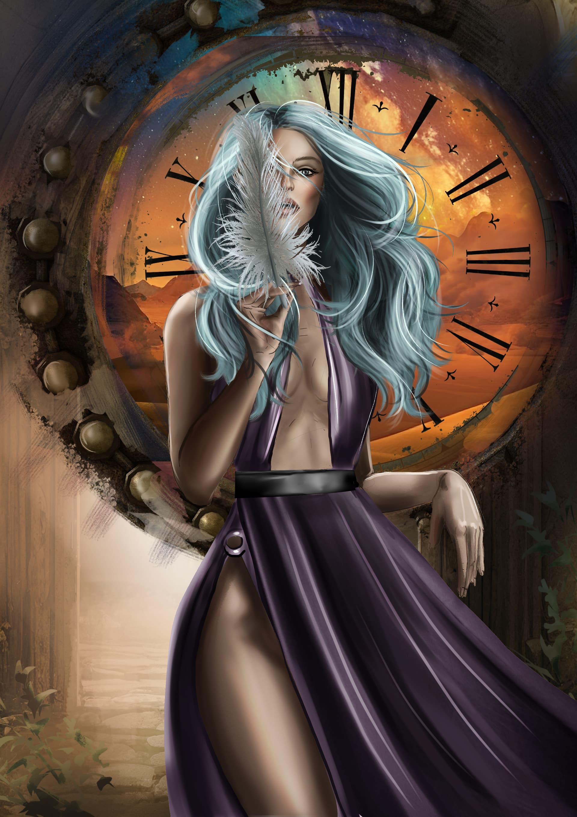
Her hand’s getting lost and I haven’t painted in the final lighting which would help merge her into the image. Here’s a super rough idea I had and did with photoshop filters, do you think this is a better direction to go down?
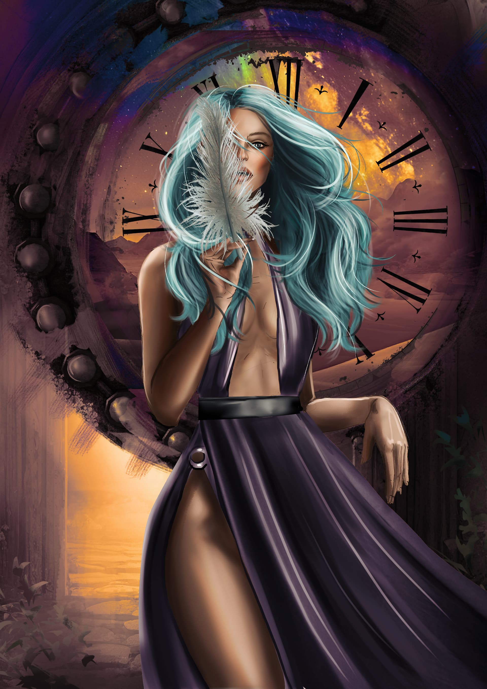
In my Krita I have configured soft proofing to use Graysacale instead of CYMK because almost always when something feels weird in my artworks it’s because of the values and fore/mid/background not being differentiated enough (or something different starnge with the values) and I use it so often. Perhaps give it a try too. I think in the third one the piece is coming together a lot better. I’d probably use less saturated colors for the background though but it depends on what you’re aiming for.
I thought the original worked best. We can easily analyze ourselves into worry and skepticism. The foreground figure wasn’t overly detailed so she stood out fine against the more detailed background and I thought the overall balance was excellent.
And the final version(s). I completely redid the background because it just wasn’t working. I’m still not completely happy with this piece but, yeah, it’ll do. I’m ready to move onto something else!
Not sure if I like it better with ot without the clock. I’ll make the final decision when I get further into the tarot deck and see how the other peices are coming together.
Both are a big step in the right direction, I like both and prefer the top one for its clarity, but the bottom one might fit better in your deck. Good job!