Have you tried a “fur” or “hair” brush? Depending on the look you’re going for, you might find some helpful brushes, tips, and bundles. There are several out there. For starters, you could search for FizzyFlower’s “ESSENTIAL” brush sets. You’ll find some cool options there!
1 Like
Oh sorry!! I thought you had created a world where only your daughter could see dragons!But it seems this is just a fictional female character . actually no matter how you look at it this is still a very gentle and romantic work!!!
1 Like
Yes I have two large sets of fur brushes. one being FizzyFlowers set and the other being “Ultimate Krita Fur Brushes Vol 6” the latter is where the V60079 brush came from and has a nice 2 tone brush that took me a while to figure out, but does provide nice highlight hairs.
Having both bundles means I have 175 fur brushes (phew - I just counted them). I need to figure out how to create a massive sheet so I can see what they all actually do
2 Likes
This is my idea for this month’s topic:
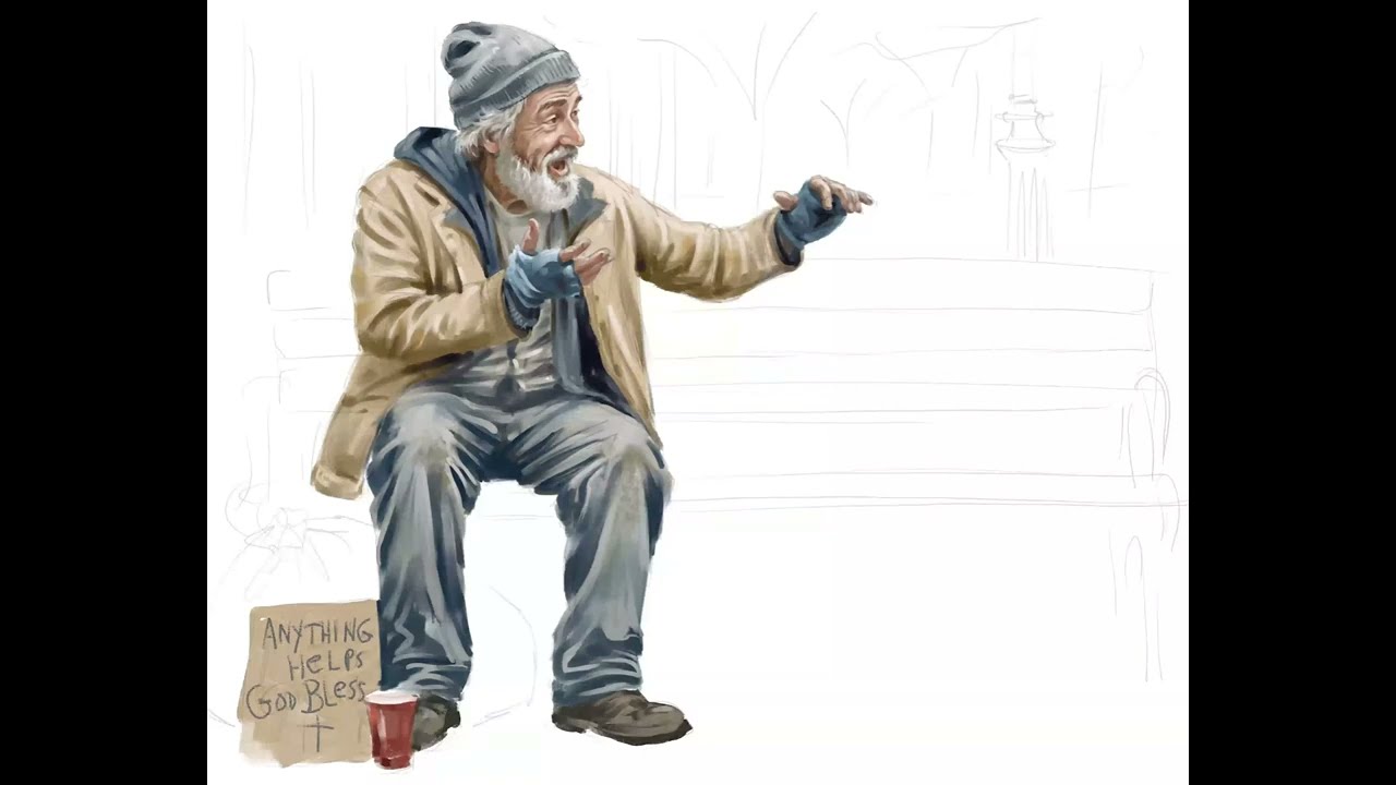
When I go to Aldi’s grocery, there’s always this homeless man sitting on a bucket in the shade next to the parking lot. He is usually talking and gesturing animatedly to some invisible person next to him, oblivious to anyone else. So, I’ve started working on a sketch and posture that shows this, looking at a few references from Unsplash and Pixels. 
6 Likes
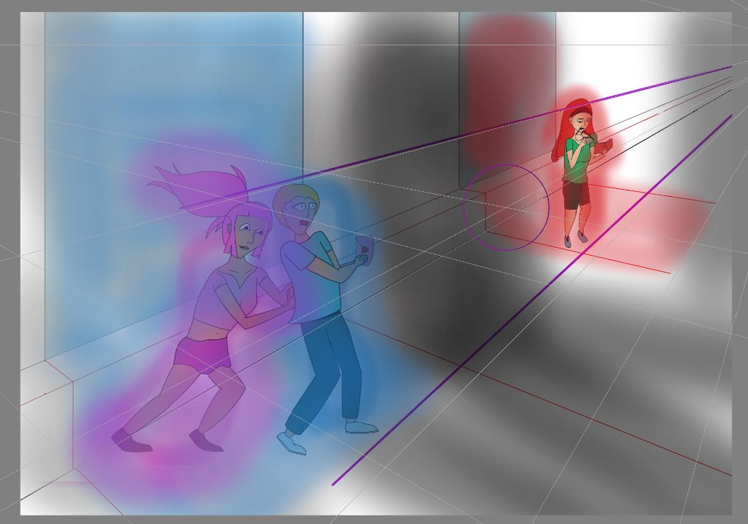
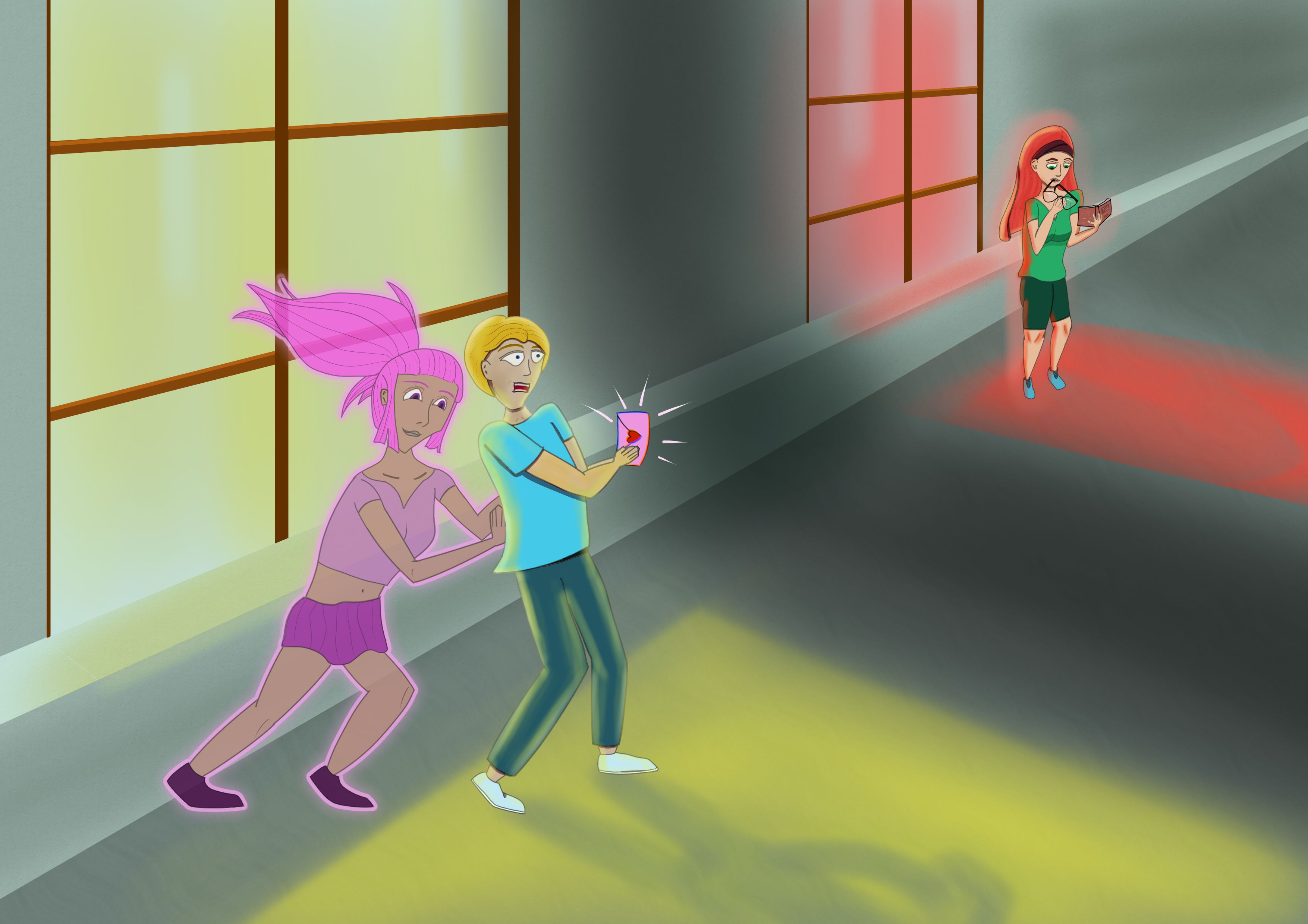
“Go for it!”
Very rough sketch, of a situation where someone just needs a little push.
EDIT: Progress
7 Likes
Here are a few things that helped me when learning to paint fur:
1. Don’t copy and don’t mirror
Try to avoid copying or mirroring parts of the fur. No matter how well you distribute them, people will usually notice the repetition, and the fur will look artificial. If you do use copied sections, only use them as a rough base. Afterwards, go over them with a few custom brush strokes so they blend in naturally.
2. Don’t use the same amount of detail everywhere
Avoid painting the same type of hair strokes with the same density across the entire surface. This makes the object look flat. In real life, fur covers the whole animal, but not every hair is equally visible. Depending on the lighting, some hairs stand out while others almost disappear. Try to recreate that effect in your painting.
3. Build the shape first, then add the fur
Before painting individual hairs, think about the basic shape of the object. For example, the head and body can be imagined as spheres, while the arms and legs are more like cylinders. Then decide where the light is coming from. If the light comes from the right, the right side will be brighter and the left side will be in shadow. These light and shadow values alone already give the object a sense of depth.
4. Start with only three values
One thing that really helped me was limiting myself to just three values at the beginning. For example, black, gray, and white—or any color with a light, medium, and dark version, such as light blue, blue, and dark blue.
Imagine you’re painting a gray sphere. Add black brush strokes on the shadow side and white brush strokes on the side facing the light. This immediately creates the illusion of a three-dimensional form.
In the darkest areas, keep adding black strokes until very little of the gray base remains visible. Do the same on the brightest areas with white strokes. Between these extremes, gradually adjust the density of your brush strokes to create smooth transitions.
If an area becomes too dark or too bright, simply paint over it again with the middle gray to soften the effect. As a final touch, you can add a few light hairs in the shadow areas and a few darker hairs in the lit areas. These small variations make the fur look much more natural and believable.
Hope some of these tips are useful and I hope to see your results 
7 Likes
So… I ran into this superfun resource the other day and it seemed like a fun thing to try:
(Written by Noel Santos? No idea if they have a KA account or I’d tag them here.)
I figured… why not try it out on some fireworks? I’m using the Bezier tool, not vectors. So I didn’t exactly follow the article, but it did have some cool ideas I hadn’t seen before.
Eventually a boy and his IF will be sitting on a dock watching the show across a lake.
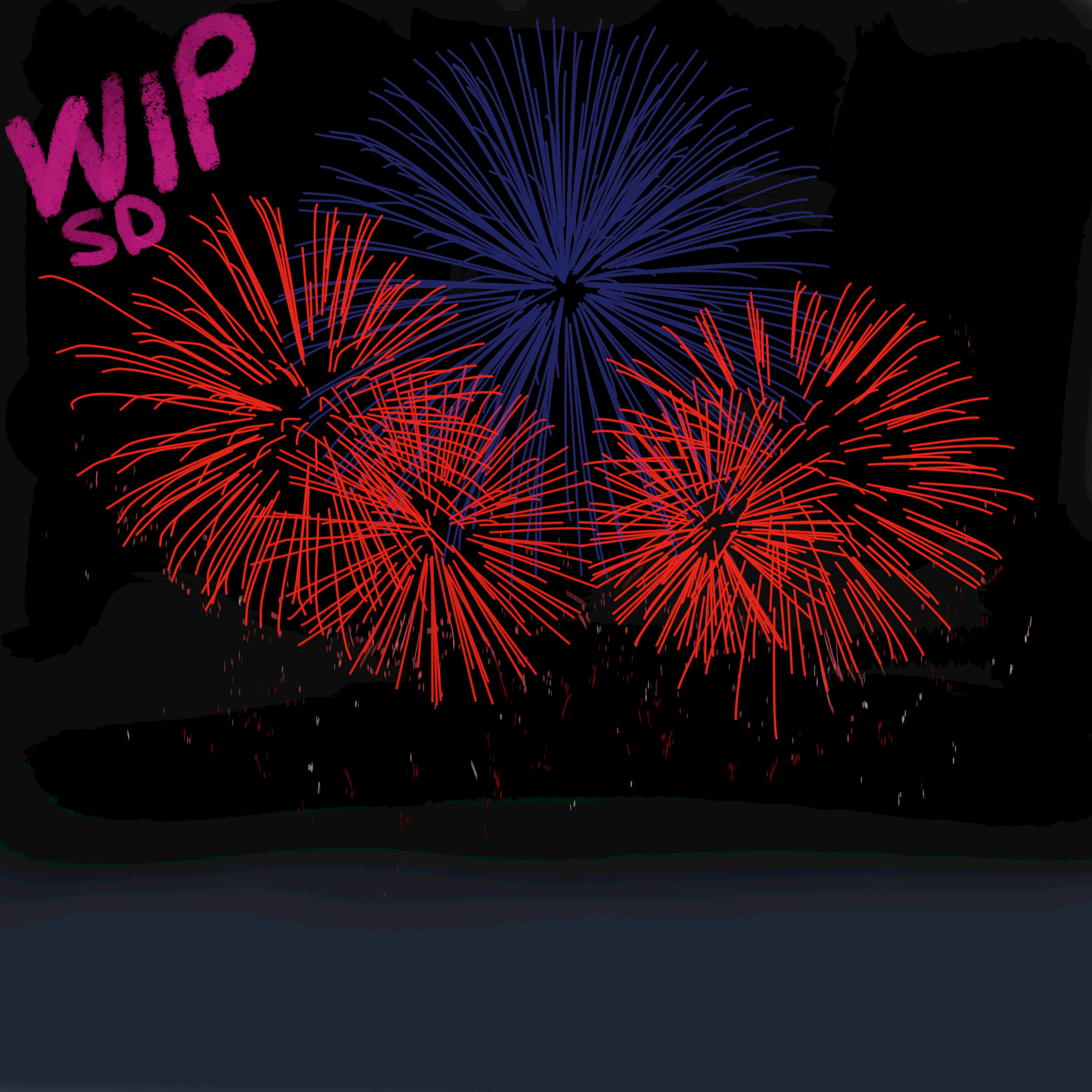

After a morning of work it’s getting close. Still some work to do on the far shore trees and the boy’s hair…
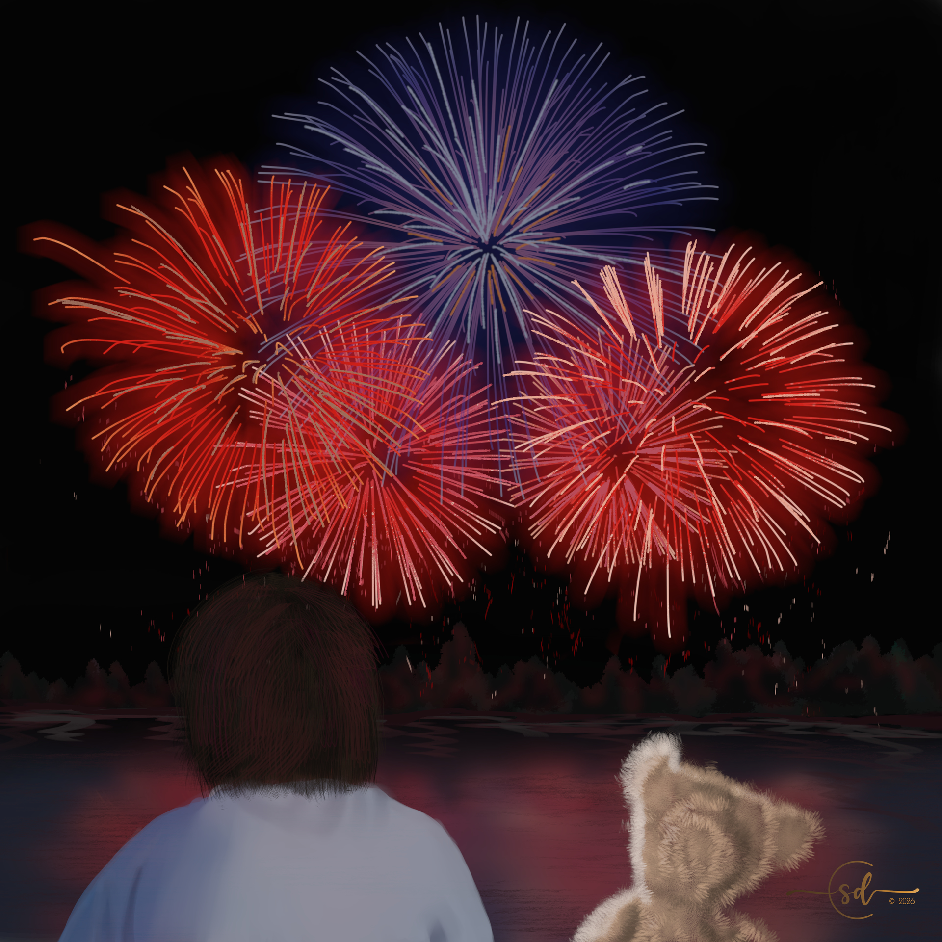
This is really killing my poor computer! Undos and Redos are taking forever, my fan is on overload, and brush strokes that normally fly are lagging. An upgrade may be needed in the future!
12 Likes
Wow, that effect is cool!
Ya! I did have to add in a bit of ink and sparkle frosting on top of what was in the video… But it got me further along than I would have been able to otherwise!
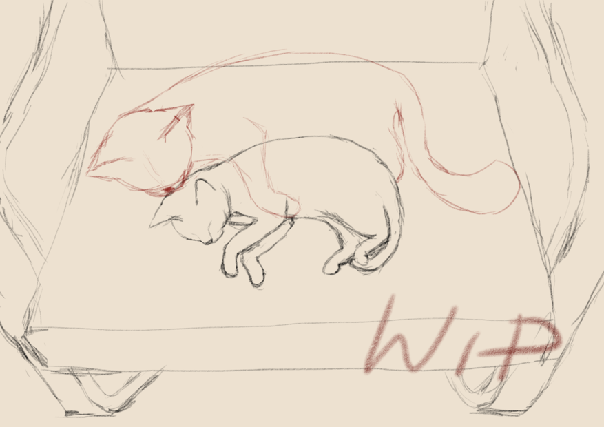
My idea for this month’s challenge is inspired by our first cat, who often had to stay home alone when all hoomans went out for work/school. He must have been very lonely back then. So I thought I’d give him this not-so-real-cat-creature as a friend to keep him company in my drawing.
Sketch for now. I’m still thinking what colors to use 
11 Likes
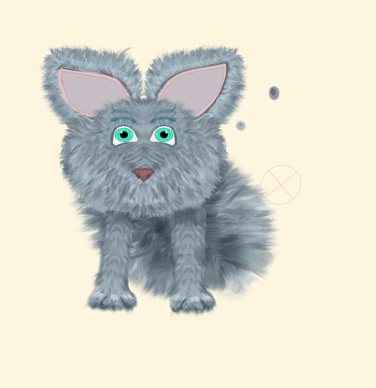
@KeriVKennedy Here’s my 2 cents on how to improve the illusion of depth and perspective. Hope you don’t mind, but I took the liberty of downloading your work to make it easier to show my ideas. For making the feet look flat on the floor, I used the distort/move tool to push up and flatten the bottoms of the feet. I also widened them a little at the bottoms and made the outer toe separation lines slant outward from the center toe. I then added some highlighting to the tops of the toes to bring them forward a little, and also a little darkening along the bottom edges to tuck them under.
For getting depth and perspective, I used the adjust/multiply brush to darken the areas directly under the chin and side of head, and also the belly between the legs and to the side of the one front leg. It even helps to add a drop shadow on the floor for even more depth and perspective.
I hope this helps! Looking forward to seeing your fuzzy IF!
8 Likes
I’ve been working on this imaginary friend that this homeless man talks to every day. Apparently he’s a loyal listener.
Timelapse WIP
12 Likes
Thank you so much! I’ve done multiple variations since this one - but your tips help so much!
Hopefully between the suggestions I’ve gotten I’ll have a much better final looking little friend.
2 Likes
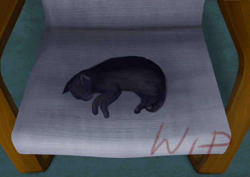
I added local colors, started rendering from bottom up. Something seems kinda off and I don’t know why
9 Likes
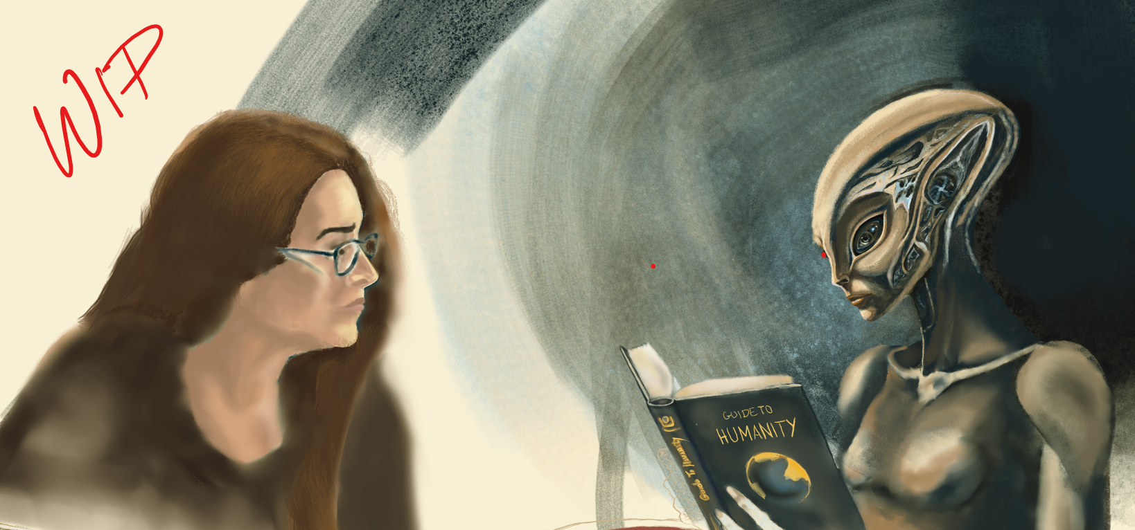

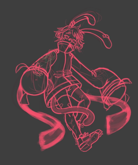
Nearly finished the yound one, wich make me want to make it more of a stand alone than an diptique. And for the other in the forest, I just stray open a new file to sketch the character and probably clean it up separely too.
10 Likes
Wow, this is so cute, I love it!

Michelist
1 Like
Thanks ^^.
1 Like
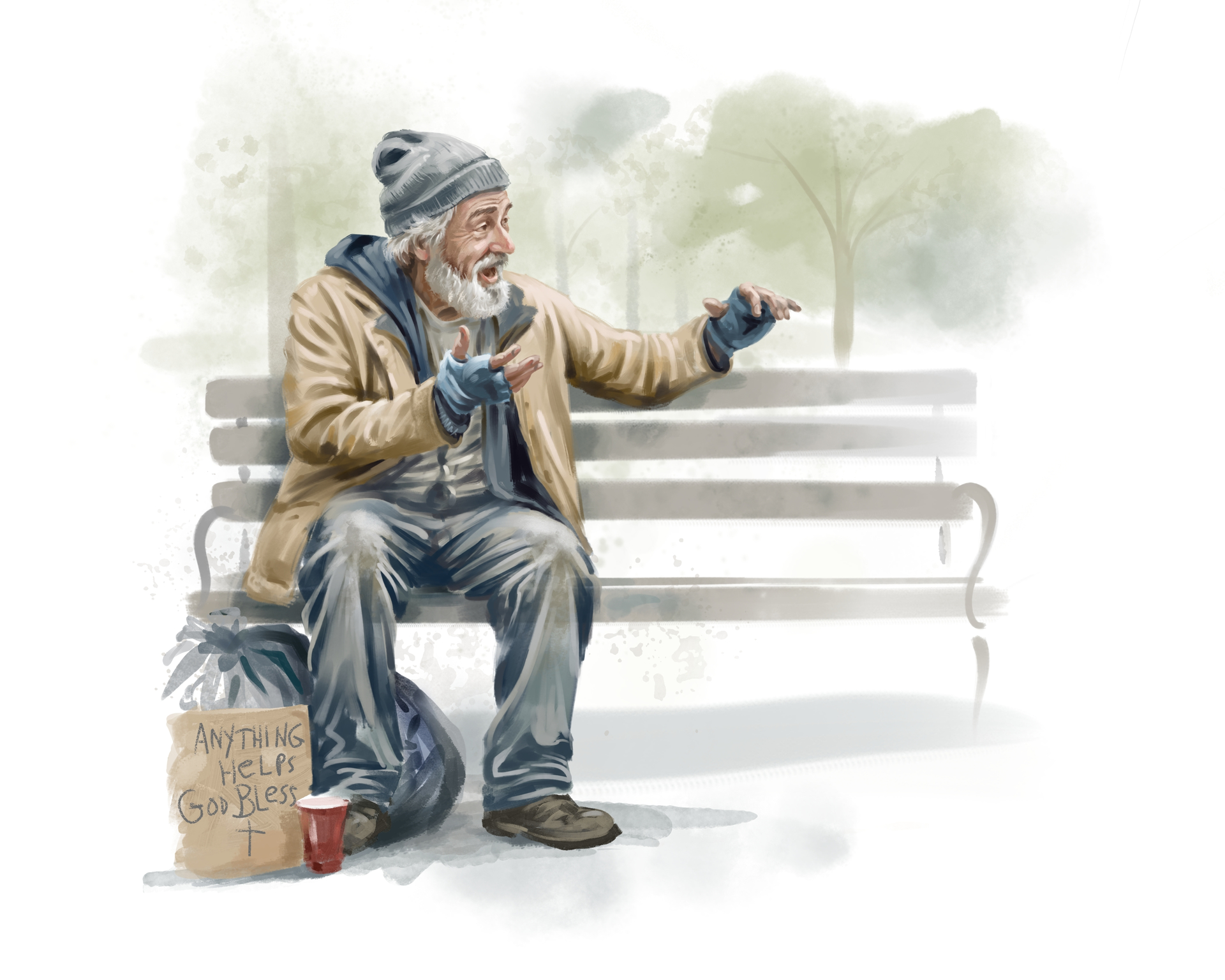
I finished this piece with the homeless man talking to his “friend”. I was trying for a kind of gouache/watercolor vignette.
11 Likes
Of course this looks great @Elixiah !
And it’s very cool you have enough computing power left over that you can have Krita record as you go… sooo cool to watch your work come together!
Just a thought since you mentioned playing with the watercolor look… Have you thought of using a watercolor paper texture as a base layer? There’s some cool info in this post:
3 Likes