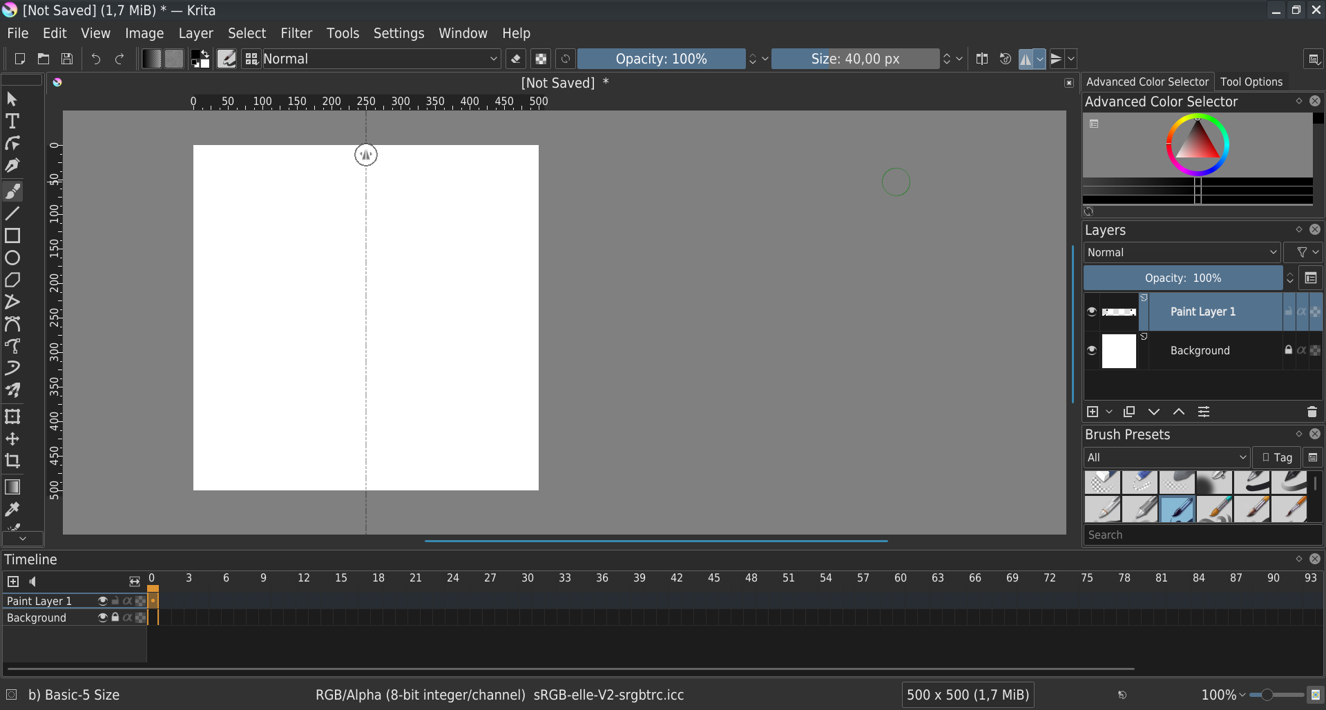
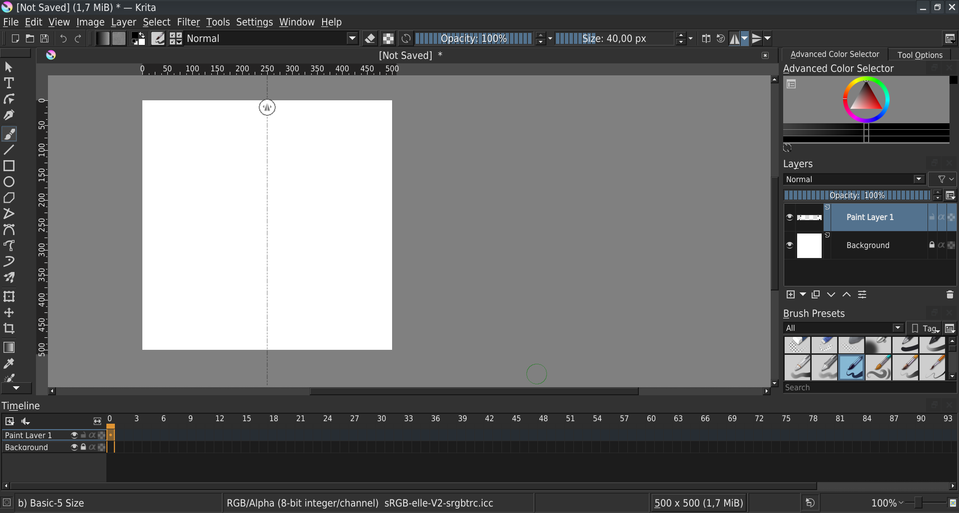
A while back I thought about this, but recently another artist brought it up…so I thought I would start a little patch and see what other people think.
You can read the overview with the patch I have now. The design issue I am trying to solve is we don’t really have any pattern we use for icons buttons. We seem to have different styles in different areas which is a bit sloppy looking in my mind.
I am thinking at the least we can have the following rules
Toolbox icon buttons will not have borders (like they do now)
Toolbar icon buttons will not have borders (like some do now)
Docker header buttons will not have borders
Docker footer icon buttons will not have borders (like layers docker already has)
There are some buttons we want to keep the borders. For example, a lot of buttons are just text like “ok” or “cancel”. I think those need to have a border around them so they don’t just look like normal labels.
Not sure if other people have been thinking about this to clean up the UI a bit and make the design a little more cohesive.
They absolutely will. The amount of finagling I have to do to tweak specific types of buttons because of overall inconsistency is something that hinders progress quite drastically. I’m all for this!
I’ve been using redesign plugin without any breaks since it came out and I can’t imagine going back to default look. My problems with UI were solved then, but I believe that going with the default design closer to the plugin is a good idea - not only as a personal preference, but rather theme consistency.
Proposed changes seem reasonable. It’s hard to compare with current default and the plugin without mockups or prototypes, but as soon as there are any, I’m eager to test and share opinions, as I’m surely going back to default theme if it tops the redesign plugin
@wojtryb, @halla@slightlyangrydodo, @raghukamath - thanks for the feedback. I think at this point I will do a bit more work converting more of the tool buttons to be flat for consistency using my best judgement. Some of the buttons might technically be QPushbuttons, so I will have to see when I am in there. Maybe I can just do a style making all QToolbuttons flat…then potentially converting some qpushbuttons.
I will post an update with a screenshot with what I have when I get to it. We can always do tweaking or finessing. This is kind of an iterative process for improving.
Indeed @scottyp.
Honestly, flat is good and really feels modern. It’s just that it must be
constructed right, with good UI design.
Say you had a dark background, then a lighter dark color works on the toolbar and the buttons. Dark separators work too.
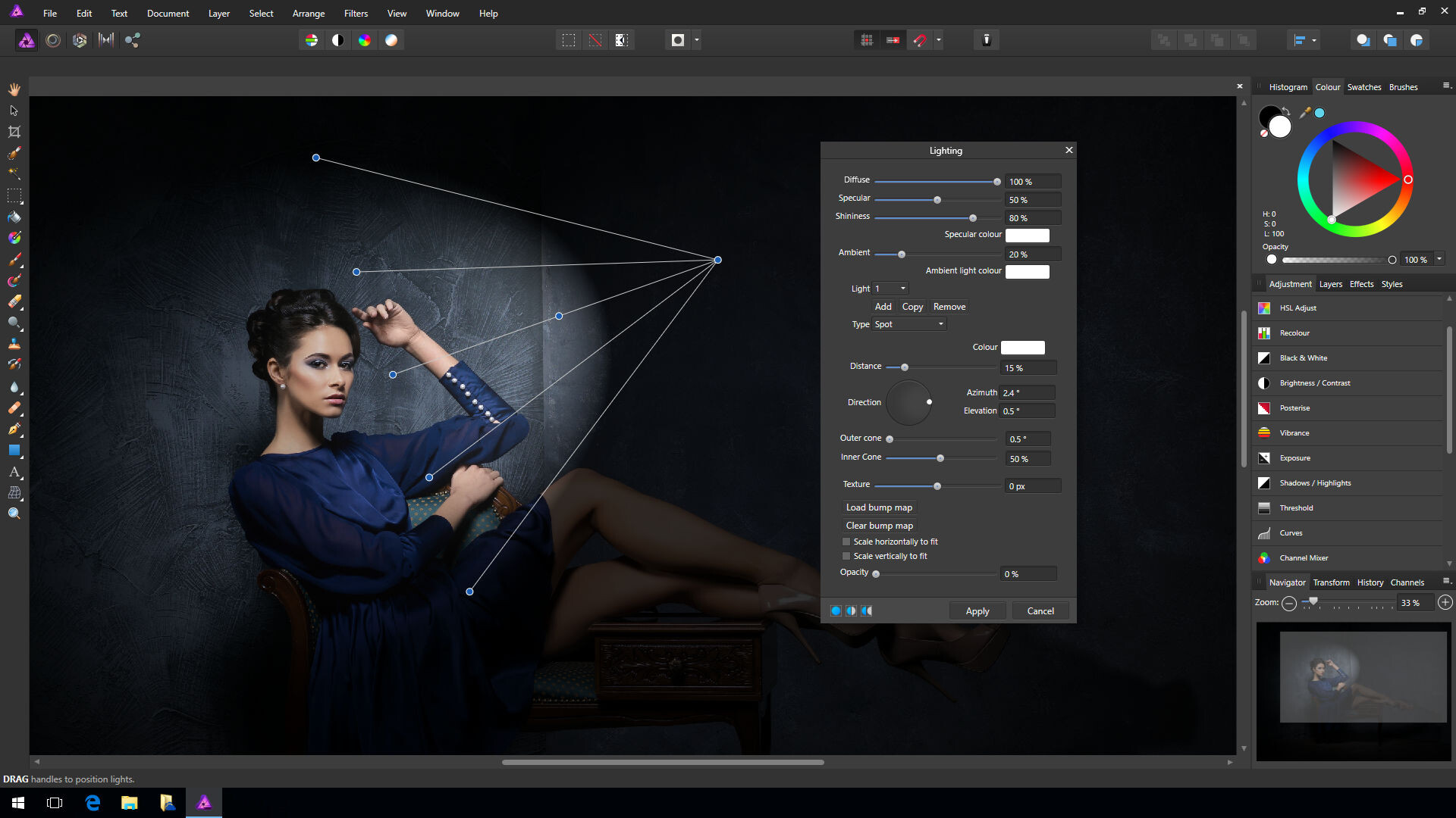
It’s probably gonna take tons of work before the real stuff comes out; in the meantime you may inspire yourself from apps like Affinity or Photoshop, or all kind of modern UI mockup references you really like.
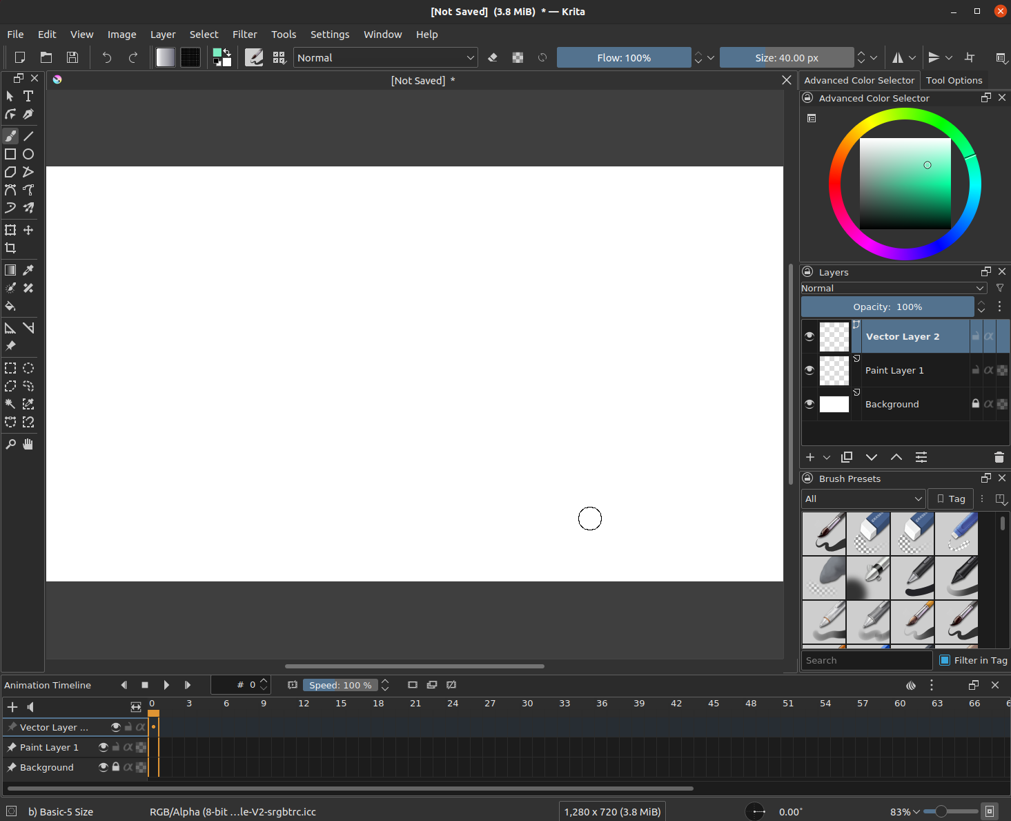
This is what I have so far. I also swapped out the tab close button so it is similar to the dockers now. I am not sure what to do about things like the “tag” button that text. It feels a bit weird to remove the border on that.
Not sure if there is anything else glaring that I might need to fix.
I did updates quite a few dockers to follow this pattern as well that aren’t shown. The “+” sign on the new layer is also simplified a bit by removing that extra thick border.
You have tried, and it looks fine.
Now, let the borders be black or have the darkest color, excepts for dropdown menu buttons like those for the blend modes.
Also, if the icons on the option bar could get as small as those on the tool bar, it would create more spacing and make things look prettier.
Now, I don’t know if you thought about this before, but using web design tools for Krita’s UI might facilitate things and help you make things easier in the future for UI design. I think this what Adobe does right now, aside from the C++ code. The idea is to utilize maybe something like an html/css UI engine for the visual side of Krita while the rest is handled through C++ code.
Also, check this modern web browser in the picture. It’s called Vivaldi. And it has a flat nice look.
Opera, Firefox, Microsoft Edge,… if you can find the way the UI of these apps
are made, you might make a big step forward for the visual aspects of Krita’s UI.
Hope you think about it.
If the devs can find a tool like sciter(https://sciter.com), but maybe open source/free, they could easily handle the UI problems for Krita’s modern look thanks to the power of html/css. @scottyp
I don’t think that is in the scope of what @scottyp is doing. IN my opinion we should plan to go with a gradual design improvement, picking the low hanging fruit first.
This is the issue of many UI design threads here. They get ambitious and go off to different tangent and then the work stalls because everything gets confusing with lots of different advices and radical mock ups and ideas etc. This is not a brainstorming thread so please be on topic.
Well one thing I am noticing from the screen shots is the timeline has a value box with text aligned to the right while widgets for size/opacity have text aligned to the center.
Personally I find double spin boxes with arrows useless. Those buttons are just way too small to press it is easier to click and use arrow keys up and down. I would just take them all off. But either way I know you guys like it.
Also the buttons seem to have different geo.width and geo.height from one panel to another. This makes some icons be bigger than others. I am not sure if I am seeing this right by the pic on my phone. It seems that the layers stack is bigger than the rest of the world. I would probably think of 2 standard sizes. A big one for everything and then a smaller one for the timeline and other animation dockers that sit at the bottom of the screen ussualy.
Other than that I only have issues with combo idea text not being centered but that is fixed by Qt
@EyeOdin - That is a good point with the icon button sizes, but that is probably going to have to be done differently. It is a bit of a mess right now with how we hard-code different icon sizes in different areas of the UI. We probably need to have the icon size set in a config so people can change it…and all the icons can use that - but that would be for another patch as that would probably need a separate discussion.
The sliders could probably need work, but I wasn’t working on that either. That would probably need a mockup with how it needs to look and work along with discussion before that would be touched.
I took a look at @slightlyangrydodo flat theme plugin. I think one of the main things that needs to be tweaked in Krita core is the QFrame element on all the UI elements that have a bright border. The flat theme plugin gets rid of that which really helps clean up a lot of the noise. I tried applying that stylesheet in C++, but it is breaking the breeze slider widgets…so that might need more research/time to figure out how to properly apply that…or fix the widget later.
Sure that is tottally understandable considering legacy.
well on my side it might sound a bit silly but instead of using a full number for the ui value like 5 or 10 I use variables that are just named ui_5 and ui_10. by forcing myself to use these variables on the ui elements they are super easy to located and change value if I feel like it. search and replace ui_5 is more efficient that doing the same for just 5.
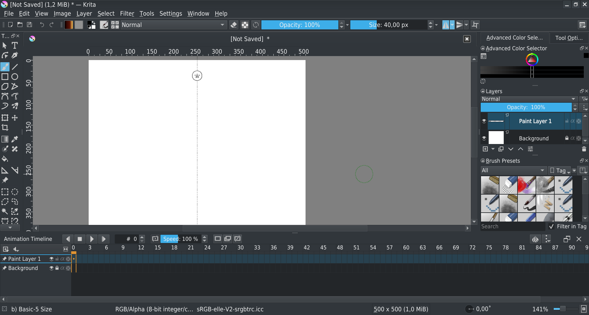
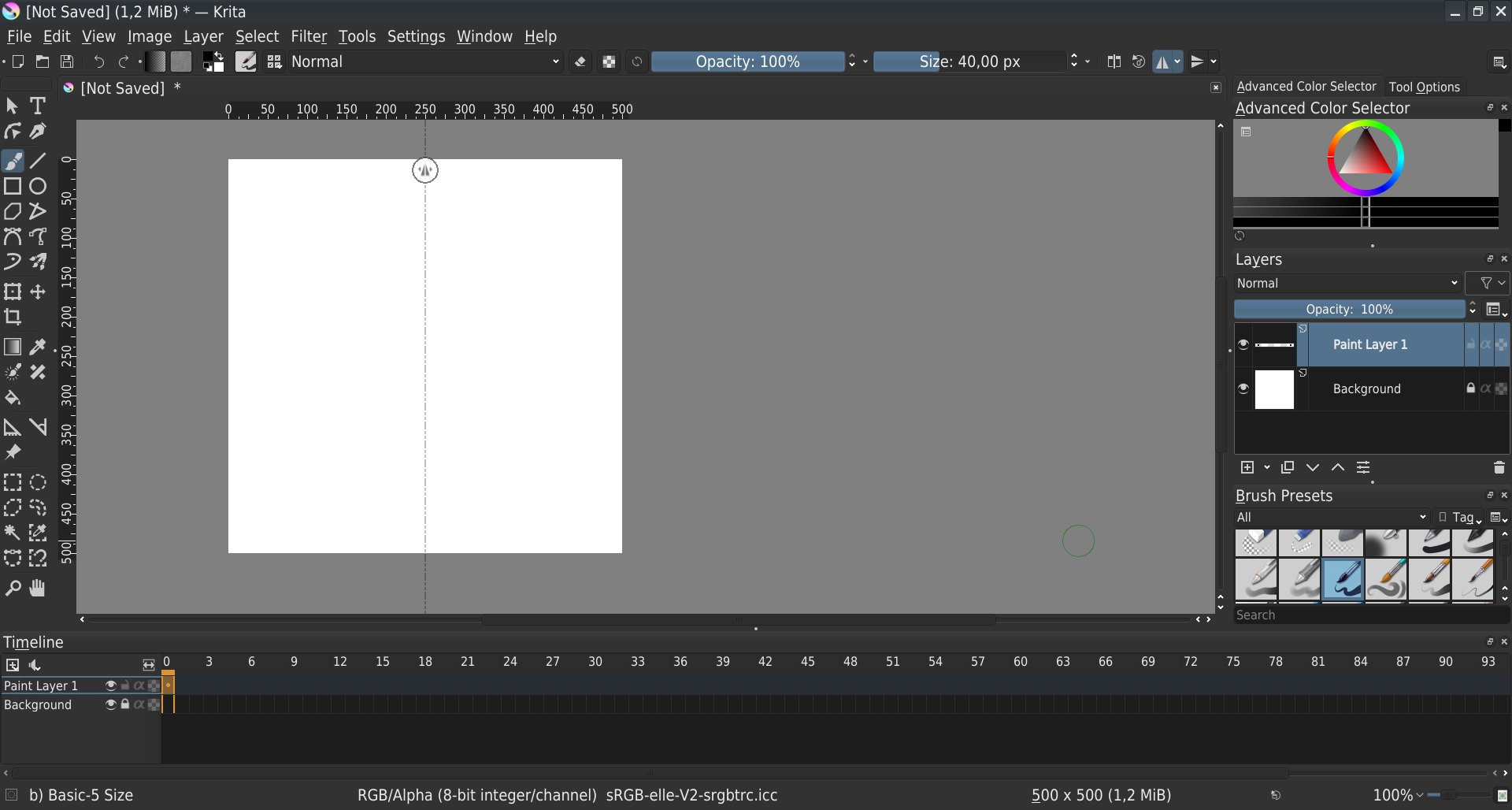
One thing is, when you compile and execute Krita, it use theme defined in Krita, but use style from system.
Looking your screenshot seems you’re using “Breeze” style.
Using Appimage, it seems embedded style is “Fusion”
On my side I don’t have borders on frames
Doing some modification on theme to force rendering could be a good thing to have a uniform interface across OS (and maybe for Linux users choice of interface style), but could also produce strange results if only a part of style is forced…
As recommended by @raghukamath, I think this is out of scope, because if you start to modify it, you might have to modify everything to ensure that interface is consistent whatever the user’s choice of style has been made at system level…
I actually had the request before of changing the buttons for increasing or decreasing values from vertical to horizontal buttons. I like the idea, but I have no idea how to do it outside of Krita, per se, and in the plugin.
I’m liking the look so far, and I think that using the redesign plugin can help you spot UI inconsistencies. I say that because I use borders only on specific types of buttons, and the toolbar especially is the one of the trickiest part of the whole UI. It looks like there are so many buttons that are nested inside of other containers, on top of being different types of buttons that it becomes tricky to apply one approach to buttons that just works.
@Grum999 has a point here that some things are just very difficult for the people designing Krita to really fine tune unless they explicitly take control of the style used. If you’ve spent some time in the GNU/Linux community you might know that this is a pretty spicy topic. Not to mention challenges for other platforms.
Here are some of my own thoughts.
If a button is represented by a clear icon or visual for its purpose then it should be a plain flat button with no border or bevel. If a button is represented by plain text then it needs a border of some kind to show that its a button. Avoid mixing text and icons.
Elements with a drop-down feature looks to be extra tricky. Some style force a downward arrow on the “tag” button while others don’t, and the brush list button in the toolbar always has that arrow. That’s a weird inconsistency. The downward arrow next to the opacity and size sliders look weird being right next to the up/down arrows of the sliders. And at a glance the down arrow next to the + in the layer panel doesn’t look entirely like it belongs to the +.