Hey there! Disappeared for a while because the iPad, and after recently buying a new tablet for Blender and Krita, I’m back, and excited to work on the UI plugin again!
There was a LOT of previous discussion on the previous push for this plugin, and one thing I noticed is that we might have started off too broad, which led to too much feedback scattered throughout the entire UI. This time around, I want to do things differently, with a much tighter focus, with the goal of revamping the entire UI experience one part at a time. Step by step, we’ll be testing and iterating on designs, and next thing you know, Krita now looks completely different!
For this reason, I would like to start with the thing people see first as soon as they open the app. I would like to tackle the Entry screen first, as it’s small enough to get my feet wet again with development, and is one of the areas I mostly ignored in the original push for the UI redesign.
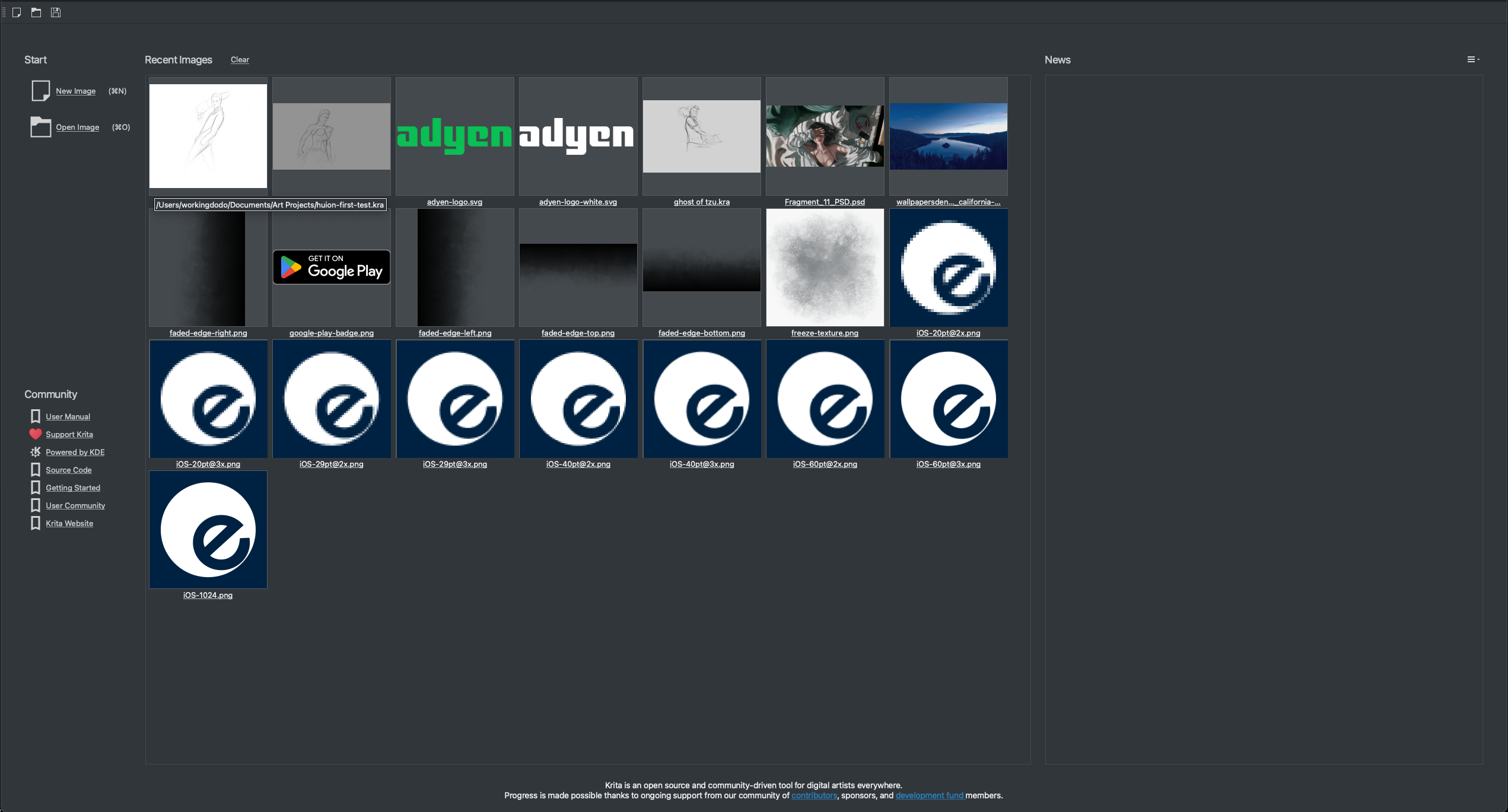
For reference, here’s how it looks out of the box, on Mac using the Breeze Dark theme (please ignore the images themselves :D):
This is in a 1440p, 27" screen :
This is in a 4K screen, 19". The color difference is due to the way the screenshot is captured, you can ignore that:

If we look at this screen like a piece of artwork, there are several things that I think should be improved:
- glancing at the page, the thing that immediately jumps out is that the recent images takes too much space, to the point that everything almost becomes irrelevant;
- two critical operations, namely creating and opening images, are in the top-left, with small text. Squinting at the page you wouldn’t be able to tell their importance due to their size;
- the images inside the recent documents are not only too big, they also have very little breathing room between them, which creates an almost cluttered look;
- the news section (isn’t working for me, but that’s not a UI problem :D), takes up a significant amount of space, and if it isn’t populated it’s completely empty space. It is almost the antithesis to what’s happening to the left of it, with too much information, and this strange contrast is a hindrance to this page;
- titles could be bigger, don’t create a lot of visual difference with inner contents, like in the “Community section”;
- the borders for some of the sections seem a bit unnecessary (but this is more minor overall)
I’m already creating some mock-ups of possible changes, but this is a community project, so I was wondering if other people would chime in with mockups, and more feedback! I’m starting to group this in a Google Docs, so you can add your feedback directly there if you prefer. For now it’s comments only, but I might change that in the future!
Link for Google Doc: Krita UI Redesign - Google Docs
Thanks for reading this giant wall of text, please leave your feedback here! I’ll be posting as I continue working on this screen, and design some mockups for possible avenues to explore. This is going to take a bit, since I’m re-learning Krita plugin scripting, but I really want to give back to this awesome community ![]()