Blender has the same corners. In general people love it.
I just don’t want to see effort being put into this but not done right. If someone is doing work, they should get feedback early.
I use Blender a lot and if Krita looks like the Blender UI, I’m a happy camper. But the Blender Foundation spent a ton of time to pimp up the UI for 3.0. The bevel might be the same as in Blender, but the Blender Elements are a bit more spacious which in relation makes the bevel smaller. The problem is too much bevel and too little height/width. And I would also be very careful with bevel/emboss effects as well.
No redesign ideas from me (though it’s really tempting), as you already have a lot of all types of suggestions (with the whole range between good, bad, doable and out of scope covered). But I have to admit, this time they are overall less crazy and less “let’s start everything from scratch” than they usually are in those UI threads  .
.
I just wanted to say that I’m really happy you work on this topic again. I’ve been a huge fun of the current redesign plugin and those two krita core changes you made (color selector background and recent layer docker separators), and I really believe you can pick the best ideas out of this thread.
After all, it’s you who decide what gets made - that’s the power if the open-source project programmer I guess  .
.
Thanks everybody for their ideas - those threads are always a lot of fun to track. Let’s see what of my picks get done after all 
Heads up. Some of these ideas are pretty and all but they will never become something. As it stands some stuff is just like that and there is no fix.
I loved @Rakurri idea for the separators but I don’t know how that goes to be feasible either.
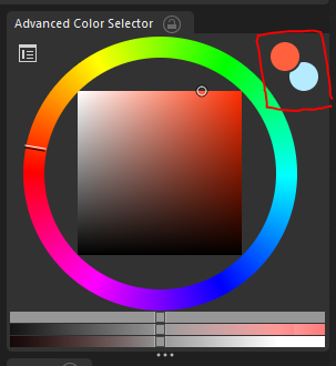
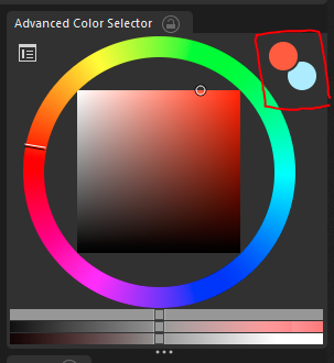
I don’t understand why people like tiny little circles to see the selected colour on pickers, so ugly. Besides those squares were the history of colours where would that go of its space was replaced by something else?
This could well be a request, I feel that sometimes to change the foreground and background colors I have to go to the other end in the toolbar, it would be more convenient to have them near the chromatic circle.
I agree the bevel, emboss and shadow effects look like solutions to a problem that is created by yourself; by taking a wrong starting point. These things look gimmicky and will look outdated quickly, imo, aside from being a bit confusing.
I was thinking, there are many UI related Blender commits from the past year and a bit. Is there a way to list these so that it could act as a ‘toolset’ with which specific problems could be tackled? I can only think of going over all Blender today vids and then search for UI related commits, but there probably is a way to find them on developer.blender.org one way or another.
I can share screenshot of Affinity Photo and Photoshop 2022 (which I personally prefer over CS6 for having a more modern look and feel to it) with the same panels open as the mockups. That may help as well?
I’m not sure, if digging through all the Blender commits might be worth the time. Not sure. I think a thorough structural approach from the bottom up makes most sense. Taking influences from other programs and (if possible/necessary) improve on them is the way to go. But his should go in hand with a re-visitation of some structural and logical issues (which would impact UI changes - mainly thinking of some issues in the layer tree and the brush management). So probably getting some of the bigger functional hurdles out of the way first might be better along the way to get the baseline right for the thoughts on the UI.
Anyway … great brainstorming up there - all in the spirit of making Krita the best alternative to Photoshop as a painting software.
Here’s Affinity Designer (looks about the same as Photo apart from the custom toolbar at the top).
Photoshop CC 2022, for some reason the Brushes panel scales oddly to single column arrangement. Lot’s of folders for arrangement 
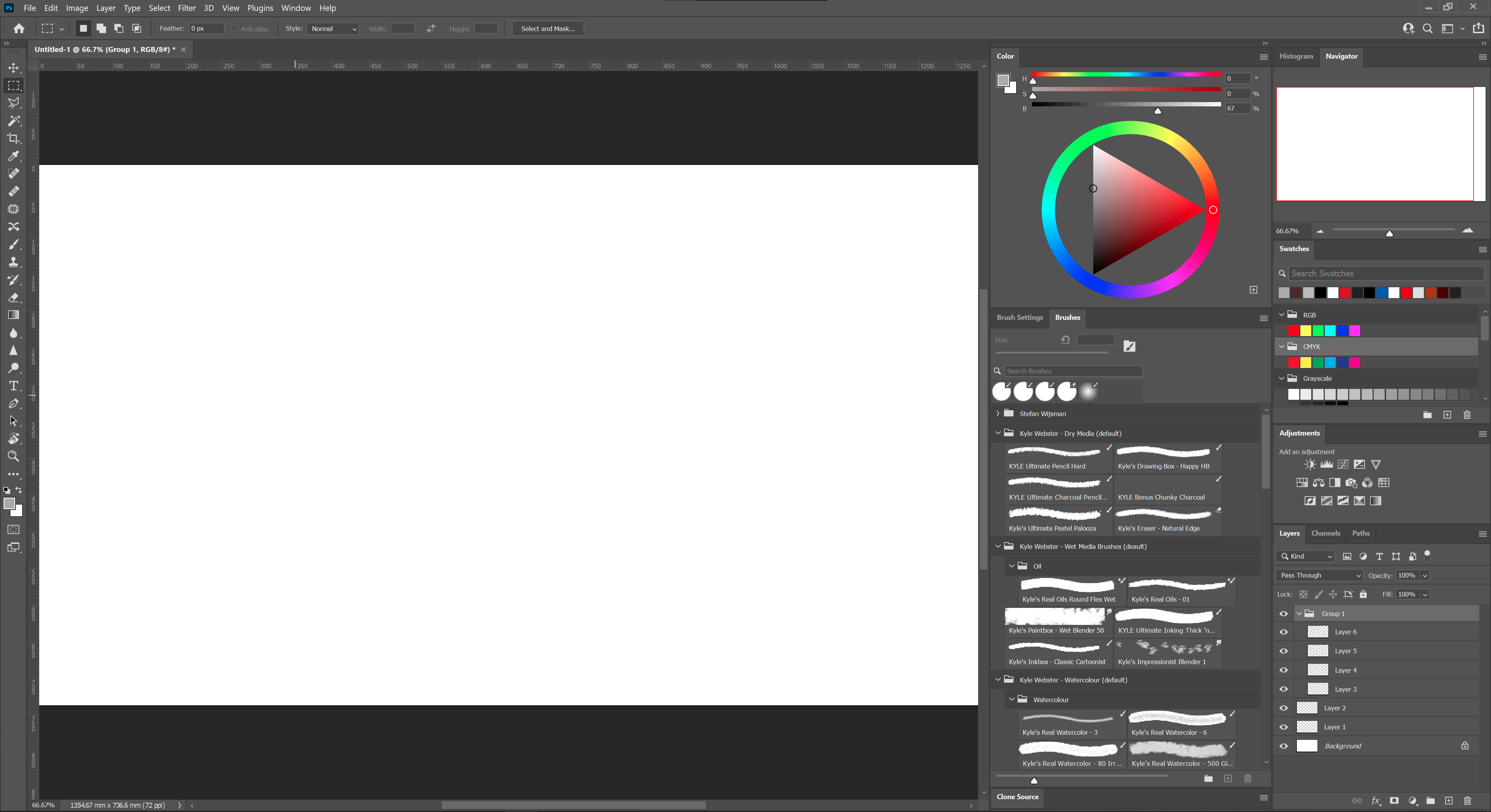
Also, the more I look at the Photoshop UI, the more dated it looks. There is little to customise in the colour wheel’s arrangement. Though I do like to be able to fold away dockers
Looking at the colour wheel, I would personally put the fore- and backgroundcolour on the left hand side so that the colour history could (optionally) be displayed on the right. This can be achieved by scaling the colour wheel. The reason why I say optional here, is by giving the colour wheel more horizontal space it may scale better with a small column arrangement. In that case, like Photoshop, the colour history could be shown in the swatches docker.
I also think the wheel needs a bit of breathing room in between the colour sliders to make it feel less cramped. The way Photoshop achieves this works well, I think, though the sliders should be moved to the bottom.
This is something I found yesterday.
If we have to be honest, even though I did that mockup above I want all software to look like the link. Which side? You should be able to tell… The problems are 2: a lot of people can’t tell, and they can’t also tell there is a problem in UI trends and why, so they will dislike it. Second is that it takes the most effort making that sort of design… for people that will not like it later on. So I concede that this is in the past. But hopefully you will catch on as to what I mean and learn.
I would love to get my hands on what you’ve got there @slightlyangrydodo! Especially, now that I have taken a good look at the interfaces of each application. For me the most important change would be for the tabs. I did a quick mock-up to show the comparison of the current layout and a new 3 level proposal, which also acts as separation between the panels.
Currently, the difference between the panels is that the tabs are spaced out all the way to fill the horizontal space. I think a three layer arrangement helps to clarify this, which consists of 1. the active tab, 2. inactive tabs and 3. background/ separation. Do note that I think the tabs are a bit too high at the moment, by shrinking them down vertically, the background would be a more subtle separator. Note that it requires a ~5 pixel padding on the right to make sure the background clips the last inactive tab in case the tabs would fill the entire background portion of the tabs.
In addition to this colour scheme, I would also like to test a Affinity style theme. I was having a go at it earlier this morning, but couldn’t quite get it the way I would like it to be. It makes quite a lot of sense to pair the UI colours with the applications you work with tbh, though I like the colour scheme you use as well.
Agreed. The Photoshop UI is quite conservative at this point. But at least the functionality is OK. Affinity Photo’s UI is also very well done conceptually. The iconography isn’t balanced too well, but the windows and tabs are really nice.
What is the KDE UI capable off? Is it quite flexible?
There’s some really excellent information here. However, threads like this quickly become chaotic, so I’m starting a shared document (similar to last time’s gigantic thread) that compiles the most important information, and links to the images you post here. That way it becomes easier for everyone, myself included, to parse so much subjective information into discreet bullet points to improve.
I’ll link it here when I have something to share, in the meantime keep the suggestions going!
I think the separators should come back. Except that they only need the dark most color rather than the light one. I’m not saying it should be black, but on the whole UI interface, it should have the dark most color. One other suggestion would be like to balance things between flat and semi-flat UI elements by following a good hierarchical rule. Photoshop handles that well and has a simple, consistent, yet modern and elegant UI look. Just saying.
If I should give other suggestions, well, I’d say that :
-
Krita’s options bar height should be slightly shrinked at least up to the points that the icons there have about the same spacing as the icons on the tool bar, the goal is consistency.
-
Regarding UI design, consistent and balanced padding make things more beautiful in general, even if the value amounts two pixels. The padding could be symmetrical for top and bottom side on one hand, and left and ride side on the other hand.
May I know what art/design program you use for your mockups and which other assets I might need to get
started with Krita UI design myself ?
I encountered some strange places:
Besides, it still conflicts with the ruler
@slightlyangrydodo Now that I have had a change to download and test the redesigned UI, I find that the docker names are also quite long. It is something I hadn’t noticed before, but “Advanced Colour Selector” + “Artistic colour selector” together fill the entire space that I have for tabs in my two column layout. Is it possible for the plugin to rename those? That would remove lots of clipped text and make the UI cleaner.
Advanced colour selector > Colour Selector/ Colour
Animation Timeline > Timeline
Animation Curves > Curve editor
Artistic colour Selector > Artistic colour
Small Colour Selector > Colour Selector (s)/ Colour (s)
Specific Colour Selector > Swatches

Furthermore, quite a lot of dockers have 'docker' in their name,
this could be removed as well for the names that show inside the panel header.
Also, I believe the supplied .colors file is different from the workspace you showed in the opening post. For instance, there was no distinction between active and inactive tabs on my system. So no distinction between BackgroundAlternate and BackgroundNormal under [Colors:View].
Do you happen to have an indication as to when you would be able to roll-out an updated version?
That would be confusing as Krita also has a palette docker (named pallete) and swatches docker or tabs in other softwares are mostly that.
Regarding the “docker” added in the name I agree it is redundant, there are only two dockers that have docker suffixed from what I see here, both are from plugins. We can report it to remove the redundant names
Oops, I mixed those up 
The Palette indeed is the same as “Swatches” and Specific Colour selector would need a different name, such as “Colour #” or “Colour - Specific”.
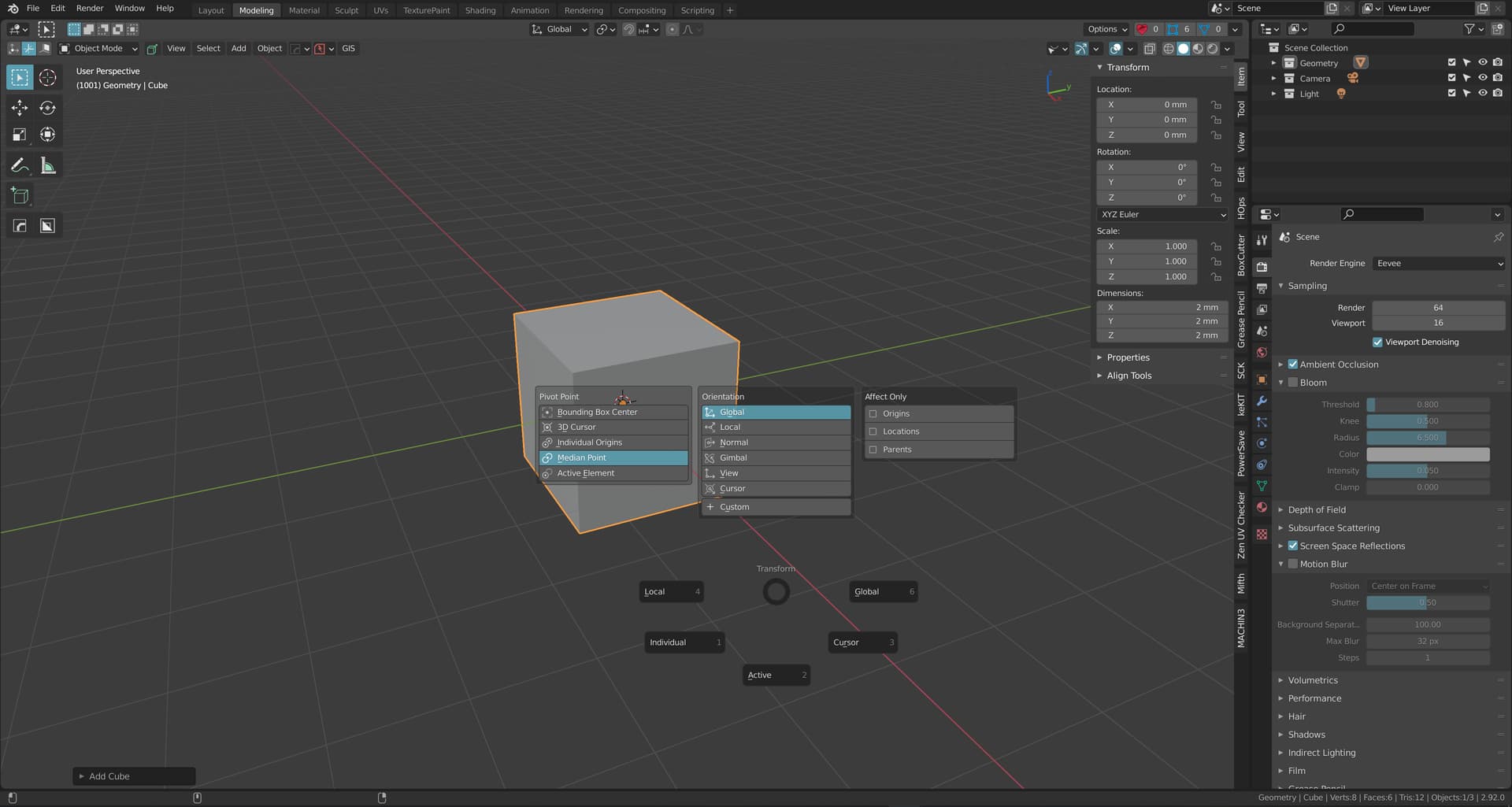
Just dropping this in here for inspiration, I just finished customising/ tweaking the Blender 3.0 UI and I am really impressed with the possibilities there.
New:
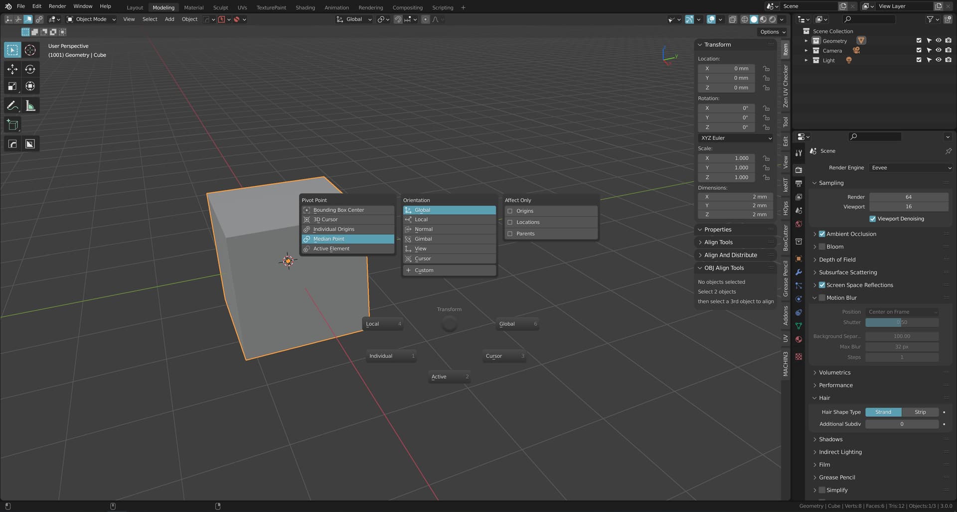
Compared to the old, everything is much more unified owed to the more consistent colour usage throughout. Rather than separating panel content and headers with quite contrasting colours, it has become much more subtle.
Old:
What I think is particularly nice is the added padding in the N-panel and properties panel to help differentiating between the various menus. I increased the roundness of the panels here, so the filleted corners also aid in separating the panels.
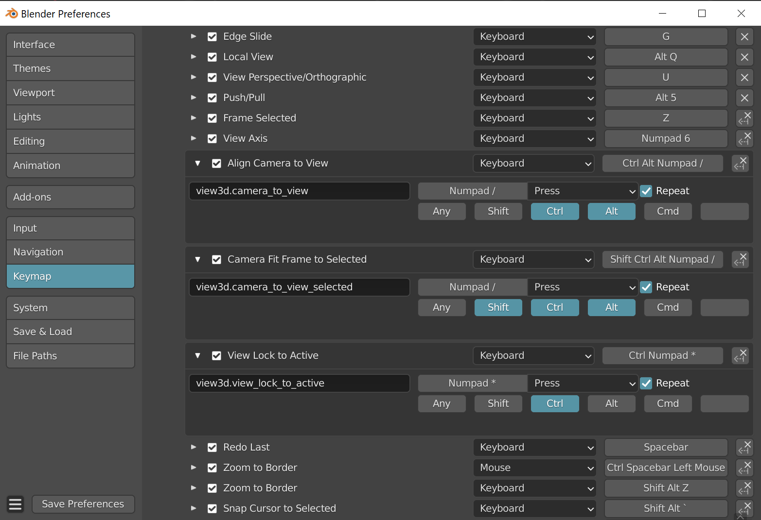
Also worth noting is that you can apply gradients across UI items, this makes the interface less flat and comes with the benefit of not having to use outlines for separation. The gradient then adds this bit of visual interest that makes the interface less dull compared to a purely flat single colour. For instance compare the new keymap section to the old:
New
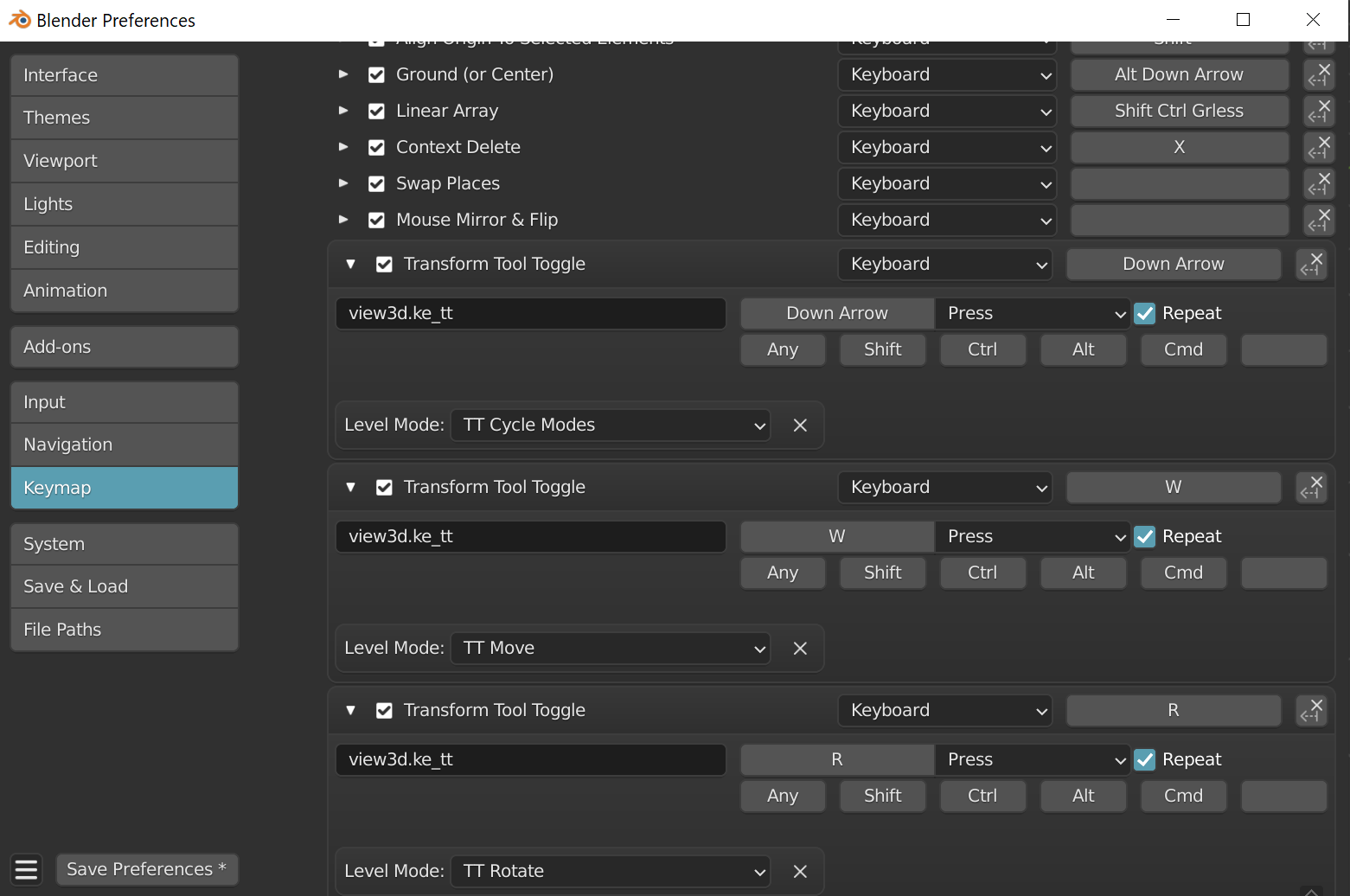
Old
Each has their own merits, but I really dig what I could do in the new UI now that the padding is increased.