Whenever I switch the theme, there will be a result like this:
AttributeError
Python 3.8.1: C:\GAMES\STEAM\steamapps\common\Krita\krita\bin\krita.exe
Fri Dec 10 22:58:18 2021

A problem occurred in a Python script.  Here is the sequence of
function calls leading up to the error, in the order they occurred.

 C:\Users\123\AppData\Roaming\krita\pykrita\bulinotes\pktk\modules\uitheme.py in reloadResources(clearPixmapCache=True)
   96             clearPixmapCache=True
   97         for theme in UITheme.__themes:
   98             if UITheme.__themes[theme].autoReload():
   99                 # reload
  100                 UITheme.__themes[theme].loadResources(clearPixmapCache)
global UITheme = <class 'bulinotes.pktk.modules.uitheme.UITheme'>
UITheme.__themes undefined
theme = r'C:\Users\123\AppData\Roaming\krita\pykrita\bulinotes\pktk\resources'
].autoReload undefined
AttributeError: 'UITheme' object has no attribute 'autoReload'
    __cause__ = None
    __class__ = <class 'AttributeError'>
    __context__ = None
    __delattr__ = <method-wrapper '__delattr__' of AttributeError object>
    __dict__ = {}
    __dir__ = <built-in method __dir__ of AttributeError object>
    __doc__ = 'Attribute not found.'
    __eq__ = <method-wrapper '__eq__' of AttributeError object>
    __format__ = <built-in method __format__ of AttributeError object>
    __ge__ = <method-wrapper '__ge__' of AttributeError object>
    __getattribute__ = <method-wrapper '__getattribute__' of AttributeError object>
    __gt__ = <method-wrapper '__gt__' of AttributeError object>
    __hash__ = <method-wrapper '__hash__' of AttributeError object>
    __init__ = <method-wrapper '__init__' of AttributeError object>
    __init_subclass__ = <built-in method __init_subclass__ of type object>
    __le__ = <method-wrapper '__le__' of AttributeError object>
    __lt__ = <method-wrapper '__lt__' of AttributeError object>
    __ne__ = <method-wrapper '__ne__' of AttributeError object>
    __new__ = <built-in method __new__ of type object>
    __reduce__ = <built-in method __reduce__ of AttributeError object>
    __reduce_ex__ = <built-in method __reduce_ex__ of AttributeError object>
    __repr__ = <method-wrapper '__repr__' of AttributeError object>
    __setattr__ = <method-wrapper '__setattr__' of AttributeError object>
    __setstate__ = <built-in method __setstate__ of AttributeError object>
    __sizeof__ = <built-in method __sizeof__ of AttributeError object>
    __str__ = <method-wrapper '__str__' of AttributeError object>
    __subclasshook__ = <built-in method __subclasshook__ of type object>
    __suppress_context__ = False
    __traceback__ = <traceback object>
    args = ("'UITheme' object has no attribute 'autoReload'",)
    with_traceback = <built-in method with_traceback of AttributeError object>

The above is a description of an error in a Python program.  Here is
the original traceback:

Traceback (most recent call last):
  File "C:\Users\123\AppData\Roaming\krita\pykrita\bulinotes\pktk\modules\uitheme.py", line 98, in reloadResources
    if UITheme.__themes[theme].autoReload():
AttributeError: 'UITheme' object has no attribute 'autoReload'
In addition, “use flat theme” is not friendly to light-colored themes…
Awesome feedback, going to have to make sure to test that light themes are properly supported in the next version. I’ll look into it later today, thank you!
EDIT: Just tested it, and it turns out that what’s really not working well in the change itself. If you restart Krita, the theme works (though I did get an error message, I’ll investigate it later)
It seems that the problem is caused by “use flat theme”. I have to close and open it before it will display normally. (The same is true in the previous version, but it will not pop up)
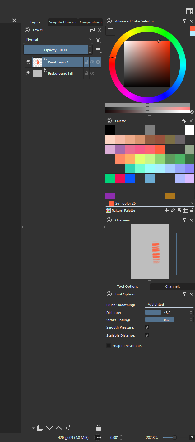
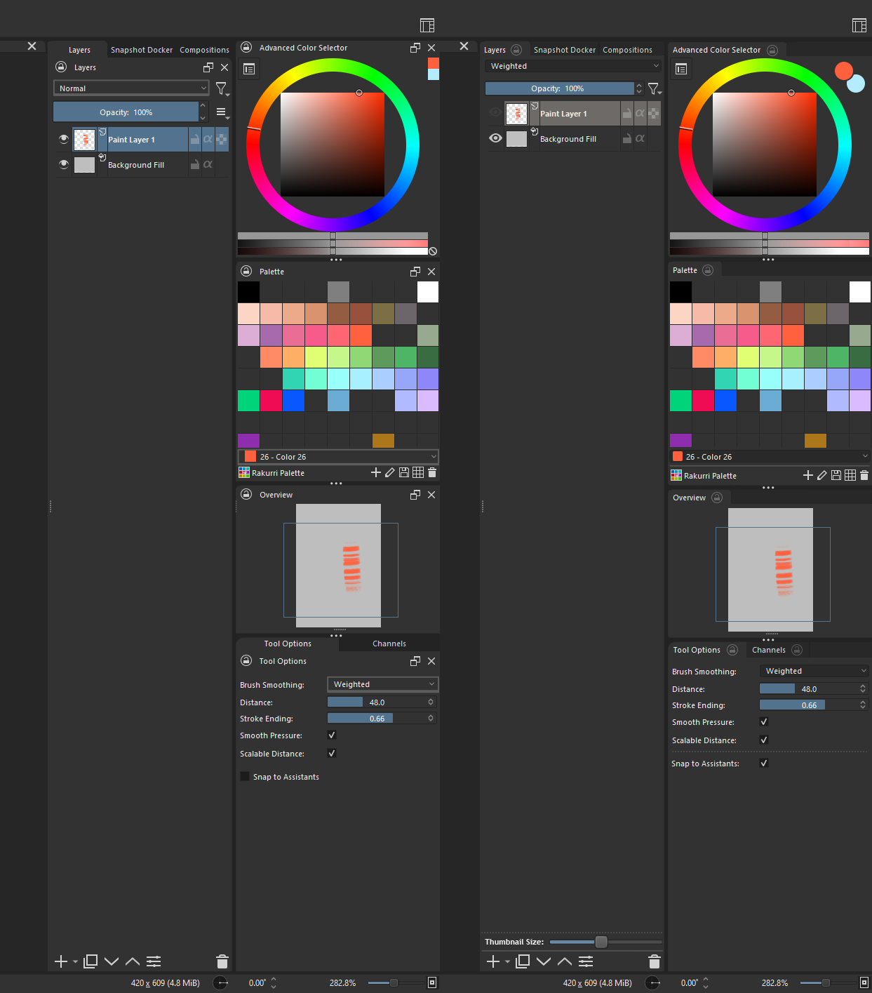
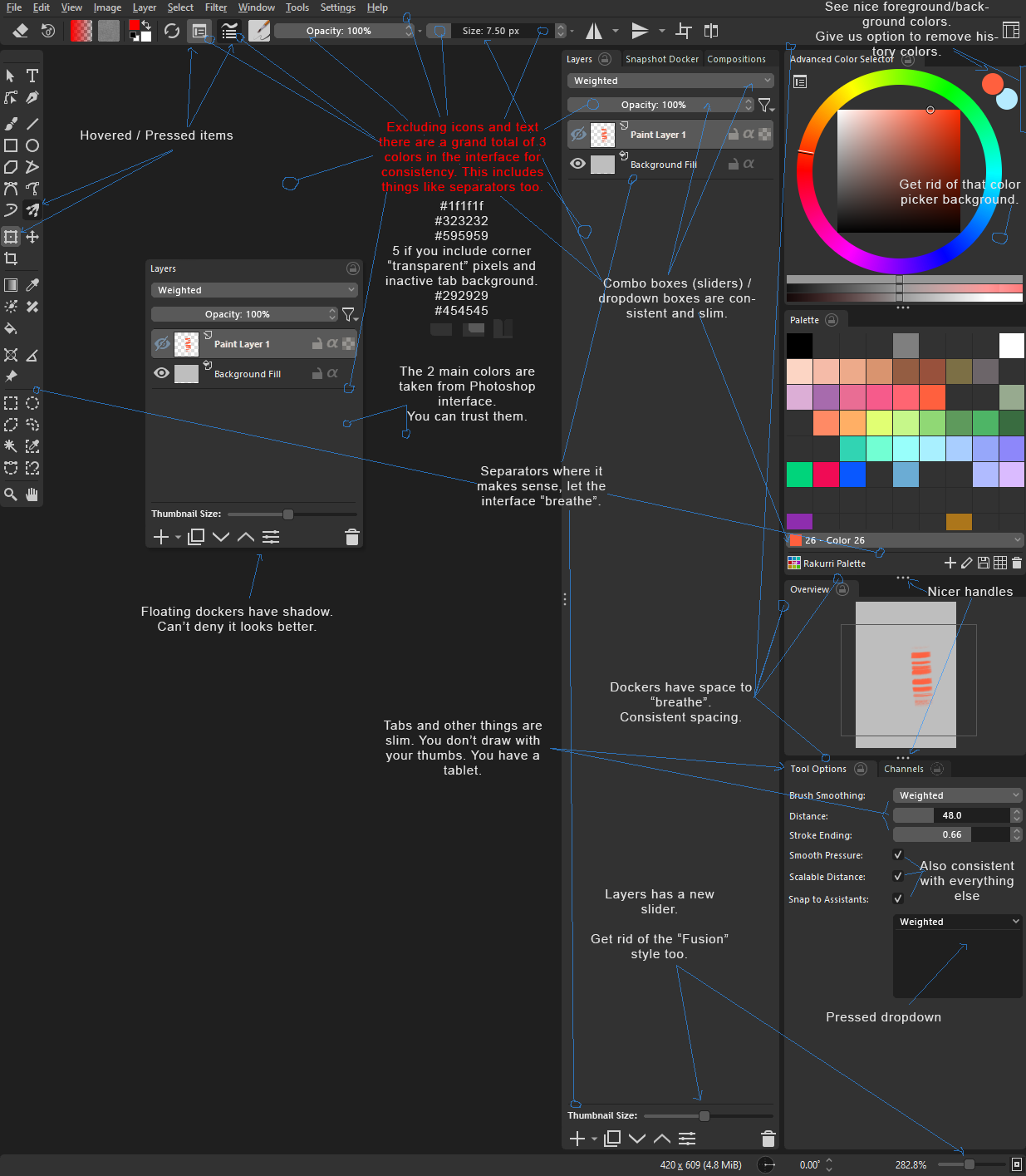
I like the rounded corners, which makes it feel a little bit less dated. But as for the rest, it’s all a bit too chaotic still. It’s all a bit randomly places. The lack of proper separation between elements makes it nard to visually organize the dockers and windows. For example the lack of a proper frame on the dropdown box is something I don’t see as an improvement.
I’d say the best thing would be to go into a design phase on paper first and flesh out some fround rules properly, then sketch it up and get feedback on that. This would be much more time-efficient than jump right into coding.
Actually this was discussed quite a lot back in the days, like maybe a year ago (long, very long forum threads…)? So I would assume there is some more precise vision behind the plugin. Though I don’t really know the details.
You’d be correct. Originally it was all started on that (huge) thread about an idea for a redesigned UI. However, despite this being based off of suggestions from that, it was such a long time ago, that I sort of began testing things out on my own for this release. I didn’t stray too far from what was previously done, but I’m starting to feel a little bottlenecked in creating a plugin.
For example, the separators in the layers docker, it was as simple as removing about 10 lines, and in my opinion it looks a bit cleaner. I believe that there’s a lot of “small tweaks” here and there in the code base that can help a lot more than a plugin can.
Still, I continued with this, because it can very well serve as a testbed for certain changes, that could in the future™ be implemented straight into the source code.
For me, the endgame is simple. I want to make the default Krita UI better looking. This plugin is almost a means to that end
I do feel like krita is in need of a visual improvement. Just not sure if the super flat direction that is so fashionable is the way to go. Problem is it makes it harder to distinguish between different parts of the interface. Imo at least some level of detail is necessary.
Speaking of which, you can go take a look at the photoshop cs6 interface. I don’t remember seeing a better looking GUI. In the following versions they went for a flatter interface and it started looking worse.
I hope I am not alone in this opinion.
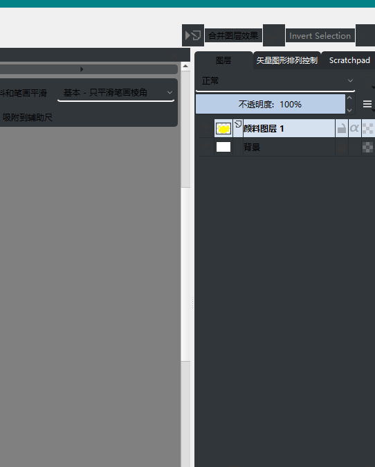
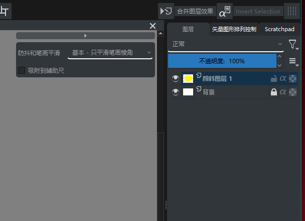
There are some problems prominent. The white line on the Palette colour dropdown looks like a divider but it is not. The trash can in the layers editor almost looks like it’s floating in-between the dockers not knowing where it belongs. It takes me a little bit of time to understand where the windows start and end, even though I do like the flatness of the UI. I love the cleaner look, but adding seperators I think it will look both cleaner and much much more tidy and organized! I feel the design is super close to being perfect as a redesign.
Here is a quick mockup of what I personally think will make the UI easier to read.
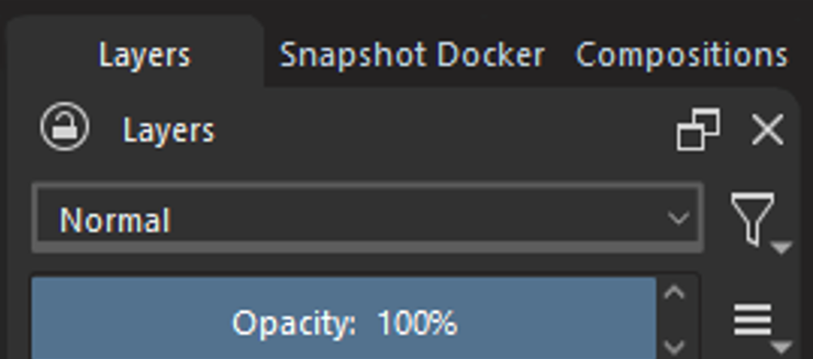
Seperators in the same dark colour as the tabs. Also, the active layer is rounded instead of the inactive ones. This makes the inactive ones take a step back into the background, and highlights the one you use. It adds depth to the UI in my opinion
The drop down for layer blending modes, brush smoothing and similar menus I gave a less intense colour, and made the box encompass the whole button to make it clear that it is not a seperator, but a clickable UI element. I really like the design you made with a bold underline, so I think keeping that makes it distinct as a dropdown. Also a nice detail is that it looks heavy at the botton, almost like a roll down curtain:
I can agree regarding the problem of flatness for the sake of flatness. At some point usability starts degrading when there aren’t any separators, borders, or gradients to differentiate elements. As an example, as @Rakurri pointed out, that is indeed a problem that dockers currently have: there’s not really a clear separation between them, and I would say it’s also a problem that extends to their respective titlebars.
In relation to this plugin, the docker tabs essentially blend into the dockers above them, which causes additional confusion.
You guys are awesome, this is super helpful feedback. @Rakurri in particular’s, I’m going to completely shoot in that direction going forward! I don’t know how much I’m going to be able to get done inside the plugin, but if I see I can’t do it, I’ll go to the native version and try there.
I would also like some more opinions about the buttons, namely the tool and push buttons. I’m not in love with them, so I open to suggestions!
I would place the buttons “Undock Docker” and “Close Docker” in a right-click-menu, just to keep the UI clean. Preferably undocking could be done via dragging the docker outside its parent window. That would be even better.
The iconography could also be synchronized better and made a bit bolder. I quickly changed the layer visibility icon to suggest such a change.
But as mentioned before. This should be done on a white paper first properly, so that the programmer will have an easier and faster workflow.
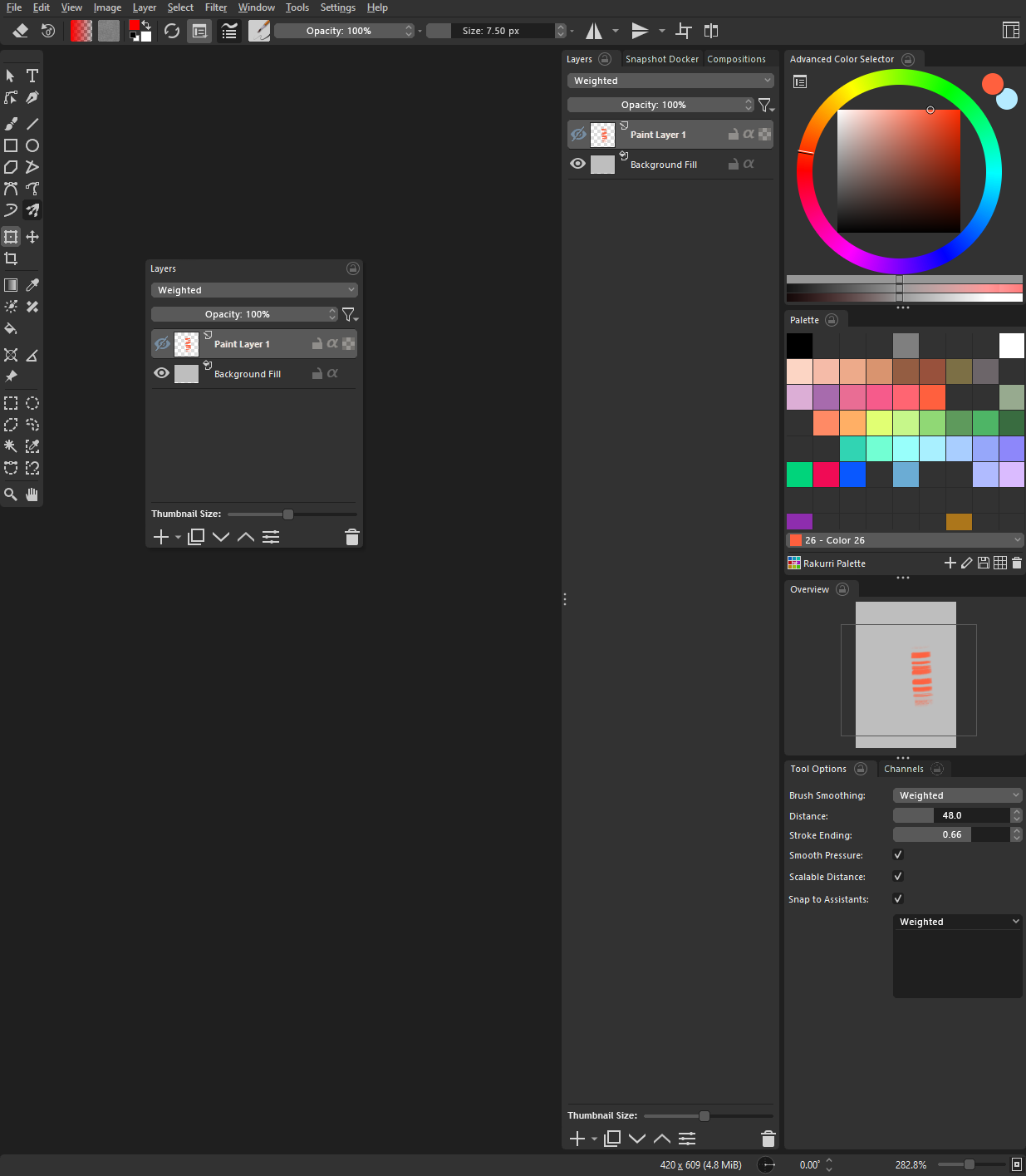
Since we are doing these image mockups I took the liberty of redesigning everything. It is almost pixel perfect… Yes I am serious about Krita and have a lot of time.
This is how I would do a flat style interface.
Nice changes. However I liked the color separation of the slider boxes vs. the dropdown and selected layer colors. After deactivating the UI Redesign addon and seeing the default Krita dropdown boxes again - I even like those and I might not even go completely flat with those. Buttons and dropdown boxes can be shaded compared to non-triggered input elements.
The Idea is not for it to be flat necessarily, more so for them to be consistent and slimmer.
Color can be there too. It’s just an idea. But I hope they are not kept super thick. and all differently looking.
Edit: Does this make it better?
or this with the shadow:
Not really better. Buttons and dropdown boxes need to be a bit more prominent. As I said, the actual ones look pretty good to me. No need to change anything that works.
If you start adding gradients you have to add them to everything, you can’t just do it to some buttons like in mainline Krita. Also there the highlights aren’t very good, they circle around the button, that’s not how light works.
Still like the original better. For me personally your corner bevels are too big as well. Makes them look a little too “cute”. There’s a thin edge between cute and elegant. I think being on the classy/elegant side will fit Krita better. I would also make the dropdown boxes higher. Text need room to breathe as well. And also some languages have stranger dimensions than English.
But besides all that. If there aren’t any developers having time for such a thing, this is not making too much sense at the moment anyway. So I suggest to wait until UI improvements become a task. For now, I’m sure there’s plenty other stuff to spent time on.