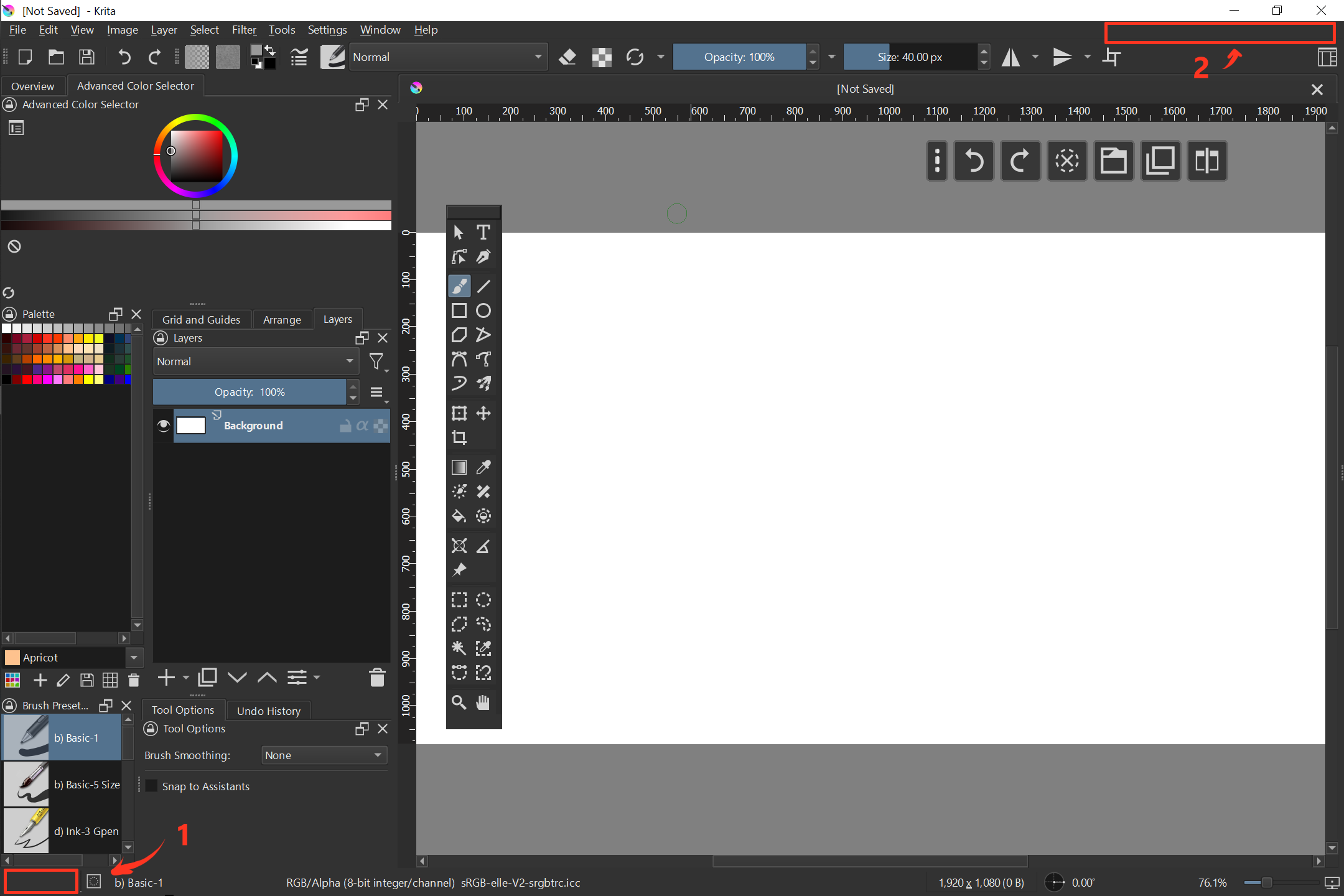
It is often users are posting screenshot of their software with a problem. It could make things (and communication) simpler if UI of the application would also show the version somewhere in a visible place.
I think bottom part fits nicely. There is a lot of space.
Not bad!
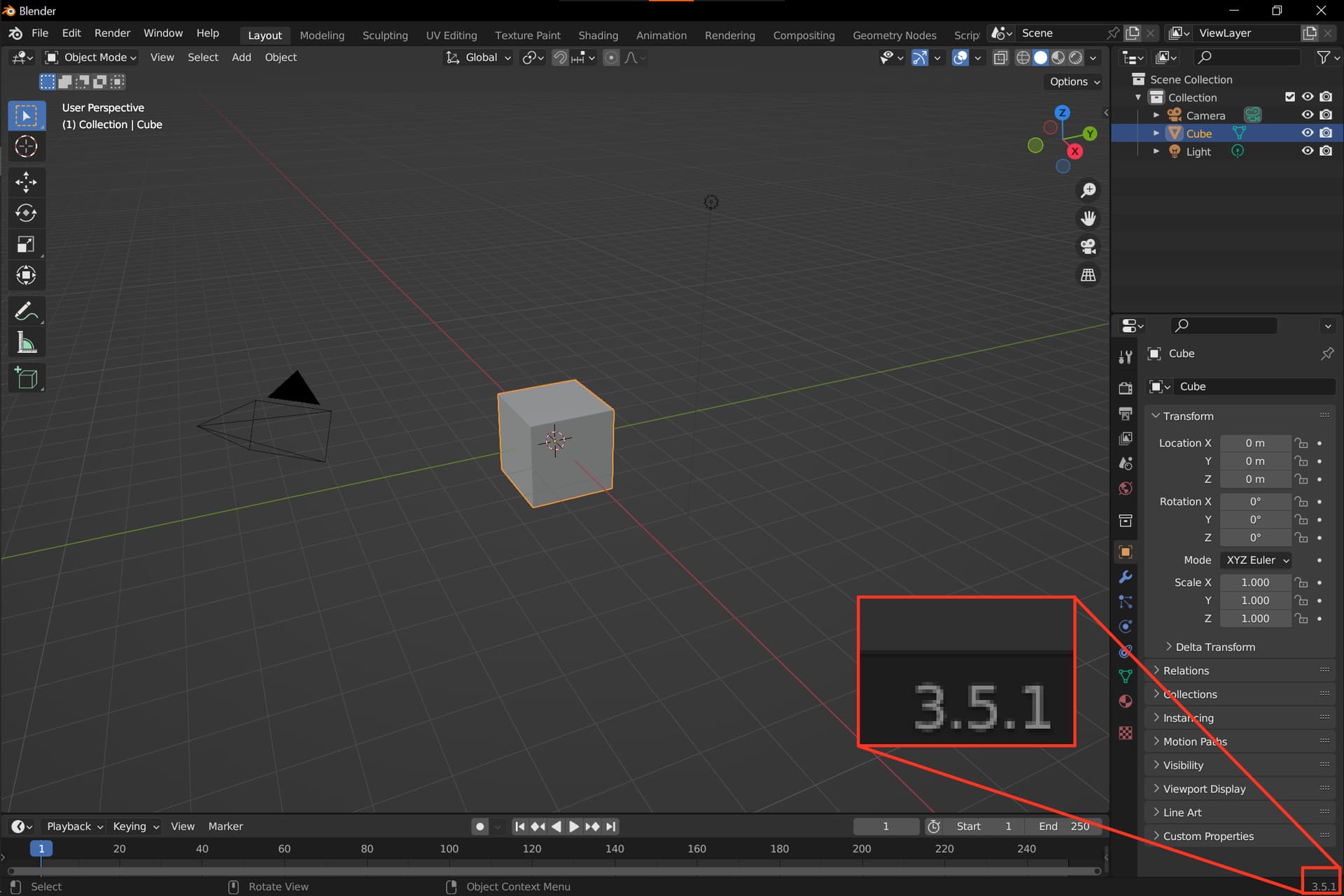
Many put this in the title bar of their software, and I believe that this place is more common than the place blender uses. But anyway, every place where a screenshot of the full Krita-Window would show this is okay for me.
In principle, it can be anywhere, the main thing is that it would always be visible, the idea with the title bar came to me because of many programs that show their version number there.
The status bar as it is now is kinda already full. Certain widgets of the status bar require more space than you would expect to not get squished, especially when your Krita window is set to half the width of the screen or something like that (though the widget widths might have been optimized since I last looked into it). Certain widgets like the Recorder icon and the operation progress bar are hidden until they’re relevant, but they’re still allocated a certain amount of space despite not being shown.
This is a bit ‘off the wall’ but how about a dummy menu item after ‘Help’ that says ‘V x.y.z’ (whatever x.y.z is) If someone wonders what it is and presses it, the text inside says 'Running Version x.y.z).
The idea is to have the version on screen all the time.
It should be such that user should not have to do any addiotional action. If the user has to click anything he can either print system information or open “about krita” windowm
It is just i noticed that people often post a screensgot with question and the first reply is often clarification of Krita version.
So the idea is to diplay the version somewhere where anyone can notice it when the user posts the screenshot.
It is also cery helpful when the versions of software change a lot. Which you can definitely tell about Krita if you take into accoutn all the platforms and nightly builds into account.
As for the placement, there are two candidates that I can suggest. However, that has to be clarified with someone familiar with the UI’s specifics. There is a third option: just to do the same as for Blender. That would mean that some of the items should be moved though. I am not sure if that is appropriate. I would go for the top right corner. In the case of a very small display where the menu takes all the space, the version can be hidden.
For the suggestion by @AkiR, I’d suggest not moving Help-> About but adding a menu item that provides the information as described.
If the user clicks it to open that menu item then it can have only one line that says “Version x.y.z”. It’s not intended to be clicked but it probably needs to have something there if it’s made as a menu item.
I would be against putting it on the edge of the statusbar, which IMO should be reserved for actually practical information or functionality like the current brush name. It wouldn’t be useful for the majority of users.
Menu bar would sound fine enough, assuming it would be possible to hack and assuming the version number would precede the subwindow management buttons.
In regards to whether showing the version number at all times would be a significant help in troubleshooting: I generally don’t really have trouble telling when a user is on an outdated version of Krita or not. It usually becomes apparent soon enough from what they describe or post.
A potential workaround solution would be investigating if there are some ways to better nudge users towards the latest versions of Krita. For example, it might not be apparent enough to a new user that they can automatically receive alerts about new updates, as the relevant checkbox is nested in a menu button on the welcome screen and is disabled by default. I came across a user today that wasn’t aware of this option, and it would probably be users like these that would need troubleshooting help.