Sorry for resurrecting this post but I just got one idea. How about indicating opacity level with a slight change in layer background:
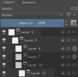
Usually when we search for this “1% opacity” layer we don’t really know the exact value. This way you can just look at all your layers at once, and instantaneously tell that layer 2 has about 50% opacity, 7 and 10 are at low opacity (15% I guess) and 13 about 60-70. I guess this feels a bit more cramped than current one (which don’t convey this information at all), but I think that it is muss less cramped than text “Opacity:100%” on each layer, while being faster to read. We just need to ensure the contrast isn’t too big (not to be distracting, and both to be clearly darker than selected and colored layers) and decide, whether hidden layer should automatically get this darker color. Current layer don’t really need that, as you have the current value on the top of the docker.
How about that? 