My English is poor, this is Google Translate.
This reply has been modified.
I improved it according to your ideas, how does this look?
The difference is that light colors indicate transparency, and dark colors indicate opacity.
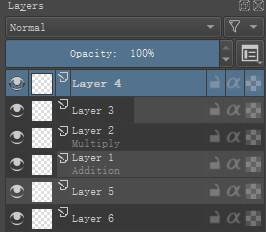
Layer 4, the selected layer can get relevant information from the top of docker.
Layer 3, “Opacity” is about 50%, “Layer Blending Mode” is “Normal”.
Layer 2, “Opacity” is 100%, “Layer Blending Mode” is “Multiply”.
Layer 1, “Opacity” is about 20%, “Layer Blending Mode” is “Additive”.
Layer 5, “Opacity” is 0%, “Layer Blending Mode” is “Normal”.
Layer 6, “Opacity” is 100%, “Layer Blending Mode” is “Normal”.