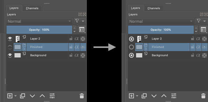
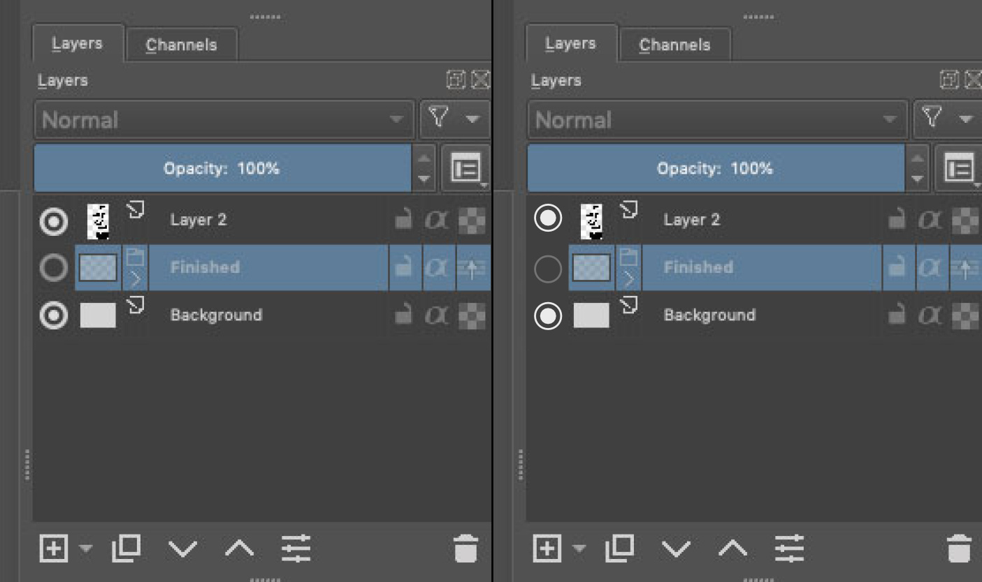
I like the clean flat design language used for the Move/Duplicate layer icons and I thought it might be nice if the layer visibility icons were more consistent with that style. Attached is a pass at how that might look.
I Aprove this!
Looks like a radio button now, though.
I agree
It’s not an eye anymore and we loose the signification of icon…
Grum999
For me the original ones are easier to differentiate.
Is it possible for me to update this icon locally for my personal copy? I was going through the Resources folder and couldn’t find where the Layer docker icons are located.
you know a radial button is a boolean Yes/No right?
and that radial is for the layer there.
it just makes sense!
Not to mention you have to distort it heavily to make it look like a no side eye.
And as it is … it looks so graphical and easy to read in any resolution unlike the original one.
you have ALOT more readability on what is suggested and that is not even “arguable”.
I know a Checkbox is Yes/No or On/Off or True/False or any binary value.
But for me, a radio button is an exclusive checkbox: by definition, only one radio button can be switched “On”, so for me, I’m not sure to understand an interface where all radio button can be set to On or Off without changing state of other radio button…
And an eye icon is immediately understandable in the functionality: visible/not visible, that’s used in many software and website.
It’s like the lock icon: locked/unlocked, you understand immediately the function, but if you start to just put radio button and/or checkbox everywhere you can have a True/False state, the interface will be hard to understand
After, it’s just my user point of view and I’m more a developer than a designer, so maybe I’m wrong…
Grum999
I think the biggest problem with this suggestion is the inconsistency with other icons.
I personally do not dislike the simple approach, I think the icon looks nice, but I think it looks too thick compared to the other elements, almost like it is from another program. Maybe a thinner frame or some similar tweak will make it feel more at home? Like this:
Though, I think an eye is much more understandable for new users. I remember people having a bit of a problem wrapping their head around Substance Painter’s hide/unhide icons, as they were the same, a circle with a dot. In the end Substance changed to an eye. Even though I personally was not a fan of the new Adobe-like eye, it did make it easier for new users to understand the software.
I think a better approach might be to make the eye icon more modern, instead of confusing new users.
Check boxes have 3 inputs actually, not 2 @Grum999.
it like None, Yes or No or something like that.
Radials are the only Yes/No you have available, unless you make a slider with only 2 stops. there is the switch button but I think that is not free to use so it does not exist in Krita that I am aware of.
Not to mention radial buttons have the option to not exclude the others in the same group as it in. I am sure even a “new user” is not dumb enough to not understand it.
I am an 3D animator/rigger but I passed through design school while I was there all 3 years of it. I think I can say I have some lights on the topic, I am not the best by any means but I know fundamentals.
Even if you guys want a Eye you guys should want another Eye! because that icon is horrid in every sense you can imagine to be compared too seriously. as an Icon it is not iconic nor does it allows readability what so ever.
I think you guys should think more about function instead of what it makes you remember outside. Because if you go that route I have counter arguments then.
- So a lock is easy to understand, but can you understand what it locks? the layer? then how does the Yes/No on the layer is any different.
- An alpha character… I am sure a new user knows that to begin with. probably something about text or something.
- A Checker board?.. do they even know what transparency even is to say that is understandable?
My point is the button is still more understandable to new users than all the rest on your logic. On my point of view a eye or a radial button is the same for me. if it looks better it looks better and it does in spades.
Even though you, I and a lot of people understand that a circle with a dot is visibility, that does not mean everyone will find it intuitive. Remember that a lot of old people, very young people or people that have little experience with tech, is using Krita, many of those will not understand a circle and a dot. They will learn it of course, but some might not even think to test the icon and learn it, if they don’t know what it is.
Let’s not make this a “x amounts of years in design school”-thing, I have been 5, but it’s not at all important, and does not make our points more valid than anyone else’s! Everyone’s opinion should be considered equal!
I do agree with you that the current visibility icon looks a bit dated! For instance Blender has a very clean and nice one we could take inspiration from.
I think a middle-thing would be best. Something that is simple and modern, but resembles an eye, like the one in Blender. Or just a rework of the existing one
@Rakurri - I do like the way the blender one does it with the one you are showing. It is a bit simpler of a design. I would much prefer something like this than showing radio buttons or checkboxes to change the visibility.
They are most probably embedded into Krita executable, during compilation. So you can only change it if you compile Krita yourself.
How about a filled ellipse (with pointed ends) that has a fine horizontal line across it for a closed eye (maybe grey it out a bit) and a non-filled ellipse for an open eye?
Or some aspect of an eye and closed/open eyelid idea.
I would agree with an eye icon being best for visibility; that’s what I usually think of when I see it anyway.
I’m sorry, but you’re wrong in that regard. Please read QRadioButton definition here, for example: QRadioButton Class | Qt Widgets 5.15.16
A QRadioButton is an option button that can be switched on (checked) or off (unchecked). Radio buttons typically present the user with a “one of many” choice. In a group of radio buttons, only one radio button at a time can be checked; if the user selects another button, the previously selected button is switched off.
For reference, WPF’s control behaves roughly the same way: RadioButton Class (System.Windows.Controls) | Microsoft Learn
And in my experience programs usually use those controls in that exact way, too. You can always say that we can make the radio buttons ignore the constraints the usual convention puts on them (the user cannot un-check it, they are mutually exclusive if under the same context) but it would be much easier and more natural to do it with a checkbox, ignoring the None option, which we often do in Krita and probably in most applications most usages of checkboxes do not use this third option.
So, I think, relating to radio buttons is a con, not a point in favour of those circles.
I could agree on making the change to the eye though, if someone makes it look better. However I don’t think the circles are better in this regards. Also note that the same icon is used in other places (like assistants), so we need to think whether it would work for all the cases?
I would agree to something like Krita icon changed to Blender icon, but I wouldn’t like to change it a checkbox, circular or not (although circular would be slightly better. But I wouldn’t like it either, I think).
Btw. from what we talked on IRC it seems like @halla entertains an idea to give Krita some icons/theme refresh for Krita 5.0. But note that any radical changes must have a good explanation: what is the problem; and why the new behaviour, new icon etc. is better. (And even then, it’s just a start for the discussion).
I do like that too alot better. And I would defend that one just as much. I am just not advocating to be a clone of blender.
I just think the closed version is hard to read if you dont see it active beforehand.
Still far better than the one currently.
That is saying exactly what I said I don’t get it. I have passed though that before.
“Radio buttons are autoExclusive by default.”
you can change that behavior. I have done it before it goes in line with everything I said, I am not giving miss information.
if you don’t like a radial button make a button or something it does the same thing in the end, you just do it in another way.
But I think the issue was it “looked” like one not that it should be a radial widget.
From my experience styling radial buttons is very hard and really bad at scaling.
I kinda think the “new users” thing feels like an argument that is used way too often and for the wrong reasons.
if you never used a software like this in your life I am almost sure any changes for them would not even be noticeable because they will never see another way to begin with.
if they are interested in it they will learn it regardless of its state or versions it has gone through, if not they won’t.
I am sure looking ugly turns down more people that are “new users” than it not being understandable the first time you see it. Emotions matter alot more than anything else.
Not to mention people that have been using it will have the the same fresh feel too if the UI look becomes more pretty too.
Blender comparison:
like I know right click select is better but I changed with the program and blender 2.8 is the best. And i had to literally re-learn everything to use it, and I don’t see anything slowing down only praise, it is only drawing more users in. I did the same thing on 2.5 and I was super happy that 2.49 changed. Btw I hated blender in 2.49 for the looks and then for its functionality and I love 2.8 more than any other 3d program in both looks and functionality. but change is something that happens naturally over time. It makes outdated tutorials but it allows new ones to pop up.
Autodesk comparison:
Maya however seems to have the opposite problem. they don’t change because people do not like that and you can see it in their UI. overly populated and no where to place things as they added alot of new stuff. not to mention it looks and feel old and clunky.
3Ds max might be a even better comparison, some options feel like a separate program inside their program because they don’t have any more space.
This to say, one is a little circle with a dot, and the other is a little circle with a dot but a tiny bit fatter… It’s actually so similar it is the same, not to mention they inhabit the same spot. Even a lightbulb would do the same job there.
My suggestion to solve Tutorial Version issues:
make a Krita UI display the version somewhere so all tuts would be coded.
small and easy change with long term profit as time goes on.
Finding where things “went” should not take too long there after.

well that’s my 2 cents.
+1 on the Blender eye icon or a minor adaptation of it.
Thank you everyone for the input. I think I will keep an eye shape for this icon, but in a style close to the blender one.