I asked him for the full stop and he realized that he read it wrong. he wants me to sent his apologies. as for the fount, here is a sample of what he writes, he types it out on microsoft word and copy paste them to krita as he is not used to typing but not seeing the final product until clicking save “ご主人様、お疲れ様です。甘いものでもいかがですかて?それとも…鹿島を召し上がりますか? うふふ” not sure if sending the text here will do anything tho. as for the font, he too is surprised for the news that it has a commercial lincense because it is already in his copy of krita,
1 Like
gists I don’t think let you upload binary files, but I created a repo for it and it works there:
Okay, I’ll take a look. now to be clear, the 。should be on the top right? It already seems to be on top right even when in horizontal… or did he type it vertically in word?
1 Like
If its normal horizontal then its at the bottom, if its vertical right to left the full stop circle is on the top right. I asked him about word and he seem to jump from verticle to horizontal. (verticle for manga and horizontal for assignments.) Also on a note of the font, He too is surprised to hear that it is license as it is already appart of both his copy of word and krita.
1 Like
Okay, I see the issue with “。”, I was looking at a different one while this one is 0x3002. And it just changes glyphs for vertical instead of using a dedicated one. So I need to add that logic to my conversion script.
As for why that font shows up on his computer, that is simple. MS owns/licenses fonts and includes them in Windows. And you can use those fonts for personal use. But it gets tricky if you plan to distribute some of those fonts, especially if its for commercial use.
1 Like
I think the vertical writing font you created works fine.
Including punctuation.
I will write a supplement later.
2 Likes
Ok thanks, I will now go and guide my friend to install this font. as for the Mincho, I will notify him of the stiuation and hopefull find him a suitable replacement. I will lwt you know if there is any problems
1 Like
Ok so he just instal it and I think we are doing something wrong, The font is there but its not going verticle, are we missing a step here?
1 Like
Nice! I wonder why he got a different outcome… is it like one of those Microsoft smart quotes where it replaces normal chars with more exotic ones to make them standout… hmmm…
There is Koichi Mincho, but I would suggest finding a few just in case. While Koichi Micho is public domain, so I can technically do it. One with a more definite license is the most safe as not all places acknowledge public domain.
Are you using the python script hooked up to Ten Scripts? The default text tool won’t work.
1 Like
Are you using the python script hooked up to Ten Scripts? The default text tool won’t work.[quote=“KnowZero, post:30, topic:27124, full:true”]
Nice! I wonder why he got a different outcome… is it like one of those Microsoft smart quotes where it replaces normal chars with more exotic ones to make them standout… hmmm…
There is Koichi Mincho, but I would suggest finding a few just in case. While Koichi Micho is public domain, so I can technically do it. One with a more definite license is the most safe as not all places acknowledge public domain.
Are you using the python script hooked up to Ten Scripts? The default text tool won’t work.
[/quote]
Python? first time hearing, Would you mind guiding our uneducated minds?
1 Like
Copy the Python code I wrote above into notepad (not ms word, notepad). And save it as a file with a py extension. Like say krita-vertical-text.py , then in krita go to Scripts->Ten Scripts. Select the first script, and hit the 3 dots. Search for the file you just saved and it will be added to Ten Scripts.
You can then use ctrl+shift+1 to launch the script. But you can configure it to another shortcut of your choice via krita’s configuration settings.
Make sure you are in the Select Shapes tool when used.
1 Like
Ok I am trying to get the note file into krita so I can relay this to him but Its not appearing, the file I name it as krita-vertical-text.py and the note itself I named it Hello.py. and have a dupicate named krita-vertical-text.py . what am I doing wrong.
1 Like
Make sure it isn’t ending up as a .txt, so select all files when you save.
Windows hides the extensions of known types (which you can disable) so sometimes it ends up as a .txt
1 Like
Thats explains a lot, But how do I save it as py? the only option there is is txt and all files
1 Like
pick all files and save it as .py, or disable hiding known file types in file manager and rename it.
1 Like
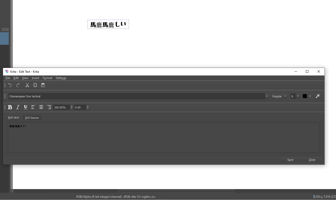
I’m sorry for the misunderstanding.
I simply thought that you had created a font that supports vertical writing, so I tried it with software that can write vertically. There was no problem there, so I pasted the image.
When I tried your font in Krita with the above script, I have the problem shown in the image below. There may be something else, but I’ll think about it once I have lunch.

(Some corrections have been made to this image.)
1 Like
I think I’m beginning to understand why vertical writing support in Japanese has not progressed… 
3 Likes
What I did was overwrite the non-vertical glyphs with vertical ones and added their data.
The space between glyphs is simply what I set them up for, that can be changed via the tool, so I am not too worried about that, but I can change the default to be better I guess.
I think I know what the problem with the font is and why some of them aren’t being rotated while some are. Can you give me the raw text, not a picture so I can use them as a test? Can’t copy and paste from pictures (unless it I ocr but that defeats the purpose cause there can be many similar glyphs with different unicode)
1 Like
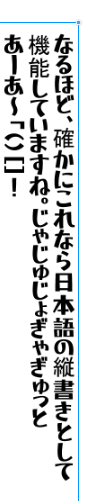
I think you can test raw Japanese text with this.
あっとまーく、はんにゃしんぎょう。
ケース・バイ・ケ~ス(多分)です
それは「恐らく」正しいフォント?
123=ABC@♡!
奇妙奇天烈摩訶不思議魑魅魍魎

■半角数字12で!!!?

"、"  Comma
"。"  Periods
"ー"  symbol to extend the preceding sound
"~"  symbol to extend the previous sound.
"「" "」"   Parentheses 1
"(" ")"   Parentheses 2
"1234567890"  Full-width number
"1234567890"  Half-width num
"やゃゆゅよょあぁいぃうぅえぇおぇつっ"  Large and small characters

Postscript
"ヤャユュヨョアァイィウゥエェオォツッ"  Large and small characters
"…" 3 dots This is also rotated 90 degrees and placed on the center line in vertical writing
The correct output will look like the image. However, depending on the design of the font, there will be differences in the gaps between the characters.Parentheses tend to omit the spacing between characters.
Also, if there are kanji that are not supported by the font you are using, they will be replaced by other fonts. The replaced font will have a different design from the rest of the characters.
“Second grade” probably refers to the second grade of elementary school, the amount of kanji that are taught by the age of eight. This is a bit inadequate.
Fonts that say you can use “Joyo-Kanji(常用漢字)(Kanji for common use)” are for the amount of kanji that are taught by the age of 15, so you should be able to handle a lot of texts. Still, there are some that are impossible…
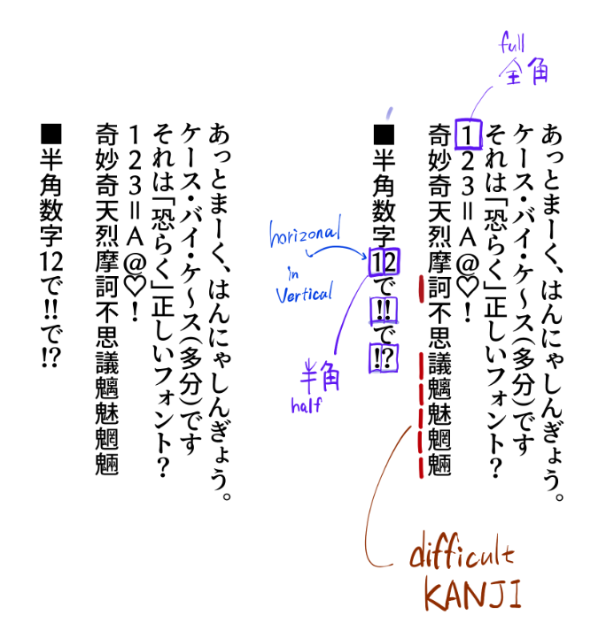
By the way, I used Clip Studio for the test, and as you would expect from a Japanese software, the detailed specifications are included in the vertical writing function. Let me explain as a supplement.
Arabic numerals are commonly used in Japan. Arabic numerals up to two digits are generally written horizontally within vertical writing.
Exclamation marks and question marks are also often written horizontally if they are two consecutive digits.
When inserting horizontal writing within vertical writing, use “half-width” characters.
In Japanese typing, there are two types of characters: half-width and full-width.
In Japanese typing, there are “half-width(半角)” and “full-width(全角)” glyphs. “Half-width” glyphs are the narrower widths that computers and English speakers usually use. The English text used in this forum is half-width from the perspective of Japanese typing.
“Full-width” glyphs are used for writing Japanese characters, and are almost twice as wide as “half-width”.
When you are writing vertically, you can switch from full-width to half-width glyphs only when you want to enter two-digit numbers or exclamation marks.
This is a function of the software that inputs the font, rather than the information contained in the font. Since Clip Studio is a software that excels in manga production, it is very clever in the details. Many other Japanese software do not have this feature, so it would be very useful if it were available.
2 Likes
Thanks! Though can you wrap it as code? Cause I see things like a heart emoji lol, I am guessing the forum replaced it.
For the spacing stuff, I think the issue is simply me treating them as english characters, and I am guessing japanese characters don’t have ascent?
For the horizontal stuff, I’ll worry about that once I get all the other stuff. Maybe prioritize half-width for anything that has it that is not vertical?
Fonts have their own rules in them for when they are with other glyphs, so it isn’t impossible to add those. But one thing at a time.
I can choose a different font if there is any suggestions, I just chose that one cause it was OFL and advertised itself as a manga font. Since I am doing conversions with scripts, not manually. As long as someone gives me a font to use, I can switch to it any time.
Though for the time being, I gotta go sleep :(, when I come back from work, I’ll upload an updated version of the font that should fix the vertical stuff at least.
1 Like
That’s sure, looking how rules are “complex”, only someone with good knowledge of Japanese vertical writing can implement or help to implement this ![]()
I remembered the long voyel mark “ー” to be vertical, but for other (especially small characters) I wasn’t aware of alignment, for me it was just smaller characters ![]()
Grum999
1 Like