Hello everybody! I did this animation experiment in Krita in June/2021. My program is in Brazilian Portuguese… but I don’t think it will (much) harm the understanding. Here it is:
The animation process is usually labor intensive and requires a lot of drawings. By default, for one second movement on the screen, 24 drawings are needed! Of course, certain movements are possible to animate with 12 drawings, even less depending on what it is… still, it’s not an easy task.
That’s why the concept of limited animation was born. In this type of animation, the character does not move all the time on the screen, sometimes only part of it moves (like the head and arms). Certain moves are repeated several times, from one episode to another…or even in the same episode. Limited animation, as far as I know, was introduced by Hanna Barbera. To know what it’s like, just watch any episode of “The Flintstones”, “The Jetsons” or other animation produced by the studio.
One of the advantages of this style of animation is that it makes it cheaper: the fewer drawings, the lower the costs and time spent to make them. Other studios soon began to do the same.
In animes this technique is also used, usually in smaller and short scenes, with a few seconds in duration. The Doki Doki Drawing channel brings an interesting limited animation tutorial of a small scene, in which a character walks along a corridor.
I practiced this experience in Krita, with an old character of mine:

I managed to reasonably animate the arms, something that the tutorial didn’t cover (it seemed strange to me that the character walks with his arms still). I could have gone further, added more details, but I preferred not to overcomplicate the experience. Although I only took screenshots of a small part of the process I will post them here as they may be useful to those who decide to try the experiment.
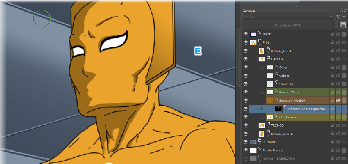
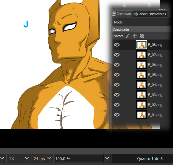
Below we have the character with the outlines already finished, as well as the basic scenario. The dark blue borders (A) are margins, I leave them to give myself space to work safely. In the final step, the image will be cut to a white area, whose natural size is 640 x 480 pixels. Organizing and separating everything into layers and groups is essential! In the group called F_01 (1) are all the parts of the character. Here you decide which layer goes up, which goes down: the character’s arm is closest to the camera, the “East_Arm” (2) is on top, above the Torso layer. We also have a separate group for Scenario (3).

This arrangement of layers and groups is not rigid, and can be changed later… however, doing the organization, right at the beginning of the work, will make the task easier. To make this separation of character parts more evident, I’ve hidden some layers. The arms are each in its layer (B), as well as the head and torso (C).

With everything traced, I moved on to colorization (D). Usually this is left for the end, when all the animation has been traced and done, but this animation allowed me to colorize. I created a sub-group for the head (1) and a sub-group for the torso (2), which goes below. I reduced the opacity of the head just to demonstrate the organization of the elements:

Completed the main colorization (E), I apply the shading. For this, it is necessary to decide and keep in mind which direction the light comes from in the scene. I considered the light as coming from the wall next to the camera, it would make everything simpler, eliminating the need to draw lamps on the ceiling…
I like to colorize the contours, because it makes them lighter. Here I colored the outline of the arm (F) with a darker brown tone than the shading tone. Compare with the other outlines, still in black:

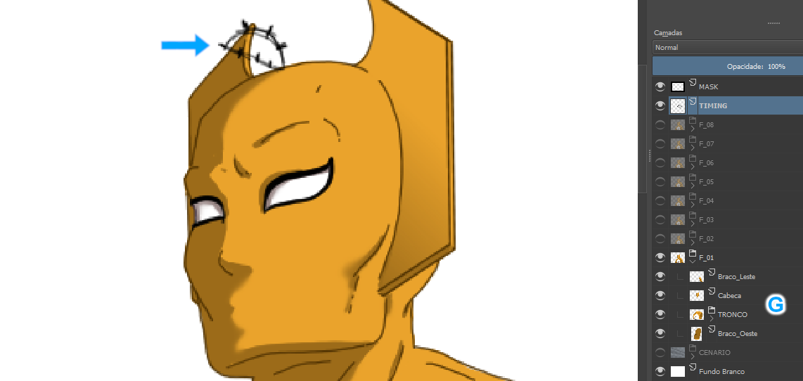
This other screenshot was taken much later. The lines drawn at the top of the character’s head (blue arrow) are called the “Timing Chart”. They served as a basis for positioning the character in each frame. At this stage, out of necessity, some of the layers were merged, such as the arms and head layers (G), in order to prevent the file from ending up too heavy.
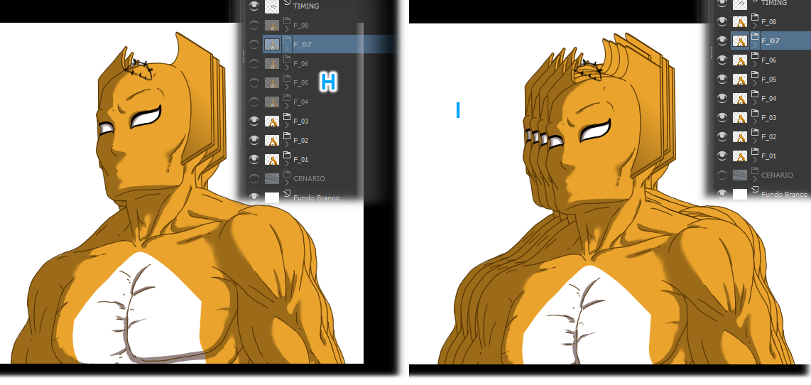
The following images show the frames. In image H we have visible frames 1 to 3 and in image I all frames. We have eight frames, the basics. At this point I still hadn’t animated the character’s arms…
I exported the eight frames as png images and closed Krita. In Gimp, I went to File > Open as Layers and imported the images. Then I went to Filters > Animation > Play… and ran the animation (J). This serves me as a first test, showing what needs to be corrected or improved.
Below right is an animated gif of this first test.

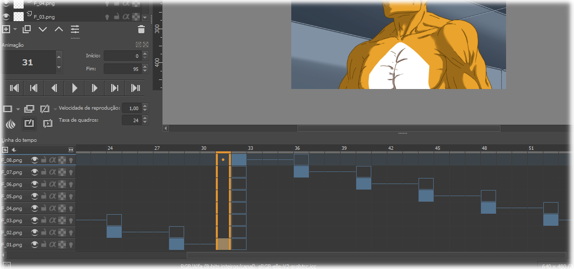
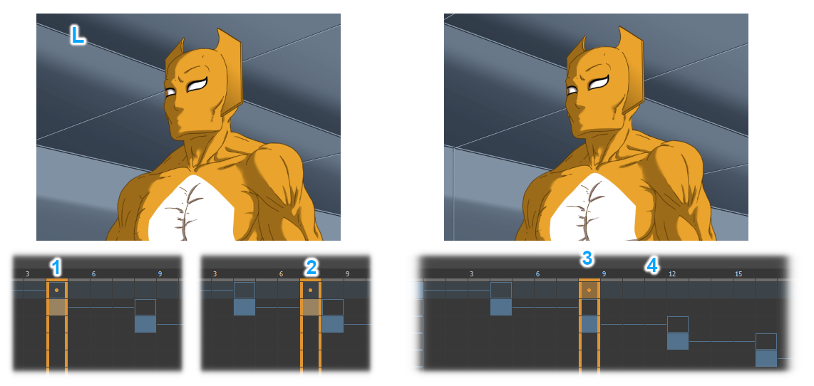
Then I went back to Krita to work out some details. In the character, I added the animation of the arms and corrected small errors. I redrawn the corridor lines as the old lines were in a difficult position to animate. I exported the eight frames as png images, the definitive ones. I opened a new file in Krita and changed the Workspace to Animation mode and imported the png files. From there, it was only necessary to arrange the layers (K) in the correct order and establish the exposure time of the frames, in the timeline (1):

Exposure time means how long each image will remain on the screen before being switched to the next one. In the case of this animation, the exposure time is four frames per image. As an example we have the second image (L), in the timeline it starts to be displayed in frame 4 (1): frames 5 to 7 are just repetitions of this image (2). The image is switched at frame 8 (3), which in turn will remain until frame 11 (4)… and so on, until the cycle is complete.
Arranging the animation in this way gave a total of 31 frames: that’s just over a second of screen display. To increase the time I copied these frames and pasted them a few times: with that the final animation was 95 frames, that is, practically four seconds long.