Lucy Cyberpunk Egderunner Fanart - P.2025058

So I’ve been practicing how to paint/shade/render, whatever the term is, without having to look at a shading reference, like a photo of someone and how the lighting work in that reference image. The result was never to my satisfaction, it always feels different than what I see from the artists that I look up to artworks. I saw they did drawings whenever, without much preparation, and I know the difference in experience is immense, and I tried my best to set my goal not too high. But I always feel that I miss something big, something that make the result not even close to what I envisioned.

I hope everyone can share their opinion on this, but what I think the mistakes that I did was focusing too much on having a clean render rather than focusing on a good value distribution and good color choices. I spent hours just to render and in the end everything looks flat compared to those artists’ works. This cause me immense stress, just like doing lineart cause me immense stress because I know after the last line were drawn, my eyes gonna pick up proportion mistakes immediately. Like my brain playing prank on me, it wait until the last second to tell me, “hey actually the proportion is all messed up”.

I think from now on, I am gonna focus on finding the right value distribution for each type of lighting schemes. I still truly believe it is not just about the amount of practice, but how the practice is device and commence. The intention/quality of the practice is just as important as the quantity of the practice. I don’t have a teacher that can tell me what I did wrong or right, or any in between, so I have to make amends that I will learn much slower than others who have one.

Sorry my English is not so good, just trying to share my thoughts, probably want to do that more than sharing this Lucy fanart.
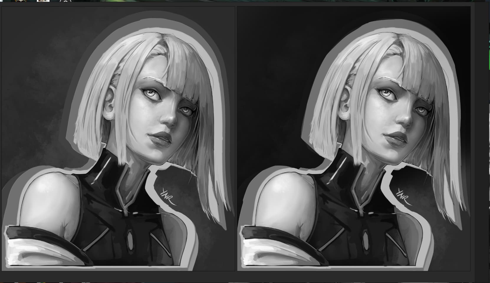
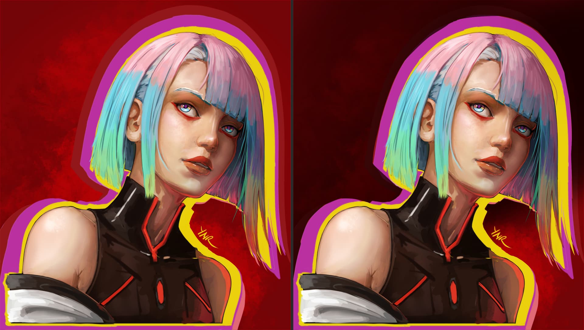
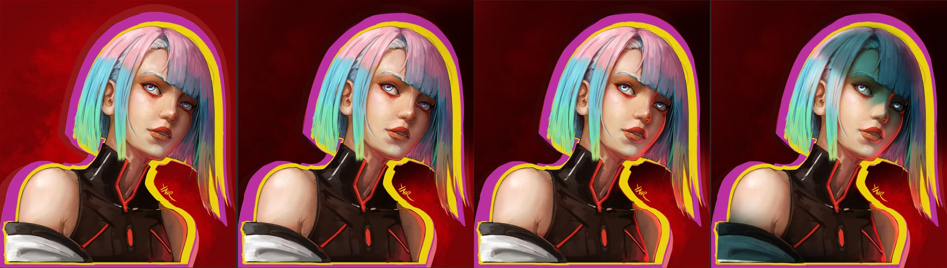
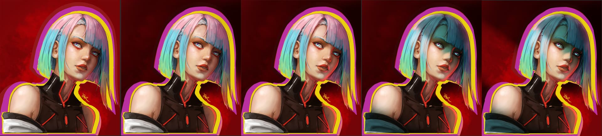
WIPs for Lucy

66 Likes

Fantastic work, thank you for showing it!
:person_bowing:
Michelist

1 Like

stunning work. I love the eyes - I’m drawn toward her and of course the features of the face look beautiful.

1 Like

The contrasting and saturated colors absolutely sell it as a cyberpunk piece. Looks excellent! And the blending on the hair is just perfect :blush:

1 Like

@michelist, thank you very much :blush:

@blackhound, Thank you :grinning_face_with_smiling_eyes:, I wasn’t sure that I can translate the manga design into my style, but it turns out better that I thought it would be.

@YRH Thank you, I am still learning how to create effects, most of the things I draw is drawn in simple way. Sometimes I wish I knew some of editing techniques that are used to make posters by graphic designers. Not sure I can add more stuff to my list of things to learn, it’s already overwhelming.

2 Likes

yes @ynr_nohara you are correct. values play a very important role in a composition… it has a very huge impact on a painting. you could try practicing by just blocking out your composition with just two value - dark values to designate where the local color/shadow areas are, and light values where the light hits the object.

great job on the painting.

1 Like

Whatt!! This is beautiful!

1 Like

@edgarej Thank you very much for the advice, I’ll definitely look into 2 tones shading practice. Sometimes I see examples of reading/redraw practice with very limited value level on site like pinterest but I don’t understand the why and the how, so I just skip it. I’ll definitely look more into that. Thank you also for the compliment :blush:

@BQwerty Thank you! :smiley:

2 Likes

@ynr_nohara You’re doing great, you’re not standing still. You’re always trying something new. This time it’s a great idea with a neon outline. :fire:

ты молодец, не стоишь на месте. Постоянно пробуешь что то новенькое., в этот раз потрясная идея с неоновой обводкой.

1 Like

eyy I think it looks great in general. I know that sometimes it doesn’t feel like it. But from my point of view you are making steady progress (This one is my favorite of yours so far. And I really think things are starting to click for you! This is really solid!). Maybe in 6 months or a year time, you can come back and revisit your Painting and you will probably identify what has been missing from the vision you originally had. And the thing with process is that everyone has their own. So don’t feel too burdened with that, there are pros with many years of experience that really plan thoroughly any or their paintings and there are also artist that just go with their guts with no plan at all and both get great results. Whatever works for you is the way!!

I think that the values of the character specially work great. You know if you set your values properly you can go really crazy with the colors and use any color you want and the piece will hold, and this drawing is a really good example of that. You used most of the color wheel and it looks great.
Although I don’t know the artists you look up to. Here are some of the things I have into account when it comes to values. (I hope you don’t mind the overpaint)
Values are a great way to add contrast in you case Lucy has a really great range of values from Darks to lights you use the whole spectrum (from 0 to 10) I think the brightest value you use is like a 1 on the highlights on the skin and like a 9.7 the darkest spot on her clothes, so she has a lot of contrast, which is great (if that is what you are looking for). But the red background you chose it is like a 6-7 in the grayscale, so It is near the middle of the scale of values you use. And it is really similar with the average of values that Lucy has. So you could make it a little darker specially near where the Neon violet is more prominent which has similar values to the red. And Automatically Lucy pop ups more and doesn’t change the vibe too much.


I also noticed that you added a secondary red light on the left side of the face, so I thought that it would be a good idea to make that light a little stronger to make the values of the face the are in shadow have more contrast (those shadows are a really good place to add a secondary light source or a bounce light like you did by the way) also added that light to the nose. I also made the ambient occlusion little stronger here and there. Specially the shadow produced by the right side of her hair. it adds a lot of volume.

Finally, you mention that you feel like it feels flat compared to the artist that you look up to. Although I don’t have the reference and this approach is obviously not what you were going for you can always make the lighting more dramatic! (This is just an example!! for me the lighting you used is great the way it is!)


Finally I am not good at painting in greyscale but I am always checking my values, in Krita there is a neat trick. You can set your soft proofing to greyscale. The thing is that you can keep painting with your colors normally even pick colors from the Canvas and they will not get affected by B&W. And with the default shortcut which is (ctrl + y) you can check your values easily.

I hope this helps you in some way or form. But this is a really great Artwork and believe me, you are really progressing. at least is evident in my eyes!! See ya!! :yellow_heart: :rabbit_face:

2 Likes

the simplest explanation to the two value approach;

if the blocks of black and white is instantly recognizable, i.e. i see a face, I see where the nose and eyes are, etc etc, then your composition is good.

but if the blocks of black and white is not instantly recognizable, i.e. is that a city or is that an elephant? then the composition has a foundational issue and needs to be reworked.

for me I typically skip the black and white and instead zoom out of my canvas really far and squint my eyes. if from afar my composition reads, then I know I’m on the right track. Sometimes the painting has a bad read… but I’m too lazy to correct it. The best example is my entry to this month’s krita-artists monthly challenge. if you squint your eye and look at my pic, my painting doesn’t read very well… oh well, I was in a hurry, lol

1 Like

@Dima Thank you, I tried to emulate one of the official poster of Cyberpunk 2077. My thought when I started drawing this, what would a good poster of Lucy like for the game. This is practice 058 of this year, and I went back to try finish this after I did practice 078. Took so long since I face so many stuff that I couldn’t solve on my own, had to find good reference for the lighting and color in the end. Thank you again, I’ll try to experiment even more in the future.


@BixclowArt thank you, this piece was made as practice 058 of this year, and It just face so many things because I decided to use less reference, but because of that I realized I know so little things in term of design. In the end I had to go back and search for reference for the lighting, and still felt it wasn’t good because I think the color on the refs wasn’t good. I forget what ref I used, probably a photo, since artworks usually have good color. But even though I can feel some things looks better than the others, I can’t explain why it looks good most of the time.

So I can’t really take full credit for the value distribution nor the choice of color. Even though I can feel in technical way I am improving, I think I am still mostly clueless on design. For example I can help some of my friends who are also artist about technical stuff, but I can’t really help about design other than pointing to existing artworks that I think looks good. How can I improve my design? I am not sure.

I remember years ago Proko from youtube said to make sure to use full range of value for the focal point, well maybe not the darkest. These value range also gradually moves up towards the lighthest based on distance of object from the viewer to simulate light athmosperic dispersion for further object. But I guess that’s more objective since it is real life phenomenon, so I can remember it easily. It’s hard for me to learn stuff that I can’t explain to myself. But thank you for making the multiple examples for comparison, maybe that’s what I need to do for stuff that I can’t explain to myself yet. I need to make comparison and choose which one I like the most.

There are 2 artist that I wish I can draw as good as. 1, Kuvshinov Ilya for the crisp artstyle, always love how the border between parts is well balanced to create something easy to read. I can’t do it because some of my mental limitation but I adore that kind of style. 2, Guweiz for the closer look to realistic and his dramatic lighting. Okay probably a 3rd one would be Rinotuna for his coloring, his has merry color, even for the spooky theme drawing still has merry coloring :blush:, I am easily stressed person so something that sparks happiness really help me .

Thank you again for the advice, I think I saw several post mentioned that soft proofing technique, I wasn’t sure what it does, but I’ll definitely look more into that.


@edgarej Thank you for elaborating on the 2 tone practice. I’ve heard about this, something need to be easily recognizable just by a glance. I think Marshall Vandruff explain in a podcast with Proko on youtube. But I guess I implement it wrong, since I zoom out and do mirror view to make sure the drawing is not wonky, haven’t thought to use it for designing the value. I need to practice on this, thank you again.

2 Likes

I think the term that you are searching is not design but composition. If you really want to learn design I would recommend Feng Zhu channel

Now for composition. And although composition is a really broad and abstract subject. I mean it is everything that makes an image look the way it looks. The best way I can recommend to practice is to get use to thumbnailing.

Here are some exercises.

  1. Just simple Composition Thumbnails. The advantages is that you can be really loose on the subject and do whatever it comes to mind, the idea is to create as many as fast as possible, you can even set a timer and do like 1 every 5 mins or something. It is a good practice
    https://www.artstation.com/artwork/DvBJ9

  2. You can be more focused if you don’t like to divagate too much and create the same scene with different compositions. A lot of Riot Artist use this technique in their videos (So a lot of planning goes into those illustrations). You can see that they create many variations of the same scene
    Dao Le shows it really good https://www.artstation.com/artwork/5v9KDw
    Bo chen Although they are not really that small and are not thumbnails in the strict sense of the word they serve the same purpose you can see that he defines really early different compositions before committing to 1 of them.
    https://www.youtube.com/watch?v=tPrVJRTWQUE
    https://www.artstation.com/artwork/D5Dy0R

  3. You can also do a practice that requires more abstraction with only 2 values. https://www.artstation.com/artwork/o2KE1w
    https://www.youtube.com/watch?v=ACJqXFyFVQw
    https://www.youtube.com/watch?v=zbjoXg_oyRI

If you really want to go deeper I would recommend this book. “Vision. Color and composition for film. by Hans P Bacher and Sanatan Suryavanshi” I have read some books about composition and this was the best one.

.

1 Like

You’ve got a great poster. Do what your soul asks, draw as you see it. Shishkin wrote that all the rules in art are only a recommendation shade in my palette of colors. You’re doing great, you have a desire to draw well and I can see how you strive for it, it’s worth a lot. You have a gift, be yourself and you will achieve a lot, believe me. :handshake:
У тебя получился шикарный постер. Делай то что душа просит, рисуй так как ты это видишь. Шишкин писал так, все правила в искусстве носят лишь рекомендательный оттенок в моей палитре красок. Ты молодец, у тебя есть желание хорошо рисовать и я вижу как ты к этому стремишься, это большого стоит. У тебя есть дар, будь собой и ты много добьешься, поверь мне.

1 Like

@BixclowArt Thank you very much for the advice, and the links. I tried to learn thumbnailing before, but just as some of the other type practice, I can’t understand the basics element of the “why” in it. A friend of mine tried to explain to me about composition, but I can’t tell the difference how one stuff is better than the others on most stuff. I can tell some of the difference when the example make it obvious, like making things extremely imbalance in objects placement in the canvas… you know I probably should read and watch more about this stuff before I talk. Sorry sometimes I can’t control what I say or know if I say some things or not. Also thank you again this really helps, I’ve seen some of these before, probably just need further explanation on some things that hard for me to grasp, but I’ll work on that somehow.


@dima thank you, I hope I can solve my study problems. There are many kind people here willing to help, gives me hope.

2 Likes

this is GODLYYYY

1 Like

Congratulations! Your artwork has been inducted into the featured artwork gallery row.

May I have your permission to post this artwork on Krita’s social accounts (Mastodon.art, reddit, X) and on Krita.org? If yes, I will credit your K-A user name (or a different name that you specify). If no, no problem.

Please write a few sentences that describe the image (less than 1,000 characters). This will be used for Alt Text.

What is Alt Text (click to open)

Alt text is meant to be shown if the image is not loaded or is read by a screen reader for the visually impaired. It’s also typically shown when hovering over it. What to write? Imagine you are describing the image to someone over the phone.

Please type @sooz in your reply so I get pinged.

2 Likes

@sooz
Oh, thank you very much, to the admins that run featured gallery and the members that vote for my work. Yes, I give my permission for this work to be reposted on other Krita Artist’s social accounts with my username here.

As for the alt text, you can put “Lucy - Cyberpunk Edgerunner, portrait by Ynr_Nohara”

2 Likes

Thank you.

Mastodon
reddit
X

1 Like