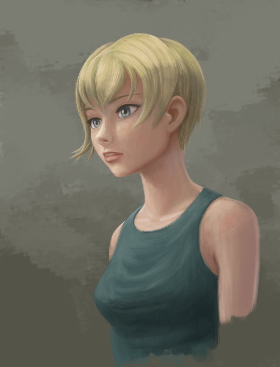
Don’t ask how long it took, at first I just tried to adjust the original to figure out how to make it more pleasing, but I just couldn’t quite figure out the intended pose. So I basically I decided I’d make my own version, and did several iterations to figure out how get to the image I had in mind.
Looking very nice! I like the 3d-ness in the eyes.
My sketch was based on materials from Hidechannel’s 2023/12 summary book (it’s a collection of drawings and illustrations from live streams for each month). There were a few very appealing designs and poses of a girl in Chinese-like dress with these cute buns hairstyle, which I liked a lot
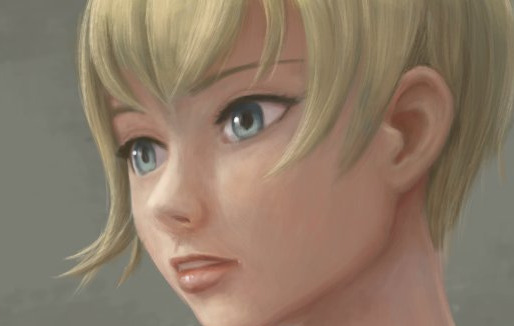
I really need to improve my sense of proportions, especially when it comes to faces…
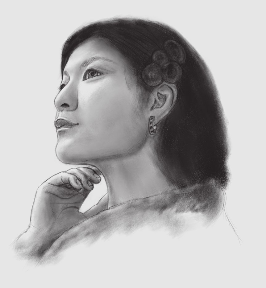
I decided to start drawing portraits from references.
For some reason, this one was very tough for me…
The first attempt was a total flop, the second one is at least not totally embarassing, but still not as accurate as I’d want:
I guess I made Tonka (I assume Potato is the owl) a bit older, even though I increased the head size later, I failed to nail the childish proportions so I just went with this.
I don’t think Deevad currently has any plans to feature Potato and Tonka in the comic, but I still wonder how he’d do the full outfit in color…
Very cool work and epic pose! I love your design for the colors.
I don’t think Deevad currently has any plans to feature Potato and Tonka in the comic.
I confirm, not part of what I written for the upcoming five episodes. But I’ll have crowd scene with many witch at one point, so maybe I should insert her as a cameo.
(PS: thank you also for pointing the broken link on the chat room yesterday; I’ll fix it)
Thanks, I’m still not sure if I like it that way, but I definitely like it better than my attempts with the greens of Hippiah outfits.
About the pose, there’s a story idea behind, and it probably gives a wrong impression because a crucial thing is missing
Let’s see if I can ever make it to a complete comic strip that doesn’t look pathetic compared to the original…or at least that one scene.
Krita says editing time is 3h 38min.
There’s still a lot to improve, but I already reached the point where I just tweak details that hardly make a difference, so I guess I better start a fresh one to improve my shading skills.
Good job on the modeling of the volume. I’m envious of your way to grade colors for the light, you have a good ability to get this type of color balanced white light that is neutral; not cold like under a neon light, not warm like under a vintage light bulb, just a bright intense light like on one day with overcast light from clouds.
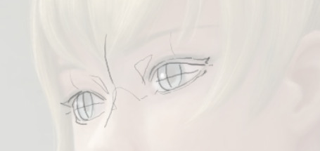
Just a feedback: sorry for the bad perspective for the eye further the camera in perspective! That was a big flaw in my sketch and it was very wrong on it, and you had to post-fix a lot I see, good job. Here is how I would solve it, not perfect.
Well thanks, though I’m nott sure this is really a skill of mine, it’s more like I have a really hard time doing anything other than neutral light
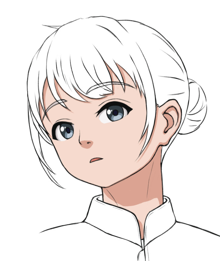
Yes the eyes are quite sketchy, which is hardly surprising because it IS a sketch.
But eyes are one of those things I keep struggling with again and again, with other parts like nose, mouth, ears I have the impression that my imagination gets a bit more accurate every time, but with eyes it feels like I’m just as clueless as ever…
Now the way you draw them looks so straight forward, I will definitely try to construct those lines of the nose next time, I hope it’ll help me with the placement and shape.
Nice practice on the portraits, you should update this.
I was trying to return the favor and browse around. I am not sure if you want to do ‘close to realistic’ shading like me. But what I did to train my eyes and my observation skill is to actually analyze the greyscale version of real photo or artworks. Either redraw or when I am not in the mood to draw, I do color picking analysis (which included if I redraw). For example at first I count the value level difference of the left and right face when the light source is to one side. At some point, maybe few hundreds redraw, your eye will adjust the difference in value level between areas and you will start noticing “flatness” in your shading or to be exact, “relative difference/sameness between parts”.
Few hundreds seems a lot to do, but if you make it a habit to just draw what you see, your eyes adjustment will happen faster. The point is to not think much about the how the shape looks, just the value distribution/variety need to be similar with the reference and the position is somewhat correct too.
I did the same thing with figure many years ago, only focus to get the right placement for the contour lines. Right now I am focusing on how to be independent from ref, basically to cut project time so I can draw more. But I reckon I probably need to draw in the thousands for the perspective conditioning and light conditioning to happen.
I really appreciate your feedback, and I think you’re right, I just need to a lot more shading practice…seeing those subtle gradients is hard, even in greyscale my eyes are still too easily fooled.
I’m probably making my life a lot harder by only working on my original scenes, finding good references with similar lighting takes a lot of time.
And athough I ended up posing the characters in Blender to fix some perspective issues, creating a Cycles rendering suitable as lighting reference also takes a lot of time, also because materials must have the proper level of diffuse reflection too for indirect light to be realistic…and faster CPU/GPU wouldn’t hurt either
Also I’ve been facing some strange Krita bugs with a second main window…maybe I can find an image viewer that can do greyscale display and ideally also mirror and rotate the view without actually editing the image.
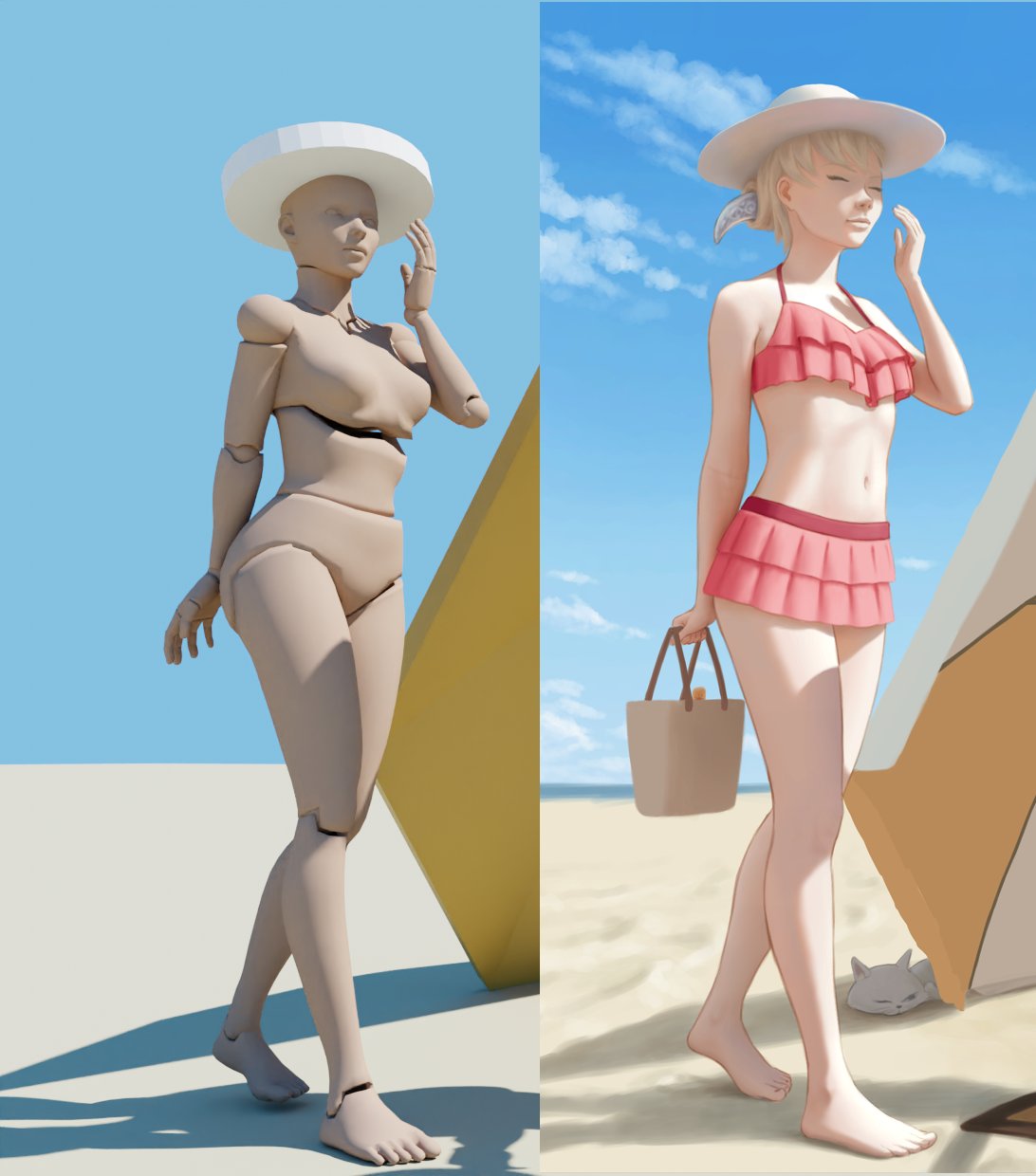
Here’s my current progress on Shichimi, in comparison to the blender rendering.
The others still look somewhat unfinished…and I guess I can just skip the current monthly challenge, I don’t even have a proper sketch yet.
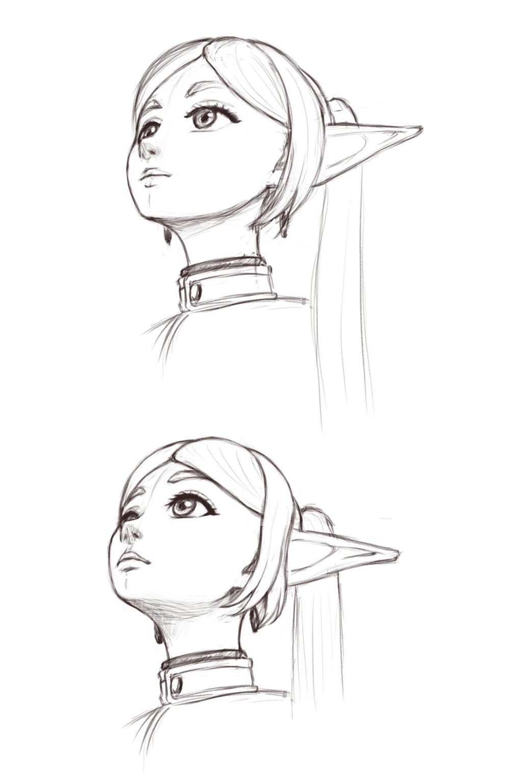
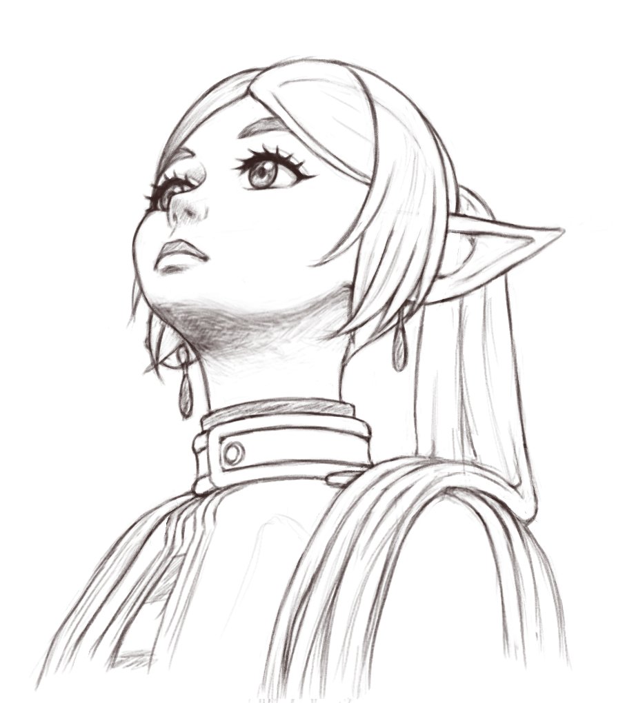
Thanks to someone’s rather odd looking attempt to draw Frieren that went viral as a meme, suddenly everyone started to challenge themselves to properly draw a character looking up, so I couldn’t help it…
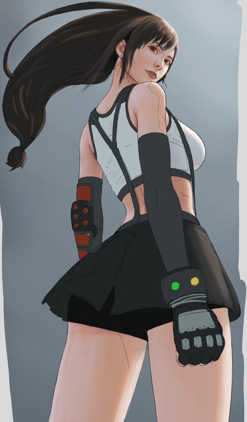
This one is based on the Tifa lineart done by @ynr_nohara.
As usual, I start to tweak some stuff…and then some more…and next day with fresh eyes it looks odd again and I tweak it some more…
Thank you for coloring this. It is quite hard for me to draw a pose in perspective like this, and to see someone trying to tackle this using 3D model made me realize that I just don’t have the visual library of such subject in this kind of perspective.
In my own attempt I was trying to use the logic of distance paired with the usual base comparison of female human figure propotion, such as
On straight on view, we could gauge size or length of a figure using heads. I gave Tifa maybe 7-8 heads tall.
So because this is in a more extreme angled view, the size distortion of objects that is further/closer will be more massive. If from a straight on view a female head could fit inside her chest cavity (my way of sizing body parts), in this kind of view I thought the head would be much smaller than her chest cavity. But alas since I am only familiar with straight on view, the look of much smaller head gave me constant warning. Hence I chose to normalize the view even more, and made the distortion less potent.
Same logic I put with her right arm. I just can’t shake the weirdness of me not having visual memory on this, so I normalize the perspective again and lessen the distortion.
I think for someone like you that can use 3D model, you could put several objects around the 3D model reference like table or chair or drawer (object that is square-ish) as something that affirms the extreme angled perspective and amplify the “yes, a much smaller head is the right decision for this situation”.
I really can’t describe how frustrating it is when my logic clash with my memory yet I can’t make a 3D scene to clear the arguments inside me. But maybe other people can.
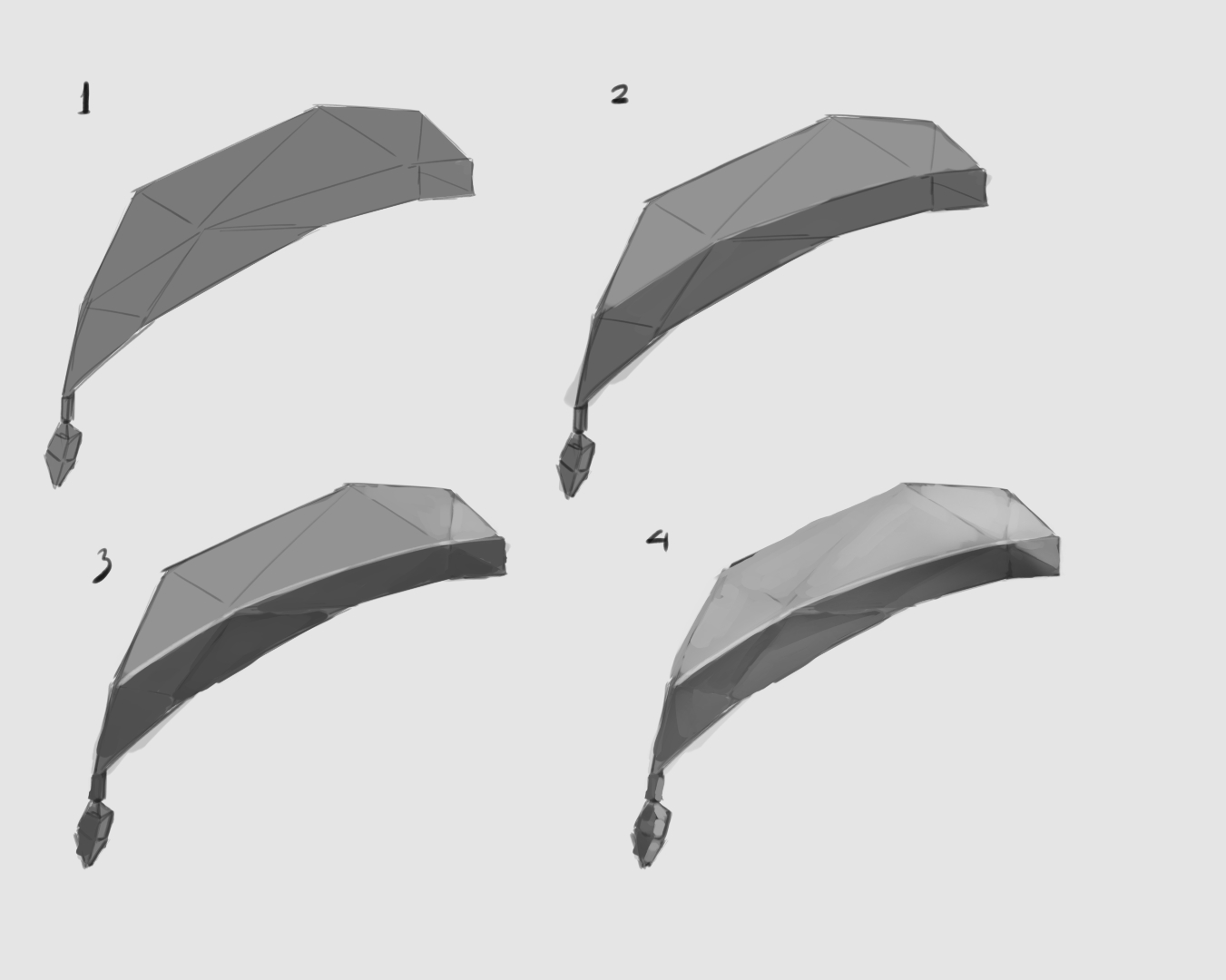
For shading hair and other stuff, I personally think it is better if you split the process to go from Shape(2D) into Form (3D) into textured Form.
split between light and dark area, which border mark the core shadow placement
Making decision which part gonna be lighter or darker.
Making decision on which part got hit by reflected light.
There’s also rule of contrast to be kept in mind, which is if something is brighter then planes on the opposite site should be darker. I called this Flashlight contrast rule since the example is when you shine a flash light, objects Inside the beam will get brighter, but object Outside the beam will get darker.
There’s no need to follow my advice, these are just the theory I made after observing artists on the internet. I don’t have anyone who is on master level say what I do is right, I only assume this is right for the simple fact I like the result and my brain don’t give me warning when I did it this way.