Hi there,
this time I’ve come back to those short krita videos, about some cool tricks in krita, that (hopefully) noone knows about
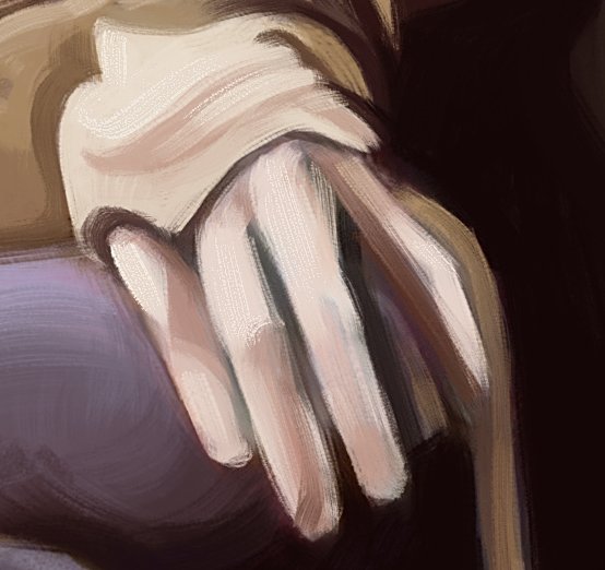
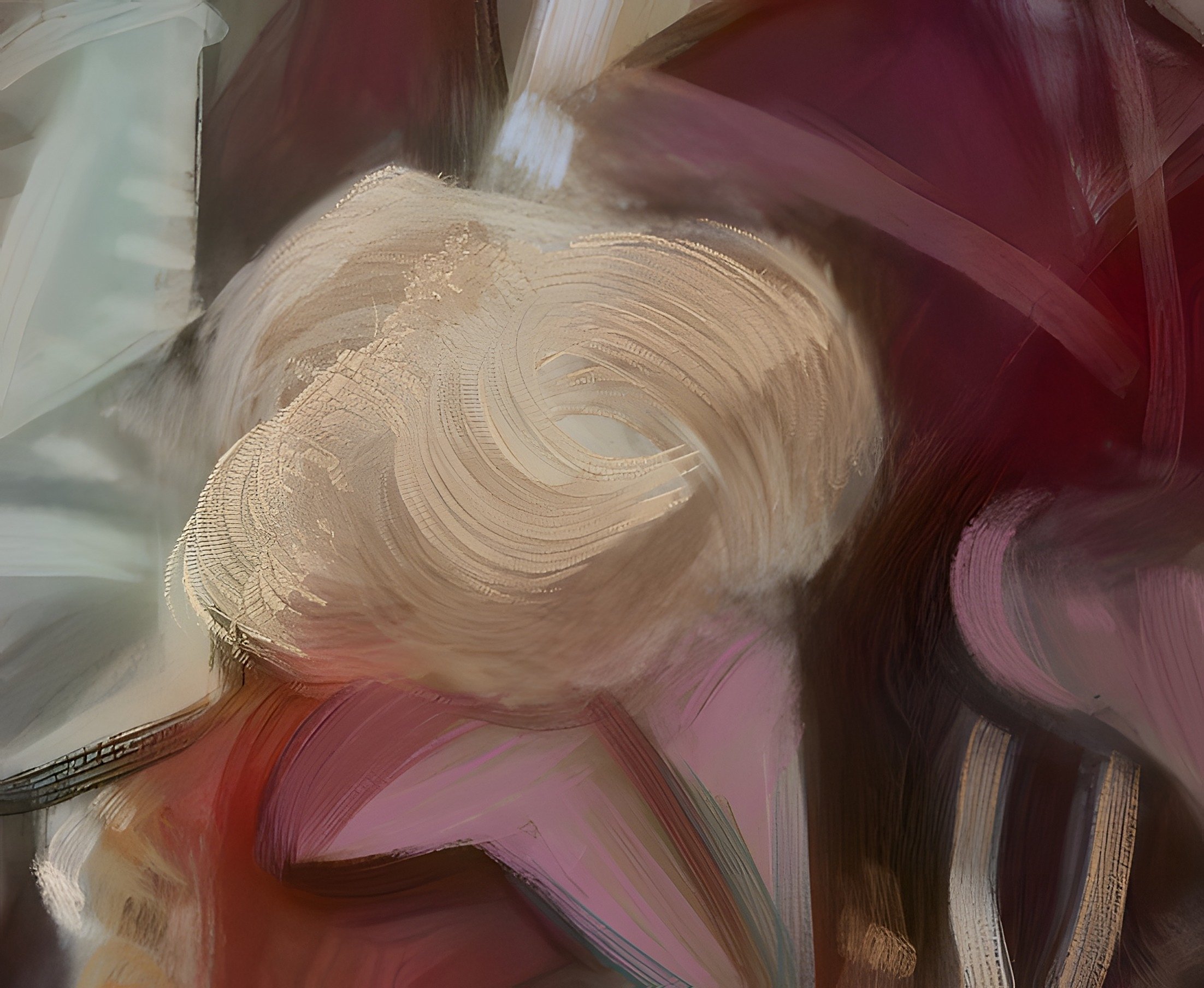
That’s something I came up with while working on my previous illustration “Nala”, and found it so cool-looking that I had to share it with you in a separate video.
Very good tutorial. I prefer not use filters but i will test this ;). I also use tricks for effects sometimes.
and btw your octopus is cool… Thanks for sharing.
Thank you! - I also don’t use them that much, but this specific one feels so fast and subtle, that I might start to use it more often if I learn how to correctly not overuse it
You know - nothing wrong with blurry brushes. I suppose artworks have a place for both sharp and soft edges, and controlling them is one of many abilities one need to obtain.
Just using a sharpening filter (this one or any other) won’t magically fix bad edge decisions - but I believe it can save some time on rendering, if one learns how to use it to their advantage
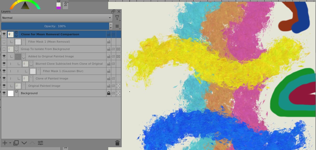
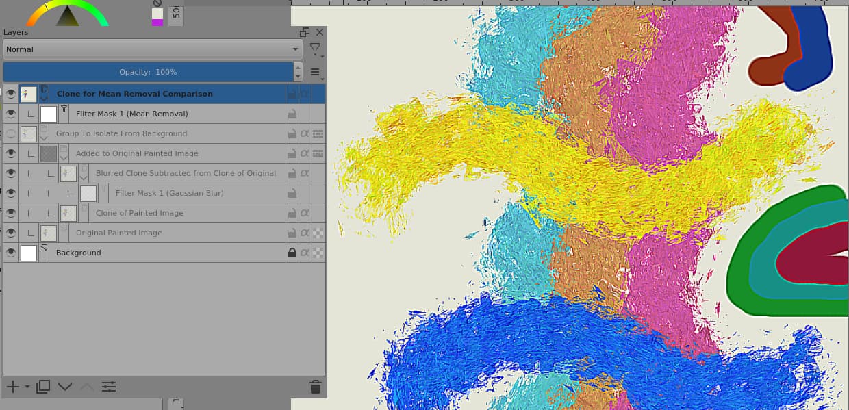
Hi @wojtryb That’s an interesting find. You mentioned that it’s only suitable for small scale details and that it has no adjustable parameters.
I think it generates the mean over about 3px or 4px.
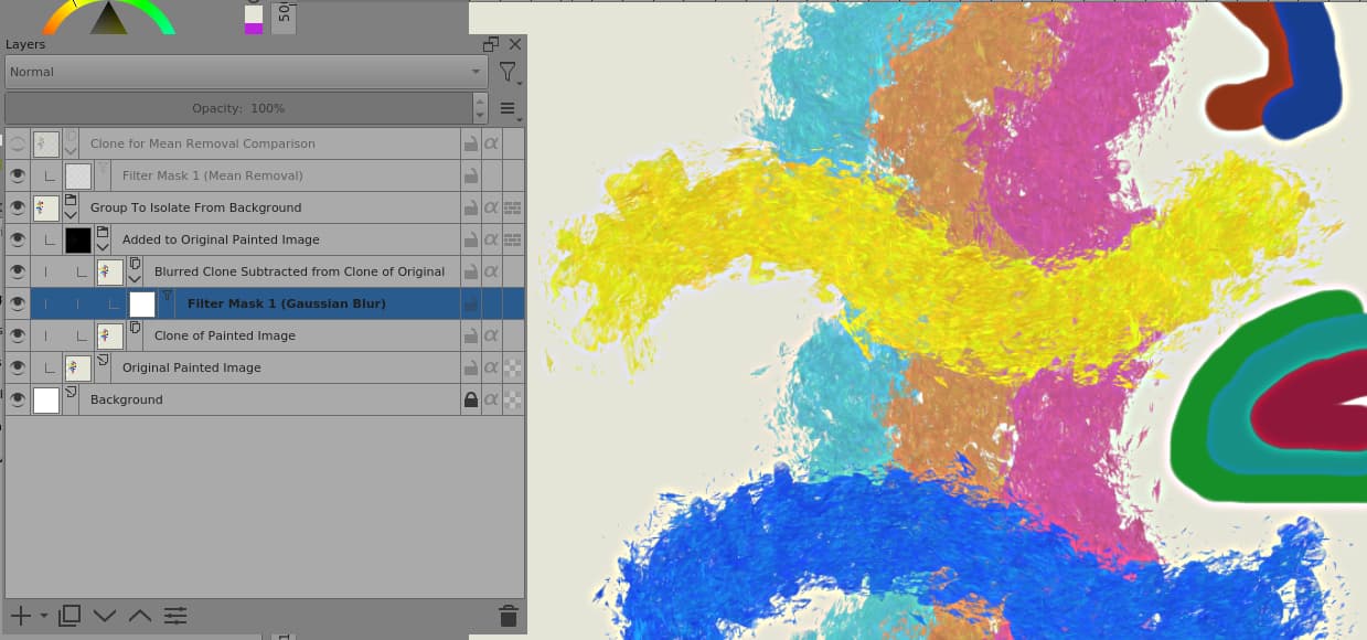
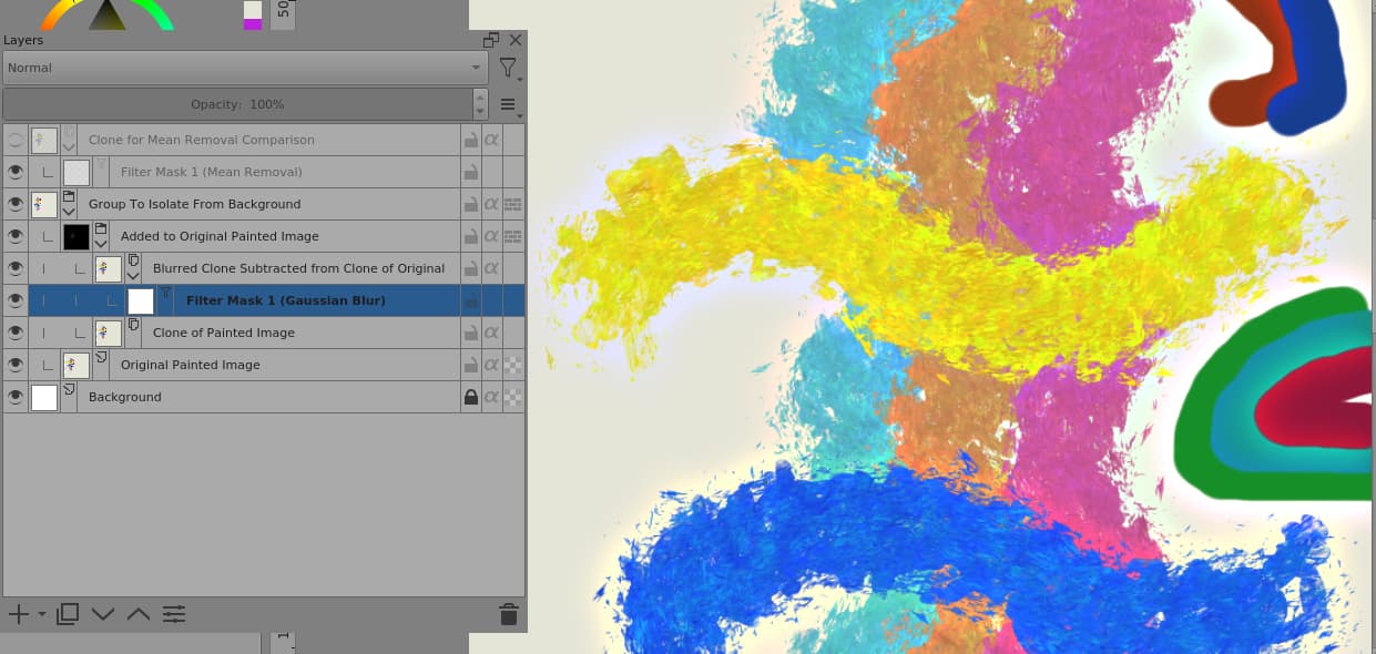
I’ve tried to simulate/emulate an adjustable version using a Gaussian Blur filter to generate the mean over an adjustable radius:
It uses Subtraction blending to get the difference between the local mean and the original. That has the disadvantage that there is clipping down into black but that seems to work better than Difference blending.
Here is the .kra file if you or anyone wants to play with it: Fixed Processing.kra
Just paint on the ‘Original Painted Image’ layer.
Thank you! I never heard about this filter at the University and Googling also didn’t give any immediate results. (and I didn’t feel like investigating the source code or programming experiments)
I’ll definitely have to analyze your file - even if the default version will be enough for my everyday use - you’ll save me a lot of time on trying to understand what happens there internally
I’ve also been trying out an AI up-scaling software lately- sort of a tangent but this produces interesting results heightening some brush marks- although it makes tiny difference when resized to smaller images for the web like you say.
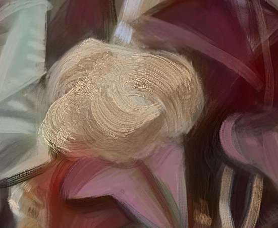
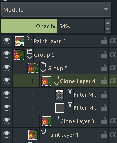
did what @AhabGreybeard did
except I made parent group Soft Light SVG (70%opacity, but 100% nice too) and next layer with the MeanRemoval filter and GaussarBlur (50% opacity,14.5 pixels) filter. layer with filters I set to blend mode Modulo
oh ya and i put a pattern in the mean removal filter
gaussarblur filter filled grey to tone it down
paint layer 6 is cutouts to show the difference with and without
and of course using brushes that have desired effect