Hello everyone !
I don’t get at all how to do that in Krita, please tell me if you have some leads…
![]() Hello @MangaNoob and welcome to the forum!
Hello @MangaNoob and welcome to the forum!
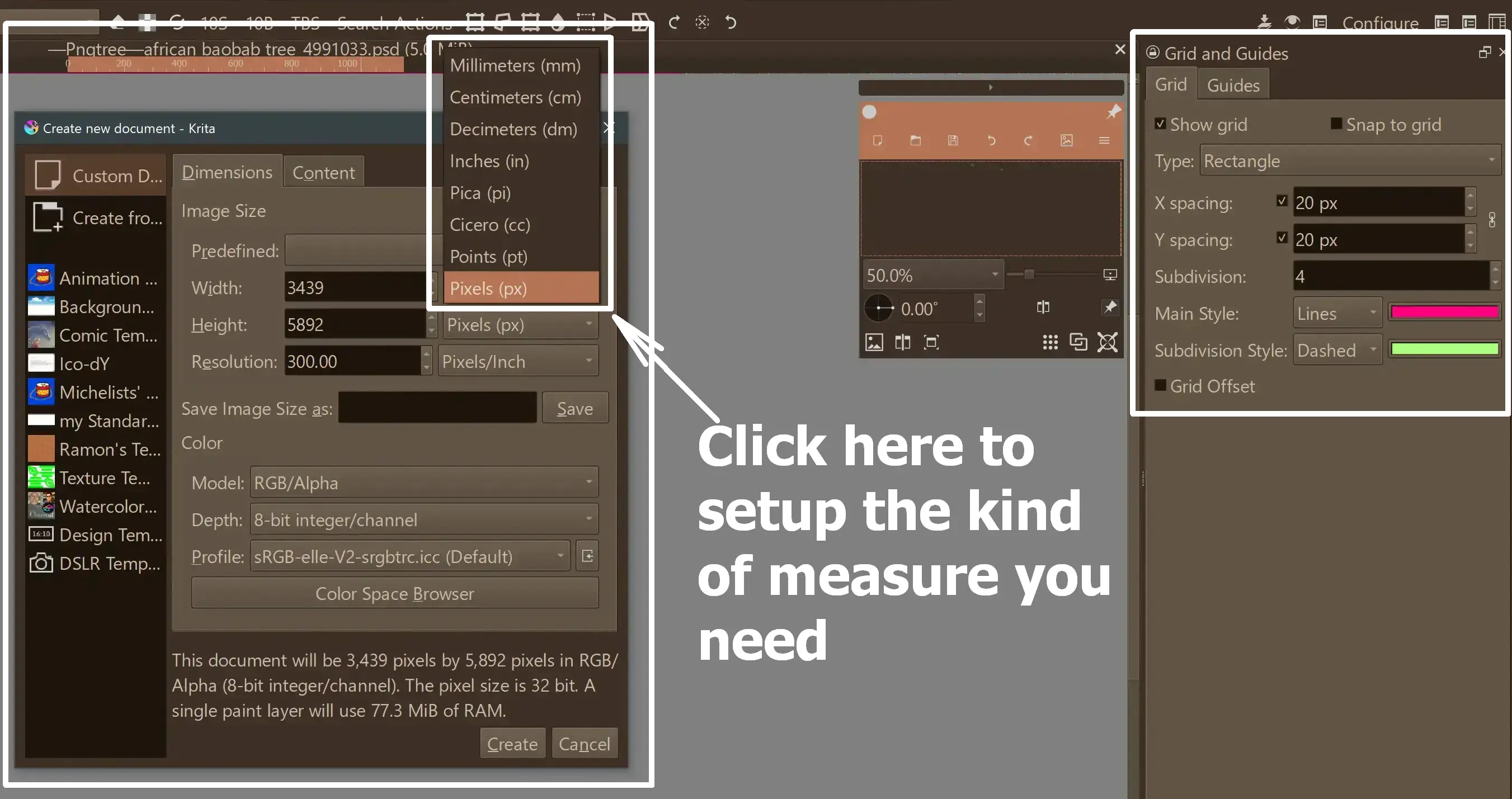
On the CTRL + N “File” >> “New” dialog, you can tell Krita to use many different measures, just select mm instead of pixel and create your picture in the needed size.
With help of the Grids and Guides docker you can set up your canvas, unfortunately it has a bug and can only handle pixel so you have to convert between mm and pixel.
An easy-to-use converter can be, again, the CTRL + N dialog, set it to mm put in your needed size and set it back to pixel and read your measure.
So, take pen and paper and note all needed conversions and use it to set up your page’s bleed, trim and margin as the organizer of the contest requires you to do.
And, after you have set up your page correctly, and before you begin to paint, save it as a template in Krita via “File” >> “Create Template From Image…”, so you can always re-use that template if you need a new sheet.
Michelist
I don’t recommend using grids and guides for the margins, use vector shapes instead, that way you can use them as masks to hide the content outside and see how the page looks like when trimmed and cut.
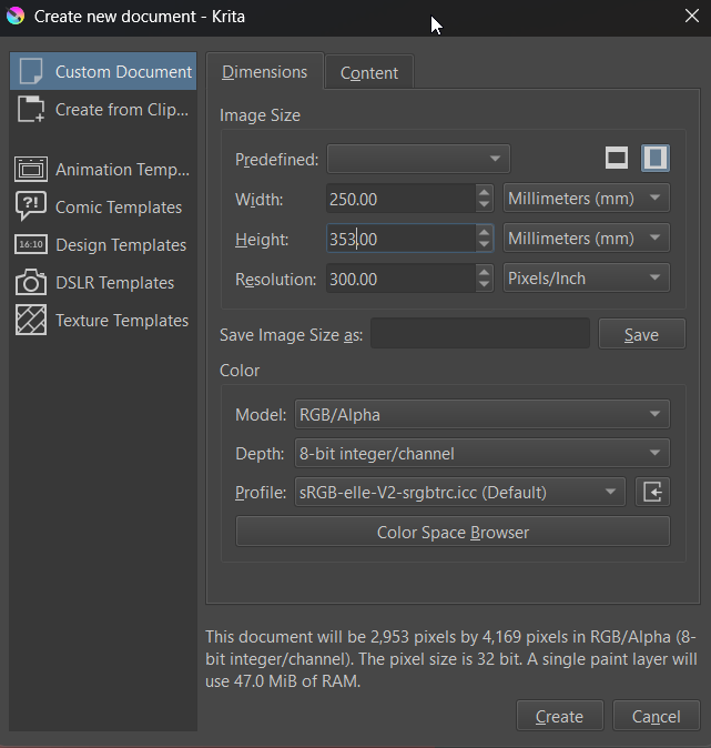
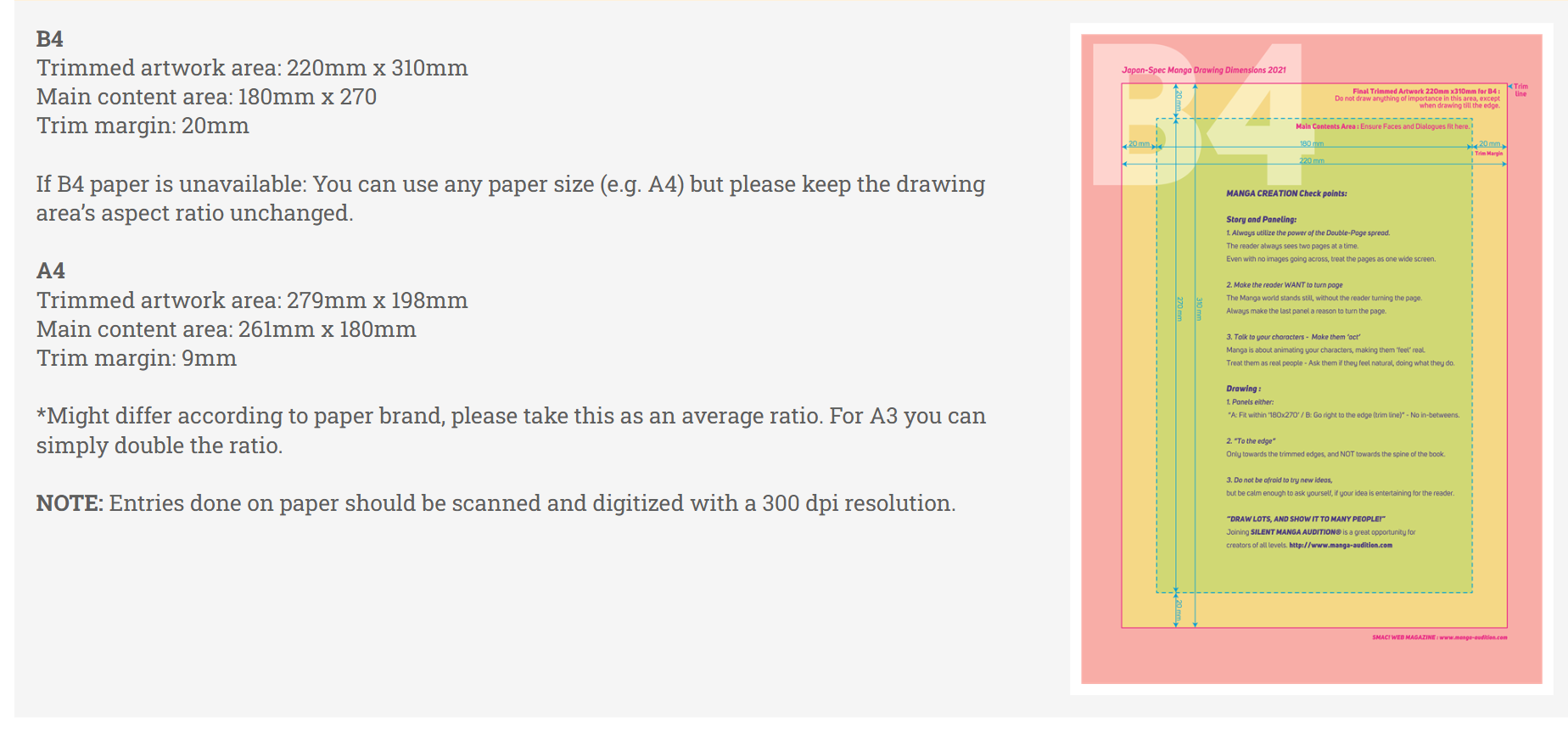
Create a new file in B4 size (that is 250mm x 353mm), and 300 PPI resolution.
The conversion will maybe not be perfect because pixels and millimeters don’t always translate that well but that’s what the margins are for.
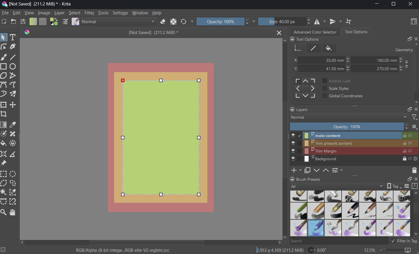
Create a new layer, make it completely red (for visibility), call it trim margin or something.
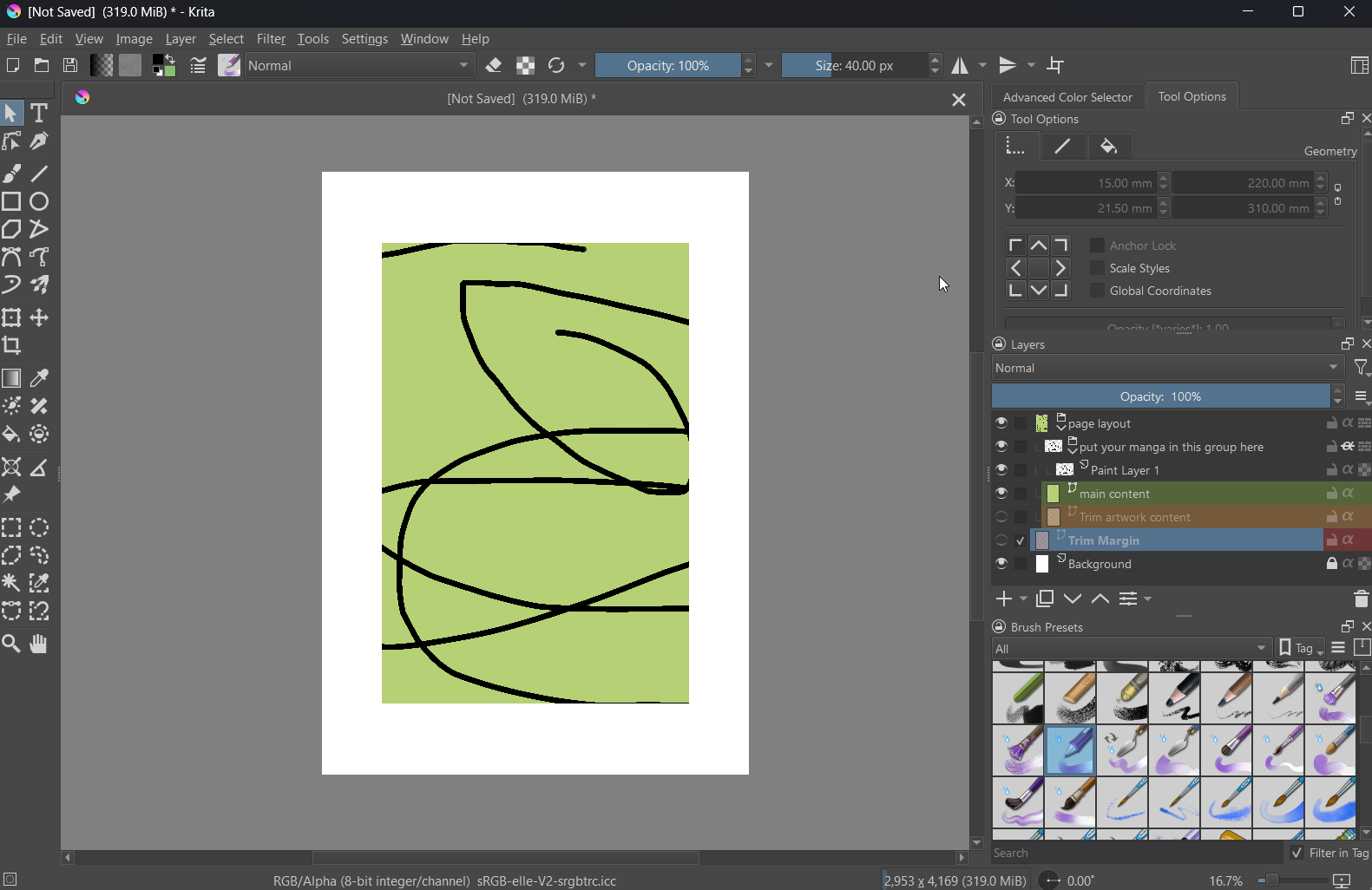
Create a new vector layer call it trimmed artwork area, crate a orange rectangle with the rectangle tool. Use the Edit Shapes tool to give it the desired dimensions and put it in the right place. The Select Shapes tool options allow inputting millimeters, making this relatively easy (you can enter the math directly into the edit field, for the most part).
Make sure that you disable the shape border because it will make the shape look bigger than it is since the border expands outward from the actual shape’s perimeter.
Repeat this for the main content area too, make it green and it should look something like that:
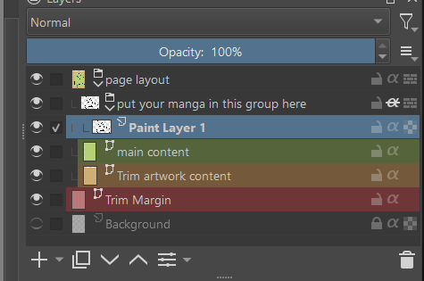
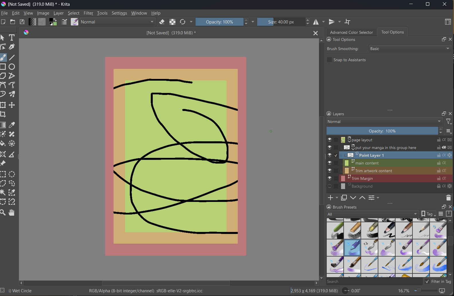
Now, prepare the magic. Put “Trim artwork content” and “main content” into a group (call it layout or something). To that group add a sub-group (this is where your content will go) and activate Alpha Inheritance on it (the little alpha symbol next to the padlock). In that group create a single paint layer scribble something on it if you want just to test the magic.
Now your layers docker will look something like this
and the whole thing
You can already see that the drawing doesn’t touch the red part that will be cut off later in print or post.
I advice saving a copy of this so far so you can reuse this later and don’t have to make the set up all over again for every page.
Now you can draw on the layers in the “put your manga in this group here” group and by toggling the visibility of the “trim” layers you can see how your page will look when things get cut off later.
There are other ways to set up pages but this one should give you the basic idea.
Additionally, this plugin might come in handy for the task:
Michelist
I’ve been looking for this for so long. Thank you very much!
This topic was automatically closed 30 days after the last reply. New replies are no longer allowed.