EDIT 9/9: Revised this one a bit . Didn’t actually make as many major changes as I thought I would – cropped it differently, fixed some of the blurry brush textures (painted over many of those parts with Clooms brushes, my new faves), added a bit of detail/interest in the roughed-in parts, and adjusted value/saturation a bit to clarify some aspects of the composition. I think I’ll call it “done” for now! If I do come back to this picture, I think it will be to totally re-paint it, and probably not for a while! Once I’ve improved a bit generally.
Taking a break from painting people! At least directly.
Painting this one I realized that some of the brushes I’ve been using don’t look so great at larger sizes… I think I’m finally going to dive into the wide wide world of creating my own brushes. I still feel like I haven’t found exactly what I’m looking for…
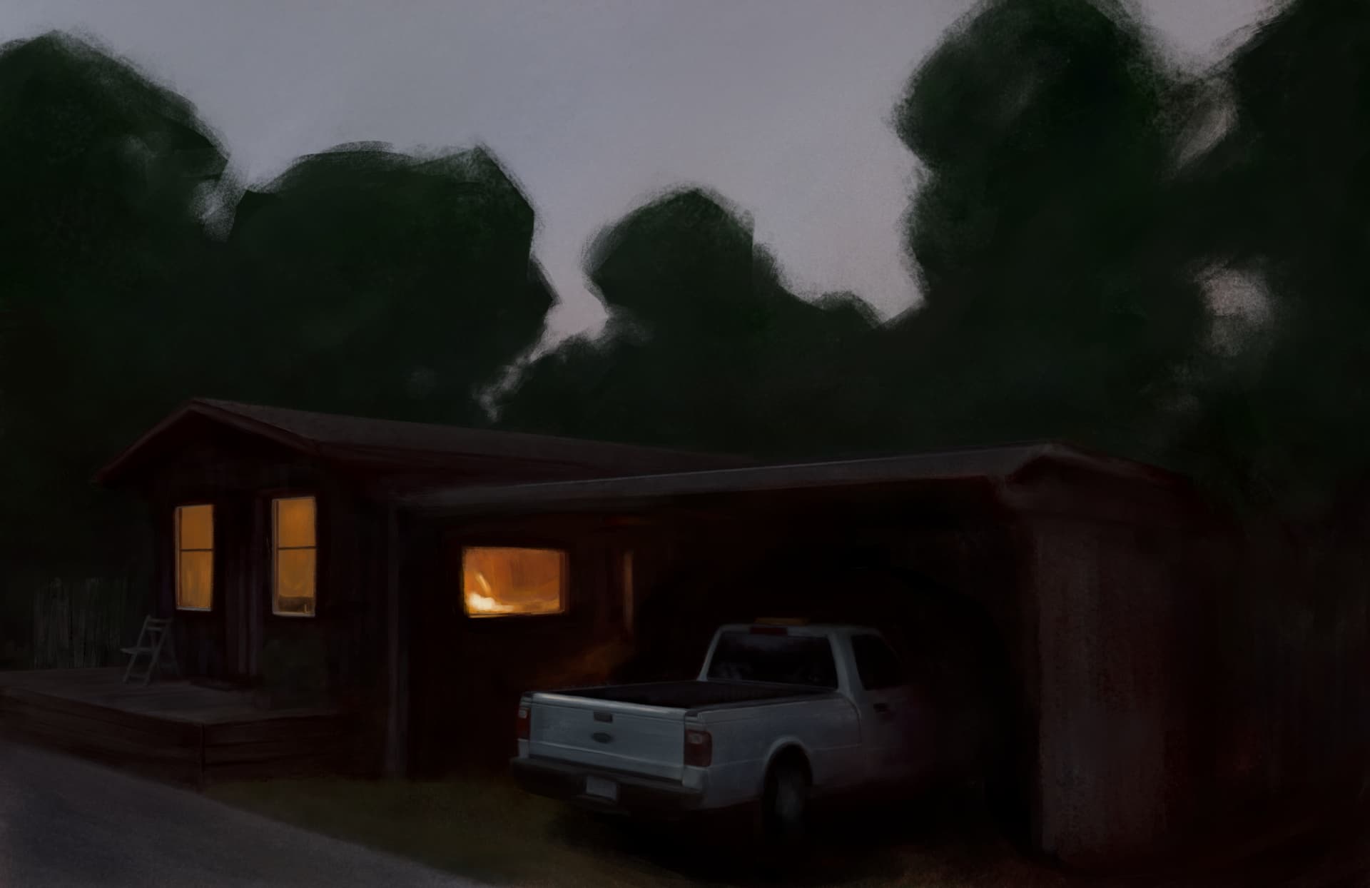
I really like your picture here! My only critique is that the overall values are dark… Which makes it hard to see. Honestly I think that’s the only reason people may scroll by it. Because otherwise - I think you did a fantastic job. It’s a simple setting, but those often touch closer to home.
Truly I think that manmade objects can be even trickier than organic subjects, because when the precise right angles and shapes are not done well… It stands out faster than a crooked tree .
All my way of saying, I think you did great with the house and pickup truck (especially that truck!). Again, your colors are very pleasing… Just dark. I know it is evening. Maybe if the moon shed a little light on the subject or something
Anyway, with all that - very, very nice piece here. Seeing it makes me feel happy
I think you’ve pretty much got it spot-on, re: being too dark. Or perhaps more generally: a value/contrast problem overall.
I actually just kept darkening everything more and more as I went, with the goal of making that middle window pop out as much as possible… but I think I got too focused in on that and lost track of the picture as a whole. (I also tried leaving the background elements flat and very low contrast, but I think I went too far with that as well, looking again now.)
I definitely plan to come back and revise this one – after letting it sit for a while – because there are aspects of it I really like. But it definitely needs more work.
It’s funny you mention this – I was scrolling through posts looking for this thread so I could reply to your message… and I even scrolled right past it . How embarrassing!
Also, I realized when I was on my phone that the image doesn’t read well at all at small sizes.
On the plus side: some valuable lessons learned from this one!
And thank you again for taking the time to critique! I really appreciate it.
I completely understand about so honing in on a specific element that you almost forget about the rest of the picture. Very easy to do. And that is an excellent point about phones versus computers! I forget that myself. A picture’s performance can be so different between the two.
But yeah! If you ever feel like touching up the values on this work … I will most certainly want to see it again!
The image is very dark, which may not appeal to many people. Personally, it was this very feature that caught my attention. You have conveyed the idea of intimacy very well with the warm light from the windows. I believe that in a sea of hyper-coloured and photorealistic images, it is paintings like these that offer something original. Clearly, in an illustrative context, the situation is different because in that case you have to find the right compromise between personal taste and market demands.
Thank you for the kind words, @sognidigitali! That’s reassuring to me as well.
The “darkness” to me isn’t so much the problem as the overall value structure… I think . Truth is, I feel like there is definitely something that still needs work here, but I’m not 100% sure what it is or how to approach it. (Which is why I haven’t tried doing a revision yet.)
However! Even if/when I do take another crack at it, it will definitely still be a darkly-keyed painting. That’s still the main thing I want to convey: the contrast of the bright orange slice of window and the dark outside.
Luckily I don’t have this problem … I have the luxury of painting/drawing purely for myself.
That said, of course I find feedback (positive and negative, from artists and non-artists alike) to be extraordinarily valuable! So I really appreciate yours and the other comments I’ve received on this thread.
Yes, I understand what you mean. I am sure that, when you least expect it, the moment will come when something will click into place, allowing you to make the changes you deem appropriate. It is a process of growth that involves not only purely technical issues but also, and above all, expressive ones, which are often overlooked or taken for granted. I am sure you will find the solution to what you currently perceive as just a feeling… and which, in my opinion, is already a good sign.
Revised this one a bit . Didn’t actually make as many major changes as I thought I would – cropped it differently, fixed some of the blurry brush textures (painted over many of those parts with Clooms brushes, my new faves), added a bit of detail/interest in the roughed-in parts, and adjusted value/saturation a bit to clarify some aspects of the composition. I think I’ll call it “done” for now! If I do come back to this picture, I think it will be to totally re-paint it, and probably not for a while! Once I’ve improved a bit generally.
 . Didn’t actually make as many major changes as I thought I would – cropped it differently, fixed some of the blurry brush textures (painted over many of those parts with Clooms brushes, my new faves), added a bit of detail/interest in the roughed-in parts, and adjusted value/saturation a bit to clarify some aspects of the composition. I think I’ll call it “done” for now! If I do come back to this picture, I think it will be to totally re-paint it, and probably not for a while! Once I’ve improved a bit generally.
 .
.
 . How embarrassing!
 . Truth is, I feel like there is definitely something that still needs work here, but I’m not 100% sure what it is or how to approach it. (Which is why I haven’t tried doing a revision yet.)
 … I have the luxury of painting/drawing purely for myself.