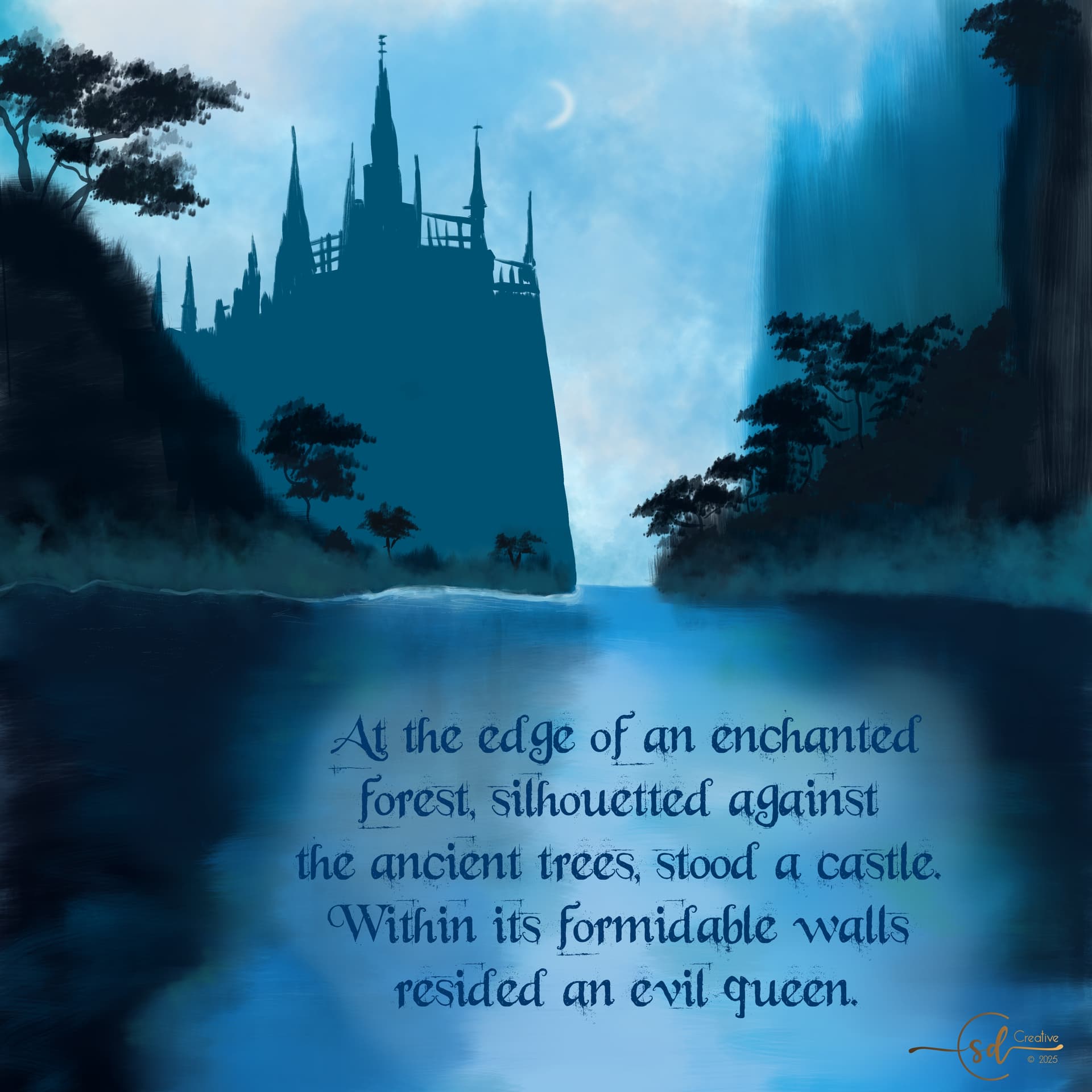
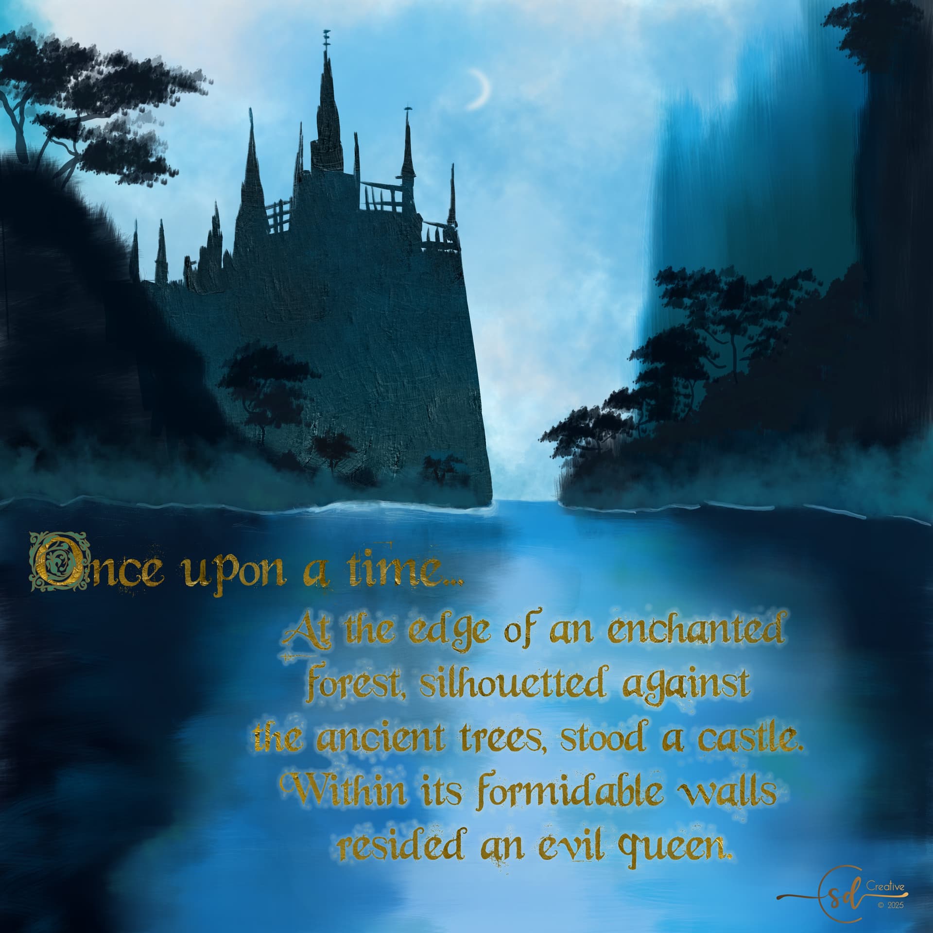
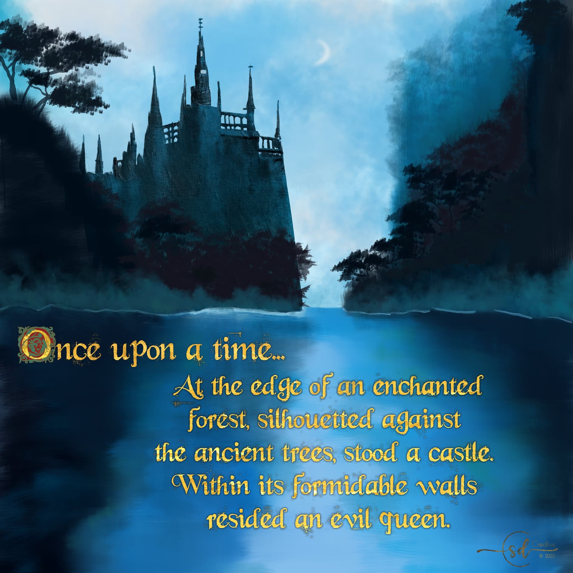
It’s a bit tricky to put text over a background that moves from dark to light and back again. The tried and true solution I’ve found is to add a ‘glow’. This is another thing that’s a bit easier in other programs, it took a bunch of trial and error. I think I found a solution…
I also added and cleaned up some details in the castle and trees. I’m thinking it’s close to done.
That’s a good idea @edgarej and I did something like that.
My process was to first change the vector text to a paintable layer using ‘select opacity’ to grab the font, create a new layer, and use a hard brush to fill in the text selection with a solid color. From there I needed to delete/erase some of the ‘fly aways’ because this font is rather more messy that I wanted it to be in the end. You can see how it caused issues in the earlier posts.
Next I created a new layer, re-selected the edited font using ‘select opacity’ again and then used ‘selection grow’ to make the font just a tiny bit bigger. Then I used ‘selection feather’ to create what a blur would accomplish, but with a bit more precision. I aimed for the number of pixels to be about 10x bigger than the hard outline created with the original ‘grow’.
After that, I used the ever-useful airbrush to fill in the selection and have some control over he feathering. Then I moved the shadow painted layer behind the edited font/text layer, hid the vector text layer, painted the edited text layer using a metallic gold brush and an alpha lock, et voilà! Golden text with a glow is achieved. Wheu!
I might still need to go back and make the ‘glow’ a bit darker when it’s over the moon glow part of the water, it’s still a bit tough to read… I also find that increasing/decreasing the screen brightness on my laptop makes such a difference. Some things are just meant to be printed.
You could also:
duplicate your vector text layer, then move that layer a few pixels diagonally downward or upward (about 3 or so) and blur that duplicated layer. That’s how I do some of my watermarks.
I’m getting the impression that you may not be completely aware of this powerful function, but most of what you describe can be done through layer styles in just a few clicks.
Of course it is possible that you tried, but that it didn’t yield exactly what you were aiming for.
If you didn’t, right click on the layer and you will find it.
I personally was aware for a long time, but was oblivious to how well it works, turned out to be a timesaver and actually the best way to apply these effects in many cases.
Only 4 days left as I type this and there are really not many participations, I hope more people will show up before the end!
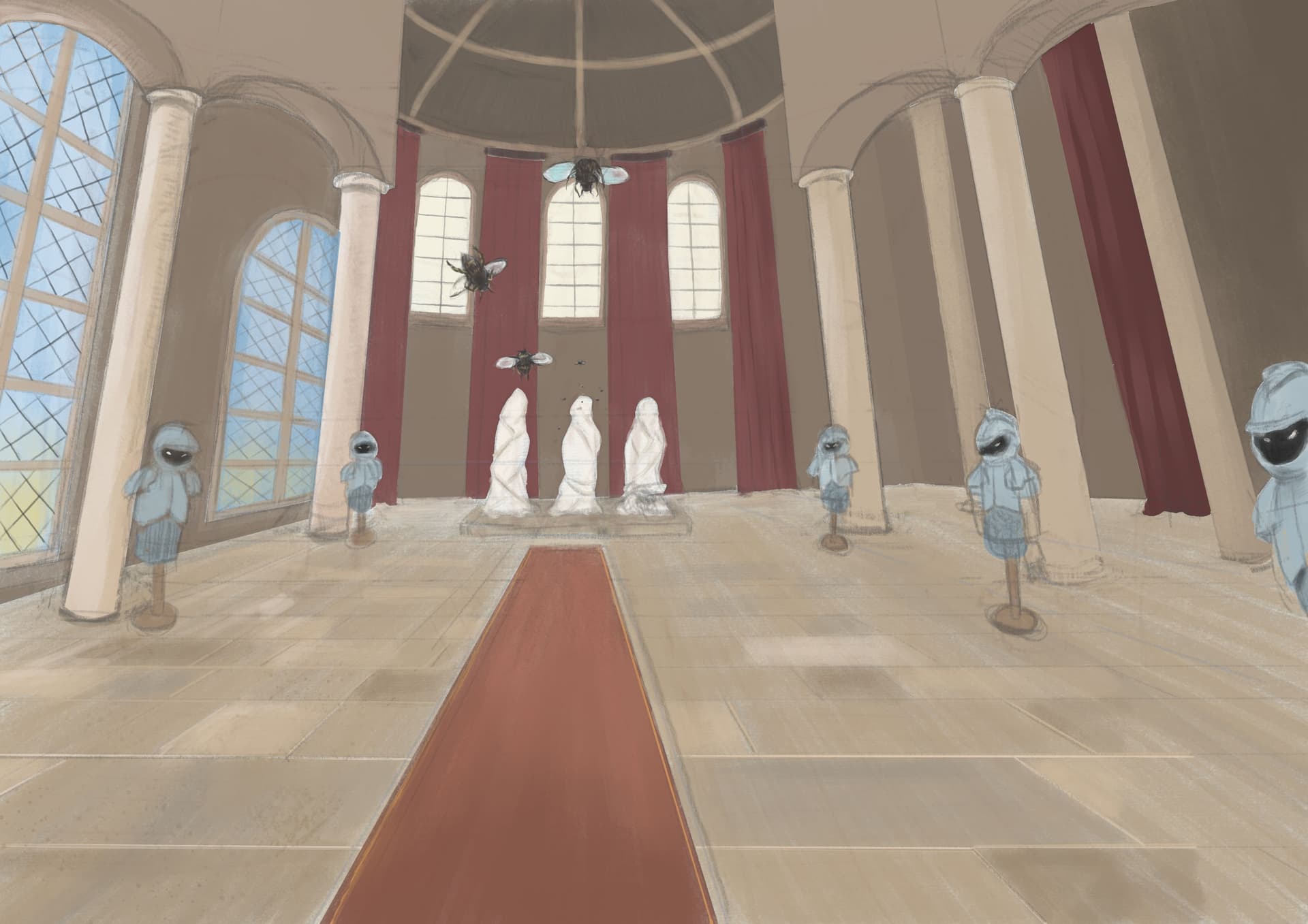
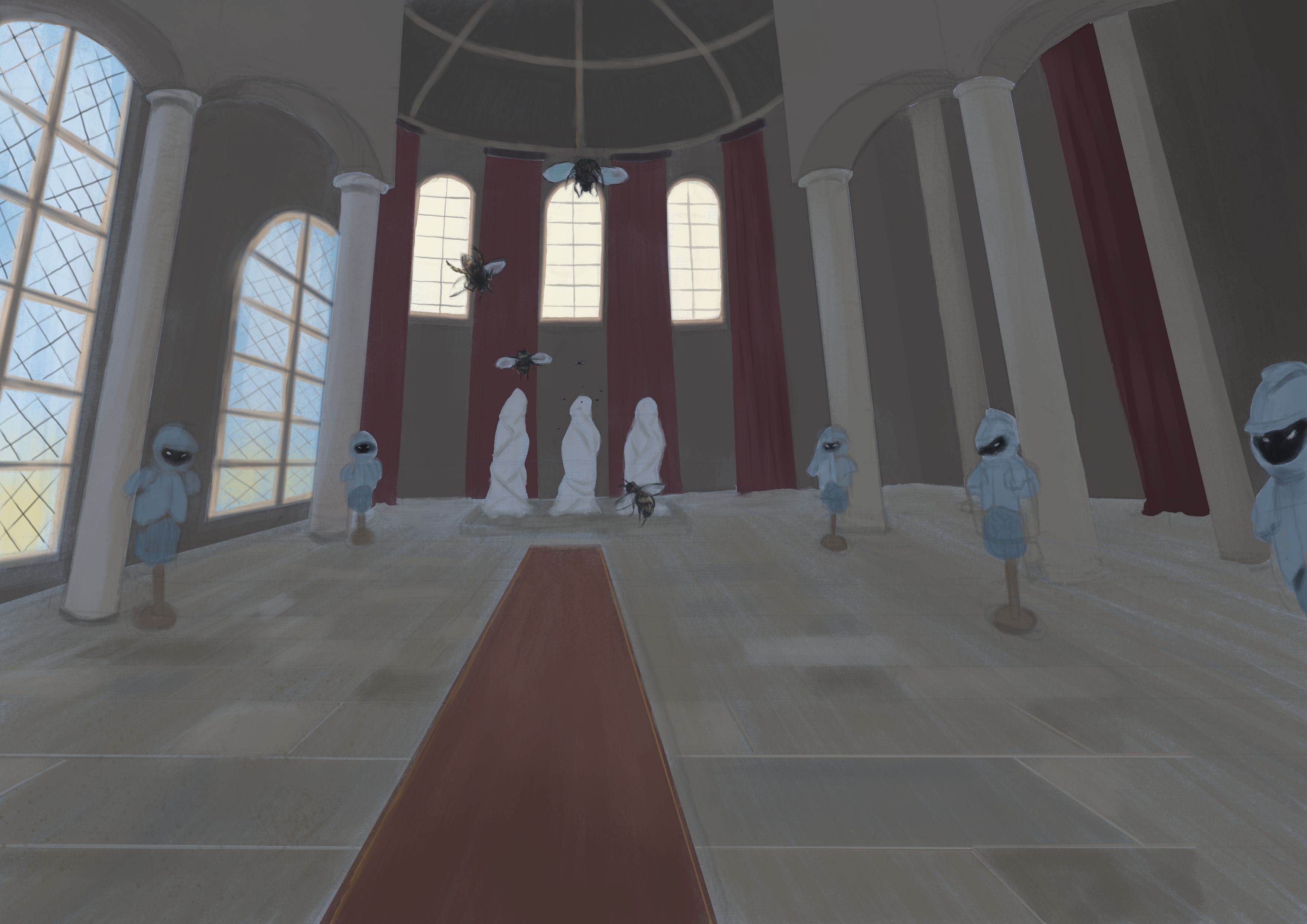
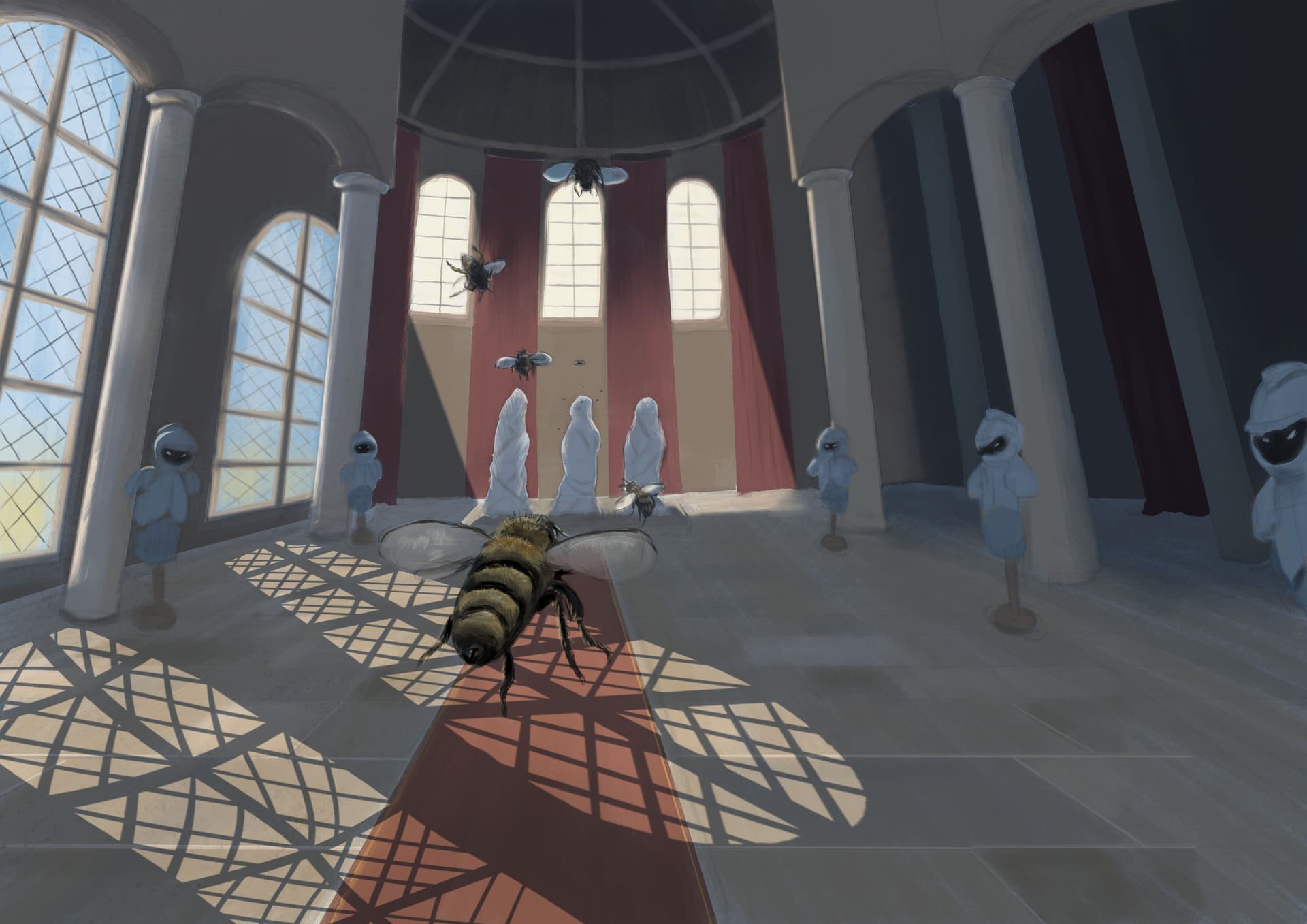
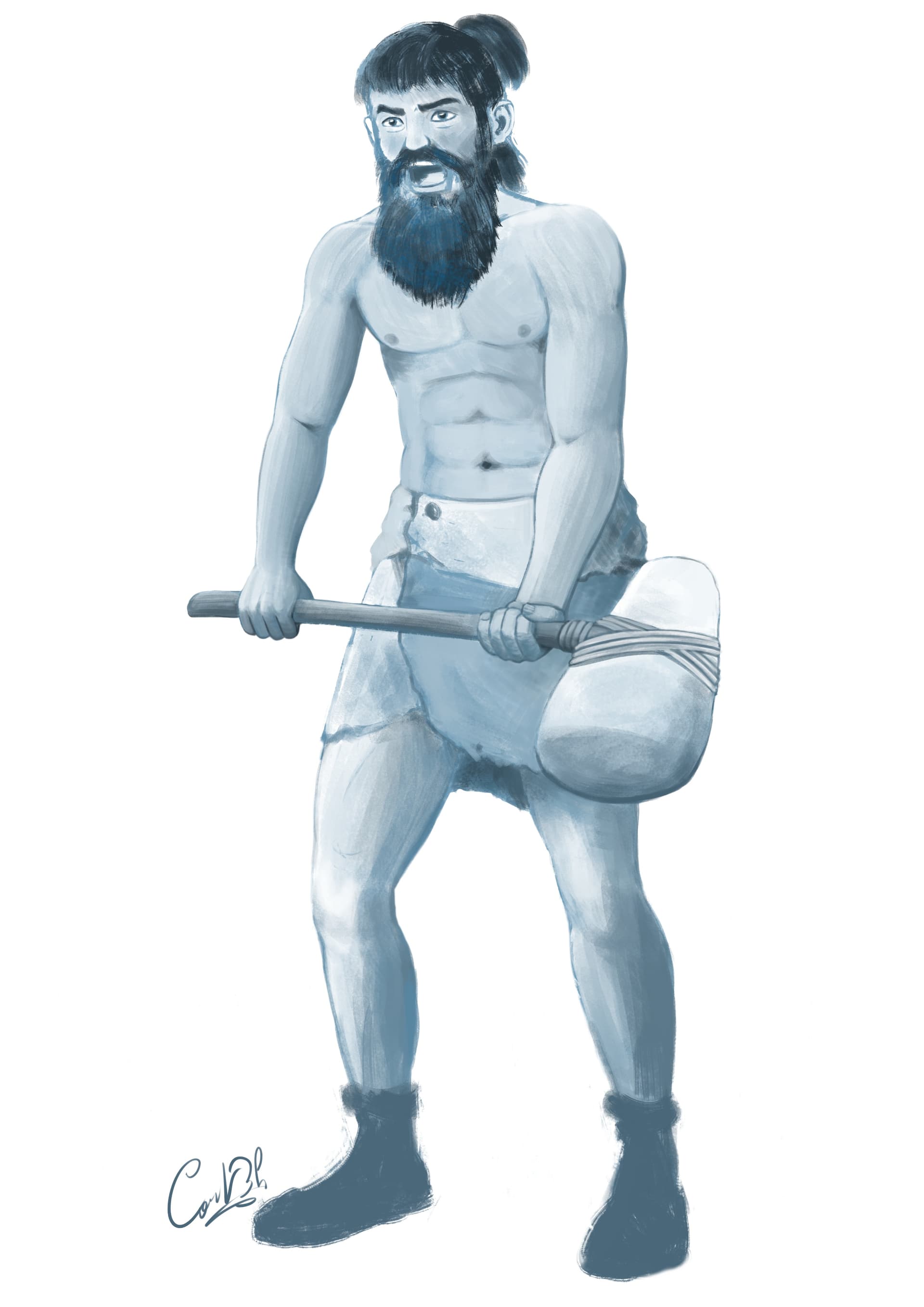
Anyway, I guess it’s time I finally show my work. Of course, my chronic indecisiveness made it very difficult for me to chose a tale, and I spent about 2 weeks simply listening to audio versions of various tales, and it was really fun to discover some of them. I finally decided to illustrate a French tale by George Sand called “Le Marteau Rouge” (The Red Hammer), that is about… a rock! LOL The existence of a piece of carnelian rock from the moment it fell from the mountain and how it was found, broken in smaller pieces, used and forgotten by people several times through the ages, until only a small part of it now remains encased in a ring. The most glorious part of the “life” of that rock was being used as the head of a war hammer by the chief of a prehistoric tribe, hence the name, so I naturally chose to paint that moment.
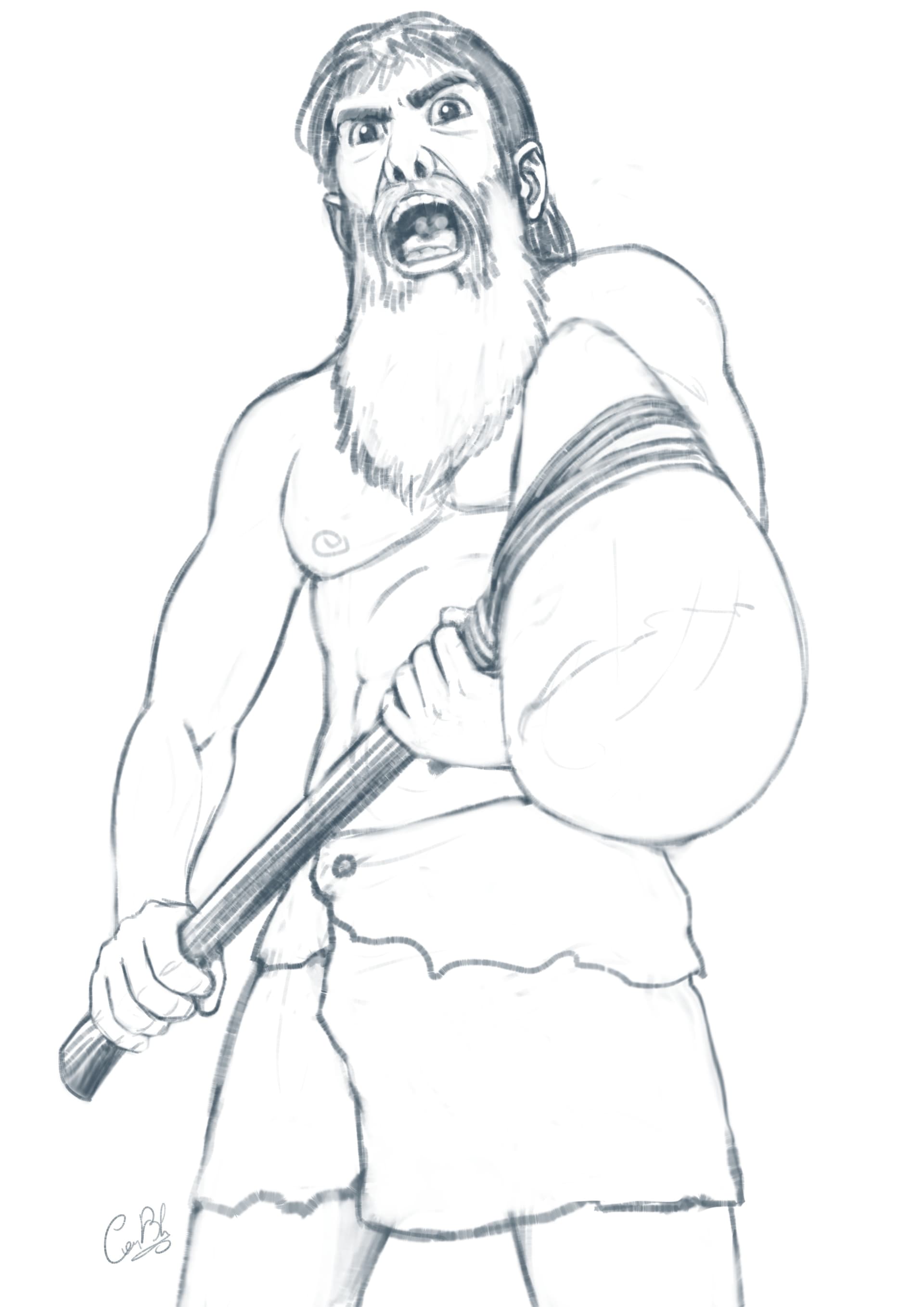
Here’s a preparatory drawing of the character wielding the hammer: