I don’t know if this should be posted in the Develop Category so I’m posting here to be safe.
I was watching a Youtube video of someone comparing Krita to other painting apps and they said the Ui looks dated. I keep hearing this in videos. “It’s dated”, “I don’t like it”, but they always fail to elaborate why and I think there’s a reason for that.
I always felt like there’s something off about it but couldn’t really put my finger on it. As I kept using Krita more and more until it became my only tool for painting, certain things started sticking out.
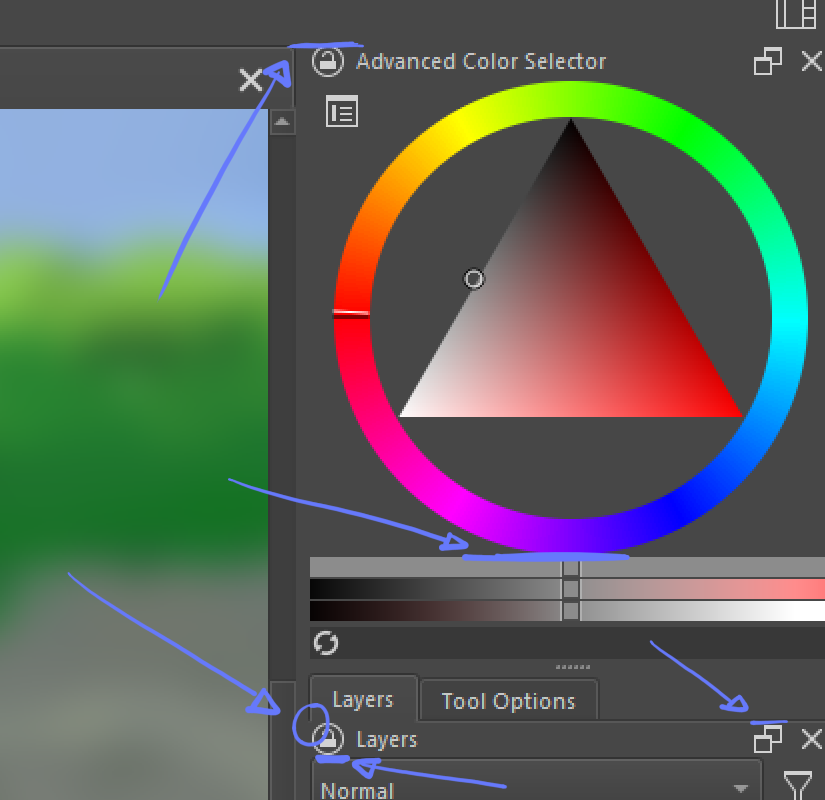
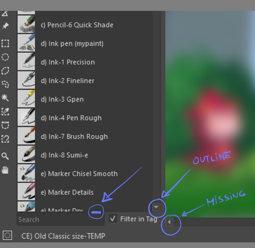
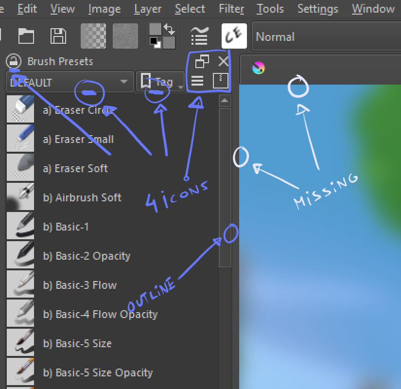
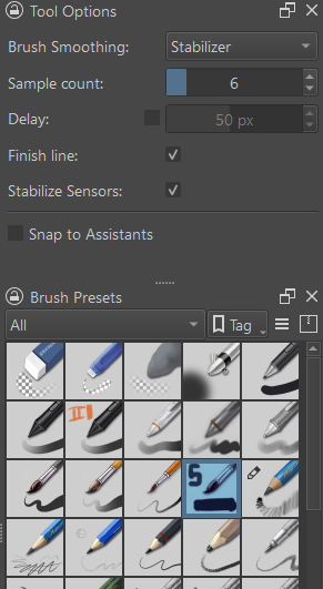
The Ui lacks a bit of consistency and a final layer of polish. Certain scrollbars have outlines and some don’t, icons are constantly placed in tangent lines, misaligned or cluttering small areas, and so on. This is the type of thing the other apps do well, and in my opinion that’s why people dislike Krita’s Ui. It’s a bit rough around the edges.
Now, please don’t take this as negative criticism. It’s my personal opinion/feedback. I’m fully aware of the challenges of software development, and I know some of these issues are directly related with the libraries, themes and styles the team is using.
I’ve attached images to elaborate what I’m saying as well as an iteration.
Hi, thanks, I think this is valuable feedback. Not sure though how actionable it is.
One thing that’s on the horizon, I think, is an upgrade to Qt version 6, which will probably be a tricky thing. However, perhaps the UI will look better simply by upgrading.
Also this kind of button design is distracting. I can unintentionally see that while drawing because they have gradient, drop shadow and outline when other parts are flat.
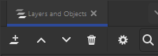
Docker headers are one of my pain points. IIRC the devs knew about it but those are a result of the type of docker they are using. They kinda wanna switch.
I dont think any UI will come not until porting to QT6 happen. Seems the vague timeline is that ui stuff will be address after that.
OTH blender 2.4x being my first foray in digital world for sure sanitize me to UI that not even freecad seems strange to me. which is a horifying realization for someone who sometimes do UX.
Hi @freyalupen!
If it was up to me I would remove those buttons completely. There’s too much visual noise. Instead, drag and drop to move the docker and right click in the name for lock and close options.
Those are good suggestions, considering krita a paint app first and consistency in graphics and avoiding tangent in illustration is something each artist thrives.
one of my issue is something like having tab saying brush preset, then having the header repeat that as well. redundant.
Though afaik, known issue and has something to do with the docker framework? they are using.
on other OSS software;
inkscape resolve the close docker by having the x beside if its full name and has space;
when there are more and space is limited , x only appear if the tab is selected.
other wise its only icons.
I have my gripes with inkscape new UI [like the damn sidebar is too wide for my comfort and takes too much space] and the spacing of icons is too much that some icon are collapse [when in prev its not]
their header tabs looks alot more cleaner.
i dont think detach docker icon and action is needed. I feel that contribute to confusion when accidentally click. detaching could easily be done by dragging by the tab bar itself [i think this is pretty universal design and is shared across software]
The only issue now is the lock docker to location icon. Right click > lock can be a solution, that maybe hiding the option to user. [i know a lot of user who dont even bother to look into that] That one can be contentious specially in mobile/tablet i guess.
I don’t understand how you can be distracted by that, when I’m using Krita I’m focused on the task and painting.
For me Krita is not a design object that I enjoy looking at like a nice wallpaper, I see Krita as a tool and it has to work, which Krita usually does. I can’t rule out the possibility that this is because I originally come from a craftsman’s background and worked on construction sites, because functionality is what counts first and foremost there, and then comes functionality and if it looks good, then nobody minds, it’s also pretty, so what.
Yes, I do use the so-called Redesign plugin, but that has less to do with design and more to do with, for my taste, improved usability due to redesigned access to Toolbox and Tool Options Docker. In other words, improved access to tools and their settings.
But at least I know that other people have issues with such, as this topic proves.
For me, gradient and drop shadow is design of the past. Design elements should be as minimal as possible to reduce distractions. PS uses mainly color to separate docker and use outline for secondary. I may be a bit stray from original post but for sure UI needs some consideration.
Thanks for your feedback. I agree on the inconsistencies. but I think part of the issue is because of the underlying tech that is used to make krita. The theme used is fusion from Qt which is its default. I believe this will be more refined and polished in future when krita switches to a new version of Qt. I am just a user so I am just guessing here.
Krita is not made with a custom library so it needs to conform to what Qt provides.
I agree with you about the tools and its functionality coming first but if the presentation is not at the same level it ends up damaging user retention. That’s the reason UI/UX artists are in such high demand in software, games and web development.
Krita being an art tool made for artists makes this even more important. If you’re doing something, your surroundings have a direct impact in your state of mind and how you preform, especially in creative tasks, and in the digital world this environment is the UI.
The best example I can give give you is the boom of Blender with it’s Ui revamp in version 2.8. Professional artists didn’t take it seriously before that. The Tools were already there, it was already powerful, but it was painful to look at and unintuitive.
I tried to convince 3d artists in the studios I worked in to try Blender and they used to laugh at me, literally. Nowadays most of them use Blender.
I’ve been trying to do the same with with my Concept Artist friends and some do try it but they never stick with it.
Another good example about how important is the way a software presents itself
visually is the artists who don’t even want to try the software. They tell that by looking at the mascot or the brush icons, Krita is an amateur software aimed at anime deviantart teenagers like Medibang, uncapable of professional production, and we all know this is not the case(but this is a different topic).
Either way, I decided to post this because I love Krita,and I never provided feedbak all these years, and constructive criticism in small thing like these is always great to generate discussion and room for improvement
The Float button does more than just detach the docker, it restores it to its last floated/unfloated position and size. (Though it seems to be bugged, that it doesn’t remember the last floated geometry from a previous session. (Bug 477473))
If I am not mistaken, I think the dock widget the developers would like to use is KDDockWidget from KDAB.
I know from several of these discussions here on KA that this is a huge problem for some users. And that definitely needs to be addressed if we want to move Krita forward.
Only, I don’t mind this at all. If I want to paint, then I paint, I block out everything else internally.
As someone who doesn’t usually pay for software, since I decided a little over 30 years ago to only use free software, whether freeware, open source (which was only slowly becoming known to a wider public at the time), public domain, cardware, beerware, MIT, LGPL, etc., I didn’t and don’t care, because you just can’t get all the programmers, with their very different design ideas, on the same page.
But this inevitably led to having to switch from software to software in order to accomplish one task or another, just as we still switch between Krita, Inkscape, Scribus, GIMP today in order to accomplish certain tasks in the best possible way, and even there you have breaks from interface to interface (whereby GIMP has always held the prize for visual atrocity).
But, as before, I will get along with every change to Krita’s interface and sooner or later I will come to terms with it.
Yeah, it may seem a bit silly, but believe me, a sleek, beautiful and consistent UI is paramount to software’s success. And it should work smoothly without glitches.
I may be spoiled, but I care about my code editor font, display resolution and refresh rate. Do they really affect programming? No, of course not. But looking at a beautifully laid out font, I’m seriously feeling pleasure just from reading and writing code, which definitely affects my attitude to work. Maybe I’m weird.
And I believe the UI in a painting app may work similarly for people sensitive to these things. However, I can’t agree with anyone dissing my Kiki