Need advice :How to better create pixel art in Krita?

Hello! This is my first time posting on the Krita forum. I’ve used machine translation for my English, so apologies if anything sounds off.

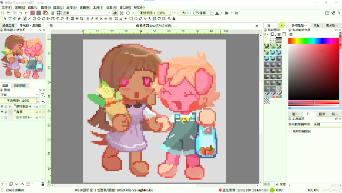
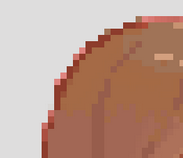
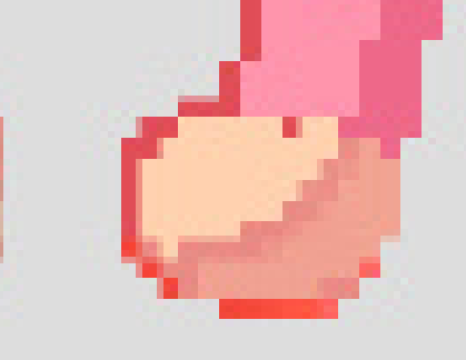
This is a pixel art piece I started painting last year but never finished. Recently, I wanted to complete it, but I’ve forgotten the workflow I used for pixel art back then. I tried making changes, but it turned out terribly, and I wanted to revert to how it looked last year when I left it. Unfortunately, I messed up, so now it looks like the second version :sweat_smile:

So I wanted to ask: Are there any settings or techniques to make drawing pixel art more convenient in Krita?
Usually, when searching for pixel art-related advice, people tell you to use dedicated pixel art software. But I just want to dabble occasionally and don’t want to buy loads of software that’ll just sit in my library like my Steam games! I’ve been using Krita for several years and am very accustomed to creating in it! (By the way, I really hope Krita updates with a better, more user-friendly text tool soon!)
I noticed someone in the community released a pixel art bundle (the paid one), and I’m quite tempted. If anyone has tried it, please let me know your thoughts!

Thanks for reading this far!
————————————————————

你好!这是我第一次在Krita论坛发帖,英语使用了机器翻译,如果有什么不对的地方不好意思。
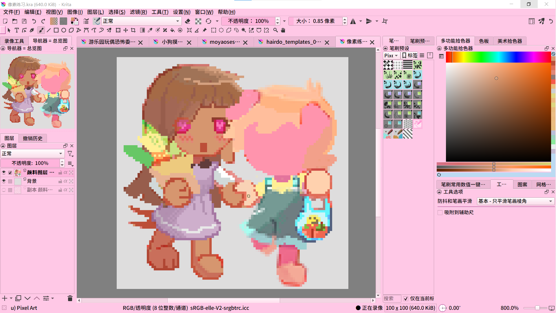
这是我在去年绘画的像素画,没有完成。最近我想把它完成,但是忘记了去年是怎么绘制像素画的流程。我修改过后感觉很糟糕,想回到去年完成的样子,但是搞错了所以现在它是第二张的样子😅

所以我想询问:有没有什么设置或者技巧能更方便在Krita中绘制像素画?
通常搜索像素画相关,都会有人告诉你用专门的像素软件去绘画去创作,但我只是想偶尔体验一下,并不想多购入很多软件让它像我的steam游戏库一样只是放置。我使用了Krita好几年,已经习惯了在Krita中作画!(顺带一提,希望Krita能尽快更新好用便捷的文字工具)
我注意到社区里有人发布了像素画套装(付费的那个),我很心动,如果有人体验过麻烦请告诉我你的体验?

感谢你阅读到此!

7 Likes

Missing image:

3 Likes

:slight_smile: Hello @mimizizi, and welcome to the forum!

If you have made a change to your image that you don’t like, and you haven’t closed Krita since making that change/edit, you may be able to restore the original state using the undo function. The default setting is 200 possible undo steps, but you may have set even more and could go back even further. To make it easy to jump back through these steps, Krita has the Undo History Docker. Since you have already customized your Krita, you will know that the Dockers can be selected via Settings → Docker.

Regarding the “SZK Pixel Art Suite” plugin by @Suzuka, I think it’s worth every penny, especially for someone who wants to create pixel art more often, or even mainly/exclusively. Maybe take a look at the user manual to get a better idea of what it’s all about?

Link to the manual:

In any case, I really like this plugin, even though I don’t do much with pixel art, I use it for icons.

Michelist

3 Likes

Thank you so much!!

1 Like

Thanks for using my brushes :heart: Nice pixel art btw! :star_struck:

1 Like

Thank you for your brush and praise!:smiling_face_with_three_hearts:

1 Like

You are doing lots of good things and I think it is already a very solid pixel art piece!

In my opinion, you could improve a few little things that would make it even better. Again, this is just my opinion, but in case it is useful to you:

  • There are some outlines with doubles that could be cleaner:

You can make them look cleaner by avoiding doubles and adding antialiasing in certain points. The pixel perfect brush is one of the things my Pixel Art plugin adds for making cleaner pixel art strokes. Even though you can always refine the strokes by deleting manually all the doubles, despite it is tedious.

But, not all doubles are wrong. Here in the dress for example in my opinion they are ok because they imply a thicker line, like it was some decoration of the dress, or even a harder difference between 2 different parts (like in this case, the dress and the legs):

  • Avoid very similar tones in a similar area. It creates some kind of “banding” and a less polished look.

Here in the hair for example, there are like 3 or 4 different colours for the base hair color that are very similar and doesn’t add very much but some kind of noise.

(I totally get their differences, the tone on the bottom is a bit darker, for the shadows. The one on the right near the face is brighter, and they are placed very well, with intention). But since they are so similar it creates some blurry effect, like if it was some kind of compression artifact of the image.

You can fix it by choosing more distinct colors. Also, at the end Pixel Art aesthetic comes from limitations. It would be rare for a pixel palette to have so many tones that similar (even if you don’t use a palette (which is totally ok), usually having so many similar colors looks off).

In the case of the hair, it will also help more to convey the depth of the head. And in case you don’t want that, you could simply group all those tones into the same color.

(Even though, what I would personally do in that case is simply adding a darker tone for the bottom of the hair, for the shadow. The bright tone near the face could be done with the base hair color. Since it would be next to a darker tone, it would look naturally brighter).

These are my 2 cents. But again, you already did lots of good things and is a solid piece! :flexed_biceps:

PS: Thanks by the way @Michelist for the kind words! You are the best! :smiley:

3 Likes

Hello Suzuka! Thank you for your detailed suggestions! This has been very helpful for my pixel art learning! When I have time, I will improve my artwork according to your suggestions!
The perfect pixel feature in your pixel plugin really appeals to me! :star_struck: I ’ve also checked out the detailed introduction of your pixel plugin, and I must say it’s extremely thorough! Thank you for creating it!

1 Like

Thanks to you for your kind words :four_leaf_clover:. And keep it up with your pixel art, because it already looks awesome! Hope to see more art from you :flexed_biceps:

1 Like