I’m new to Krita (and to graphic design and digital drawing in general), and I’m trying to create a design for a t-shirt around a picture I’ve taken.
I want to add some words in it, and at first, I used one of the default gothic-style fonts (as I thought they thematically matched my design, even if it is in a very cliché way), but the fonts just don’t cut it for me: they are too crispy and well-aligned, in comparison to the grainy, irregular picture I’m using.
So I was thinking I could use a different font, apply to it some grain effect (or even I could play around with some sort of dithering effect) and create single-letter text boxes to vary the height and match the irregular fom of the picture. The thing is that I tried converting the text vector layers into paint layers so that I can, in turn, add filter masks to them; but I don’t see the filter effects taking place .
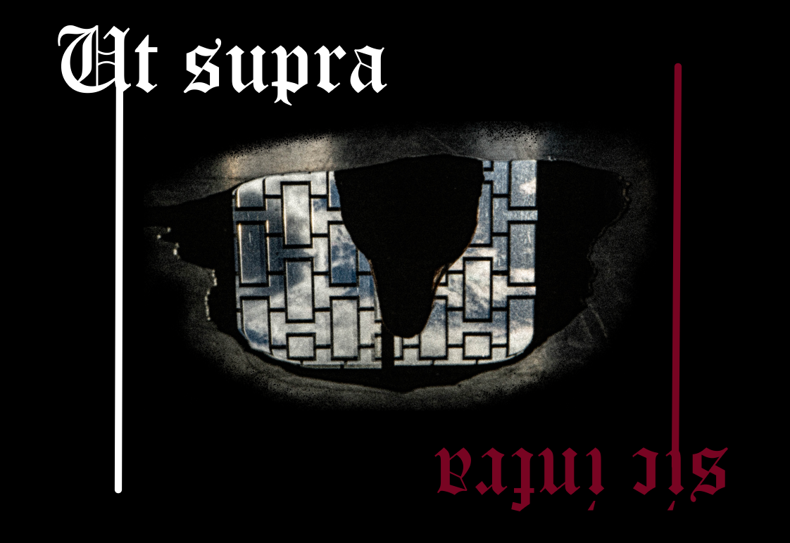
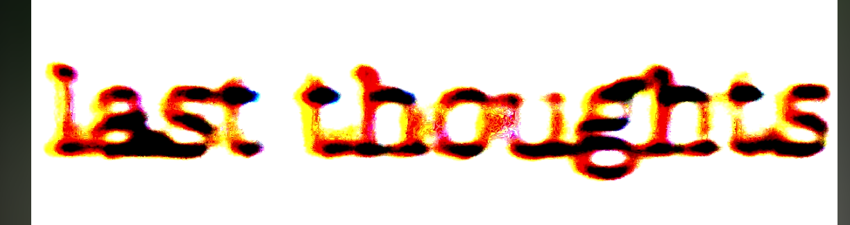
I’m clearly doing something (or many things) wrong, so I would definitely appreciate some guidance on how to achieve this. Below I attached a screenshot of the canvas (don’t mind the red and white lines going up and down, I was just experimenting when I took the screenshot) and one of a font effect I’d like to achieve.
I don’t know if anyone will read this and/or be able and willing to help me, but I thank you all in advance for your attention and help .
Filter masks and filter layers will work with vector layers because they operate on the raster projection of the vector object.
That has the advantage that you can select individual letters (with the Contiguous Selection Tool, sometimes known as the Magic Wand) and then move them around.
You won’t be able to edit the text because it’s then a picture, not vector text.
Filter Masks and Filter Layers will work on paint layers of course.
Please upload a full screen screenshot showing all the contents of the layers docker.
Note: You can select the text characters, on a paint layer, by right-click → Select Opaque (Replace) in the layers docker, then paint over them with a ‘grungy’ brush for a distressed effect.
You can do that in a new paint layer above them if you prefer.
Then deselect from the main menu with Select → Deselect to carry on as normal.
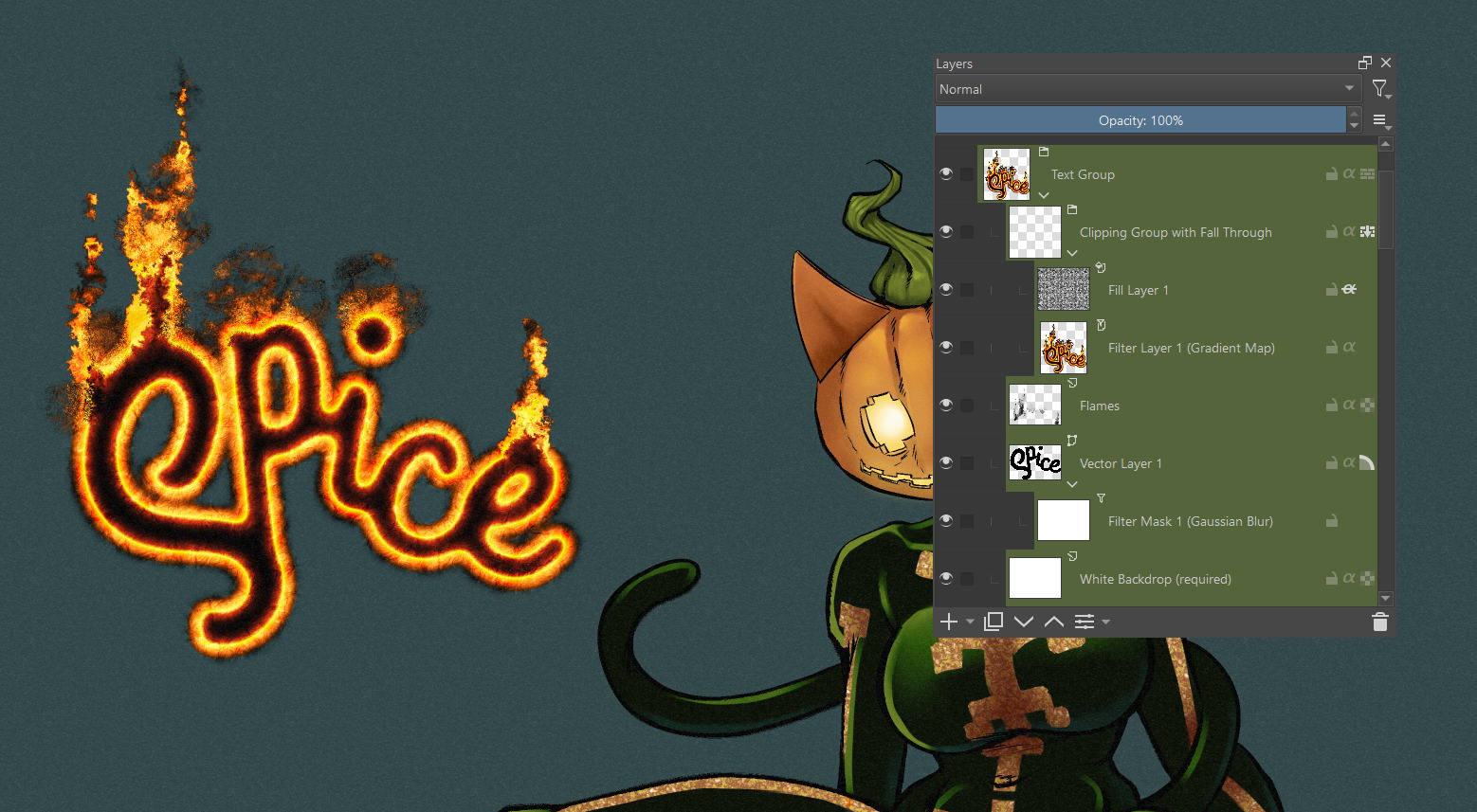
You should be able to approach the effect, with some tweaking. In the attached example, my text remains a vector layer (so the filters are applied in a non-destructive way, allowing for editing).
If you do a search for “free fonts” then you’ll get many websites that specialise in providing fonts that are free for personal use.
In the websites, there is usually a search box so you can do a search for ‘grunge’, ‘distressed’, ‘worn’, etc.
Here are just a few search results from one particular website:
There are thousands of different fonts available for download on the internet.
You install them at the system level in your operating system and then they’ll be available for use by any application when it is started.
Some fancy fonts can be too ‘extreme’ in their design and can get cut off at the bottom or top.
Some are limited in that they don’t provide bold, italic, condensed, upper case, lower case, etc variants.
You just have to try them to see if they are useful for you.
Here are two I tried (because it’s a long time since I did this sort of thing):