My god the layer visibility icon is so ugly 

How about something borrowed from C&C
/AkiR
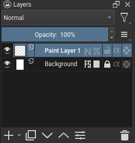
Maybe something like this?

Advantages:
- no added colors
- no need to parse numbers, you see the amount instantly (does it matter is it’s 93 or 97% of opacity?) - at least for me, the important information to look for would be “is this layer 100% opaque or not?” (if the slider is there, it means it’s not) and “how opaque the layer is?” (super transparent, mostly transparent, nearly fully opaque etc. - for that I don’t really need precise numbers all the time I look at the Layers docker; I might want to look at them if I want to set up another layer exactly the same way, maybe, but only in specific situations) - for that, for me at least, looking at a half-filled, nearly-fully-filled or just-slightly-filled bar gives me that information much faster.
- only shows for layers with settings that differ from the standard 100% opacity, Normal blending mode, avoiding clutter
- small icon, doesn’t take up much space
- you can still read layer names easily since they’re not interlined with blending modes
- even if you don’t know what the letter means, you know that it means the blending mode is different from the Normal, so you can select that layer and see what it is (a similar approach is used for layer styles)
- doesn’t obstruct other options
Note: I wouldn’t mind if someone came up with some nice idea to replace the “first letter of the blending mode” with some icon. It might give less information but would be more international-friendly.
Not bad but I think it does fight for attention with the visibility icon.
The blending mode under the layer icon wouldn’t work for groups. Otherwise it would be quite nice.
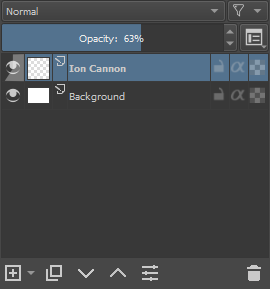
For the numbers above the visibility icon, I don’t really like it, though I see what the idea was (I mean 0% of opacity = invisible layer, after all).
I kind of built upon your idea, though I must say I came up with mine on my own, and later saw tat you had something similar in mind. Great minds think alike  Even the original placement I thought about was under the layer name.
But I must admit I’m not a fan of color bubbles because 1) Krita is mostly greyish because it lets your eyes see colors better; I don’t think bright colors for bubbles fit the rest of Krita, even if we ignore that effect; and 2) might be my display settings, but I have a hard time reading the text in the bubble, especially on the bright green (red is much better).
The bright blue bar showing the opacity is a very nice idea, but besides of what @raghukamath said, I think it should be muted as well because otherwise you’d have a whole Layers docker with bright blue bars (since usually layers have 100% opacity). Maybe it could be blue showing the transparency part instead?
3 Likes
right… the groups, but it isn’t impossible to fit it there if the arrow is slightly adjusted. Just would be limited to 1 character
from googletranslate:
I have to say, I didn’t like to use letters. But the difference in length is very uncomfortable.
Indentation is also a big issue. Take Chinese translation as an example, you will find mixed patterns of this length
Because of historical issues, these words have been translated into different meanings. (Although we don’t know why we need to translate that way) Then all kinds of software are still in use today. In order to facilitate cognition, use the equal sign to connect. In places with limited space, such a length can be a nightmare.
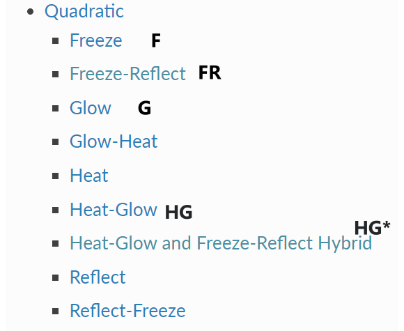
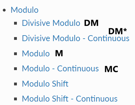
Well, even without discussing language issues. krita also has an ultra-long blending mode such as “Heat-Glow and Freeze-Reflect Hybrid”
I think the color should be related to the theme. @Zoldyako did a lot of colored themes
One letter may not be enough: Freeze、 Freeze-Reflect、 Reflect、 Reflect-Freeze、 Heat-Glow and Freeze-Reflect Hybrid
How do you distribute f and r here?
1 Like
I guess it would just hint to a blending mode, not describe it precisely. How often do you use not only several different blending modes, but even more, those starting with the same letter?
I think the most common are Multiply, Overlay, Linear Dodge, Color Dodge, stuff like that.
With all default Krita themes, you onle get one color that isn’t grey (the “highlight” color). Even the layers and frames colors are coded separately somehow, I think.
1 Like
You use the most common ones for single letters, and the rest you can resort to unicode letters. Because as mentioned, these are quick hints for your own project, any symbol or unique letter would do. This is why even translations aren’t really necessary cause its an icon. It’s like the T represents text icon. No one translates that.
So you have F, f , 𝑓, Ƒ , ꞙ, 𝕗, 𝒻, 𝐟, ℱ, 𝔽, ℱ, Ḟ, ᵮ, and etc. Though to be fair, not all of them are fully usable but I am sure there are plenty of options. The goal is again, for them to be recognizable enough, if you need the exact name, it is but 1 click away.
These are the ones I commonly use. I think it’s better to use at least two letters for them. Also the rare blending modes can be better expressed.
Wait a minute, I later found out that the inside color is the same as the outside. This is a redundant suggestion …
Well, it’s just that I personally prefer the two-letter expression. There is also enough space on top of @tiar’s scheme. If others prefer unicode letters, I can live with that
1 Like
I think procreate vibe is a better path to follow here.
why not format this type of information to look similar to icons so they sit next to the transparency lock, alpha inheritance and so on. I did this mock up quickly don’t mind the fonts they are hand drawn.
square for 100% and the rest goes by with a set of 2 numbers or letters (blending mode would hold the intials of that blending mode).
these options above I think will create so much noise that people will want to revert back:
- floating bars next to the icons with bright colors is bad. this breaks the hierarchy scheme of the layers.
- a second line of text is explicit and to the point but will make reading harder if you have more than a couple of layers. the text would have to be more grey to not be as important as I said before but still would not be enough I think.
2 Likes
IMO, the extent to which this crowds out the layer name from the side (and will force abbreviations very quickly), coupled with the group of 5 (!) icons, looks way more visually cluttered and difficult to parse at a glance, especially for a new user, than a simple second row of text does. I’ve extensively used the aforementioned programs that employ this subdued second line, and difficulty parsing layer names is not something that has even crossed my mind, ever, even when I was brand new to using them. SAI 2 even uses 3 lines of text, and that was never an issue for clarity, either!
It seems to me a lot of this ideation is preemptive solving of a problem that doesn’t even exist, and causing other potential problems in the process (namely unsightly horizontal clutter that eats layer name space, just to avoid vertical clutter, that if text is adjusted properly, doesn’t even use any more space). If others here have had difficulty identifying layer names when using programs such as CSP and SAI, then I guess it’s a personal thing, and I apologize if I overstepped with my accusations of reinventing the wheel. The main thing is that, IMO, horizontal space is more precious than vertical space in the layer docker, especially once indentations from groups are added into the mix. Too many horizontal elements, and there’s quickly no room left for the actual layer names 
A lot of these mockups look great though! And I think the best suggestion so far has been to just leave the info out at default values, which is something that would also work well to reduce clutter of having a second line; unless the opacity/blending mode are different from 100%/Normal, the layers would look exactly as they do now, and layers displaying the added info would be much rarer.
Thanks to all for the discussion!
2 Likes
Since I’ve just gone to the trouble of counting them, I thought I might as well share; There are currently 130 different layer types available in Krita! 
2 Likes
I think I would prefer to have the initial of the name or at least shortened name. The initial and the second letter next to each initial. Maybe something different for Binary Mode since they’re essentially a very different blending mode useful for abstract art when using colored gradient? X letter for Binary, and initial+2nd letter of the name for every other modes.
You mean blending modes; layer types are like “Paint Layer”, “File Layer”, “Clone Layer”, “Fill Layer”, “Group Layer”, “Vector Layer” and “Filter Layer” (not that it’s a small amount :P).
1 Like
Yes! 
(And I even nearly corrected it for specificity before I posted!) 
1 Like
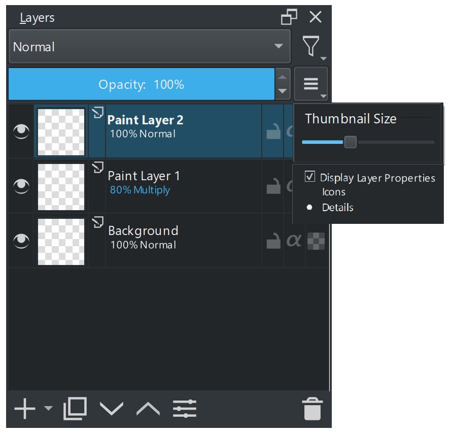
I made another mockup. I was thinking there could be a option to choose between a “icon mode” that displays a small condensed version of the opacity and blend mode information like from @tiar 's mockup. I think it should just take up to two initials if the blend mode has two words or more.

My ideas on how blend names can be indented into initials
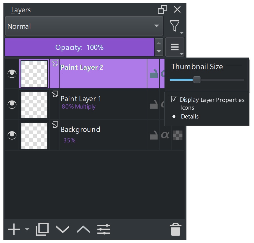
Or a “details mode” that shows the text of the opacity percentage and blend mode but uses two lines. I was thinking that when the opacity or blend mode changes the bottom text can change color to whatever color Krita’s set theme is using like @TheTwo said. If the layer is highlighted the text turns white
14 Likes
I like the details mode. Although this would restrict going compact like we do with smaller thumbnail and single line for layer name. It is a good compromise and I also like the colour differentiation. 
3 Likes
I also like the details mode
1 Like
The second line in the dark blue looks nice
Details mode is * chef’s kiss * 
I think I could live with that… 
I think full labels are needed rather than abbreviations due to the wealth of options available, and if the extra detail is optional, then it’s up the user if the extra clutter is worth it.
1 Like