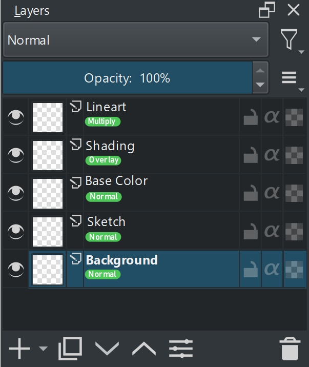
The convenience of seeing the opacity and blending mode of each layer at a glance is something I miss when using Krita (this is especially felt in workflows with many layers, where naming them becomes inconvenient). I understand the added information could be considered clutter and not to everyone’s taste however, as in order to accommodate the added information, it requires layers to display as slightly taller or layer names to be abbreviated sooner, and so keeping it a layer UI option would probably be best.
Looking at Krita 5 previews, the layers are actually already tall enough to accommodate the information I’m suggesting; all that needs to be done is to slide the layer name slightly upwards, rather than centered, and then add a second line right beneath it for the layer info (e.g. Normal, 100%).
Anyways, I know this is a small thing (as was my other feature request for horizontal zoom scrubbing), but small things can go a long way in the overall experience when they’re used constantly. I’d hope that being small things, they’d also be easier to implement.
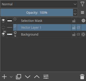
For reference, Agitato probably wants something similar to the following mockup:
(difference in rendering of the text is not intentional)
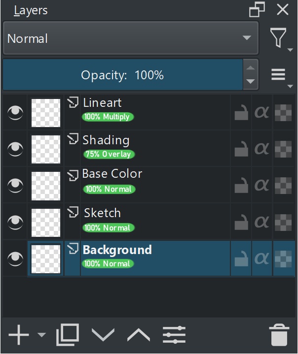
The opacity is displayed before the blending mode, as doing otherwise could lead to the opacity getting cut off when using groups/longer-named blending modes/wider fonts.
On an added note, some spacing on the sides could be removed for the above reason:
This gets pretty close to how for example CSP does it, however they display the opacity + blending mode above the layer name instead of below the layer name.
I agree that something like this would be nice to have.
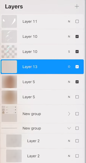
I actually like that Krita doesn’t have that clutter in the Layers docker. The double-lines make it much less clean in my opinion. Maybe we could figure out a way out of this issue without having two lines of text? Maybe we could have another icon or something.
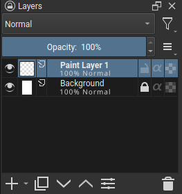
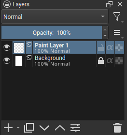
Comparison:
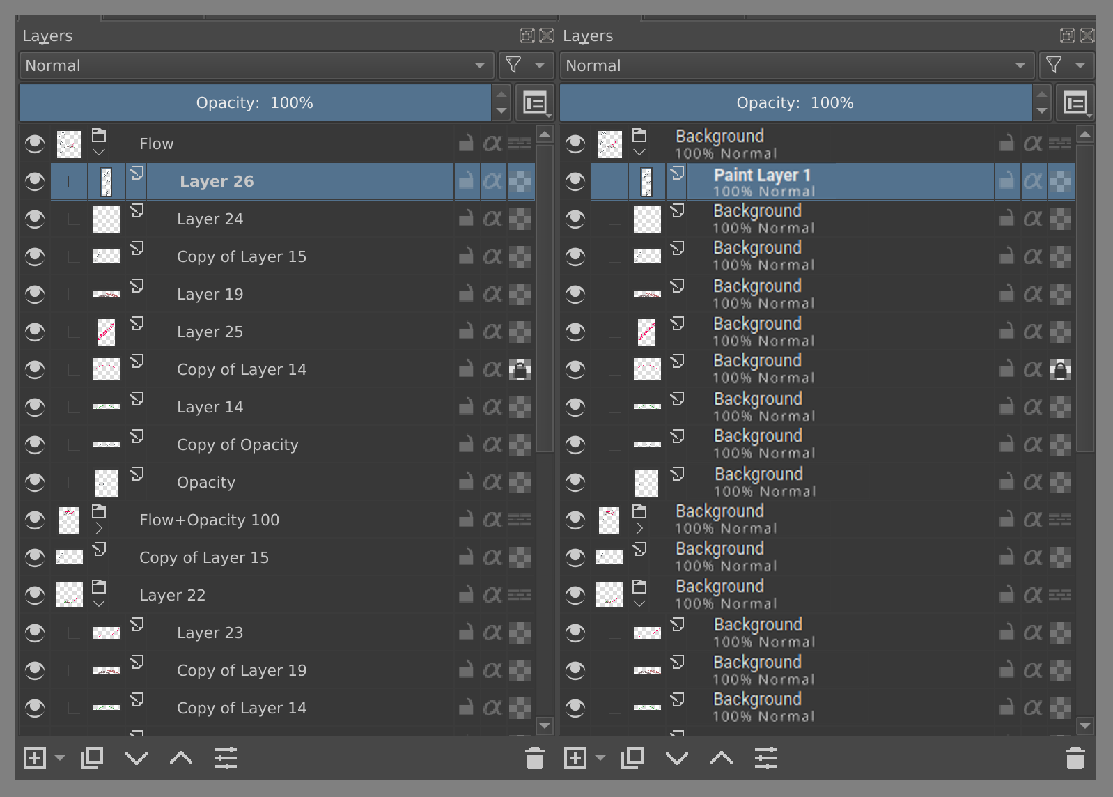
For me the one on the right is just way less readable.
So for me it would be a step back, actually. If we have a problem, let’s try to focus on the problem and figure out how to solve it on our own, instead of taking the one solution that exists already.
Our own solution proposal
a) copy working solution
b) make it toggleable in options
c) blending more shown when different than default
d) percentage shown when different than default
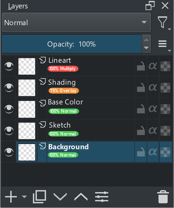
As @ZigiZen said one solution is to have percentage and blending mode shown when it is different than the default, but it could still lead to visual clutter when there are more subsequent layers with non default values for blending mode and opacity.
- I think we can also have a visual indicator may be a dot to show that the layer has different blending mode and then user can hover over it to get detailed information through the thumbnail popup anyway.
- Or we need to increase the minimum height of the single layer row to accommodate the text with enough padding. This type of arrangement is common with Paint Tool SAI and Clipstudio may be we can see how they solve this.
The thumbnail popup is very useful for that information, if you want it, but I find it intrusive and annoying most of the time when I’m renaming or manipulating layers. I know it can be turned off in the settings.
Would it be possible to have it appear only when the cursor is hovering over the small thumbnail icon at the left of the layer, that would seem appropriate for a ‘thumbnail popup’.
May be this can be a ( i ) info icon. I am just giving random ideas. Hovering the thumbnail to get the popup is also good idea
Between the layer type icon and the first letter of the layer name, there’s a lot of space so maybe an (i) icon could be put there.
Then hovering over that icon or anywhere to the left of it would bring up the thumbnail popup, but not hovering anywhere to the right of it.
I remember there was a thread about it long time ago. I’ll link it here (just to give you some more ideas, please don’t resurrect this particular thread)
I also think that two lines of text feel clamped once you have many layers, and you pick a narrowest node display size. So maybe it could appear only once you reach a tall enough size, so that there is enough space for them not to feel so clamped?
Yes I remembered this thread  but forgot to link it thanks.
I don’t think it would be cramped if info would appear only on changed layers, at least in my workflow 90% layers are default.
Is this not a design layout issue?
If I get the problem is the fact there are two lines of text and both have the same importance on contrast.
Maybe lowering the importance of the second line by making it a dark gray but not as dark as the background. That way the line above would be read first still.
I would probably first try to make the second line color a linear RGB interpolation between the text Color and the background by 50 or 30 percent.
But its settings are not friendly to users of other languages. If you don’t say, I don’t even know it…
Yes it depends on english, The text can be translated, but I wonder it would mean anything when translated.
For me at least, hovering defeats the purpose of the request I was making in the first place, which was to be able to distinguish unnamed layers with different opacities and blend modes (and thus different functions) at a glance. Hovering is very close to just clicking the layer to check, which is already how it is (and hovering is arguably even more inhibiting since you have to hover long enough to get the popup).
I mentioned in my original post that many would probably find the added info to be noisy/clutter, which was why I suggested it be a toggleable option, so that those who are more used to the minimal layer UI (Krita as it is now, Photoshop) could leave it off, and those who are more used to other programs that show this info (Procreate, Clip Studio Paint, Paint Tool Sai) won’t miss it when using Krita.
@tom’s mockup is pretty much exactly what I meant, and I agree with others that it does feel better when the layer node size is taller, but personally for me, as long as the layer divisions are clear and the layer name text is bolder/with more contrast than the layer info, readability is fine.
Alternatively, another box on the right side with a blending mode abbreviation (similar to Procreate), and a simple opacity percentage following the layer name, or under it as in tom’s mockup, could be a good in-between solution perhaps?
I created some mockups of my ideas of how this could look like. I think putting the blend mode information in a color bubble makes it easier to read. I think it would be best to have it optional to display the blend mode and/or opacity on the layer and have it off by default.
With the opacity and blend mode information in the bottom
A random color can be assigned to each blend mode to differentiate the bubbles easier
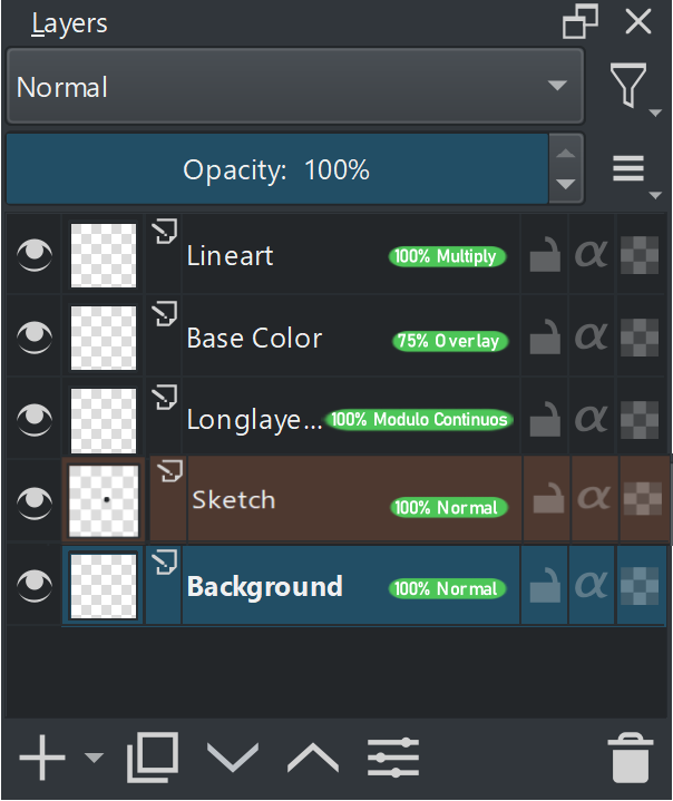
The blend mode and opacity information is in the right side with no double spacing. If the blend mode name is too long, the layer name will be cut short. A lot of blend modes in Krita have very long names ![]()
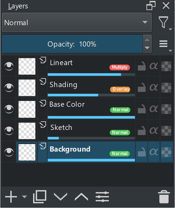
The blend mode info is in the right side. The opacity percentage is represented visually by blue lines at the bottom of the layer. The less the line is blue, the less opacity there is.
Thank you for making the mockup. I do have some critique for them. These are just my opinion.
I would prefer Layermockup1_2 but without the green highlight, I personally find colours in the surrounding UI to be distraction, colours can be there but muted. would not have highlight. If we remove the bubble it won’t take away the function so the bubble is extra element which is not required.
As for the opacity in a bar at the bottom, we already use the bar to show progress of filters and masks etc. so it would clash with that.
The issue with the bar isn’t even that it is used for progress. It isn’t a problem if the opacity isn’t shown while progress is running. The bigger issue in my opinion is that it wastes a lot of space to show pretty much nothing unless you can count pixels at glance.
Overall, I think the best way to go about it is not showing 100%. That is a given, and now you only need 2 characters instead of 3 as well, Thus 99 would be max. And using a single character to represent the blend mode is fine too. Maybe 2 can fit.
I am thinking maybe something like this?