Unifying this across platforms absolutely makes sense - I just hope that on Win10, separate windows aren’t used due to some major, hard to fix problems with the system.
I think I’ve mentioned this before, but the whole docker system is not something we krita developers have coded. It comes with Qt, and is one of the less well-maintained parts of Qt. But implementing a cross-platform docking system is very hard: we had already gone through three implementations of our own before Qt got its own system. It is very unlikely that using windows with a real os-level titlebar isn’t something that was necessary on Windows (and OSX).
It is possible to mess with specifically the titlebars, and we used to do that, but that presented us with several bugs:
We also tried to set a proxy style on the dock widget titlebars, but that gave other problems: if there’s a proxy style set for the titlebar widgets, the dockers become part of the central widget, and get the central widget’s cursor changes. And that breaks the layerbox; the cursor follows the canvas cursor,
I’m not saying it isn’t a good idea to figure out how the dockers could be better, but be aware that it is a real can of worms once you do something that’s not default in Qt.
Small update, to my previous post, the plugin repo was changed (I prefer GitHub), so here’s the new version. It already includes @Kapyia’s work on removing the “dang white line”
Also FYI, the new style switcher was just merged, so you could play around with that to see how much better/worse it makes things. The change will be on the downloads page under the “Krita Next” link the next time that nightly build run.
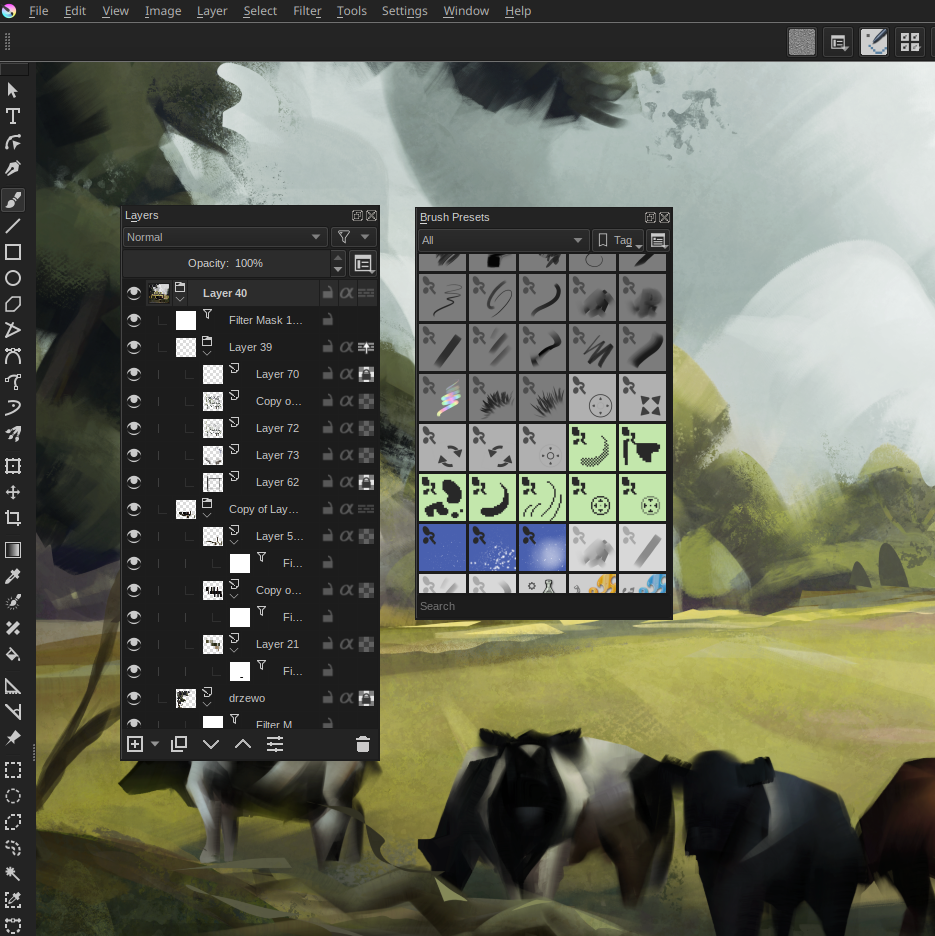
I normally didn’t undock the toolbar either, but when I started applying style sheets to it I realized that it doesn’t have the same title bar as the other dockers. It allowed me to give it a neat transparent design that I’ve been using for the past week or so. I have yet so see if I can lock it to the side of the canvas however…
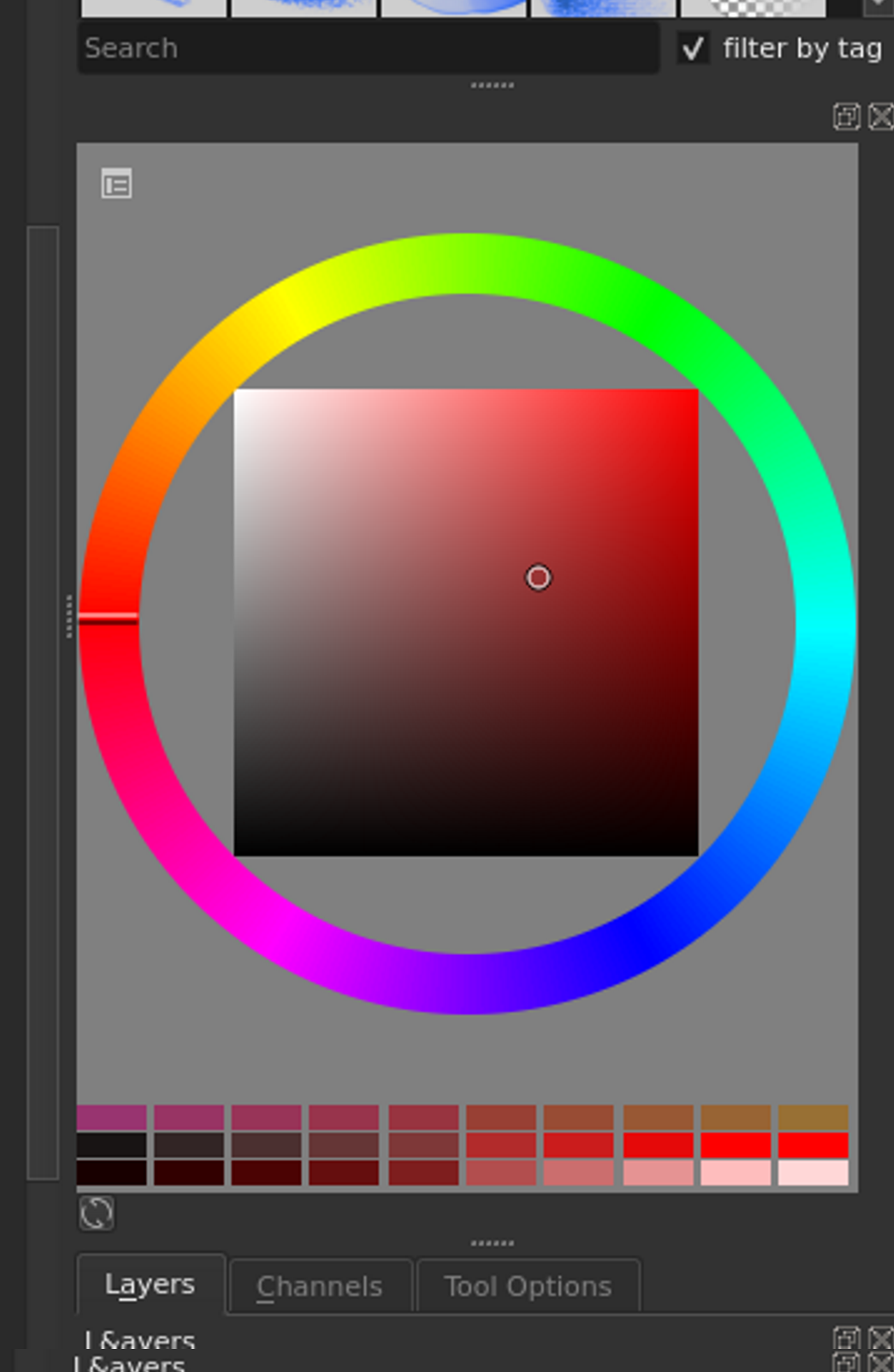
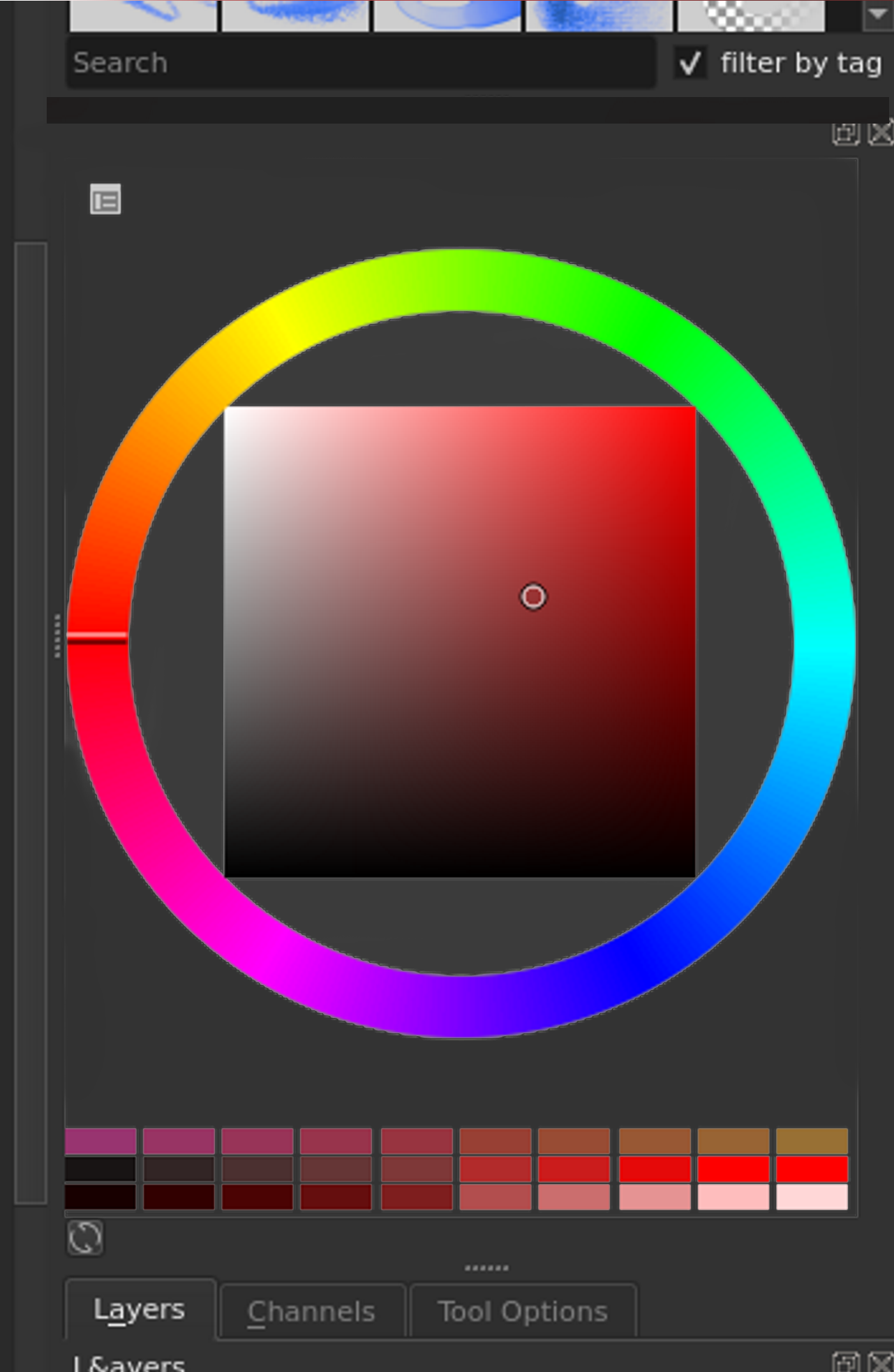
A question, I personally find the grey on the advanced color selector a bit too “aggressive”. Despite understanding to create a more readable square, I did this small mockup, what do you guys think? Never mind the label not appearing, that was me testing out things
Maybe just use a color of canvas background? This would allow people to have both dark and light themes.
(I guess now it’s just one unchangeable color? I don’t use this docker myself too often)
Yeah, I’m trying to first change the color from the style sheets, but the ideal would be background be the color theme. That way it would appear more consistent with the overall UI, but that’s just my opinion.
I actually made some mock-ups for this a couple of years back, and I think the response was that the current background (50% Grey) is there to help show the color wheel against the most neutral background possible.
Furthermore, I don’t think it can be customized with CSS since it’s not inherently part of the Qt framework (much like the canvas itself). This is something that need to be opened up for customization in the C++ source code.
Yup, just noticed it too… One suggestion would be to add a grey border to preserve relative values, while still increasing consistency in terms of colours, maybe. However, this reduces the amount of useful area. Ideally we could add a new theming or settings docker where we would be able to give this control to the user, I believe.
Edit: Or better yet, let it be an option in the Advanced Color Settings Docker preferences. What do you guys think?
I personally wouldn’t mind a way to configure the background of the widget
Aside from the current option of 50% grey it would be nice to have an option to make the background color of the wheel the average color of the current artwork, black, white, and the background color of the UI. Or maybe it’s just easier to let the user choose the color freely
I would love to make it darker to fit more with my theme! I totally understand why it is a 50% gray though, nice for very careful colour picking!
Having it as an option as you said, I think would be best! In my opinion: the more I can tweak Krita to my liking the better!
I’m seeing what parts of the Krita code are responsible for this, and when I do, I’ll see what I can do. It’s a lot of sniffing around to do, so I don’t expect to have this done today, maybe not tomorrow, but I’ll still look into it!


 .
.
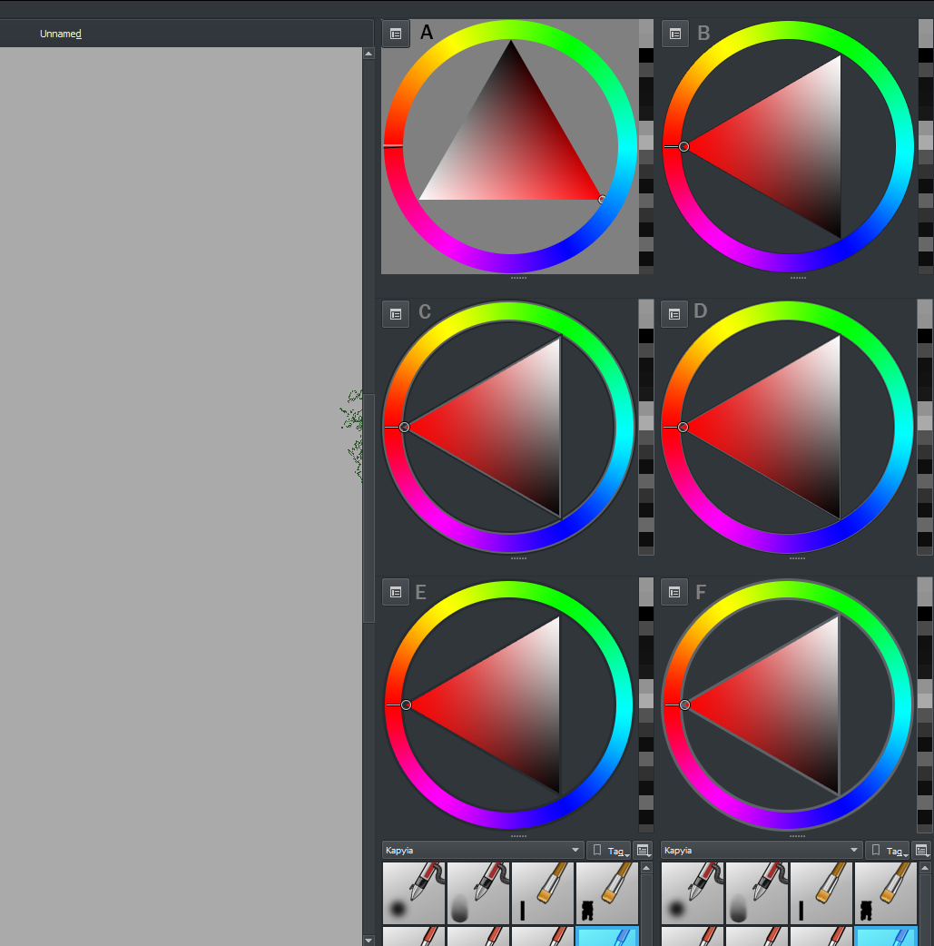
 Might be something to take in mind, I’ll write it down in the Google Docs.

