Maybe the best is to make a compilation of user workflows regarding assistants and then draw conclusions from that as a whole than coming up with hypothetical ux, I don’t know.
1 Like
Or add to the pros and cons list which workflows would be supported by which option. I’ve made a quick start, feel free to copy paste and expand the list then.
Example workflows:
- Bundle a set of assistants as a preset to allow re-use.
- Linking assistants across multiple layers > adjustments to the assistant are propagated to all the layers they are applied to
- Transforming assistants along with layers > e.g. use assistants to create a hand-drawn layout for comics (don’t know if people would use this)
- Associate a set of assistants to artboards/ frames > you can modify the artboard/ frame and all assistants applied to the frame will adjust accordingly. Think of it as a way to specify the bounds of the perspective grid or rulers and the extent to which they can be snapped to. If people use multiple assistants, it is easier to specify the extents once, instead of for individual assistants.
UI concerns
- Ease of access to a particular assistant > where it is placed in the UI determines how many clicks one needs to modify/ enable/ disable/ show/ hide an assistant. This should be as low as possible.
- Screen space consumption > either as new docker that could be collapsed or as integral part to the layer tree (or maybe both?) A larger screen space consumption in a docker might be offset by the fact that the docker can be hidden or that it could become a pop-up, so that it is only temporarily visible.
- Display whether or not an assistant is associated to a layer > there should be differentiation in the way this is displayed if workflow #1 & #2 are supported. This is vital in order to understand which layers are affected by adjustments to the assistants.
- If workflow #4 is supported, local assistants would be associated to a frame or artboard instead of layers, as a result, the artboard or frame may need to be shown as parent of the layer in the layers panel. Any assistant docker would have to show to which artboards/ frames it is applied.
- When managing assistants in an assistant docker, the assistants are not located alongside the layers they are applied to (if they are local assistants). In that case, it helps if you can click on a button in the docker which outlines the layers to which the assistant is applied.
1 Like
I prefer Assistant Masks out of the current suggestions, it’s the most useful and obvious way for current Krita users to organize assistants, but I think they have some superfluous features that aren’t terribly useful or annoying to think about especially for brand-new users:
- Is it supposed to matter if Assistant Mask 1 is above/below Assistant Mask 2?
- Will anyone actually bother naming their assistant mask something that isn’t “Assistant Mask N”?
- There will be much annoyance caused by warnings that appear when users try to use the Freehand Brush Tool whilst the active layer is an Assistant Mask
My humble suggestion, similar to Assistant Masks: Local Assistant Property
Local Assistant Property
Local Assistants are stored as a property of layers/groups and displayed in the Layers docker as an icon, similar to Layer Styles. Takes up no vertical space in the Layers docker, and is less for the user to think about when glancing at the Layers docker.
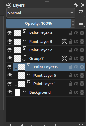
It’s way less flexible than assistant masks, but IMO more ergonomic and still broadly useful for the people who need better ways to organize assistants.
-
“Global” Assistants are actually just Local Assistants attached to the hidden root node of every Krita document.
-
Local Assistants have to be intentionally toggled on on a per layer/group basis:
- Checkbox in layer’s right-click menu or Properties dialog
- Action / shortcut that operates on selected layer(s) and flips their Local Assistants toggle
-
Only display the active layer’s assistants on canvas if it has Local Assistants property toggled on
- Else, display parent layer’s assistants if it has Local Assistants toggled on
- Keep checking parent layers until one is found to have Local Assistants toggled on
- Stop at root node because it has always-on Local Assistant property
@Hologram suggestion:
-
Drag/drop a layer’s Local Assistants icon to move assistants between layers
- Drag/drop onto destination layer’s Local Assistants icon = Overwrite destination layer’s assistants
- Drag/drop onto anywhere else on the destination layer = Add to destination layer’s assistants
- Modifier held = Copy from source layer
1 Like
Well, maybe if I have just one assistant on the mask, I would rename it to the type of assistant on the mask (e.g. ellipse, 2-pt, etc.).
Affinity solves this by automatically adding a layer on top of a non-paintable layer (e.g. when using a pixelbrush on a vector layer). It shows a pop-up when it does create a layer.
Alternatively, painting on an assistant mask would actually paint on the layer it is associated with.
@NabilMaghfurUsman how would you propose to duplicate local assistants? Would you be able to drag and drop one by click dragging the icon (a bit like appearances for layers in Illustrator)? And duplicate by holding a modifier? Or maybe duplicate by default if a layer has none? In the latter case it would prompt to override an assistant if a layer already contains one.
I do like the idea. At least I wouldn’t want an assistant mask look like any regular mask, so it might already need to be a lighter/ darker shade of grey.
I believe masks are always attached to a paint layer or group layer. So both of these will not work if a mask is attached to a group layer.
Yeah I was going to write this exact mechanism in my proposal but I’m not sure how to handle the case where the destination layer already has its own Local Assistants. Prompting the user first is the safest, but I think a better way might be:
- Drag/drop onto destination layer’s Local Assistants icon = Overwrite destination layer’s assistants
- Drag/drop onto anywhere else on the destination layer = Add to destination layer’s assistants
- Modifier held = Copied from source layer
That’s also a viable option for local assistant interaction.
For Group layer assistants, you could create a new layer automatically at the top of the group, no?
I know I am late but I just read it and as per ussual I think differently on some points. But I will go through the points referred above.
Naming scheme: “assistant layer” and will explain why and by consequence this means no dockers for this and instead a layer item.
One of the big things about Krita is modularity and that means in a way good organisation to things. Making the assistants into sub layers make sense but not to what they are connected too. Because once you start to pile up a bunch of assistants and then decide do some filters you will have problem to distinguish them from one another easily. This is a scalability problem.
There should be a new “assistant layer” globally where the local layers of it would be each assistant entry. This would allow the layer to act like a group for all assistants allowing good scalabity and clean organization. This would also scratch out the very bad idea of parent transforms affecting the assistants randomly.
Beyond assistants this would also allow vector layers to have the ability to show their shapes in the same way as they have the same exact problem already.
This would create consistency instead of a sort of placing something somewhere kinda similar that only really work if you have like 1 assistant activeand thus not getting in the way of the rest.
2 Likes
I agree, I am afraid that assistant layers make the code very hard to maintain in the long term, because it is so intertwined with all other aspects related to layers and transforms thereof. A more modular approach, to me seems to be more manageable. Also from a user perspective. Ease of differentiation, ease of access of a stand alone docker, all come to mind in this. I think, it would be simpler to associate an assistant to a layer with an imput field within the assistant’s properties, than to have the assistants behave in a fairly rigid manner for the sake of being consistent with Krita’s layer paradigm.
Concerning naming I would like to have convention so it would be easy to make tutorials or explain the concept to others.
In Krita we have Layers, so we have Layer convention:
- Paint
Layer - Group
Layer - Clone
Layer - XXX
Layer - …
This convention makes easy to talk about them and understand that they share some characteristics.
Maybe we should make new convention for Mask. Masks are called masks because we call them like that in code. (Probably because in the past there was only one mask → transparency mask (?) I dunno).
For user calling everything mask will be confusing, but calling every type of Mask differently in GUI will also make confusion. (And it will be hard for me to explain them to my students :P)
My ideas
Convention Sublayer:
- Transparency Mask
Sublayer - Filter Mask
Sublayer - Colorize
Sublayer - Transform
Sublayer - Local Selection
Sublayer - Assistant
Sublayer
Convention Modifier:
- Transparency Mask
Modifier - Filter Mask
Modifier - Colorize
Modifier - Transform
Modifier - Local Selection
Modifier - Assistant
Modifier
Convention Effect:
- Transparency Mask
Effect - Filter Mask
Effect - Colorize
Effect - Transform
Effect - Local Selection
Effect - Assistant
Effect
Convention Decorator:
- Transparency Mask
Decorator - Filter Mask
Decorator - Colorize
Decorator - Transform
Decorator - Local Selection
Decorator - Assistant
Decorator
Or maybe something else, any ideas? In my opinion Sublayer will be the best because it ties nicely to Layer convention and is very abstract so will fit any type of Mask, at the same time explaining some characteristics.
So if, then I would want Sublayer.
But actually I am somehow more familiar with the term masking, the mask, and this term fits, at least in German, also linguistically significant quite well. Because if I put one of these layers, which hold effects of different kinds, over one or more “ordinary” painting layers, then it resembles what a mask, behind which one hides the face, for example, does, it gives the “ordinary” person hiding under it a different expression or also other characteristics, respectively to the layers under it, without changing the person or the layers themselves. Should we perhaps use the term mask more consistently and apply it more broadly?
Michelist
I don’t think Sublayer is a good idea…I bet a lot of people will think you’re talking about layers nested in a group.
It’s already hard enough to explain that Filter Layers and Filter Masks are not the same. Filter Layer vs. Filter Sublayer makes it even harder to distinguish.
Whether mask is a good description or not I can’t really say, it probably depends a lot on language. I can only confirm that in German, “Maske” works quite well to describe what most of them do.
But I remember a complaint that “Ebene” is a misleading translation of Layer…
I think I would go with the term “sub-layer” but we don’t need to expose this term in the UI
Currently with the exception of colorize mask and transform mask all other have a grayscale mask attached for example filter mask can be painted on and the effect can be limited just like a mask.
We had transform mask as exception and I think it got complicated when we added colorize as a mask. So as I had initially proposed we can have things as child to the parent layer or group but it is not required to call everything as a mask. The colourise mask can be called as “Colorize” and the guides can be called as guides and assistants as “parallel ruler” or “2 point Perspective assistant” based on the type. This keeps it flexible to add anything new type of layers to the mix.
There is already prior art in how to show multiple things attached to a single layer or element in the tree. Take for example Blender shows things like this in groups
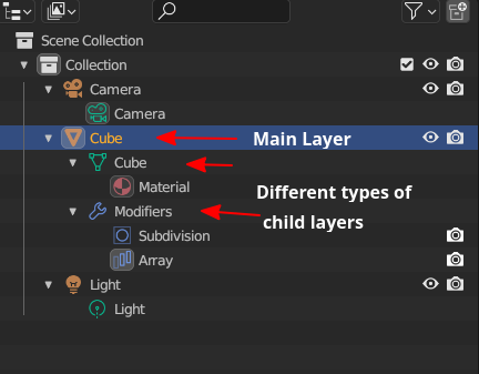
As you can see the “Cube” is the main layer and there are different types of child layer attached to this layer and are shown in group, multiple modifiers are clubbed under modifiers, materials is shown in its own group.
Another example is of photoshop here are some of the screenshots from google showing how it shows child layers to show various effects and adjustment attached to the parent layer, in their own group
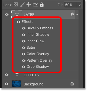
In the above image you can see the Layer in expanded view showing various layer styles (which we have too) Notice it shows the style in in proper stacking order too.
Sublayer is not very good because you can have a sublayer at the same level as a layer. Which makes thing confusing by themselves.
Masks i think are appropriate because it is connected to a black and white image instead of a image with colours like others. Since that black and white image says yes or no to the given effect (transparency and what not) to be applied masking it.
But I do think there should be stuff like sub layers around especially for vector shapes, guides, reference images and assistants so they are not invisible to the layer stack that should act like the outliner of information inside the canvas and not be picky about it. Alot of information is hidden.
@raghukamath
For now, we have two exceptions, if we add Assistants we will have 3 and who knows how many in the future ![]()
Actually, both of the examples from Blender and PS have a name for a group, it’s just shown as a special container instead of postfix in the name. Maybe that’s a solution?
In those screenshots, you can see that Data has its own group, Modifiers its own, and you can have even more of them:
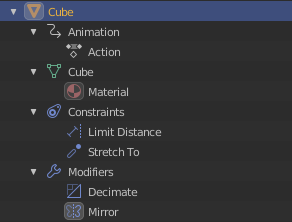
Problem is only how Data is visualized, it’s only distinguishable by green icon.
PS groups it into Effects.
Also, @EyeOdin has a point that because of Masks can be used on the same lvl as other layers when they are attached to Group Layer it becomes confusing…
Maybe Masks should have stronger change in visualization to Layers like special border, size, indent or grouping I dunno. For now Icon’s should be what distinguishes them but they are so tiny ![]()
Oh, and I forgot about moving data to PSD xDDD omg
It’s a complicated problem ![]()
I made a fast mockup for a test. I’m not saying that it should be like this, just made it to see for myself and maybe it will help in discussion.
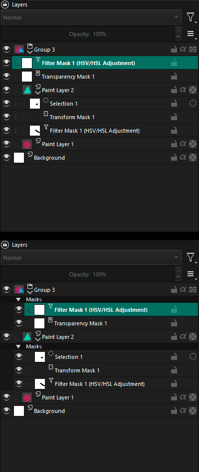
2 Likes
I like your mockup. A suggestion would be to drop the “Filter Mask” and “mask” prefix and suffix since it is already conveyed that these are masks through the section (calling it section and not group to avoid confusion) header.
P.S. Even if the layer is a filter layer I think it should only have the name of the filter that is “HSL Adjustment” and not redundantly state it is filter mask this elongates the name and truncates it. Since we already convey what type of layer it is through the layer type icon, duplicating information doesn’t make sense.
Oh and also keep in mind these filter can be arranged in any order and I don’t know if it affects the composite. For example under this new section system how would it be possible to have a transform mask on top of a filter mask. For example the result will varied in different layering order like transform mask above a gaussian filter mask or below it. This needs to be investigated.
2 Likes
Made version with @raghukamath suggestions. Additionally, I made icons bigger and removed redundant down arrow in Group Layer. (Also removed numbers because I hate them, but we can ignore this for now).
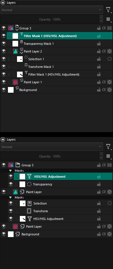
Oh, and I think rearranging masks won’t be a problem on this mockup? Why are you concerned that it will be? Can you explain? If mask is in Group it affects whole group only position masks to other masks is important for them (which is also confusing when they are loose in group).
1 Like
In this there is no issue that I see as transform mask and filters are in one section. What I mean in suppose in future there are multiple sections and some of the masks (elements) may affect composite of the layer and in that situation the stacking order of the masks (elements) becomes important can the elements of group be arranged fluidly between the section. Right now it is not a problem I see in the mockup so no need to worry but something to keep in mind for future.
1 Like
Mmm… how about Manipulator layers? They manipulate the parent layer they are associated with. In that sense, you could also say there are parent layers, child layers > the current mask layers and nested layers. The latter are basically all sublayers of a parent layer. But this distinction cannot hold, because child layer are also nested under the parent layer.
I like your mockup, but I would then make sure everything that’s inside the mask ‘expanded mask dropdown’ is also black. It shouldn’t be just a header, but a full colour coded collapse/ expand thing.
How about displaying the ‘mask’ type icon up front and have the mask thumbnail (the black and white where it is applied or not mask preview) show behind the icon? That also helps differentiate between the two. And you could have a larger layer type icon there.

E: There would need to be adjustments to the layer arrangement shortcuts so you won’t add a paint layer in the mask section and vice versa.
1 Like