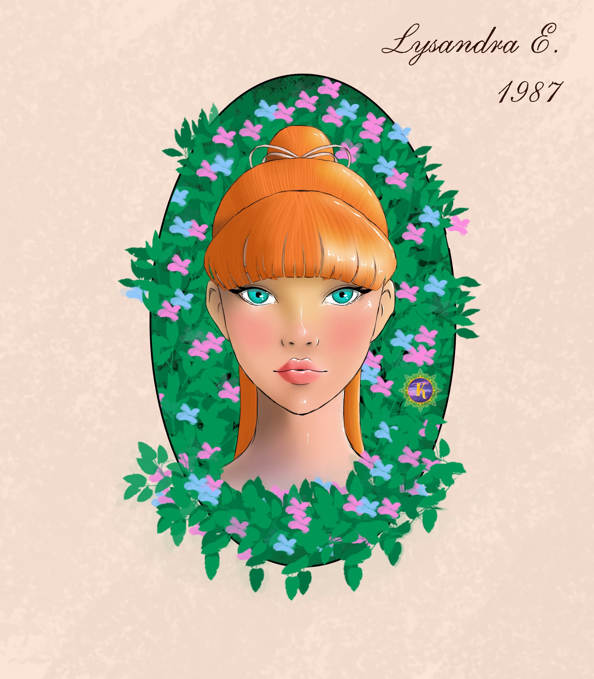
Here’s my latest drawing ! 
I’m still working on my technique and there were a few moments when I almost gave up… but I pushed through, and I’m actually quite happy with how it turned out.
I’d love to hear your thoughts, feedback, or tips to help me improve! 
(I never know where and how to put my logo on my drawings  )
)
10 Likes
Logo placement looks fine. I like to put my signature on the bottom right corner, but that’s my preference. (Bob Ross puts his on the left corner, btw.)
2 Likes
At first, I used to place it at the bottom, or at the top, and in the center — especially when it was a small drawing that didn’t fill the whole canvas. But sometimes I feel like it really spoils the illustration.
Well, this time I managed to “camouflage” it nicely, so I’m happy with it.
(If Bob Ross signed at the bottom left, then on the day I can’t decide where to put it, I’ll just place my logo at the bottom left on principle, haha!)
2 Likes
Lovely! So glad you pushed through to the end  .
.
At a glance, my only initial recommendation would be to perhaps add a little more darker values to your bkg foliage. I think the lightest part of an image is (generally) what stands out the most, and so if you make the bkg a little darker in areas, it would by default make your foreground the brightest. (A trick you may know is to temporarily turn the image to grayscale - that will show you the distribution of values in your picture.)
But! To be clear, your finished piece is really very, very lovely just as is. I like her hairdo and coloring! And I love what you did with the foliage spilling out of the “frame”. Very stylish. Honestly, my thoughts for the bkg would just be an optional icing on the cake to help your portrait “pop”, as it were, even more  .
.
Nicely done!
1 Like
Thank you so much for your advice! I’ll take a closer look and try to darken the foliage a bit more — I definitely lost some depth after adding so much, haha.
I’m still learning how to color my illustrations. It’s not easy to find my style with so many brushes to choose from — not to mention the filters and other tools I haven’t fully figured out yet. But I’ll get there!
Thanks again!
2 Likes
You are so right about the brushes! It can feel so overwhelming, especially when you are still discovering your style. I’ve heard professionals say that they only wind up using a handful of favorite brushes. At first, I found that impossible to believe, but I’m starting to think they’re right. The trick, I guess, is finding the handful that work for you  . I know that I’m still searching.
It’s a fun journey though! With lots of accomplishments and memories along the way - like your Lysandra portrait  Looking forward to more!
1 Like