@MangooSalade
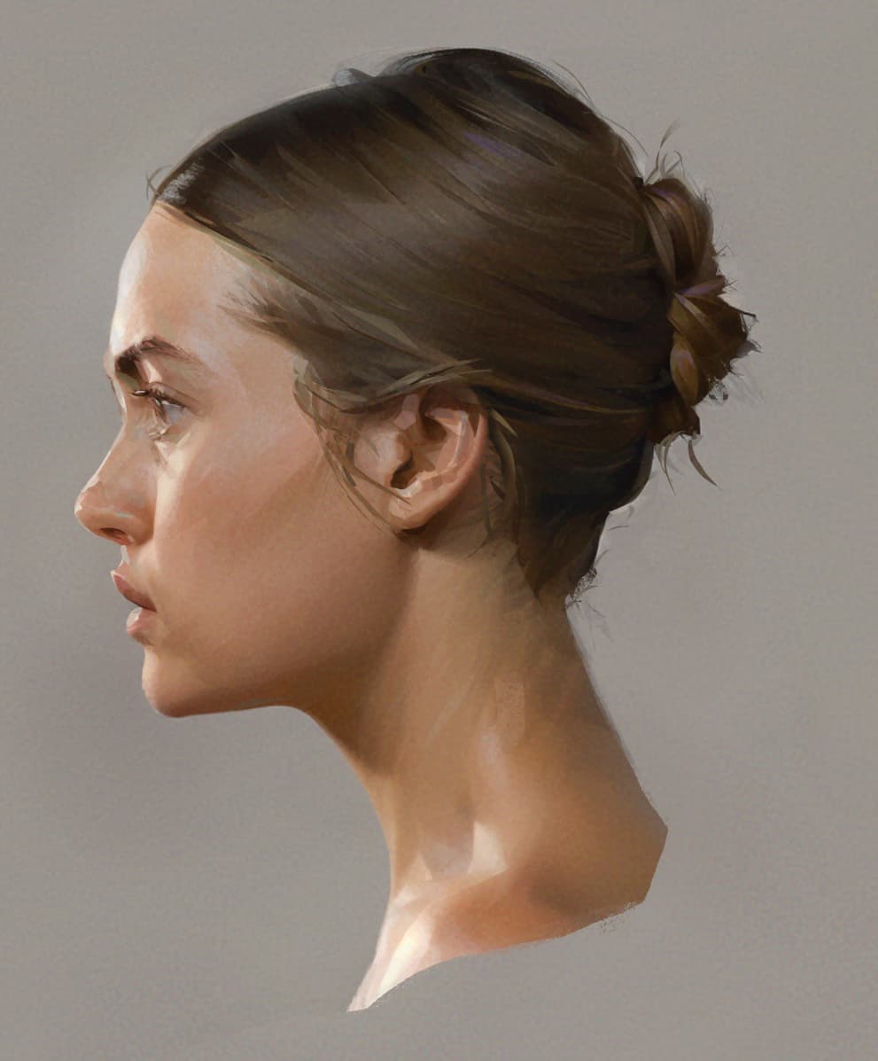
I try to go from large to small. A sloppy sketch on top, base shading underneath done with big round soft brushes, some intermediary layers I’ll probably discard/lower opacity with a simple brush to get a sense of depth because I can’t visualize too much ahead, then freehand selection my way to completion. I threw a bit of noise and a texture to add a bit of “grip” to the result, though I messed the noise.
I use every and any brush with the freehand selection. Here mostly airbrush, plain round, and charcoal.
I usually start with a smaller canvas and resize up when I’m refining things. It’s for performance, though sometimes the blurring actually helps in softening edges and textures. Happy accidents and all!
The sheen on hair and skin, that’s unfortunately just knowledge of which hues go well where. I know this shade of skin works well with gray-blue reflections from ambient light. It also benefits from a bit of yellow-green and orange shifts, which I usually add with an overlay layer using airbrush very lightly. It’s important to not make everything saturated because then no color pops.
Besides overlay I might also use color dodge for subsurface scattering, lighten or darken to push hue shifts without messing the colors around too much.
Hair hues I find even more challenging than skin, for this shade of brown I like some subtle purple and green reflections at a pressure that must make them something around 5% opacity or less. I color pick a lot, doing a soft stroke, sampling the blended color result then doing the actual stroke. The hues themselves I try to keep confined to designated areas; If you do many hair locks of different hues side-by-side it looks like it’s the hair color instead of reflections.
Be careful when giving hair some definition, if you go too hard on the strands the hair looks fragmented. It works for stuff like the locks over the ear for example, where I want it to stick out of the hair mass, but for other areas it’s easy to overdo (I’m still working on improving my control over hair mass).
Details always go on top, even most that look like “oh that’s just an effortless brushstroke from earliest steps I left there”. Because I’m too heavy handed I’ll also tone down some transitions that look too harsh or muddy with airbrush again, blender, whatever I feel more comfortable with at the moment.
I used to have a very impressionist style, thousands of brushstrokes with pastel-like look, but I’ve grown both weary of it and old enough it kills my hand, so I’m doing my best to reign it in. That’s how the selection helps, I don’t need to lay down so many brushstrokes, I just use the contained space to the same effect but cleaner. Plus I’m trying to lose my utter terror of airbrushes. I used to use round gradients just to not touch them.