This is exactly what I’ve been looking for – I’ve been working hard to make those Ben Day brushes (making the textures is… rough…) but you got the patterning down better than I ever did!
1 Like
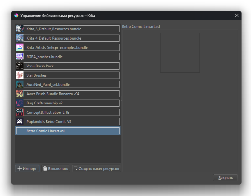
How does the Retro comic lineart filter work? I tried applying it on different layers and I don’t know what effect I should achieve.
Hi!! Thank you very much for the brushes, but I have a problem, I can’t import lineart brushes, can I do something about it?
1 Like
![]() Hello @zhenchhhhh, and welcome to the forum!
Hello @zhenchhhhh, and welcome to the forum!
The ASL bundle contains no brushes but so-called layer styles, which you can apply by right-clicking on a line-art layer and selecting Layer Style. In the dialog that opens, you have to check the box ‘Enable Effects’ on the left and click on ‘Styles’ directly underneath to then select ‘Retro Comic Lineart.asl’ from the drop-down menu on the right in order to be able to use its layer styles.
That’s it.
Michelist
1 Like
Oh, thanks, I figured it out:)
1 Like
It’s a layer effect ![]() You can import it as a normal resource, then use it from the layer effects menu dropdown dialog.
You can import it as a normal resource, then use it from the layer effects menu dropdown dialog.
Howdy howdy! I’m really diggin this bundle and have been trying to learn it a bit. I’m not sure if I have to use a larger canvas with a higher dpi because the dots seem more prominent on my 1080x1080 test square. Also I’m not sure if I mixed the halftones right? Should I keep using the multiple blend mode for the best effect? PS thank you for making this
2 Likes
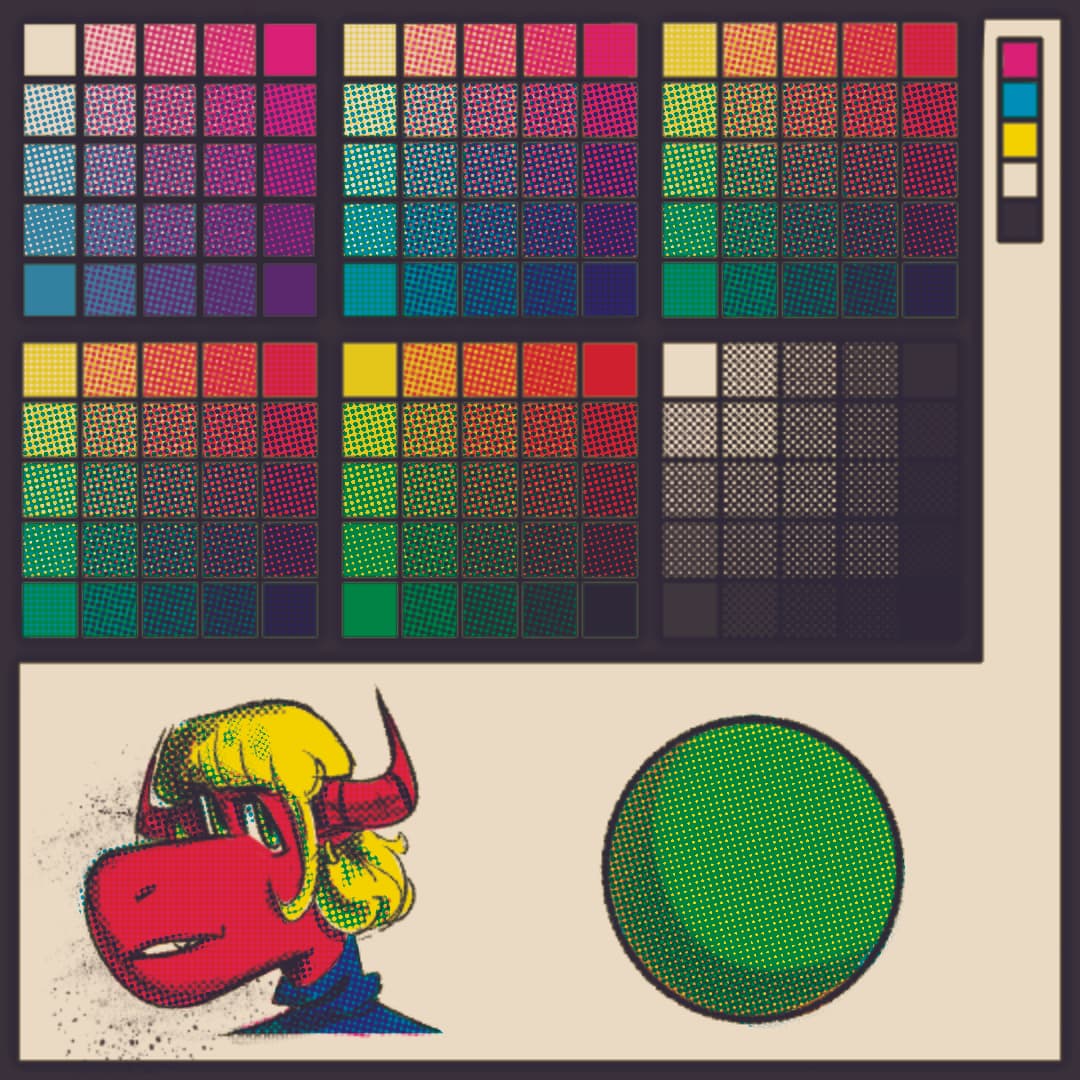
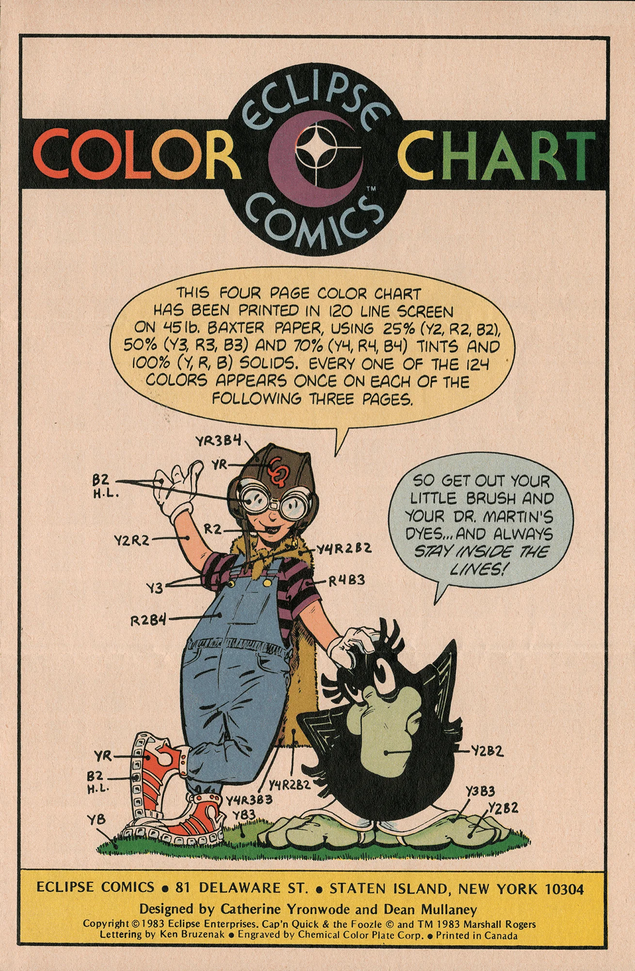
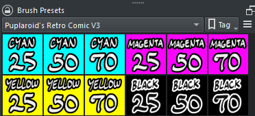
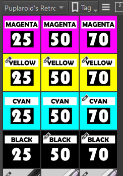
Thank you for sharing this bundle, but I am wondering which Brushes are the 25% tint, 50% tint, 70% tint, and 100% tint?
(mostly using this as a reference)
4 Likes
Thanks! ![]() The halftones were designed for 300 DPI/3000 pixels wide canvases, but you can change the size of those halftones in the brushes’ texture settings.
The halftones were designed for 300 DPI/3000 pixels wide canvases, but you can change the size of those halftones in the brushes’ texture settings.
1 Like
The first brushes (1) are 25%, the rest are 50% and 70%. ![]() You can use the lineart inking brush in bigger sizes for 100% tints, I wanted this brush pack to be easier for some folks, so I didn’t included duplicated ones.
You can use the lineart inking brush in bigger sizes for 100% tints, I wanted this brush pack to be easier for some folks, so I didn’t included duplicated ones. ![]()
2 Likes
Thank you!!
1 Like
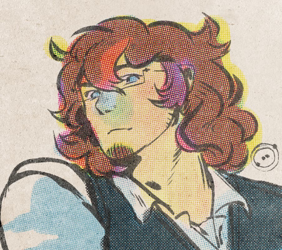
Yes!! This is what I’ve been waiting for! I always wanted to draw in the style of Shape comics, but I can’t afford any new software with expensive bundles and etc. I found a very similiar look for Krita, but that was way too complicated. Thanks very much! But I still have a question. If you scan in a traditional piece of artwork, and want to color it with this pack, which layer is optimal to making the same look as digital inking, if that makes sense?
1 Like
You can use the scanned linework into the lines layer, just don’t delete the texture layer masks in the lines group. ![]() You can also use some G’MIC filters to roughen up a bit of the lines, I suggest using the “Ripple” effect.
You can also use some G’MIC filters to roughen up a bit of the lines, I suggest using the “Ripple” effect.
1 Like
Thank you for your work. Salute
1 Like
What would be the best PPI/DPI to get the best Retro look? cause I tried them with 600 PPI and the dots were too small to be noticed
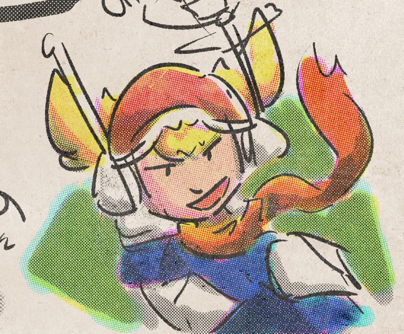
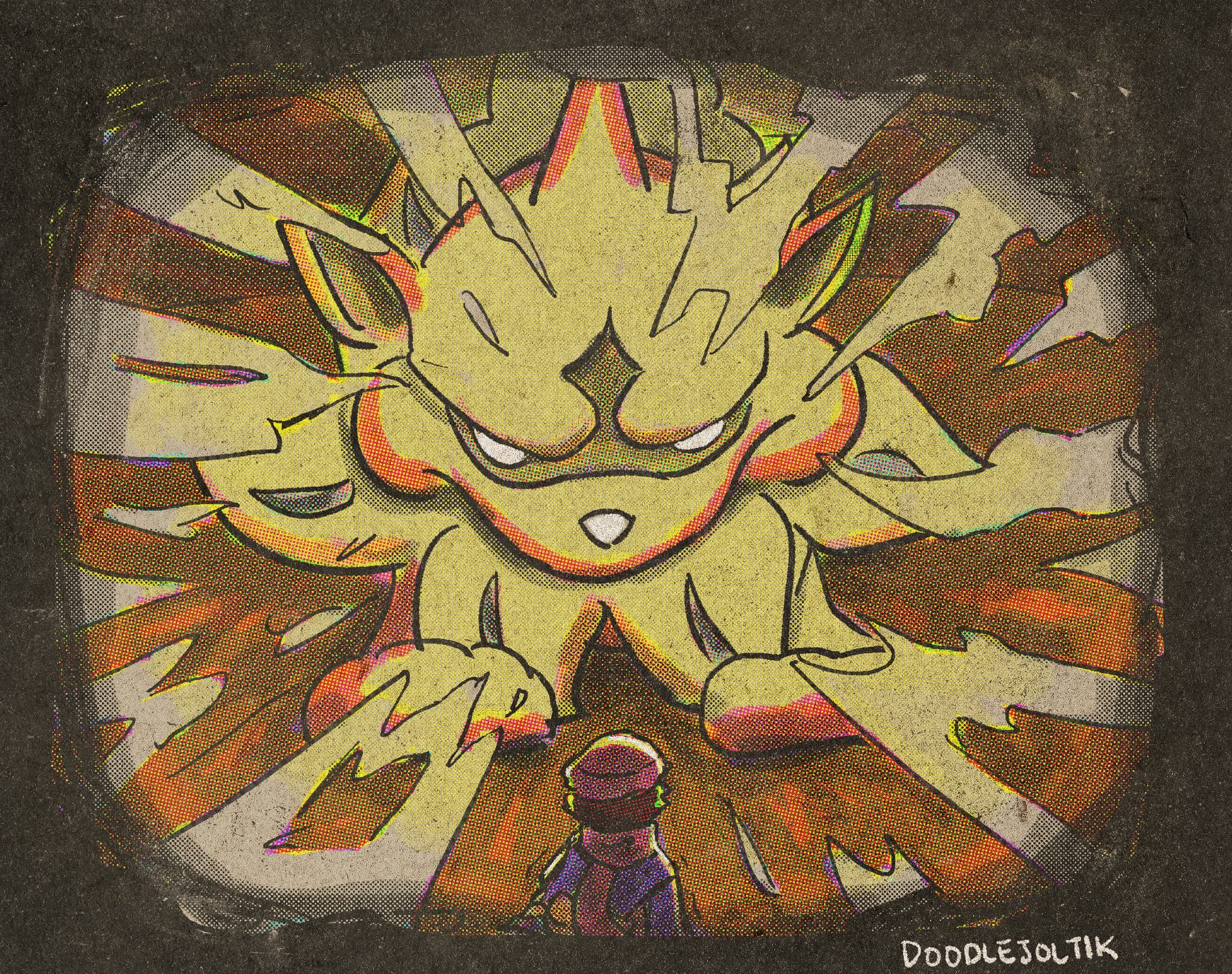
This set is awesome, I had lots of fun experimenting with it! Here’s a quick doodle I did.
I was wondering, would it be possible to have versions of the brushes that change their halftone based on pressure? (Aka pressure sensitive halftone gradient…) The Mojo Moo set has something similar for halftone within Krita, but their halftones are, understandably, not compatible with the interlocked CMYK patterns you have set up here.
The True Grit Texture Supply KraftTone set (paid, for Procreate/CSP/Photoshop/Affinity), also a CMYK system, has pressure-sensitive halftone brushes for each colour. It would make it easier to get more colours or make the workflow easier.
But no pressure at all (haha), I’m already quite enjoying it! Cheers!
4 Likes
Hello! I’ve tried it out a bit more, I hope doing a double post is OK, because I have a lot of new things to add/mention and it’s been more than a week. I’m not very familiar with forum etiquette, however, so feel free to correct me!
I did a larger illustration which I inked, roughed out the colours first and then filled them in with the CMYK colours. (signed with a different username.)
Some things I noted:
- It’s a bit tricky to find the correct brush since they all have the same thumbnail icon. So, I manually made icons for each brush for my personal use, which makes them easy to find. I suggest that something like this would be a great QoL improvement!
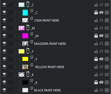
- I set up my document a bit further than the original template, which just has CMYK layers. I tried making clipping groups for each colour, so that I didn’t have to swap brush colour when moving between the different colours.
The groups are set to multiply, with an inherit alpha layer of the CMYK on top of the layer you paint on. If anyone has a more elegant way to do this, I’m happy to hear it! As a bonus, this way it’s immediately obvious if you accidentally started painting on the wrong layer (the colour will be wrong). - I swatched all the colours myself on the particular paper I was using. It might be nice to provide a template swatch as a .kra file that allows users to easily swap out the base colour or put textures/overlays on top so that they can see what the colours will look like.
- Related but a little bit different: in keeping with the suggestions from the ColorLab tutorial, I roughed out my art with solid colour first before going in with the CMYK. I made rough approximations of each colour by shrinking my palette to a small size and then sizing it back up; I know that True Grit Texture Supply’s KraftTone set comes with a solid palette included that corresponds to the colours it can make. I think it’d be neat to make one for this set!
- Might be nice to make pattern fill brushes for each tone as an alternative way to apply them, especially for larger areas. I also feel like this may produce results that look more authentically like print misalignments. Alternative to making a brush is making patterns that are usable with the existing fill tools.
Of course, these are all just suggestions and not demands. I might poke around with doing some of them myself, such as the pattern fill tool. I enjoyed using this bundle and I can see myself using it again! Thank you for making it.
6 Likes
It is possible. I made my own personal CYM ben day set like theirs, and if you copy the method that krita has for their pressure-sensitive screentone brush you can make a very nice brush like you describe!
1 Like
Hey dude, really liking this bundle! It’s super awesome, and the result really looks like a high-quality scan of an old comic.
some notes:
-
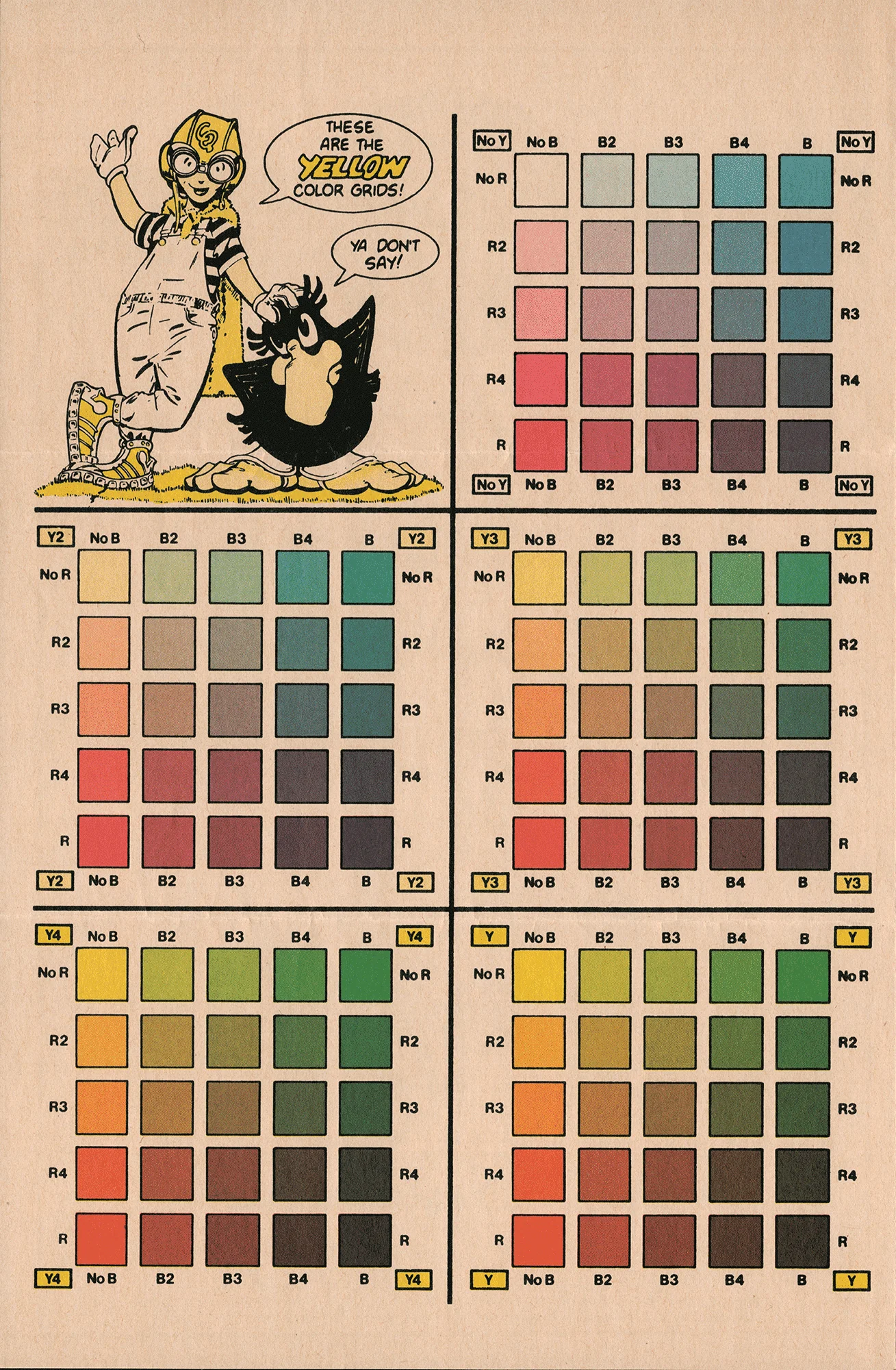
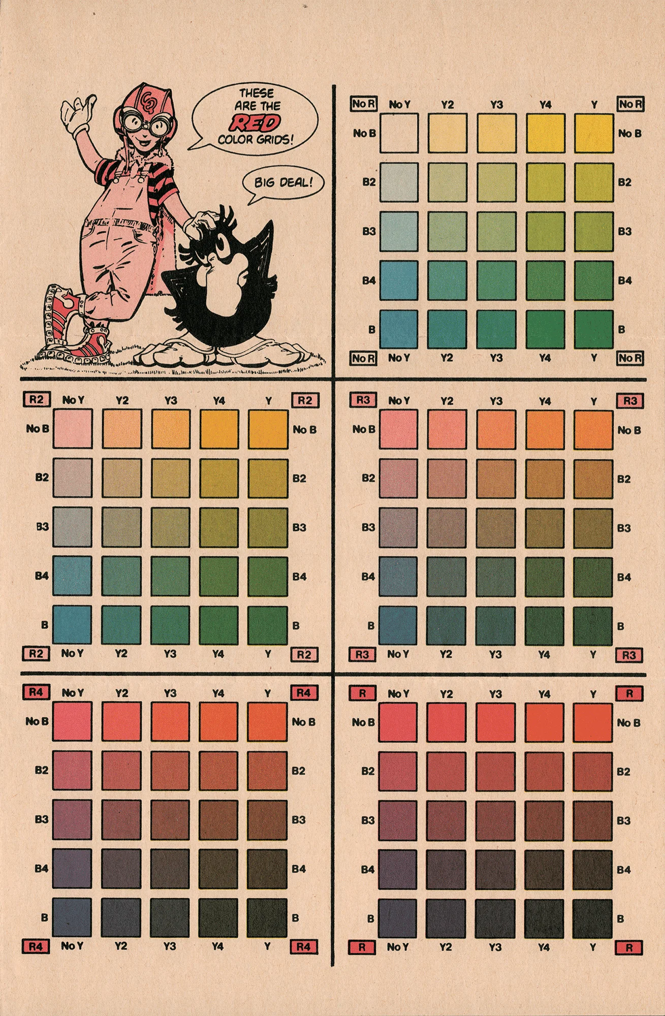
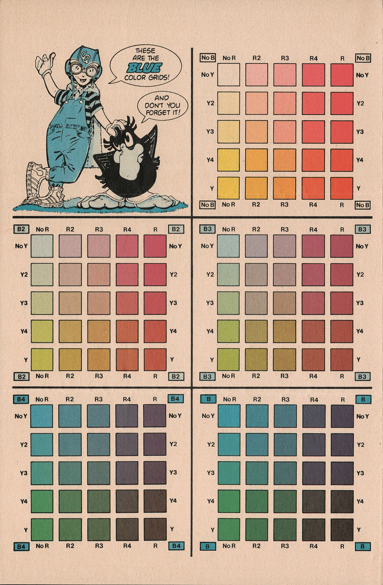
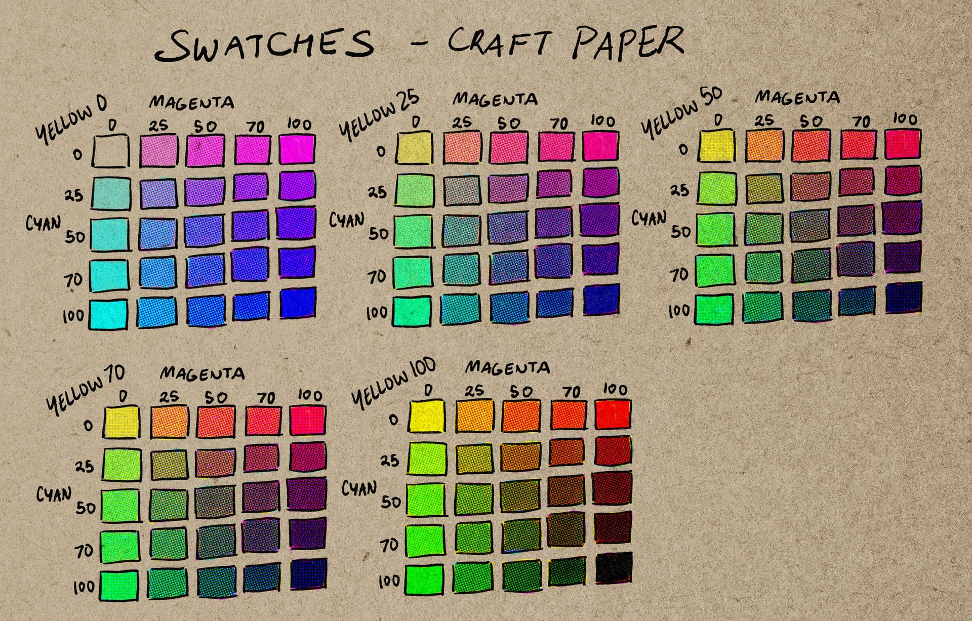
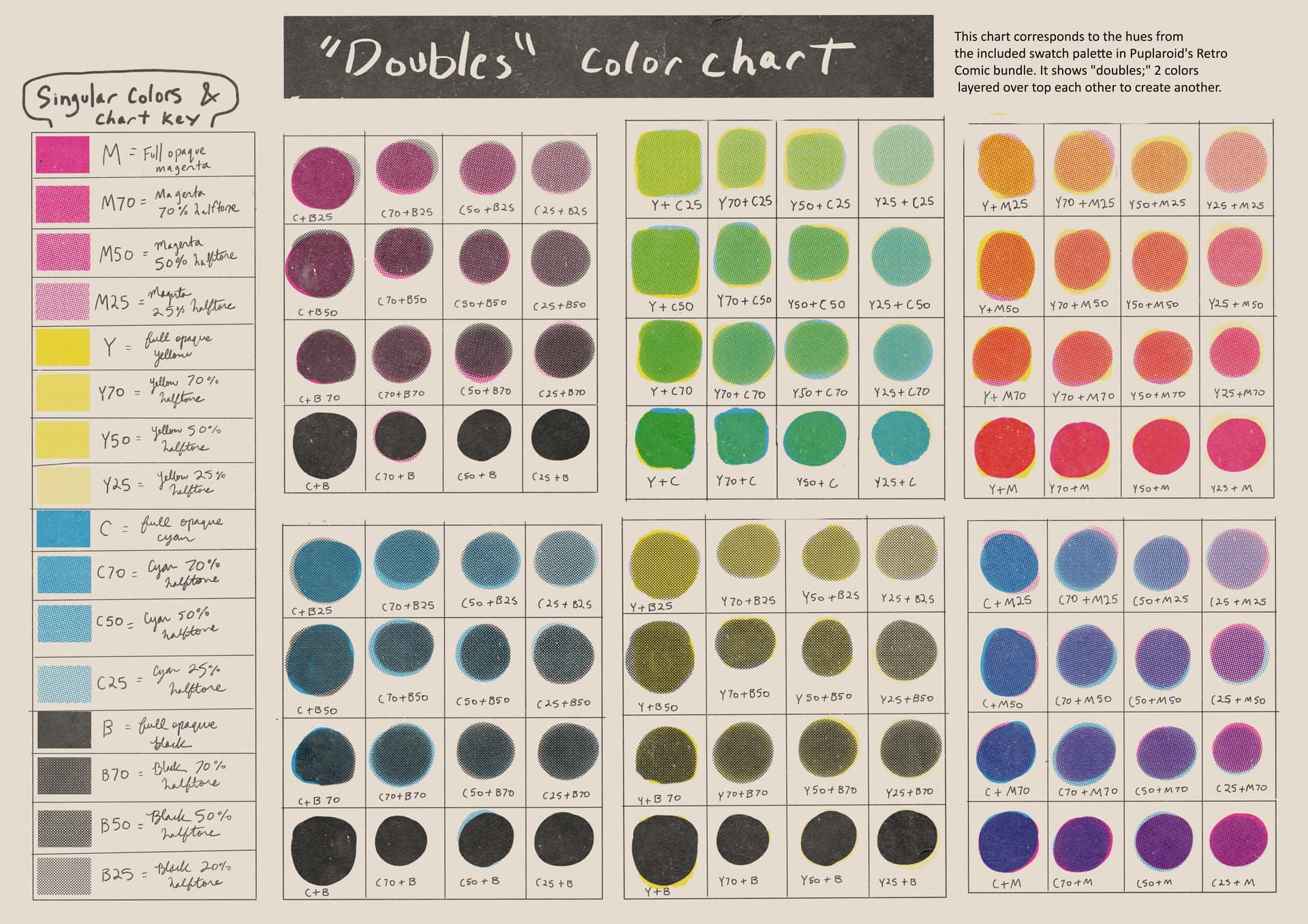
It took a while for me to wrap my head around the layering, but practicing by making color charts helped.
-
I agree with @sandbuggers about the thumbnail icons. I followed their example and made my own as well, but no pressure to creator to fix this! (does anyone want the jpgs for their own use? I could post them here)
-
I found it helpful to color code the individual color layers to match their specific color
-
I noticed that the yellow 50% and yellow 70% halftones are virtually indistinguishable. Idk if this is yellow being yellow, something I did when I changed the thumbnails, or what.
-
For people trying this bundle out with zero knowledge of halftone printing, as I did, I found it very helpful to practice mixing colors. I made a color chart with some possibilities and color codes:
hopefully this could help someone with coloring?
Thanks again for making and sharing this! (also, if I have committed a forum faux-pas, please let me know)
3 Likes