Hi, I would love any experienced artists’ input on shading techniques. I am an amateur artist who has started doing research on shading/tinting colors and have a few questions relating to it that needs answering.
The first two revolves around a tutorial I watched on YouTube from a channel called Proko ( BC24 Anthem 16x9 30 US) from about 4 years ago. In the video tutorial, he talks about curving the base color towards the color of the light source. How would I go about curving a base color towards a light source’s color in Krita for tinting (giving it brightness)? Also, how would I be able to do the opposite for shading (giving it shadows)?
My last one - at least for now - is a two-parter revolving around a technique someone (forgot their name) recommended to me. It involves using complimentary colors for the base colors I want to add shading/tinting. I did a little research about that myself, and one tutorial said I should mix the two colors together to shading/tinting. First, is this actually one of the genuine methods used for shading/tinting a base color? Secondly, if it is a genuine method, is there a third color I need to mix alongside it for shading (darkening) or tinting (lightening) the base color?
I’m not an expert on color theory, but here’s my take…
How would I go about curving a base color towards a light source’s color in Krita for tinting (giving it brightness)? Also, how would I be able to do the opposite for shading (giving it shadows)?
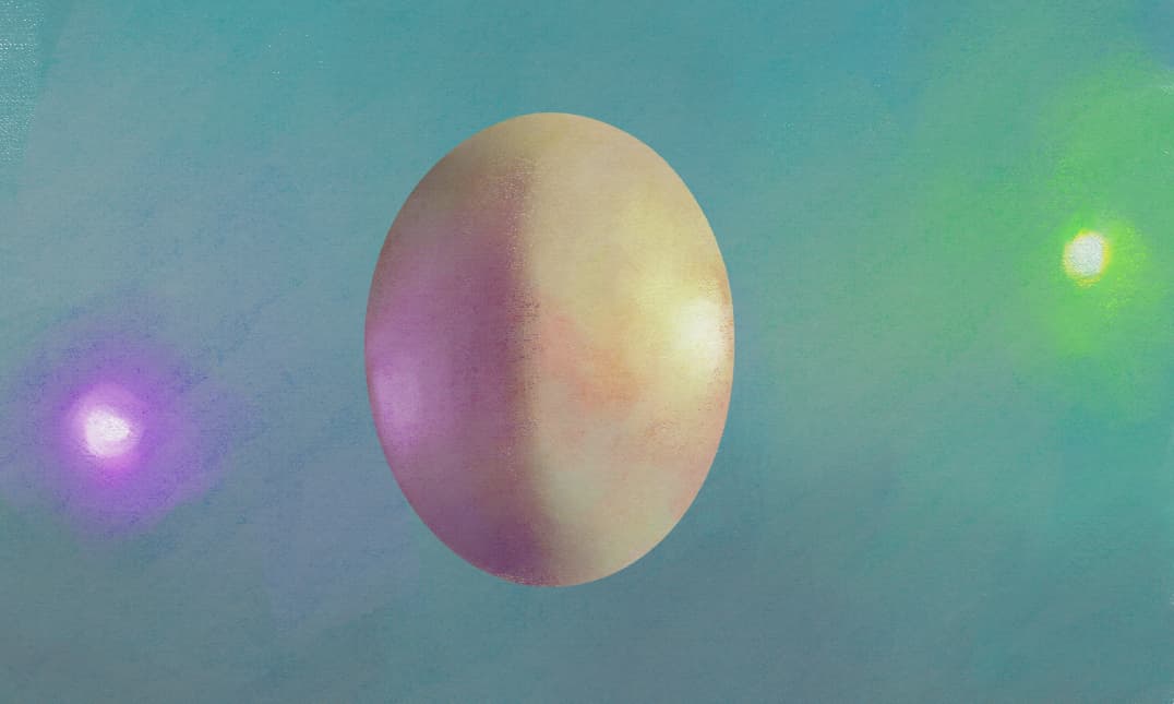
I believe “curving” here, is just a term he’s using to describe the shift of the tint/shade and hue, along the color wheel. The concept being, while your object may have a shade of red in it, when a blue light source hits that surface the color appears to shift towards blue, resulting in a more purple hued surface. Beyond that, the amount of light determines the tint or shade. So, on the brighter side, the hue is given tint (a shift towards white). On the darker side, the hue is given shade (a shift towards black). Though it’s often said we should avoid a pure black. Which actually leads into your other question.
It involves using complimentary colors for the base colors I want to add shading/tinting
This is a color theory concept, where opposing colors, side by side, appear more vibrant to the eye. Mixing these color (using traditional paints) results in a muddy brown or gray tone. In practice, where you’d have a warm (say yellow) light source, you’d try to oppose that light with a purple hue in the shadows. These opposing colors will add vibrancy to the two side, emphasizing what would otherwise be a dull shadow.
Below, is my attempt with the concepts in practice, though I went with a more pronounced specular highlight, as I had the light sources in there.
Ah, I see. Thanks for explaining - even if you are not an expert. I was a little confused about the concept when he mentioned “curving”. I wondered if there was a tool in Krita I could use to shift a base color towards the color of the light source.
As for your comment about complimentary colors, your explanation of this color theory concept makes some sense. So, if I were to mainly use this color theory concept in shading/tinting, I would use the complimentary color of the light source, right? I was under the assumption I had to use the complimentary color of the base color that I wanted to shade/tint. I also like the pictured example of you using this concept - shows how I would go about doing this.
I haven’t watched the video & apologies if this reply reads obtuse or unhelpful (not meant to be!), I’d say do some more monotone / black & white drawings to get more used to shading, but shading shapes that are well designed or placed.
Drawing ‘Notans’ is helpful.
Here’s a good quick example:
When you have shadows in the right place (you are drawing shadow, not the object that your brain recognises) your image is grounded & then if it’s your aim you can go about blending & making subtle shading, adding highlights at the end etc
But you give yourself fairly reliable start if you begin drawing out where shadows are, then adding a mid grey, rather than having to intricately shade & render everything pixel by pixel lime you’re a machine.
Sorry if this is off topic, just see many people frustrated wanting to shade skin, hair, eyes & I beleive doing simple steps 1st avoids some of the pain.
Before you’re even bothering with colour much.
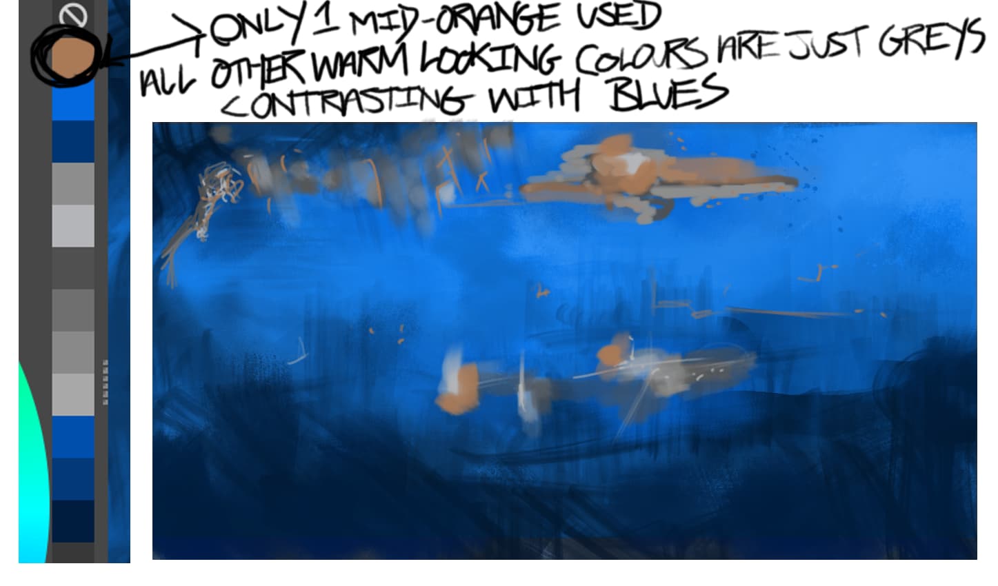
Re colour & opposites often if you have an overall dominant colour then quite neutral colours around grey will appear opposite to the main colour.
A small spot of a true opposite colour will really stick out.
This quick example has grey against blue then 1 quite muddy orange (right from middle of the colour picker) looks really bright against the blue.
Marco Bucci (perhaps you’ve seen him already) has very clear videos on colour - much more help than any rubbish I’m typing here:
Check his channel out
I would use the complimentary color of the light source, right?
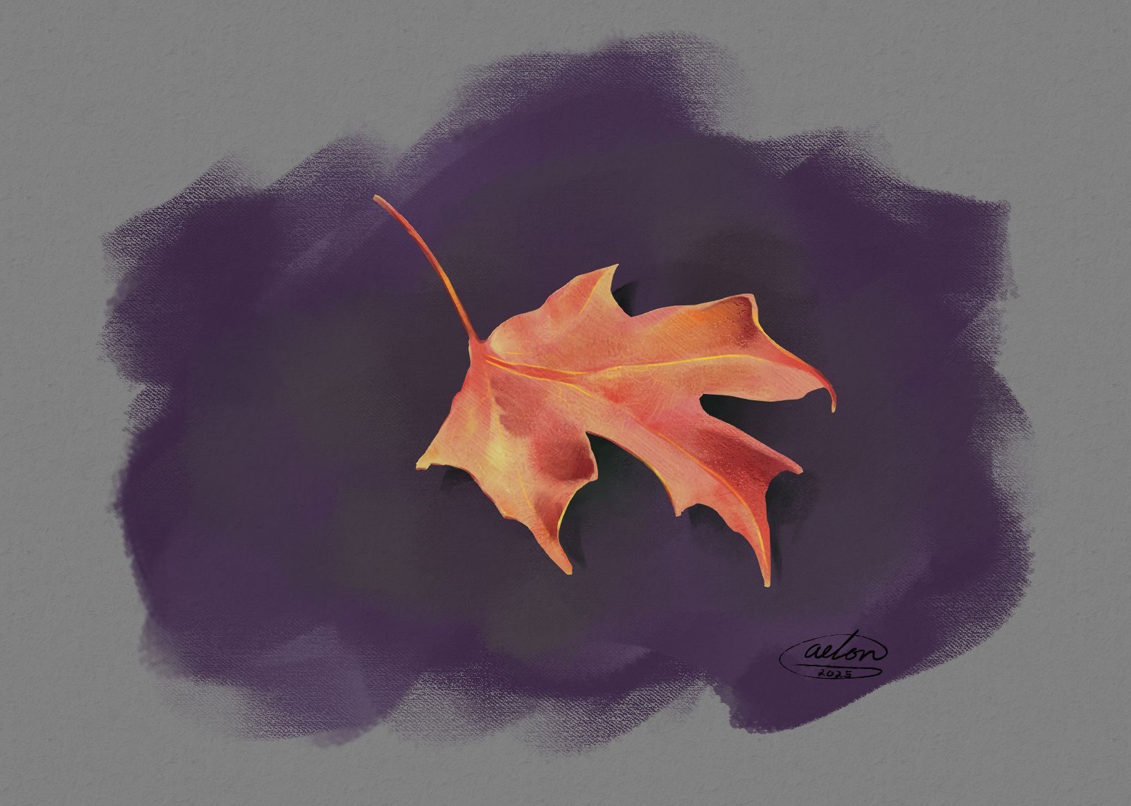
It’s not so much about the source of light or the actual color of the object, in this case. It’s a matter of the color that is directly next to where you’ll be painting next. If you have an area that’s primarily blue, and you’re about to put another color next to it, you should sit back and think about what you’re attempt to do in that area. For example, in the attached study I made for this example, I have a red and yellow leaf. I purposely chose to make the background purple (yellows complimentary color) and the shadows green (reds complimentary color) in an attempt to help the leaf stand out.
(Edit)
I wondered if there was a tool in Krita I could use to shift a base color towards the color of the light source
There kind of is… I sometimes add color to my black and white images using Gradient Maps.
No need to apologize at all, and thanks for your input. When I start shading, I’ll likely go with that method where I start in black & white and then swap out the different shades of gray for the proper shades/tints.
Thanks for your input as well. That does make sense if you wanna make the main focus of your drawing stand out. My question you first quoted was more about shading the main focus of a drawing, such as a character. For example, a character I plan to redraw in the future will have dark-blue skin, so I wondered if complimentary colors would be used for shading her skin.
I’ll also try out the Gradient Maps, which I have heard of before from a video I watched a year or so back from a Krita tutorial. I haven’t played around with it much.
Yeah, they could be used.