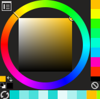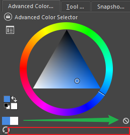
There are two problems here:
1 is that a button at the bottom occupies a row of space. Unless the official considers adding other buttons, such as adding the image color to the swatch
2 is the “Clear” button is a strange misunderstanding, my suggestion is to move it up
The following is my improvement (I reduced it to the smallest to use)