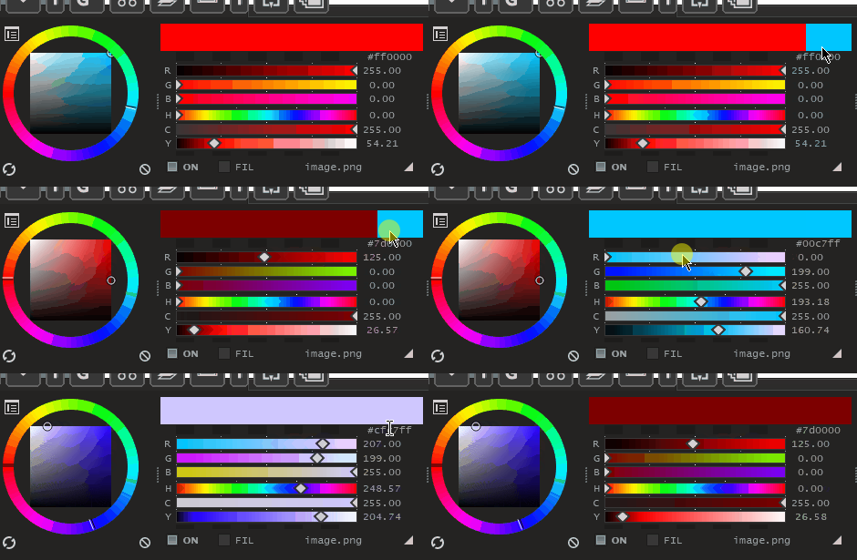
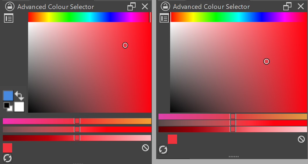
Hello, first of all this really is not something like a redesign but rather an adjustment, I understand that this will not be easy, but I would like to suggest some changes in 2 dockers, I also apologize in advance, English is not my primary language , so I may have misspelled some term.
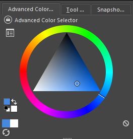
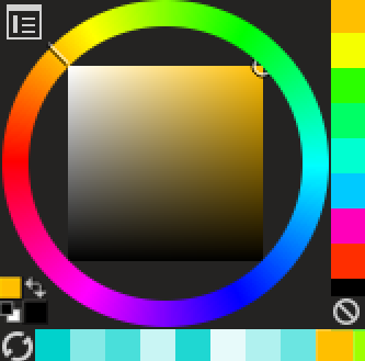
It would be good to move the color selector in the foreground and background to the advanced Color Selector, this mainly because it would be more comfortable than to be moving between the advanced color selector and the toolbar.
→
Also I think it would save a bit of space
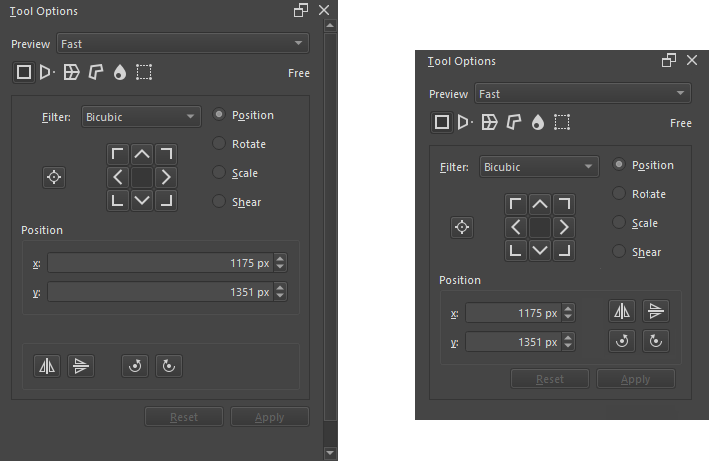
Another docker that I think needs tweaking is the tool options.
The compact layout position of the buttons for the transform tool is well done
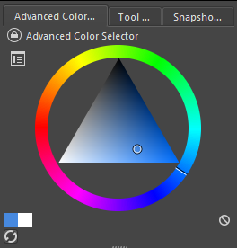
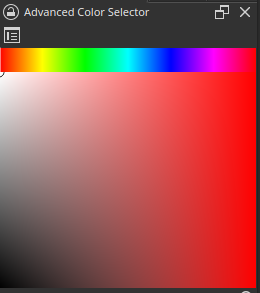
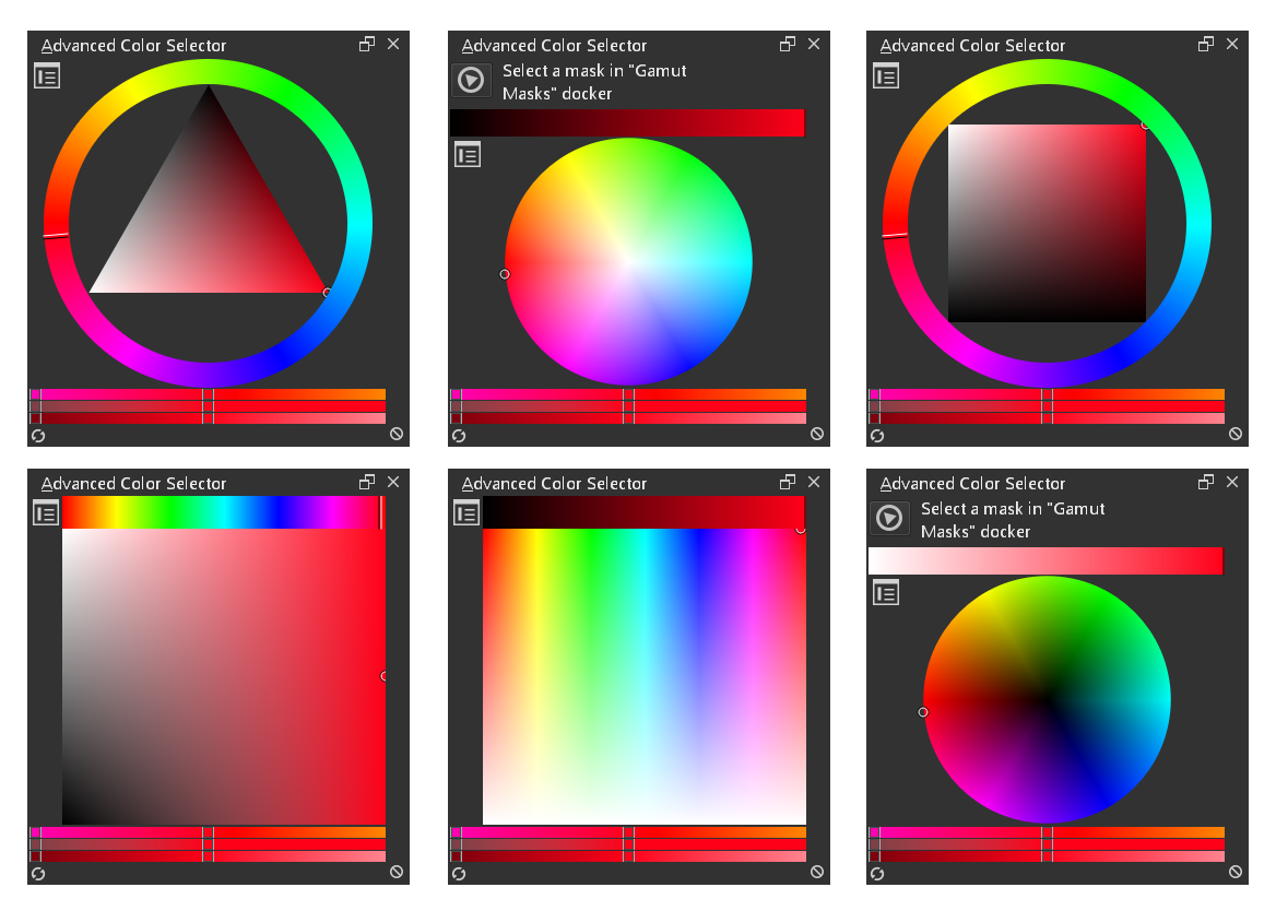
About the foreground to background widget inside the advanced Color Selector, I understand your usecase and feedback. It’s valid. But putting it on a bottom corner will conflict with other Color Model Type. This one for example:
Any additional feature would be probably easier with a mockup taking into account a full new column or full new row. One that can be hidden/revealed via settings. That’s how I see ‘Shade Selector’, ‘Color History’, ‘Color from Image’ features are designed on this docker.
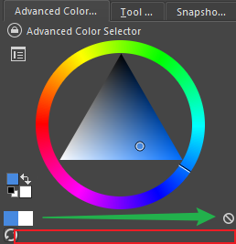
There are two problems here:
1 is that a button at the bottom occupies a row of space. Unless the official considers adding other buttons, such as adding the image color to the swatch
2 is the “Clear” button is a strange misunderstanding, my suggestion is to move it up
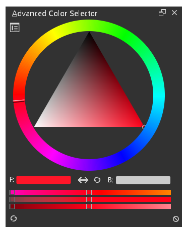
The following is my improvement (I reduced it to the smallest to use)
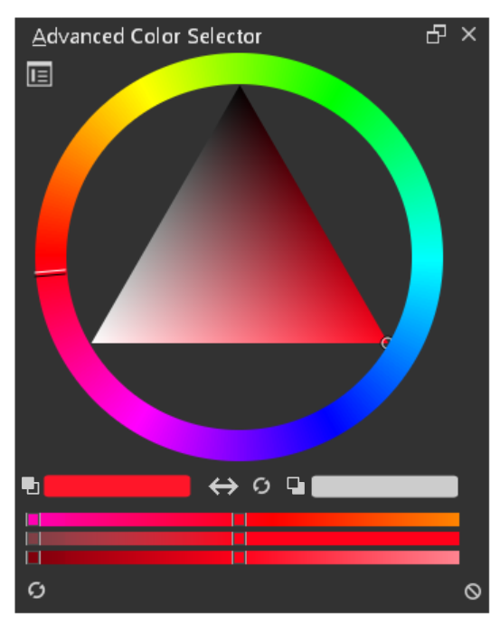
in terms of the foreground/background selector, we cannot have it on top of the color selector box. We have too many variations of it, so it really needs to use a more modular design.
There area a lot of variations we currently have which it needs to work with.
The switch icon switches the foreground and background colors
the reset icon changes the foreground to black…and the background to white
This could be a new section that is toggled on/off.
This approach should work better with all the various color selectors and hopefully make sense. I know it isn’t the normal foreground/background appearance used in other applications, but I personally think the existing foreground/background selector in the toolbar is too small…so his would be easier to use for tablet users.
Not sure what other people think about this.
@SchrodingerCat - the tool options seems like a good idea to condense space a bit. We probably need to do something even more since there are so many options in the transform tool.
This sounds good and more clear than overlapping rectangles. I think the switch icon and the reload icon can be at the end. It feels odd I the middle, this is a subjective opinion. Having it at the end on the right will make it align with other icons which are generally at the edge and not I the middle.
I think that’s partly my fault, I have the advanced color selector set this way, so it’s not really wasting space.
The truth is that I like how it looks and it would certainly be an excellent option , I also feel that the foreground / background selector is very small.
Thank you very much, I really feel that it would be an excellent improvement not only for the interface but it will also be more comfortable to use.
We could do that. I wasn’t exactly sure the best place for those to go. The only idea I had for the switch icon is that it is actually pointing at the options it will switch…which is why I put them in the middle.
I also was thinking of potentially making the foreground color swatch larger than the background since that is usually used more frequently used. It could help if you look at the area with a quick glance.
Ah yeah the task really needs an update though…I totally wasn’t aware last update was in February
I’ve been doing small things here and there, and always wanted to update it when I got some part finished, but somehow always ended up with something else half finished instead and postponing it again…
But most of the work really deals with the way color is handled internally rather than a flashy new design.
Although I have to admit that despite the stopgap design, I do all my painting now with my own selector docker, because it’s just more consistent when the shade selector can use HSY’ too…
The MR you had going looks like a pretty big job with unifying the color selector internals as well as making a number of UI changes.
There are some neat UI ideas you had too like adding more options to the configure menu for quickly swapping out the color selector type. Were there any of those ideas that you could peel off your branch into a smaller PR? It looks like you spent a while working on all those changes.
It looks like this request was just specifically thinking of a way to add a foreground/background color picker/swapper to the existing advanced color selector docker.
Not really, not for the Advanced Color Selector docker in any case, the code bases simply have hardly anything in common, beyond offering roughly the same feature set. The main point was getting rid of the sRGB limitation after all, but there’s other design decisions that were just tricky to work with (or shall I say: work around).
Some batches of changes to KisVisualColorSelector have been upstreamed already and now are available more easily for the Popup Palette with 5.0, but that’s really all that made sense splitting off so far.
I was also hoping the issue of HDR support and Qt6 migration would become clearer, but so far, quite the opposite…also Linux and HDR output…let’s talk again in 2030, I guess…
Alternatively, the other colour modes (non-wheel based) could be scaled down to make space on the left hand side for the front/ background colour switch. So maybe these non-wheel modes should have a column on the left hand side for the widget, whereas the wheel modes may only need a tiny bar to ensure sufficient padding.
I personally think that it is better if the front/ background colour is a little detached from the rest of the docker so the colours are more easily discerned from a glance. Also, this docker can already be very cramped in terms of layout, so I think it would be better not to overload it even more. It could use some more spacing in between the HSL bars and the wheel/ square colour picker. Similarly, I would also add a few pixels in between the HSL bars to give the eye some more rest.
In case of the mockup, the fore/ background colour takes up a lot of horizontal space that it really does not need. In my mockup, I had to scale the square colour selector by the size of the white background colour box, so that’s a very minimal adjustment to gain more vertical space in the docker. Not to mention, the colour wheels would remain largely unaffected, because the widget fits in there already as @SchrodingerCat showed.
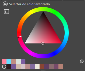
I love this! Although, maybe instead of F and B, which feels kind of un-universal too me, and would have had to be translated to other languages: Maybe having simple icons would look cleaner and be more universal? Something like this
 →
→ 






 , I also feel that the foreground / background selector is very small.