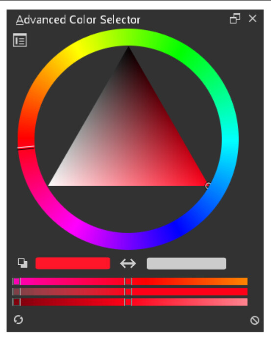
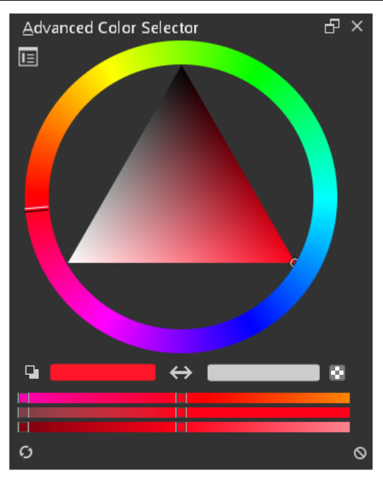
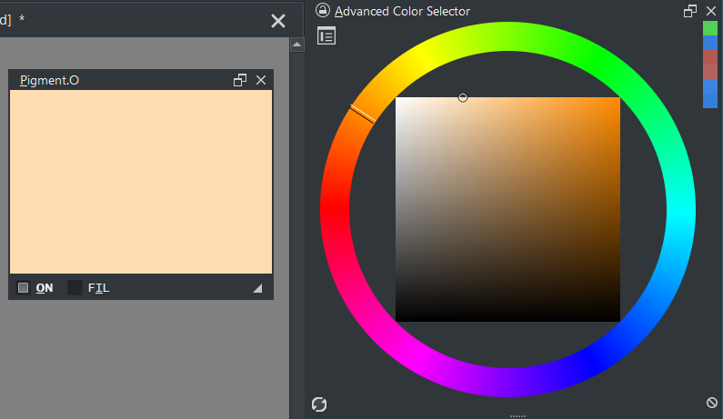
I think something like this would be better, so the two icons would be buttons, the first would fulfill the function of defining the colors of the foreground and background in black and white:
Just my 2 cents. If something has been establishes as a standard and proven to work well, only change it if the reasons are very strong and are an overall improvement for the user. Otherwise stick to it or just slightly adapt it. Changing things just for the sake of it, isn’t a good reason.
Along that line, the side-by-side variation of the FG/BG color fields, is no improvement over the standard overlapping fields. The only reason seems to be that it’s easier to implement, which should not be the top priority (compared to usability). So sticking to the standard makes more sense. And the corners around the circular picker are a great place for those fields as they are unused anyway. No need to add extra vertical space. If the selector is one of the square ones, probably using a column next to it for the color fields and icons is a good option, as the rectangular area usually is rather big anyway.
In that case, one can wonder, do people switch between modes?
If the answer to this is no, why should the solution opt for consistency over efficiency? I think that providing two solutions for two different colour selectors would actually be a valid option. They are different to begin with anyways.
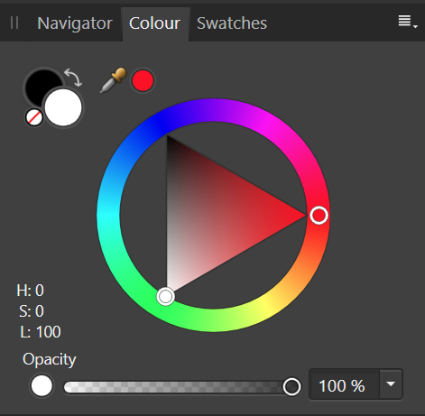
I can imagine activating the fore/ background colour within the docker to be dependent on the chosen colour selector. To me it feels like a waste of space for the circular selector, in which case there could be a circular fore/ background colour widget like in Affinity:
Looking this topic, I seems that for miscellaneous reason, everyone wants it own version of the color picker…
It might be difficult to satisfy everyone
There are only two versions, right? So the question is either will the square design be used throughout (since the majority seems to be content with that), or could there be a differentiation between the square and round colour selector to opt for a more conventional design that fits within the margins left by the wheel. Perhaps with a tiny bit of scaling of the wheel.
Also note that if the square design is implemented for the square colour selector, users could opt for the square design, because it is already there. The other design would be the optional choice — and I think this would satisfy everyone.
I obviously don’t have a clue on how much work this is, so I am hoping a developer could shed some light on this question.
I actually have been trying to avoid talking about this because I am overly biased on whatever I say on this as I too have my own design ideas.
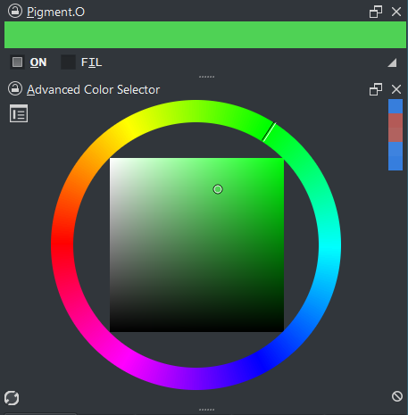
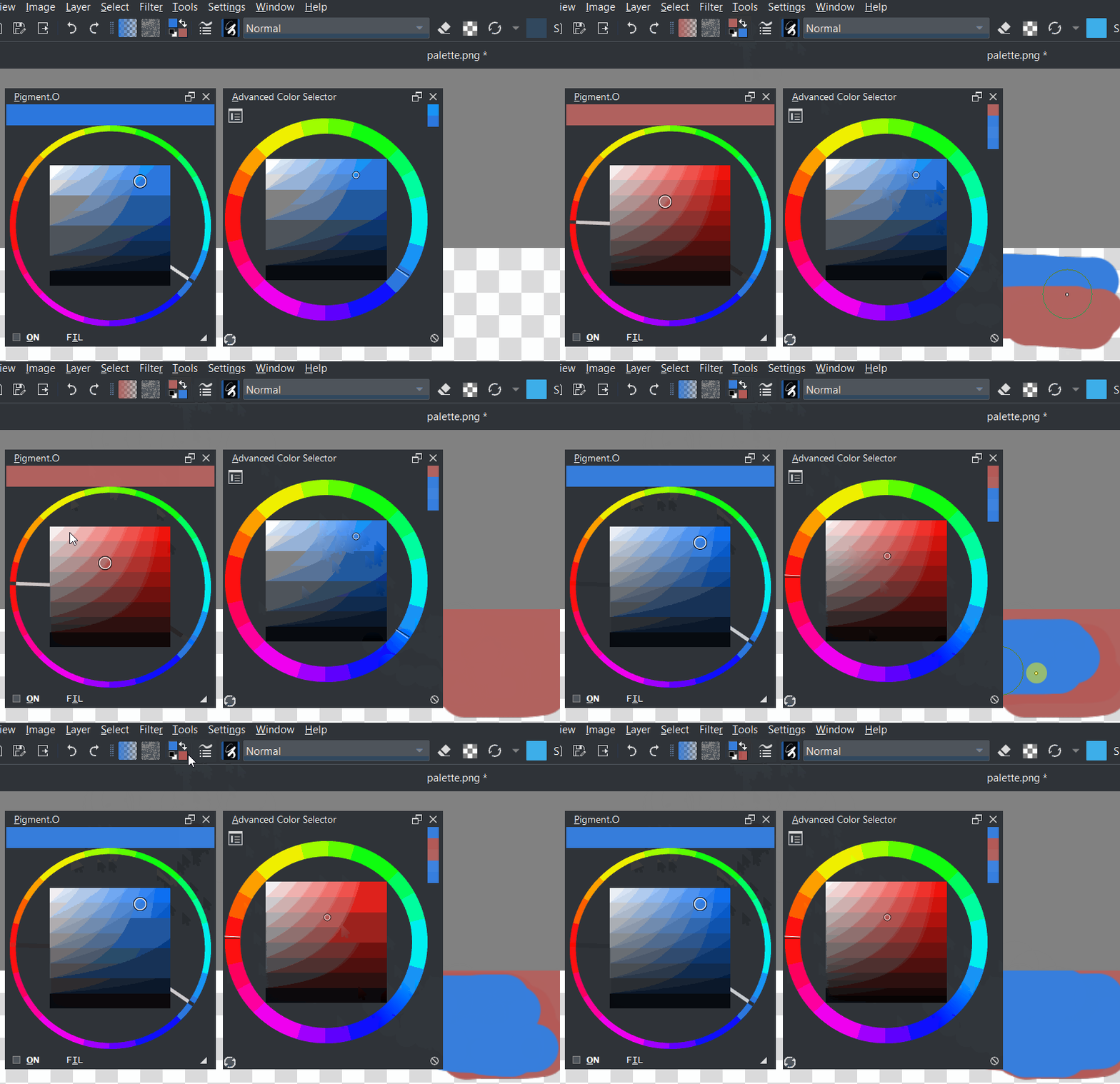
I made a panel for this Fg and Bg issue that could be used like this for myself. You can actually just use Pigment.O just to display your chosen color and use any other of the Krita pickers like this:
I am glad people are finally talking about the color display in the pickers
However there is a small issue on the swap I noticed while reading this thread as I was testing my alternative and it is not updating right away when you do a swap. This is valid when using the FG/BG widget and when using Python Actions(pigmento) to swap colors as shown below.
Work around: after you swap if you click on another color it will update again and then match.