Hi,
i found this image on pinterest and i would like to replicate this nice effect where the lines seems literally “written” on the paper instead of what i usually get where the lines are just “floating” on the paper.
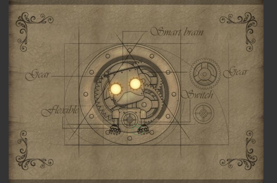
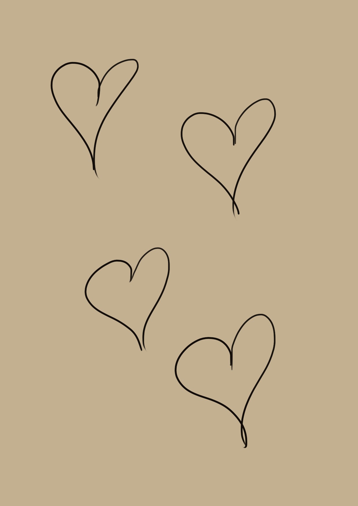
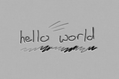
This is the reference image:
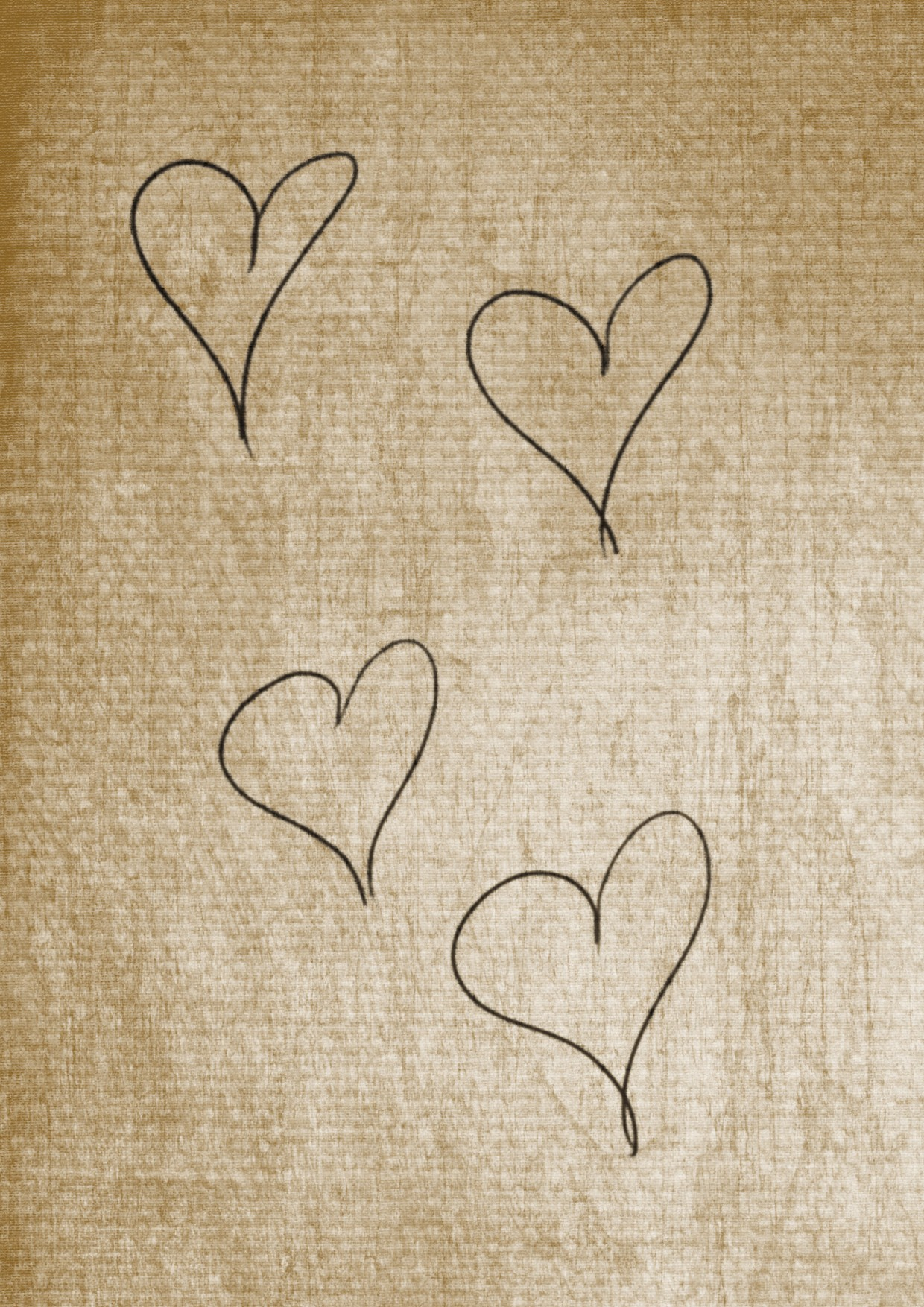
The lines are thin, perfectly straight. Most of them have a “slight opacity and thickness variation” but it is “simple”, meaning the start and end are thin and almost transparent and quickly reach their full opacity and thickness. When i try to do just this i do not get the same great effect of “written on paper” so I am clearly missing something else.
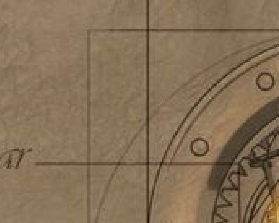
I tried to zoom but i do not see what it is:
I see this kind of “effect” in a lot of images so i guess it must be something simple but i cannot replicate this no matter what i try.
(I tried to use multiply and add as blending modes to see if i was getting better results but nothing)
Anyone can point me in the right direction?
thanks for any help
Here I would begin to create a canvas with texture and would also make it looking old/aged, may it be a paper, parchment, a real fine woven canvas, something like that.
For painting or writing I would try our calligraphy brush tool, but I guess you have to experiment here. And it may be perhaps an idea to put the “aging effect” above your lines (or writing) and canvas via a very low opacity layer, maybe from an originally (dark?) purple tone with a little blur added, and as said above all that.
But that would be something with which I would probably experiment for hours if not days till I’m happy and satisfied.
Let’s wait and see what for ideas other users have to offer. I think this can get an interesting topic, so thank you for that question!
Do you mean the the line varies in thickness and opacity?
This “drawing” you see here are often done in vector drawing programs. These lines that tappers at both ends is easy to draw there. Then you overlay your final drawing over a paper texture with slight opacity.
You can do something similar in Krita if you have a graphics tablet but with less control (like in is practically impossible to draw the perfectly vertical or horizontal lines). Choose a brush with thickness and opacity that varies with pen pressure. Then, use the Line Tool and then “flick” your pen across the canvass. The result would be like this:
It is really difficult to control the angle and length of the lines though you can use the transform tool to remedy that a bit. The lines doesn’t taper the same way on both ends but that does makes for a more natural looking result.
Another alternative is to use the Ellipse Tool (instead of the Line Tool) after selecting a Brush to essentially draw thin ellipses, use the Transform Tool for further control like making the “line” thinner and longer/shorter. I suggest you use the Ellipse Tool to draw a thin ellipse but still on the thicker side and thin it further into a “line” using the Transform Tool. Use the Transform Tool on one of the “lines” to be at an angle. Layers is also a great help here to control individual “lines” which you can then merge. This is what the result would look like:
The taper on the ends of this one is more symmetrical which isn’t always bad. You can try various brushes and you tinker with the tool options to see what effects you can get.
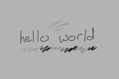
No i probably did not explain what i am looking for.
I can do the lines with varying thickness and opacity. The problem is that they look “floating on the paper”.
Consider your images, the lines are really nice but at least for me they look on “top” of the background. In the example image i have this impression (and maybe it is only me) that the lines are part of the paper like almost if they are carved in the paper. Of course the role of the paper background is important but when i draw lines like yours, no matter the background, they always look like they are floating on the paper, like i am missing something to “link” the lines with the background
What if you did an offset shading layer beneath your lines? I do this with my watermarks. You can duplicate the lines then apply your desired mode (such as multiply, addition, or whatever) and fade the opacity and using the Move tool, move it a few pixels downward and either left or right. (You can see examples of what I mean from some of my artwork in this forum.) … You might even be able to apply a gradient mask or something like that.
Hmmm. One thing you can try is to blur your drawing a bit first. The floating effect might be due to the lines being too sharp. Turning down the opacity of the drawing could also help make it blend in more. Not using a pure black (and instead use a very dark grey or very dark but unsaturated brown or any dark colors you want) could also help. You could also try overlaying the texture on top of the drawing and apply the blending modes on the texture, instead of overlaying the drawing over the texture (like what you seem to be doing). See if any (or even try all at once) works to get what you want.
(flick between the two images to see the difference.)
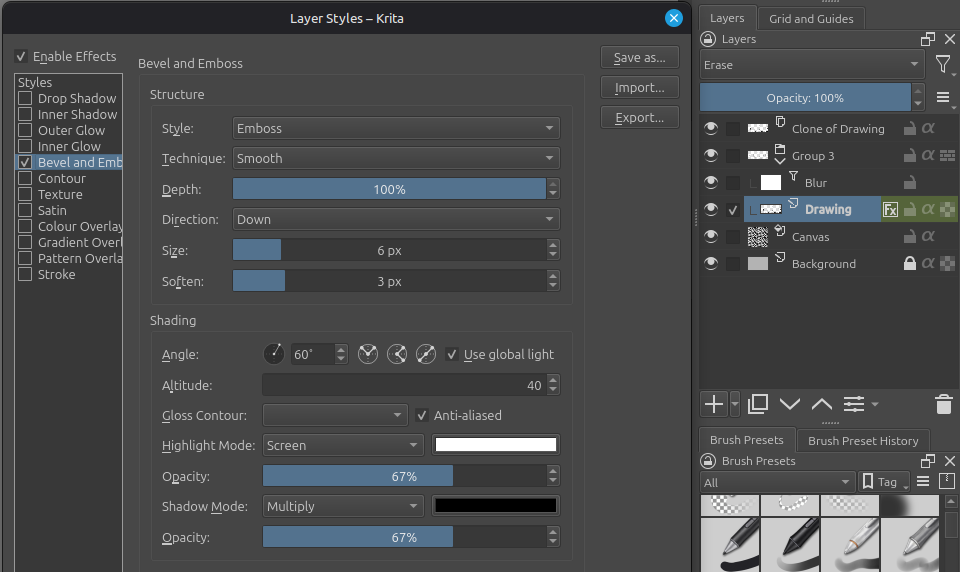
I was going to attach my .kra but I’m just now learning you can’t do that
It’s pretty straightforward though so I’ll just describe it…
This uses an emboss layer style on the layer with the drawing. The emboss has a hard edge so I use a blur layer on it. This also blurs the drawing itself, so I set the drawing layer mode to erase, place these layers in a group to isolate the blur/erase, and make a clone of the drawing layer outside of the group with no style and normal blend mode.
@tomjk First of all, this is exactly what i was looking for and you example looks amazing!
I am sure i was not going to figure out something like that even in a million years.
Can i ask you how did you figure out the erase method? Because before trying your solution i was sure that whatever blending mode you put on the last blending mode of a group was irrelevant but it is clearly not the case. I am going to mark your answer as the solution, i will just wait a little because i do not know if after that anyone else can answer/
It was important to have a clean unblurred copy of the drawing layer, which is what the clone is.
The problem is then that the clone layer is “doubling-up” the drawing layer, so we need to get the contents of the drawing layer out of the way while still keeping the effect of the layer style.
Having the drawing layer in erase mode does exactly that; it makes the layer contents invisible while still showing the style as though they were visible.
As for how I figured that quirk out, well, I just took a punt on it while expecting it not to work
As you said, being the last layer in a group means its blend mode is irrelevant, that is, it isolates the effects of its blend mode from the rest of the image, which was exactly what was needed.
I should clarify at this point: if you don’t mind the harder emboss then you can ignore all that nonsense and just use the drawing layer in normal blend mode directly