Hey all,
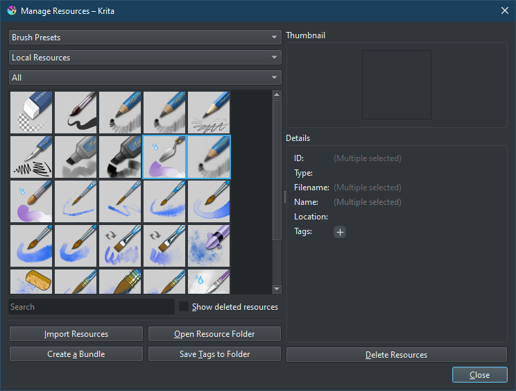
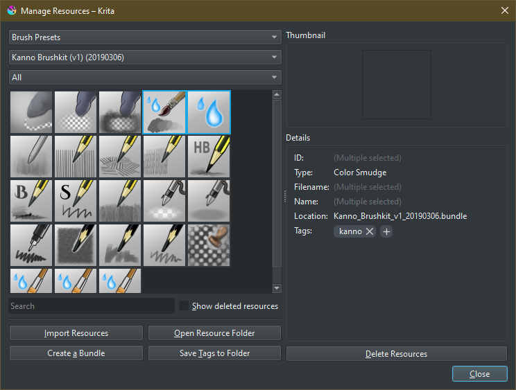
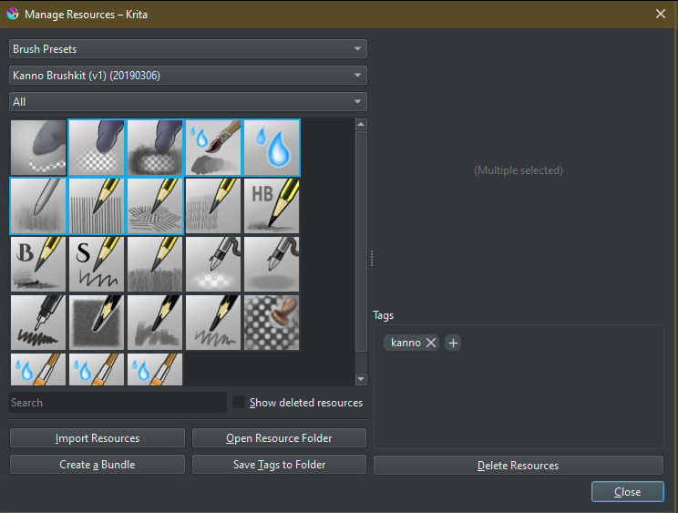
Here to ask some feedback about Resource Manager: add a placeholder panel for no/multiple selection (!1752) · Merge requests · Graphics / Krita · GitLab to try and improve the UX when selecting resources. I’ve added a placeholder panel for none and multiple selection, trying to aim for a cleaner and more accessible view.
However, I’m not sure about the multiple selection panel:
| Before |
After |
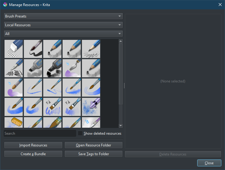
With placeholder |
|
|
|
|
|
|
What do y’all think?
5 Likes
Things are looking neat and clean. For the placeholder, you can use a thumbnail with selected resources stacked together. Example, two brushes are selected. Take both of these thumbnails and stack them together, one on top. OR you can be generic and use a predefined 3 or 4 icons stacked together regardless of what brushes or resources are selected.
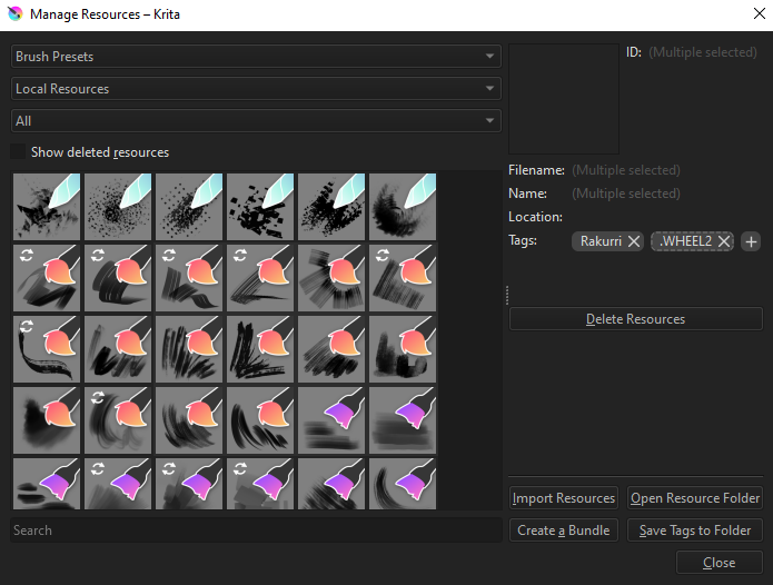
Also, while you’re at it, the selected resources should have a better highlighting. As you can see, purple/violet makes it hard to see what’s being selected.
also, it would be useful if it also let us know how many items are selected for the multiple selection panel.
Wonderful! I like the changes!
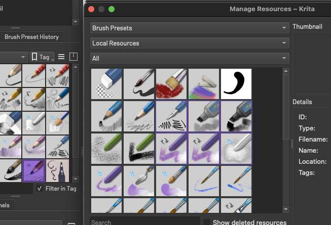
Also, I agree with TheScroll on the highlight issue. I use a theme that has a light grey selection highlight which works nicely elsewhere, but it’s near impossible for me to see which resources I have selected, but I do not want to use another theme as I like it so much (Wojtryb Darker Redesign)
The selection colour in the Layers panel
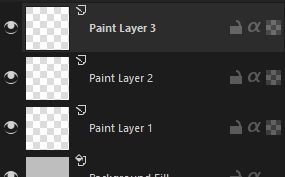
The (I assume) same selection colour in the Manage Resources panel
Keep up the fantastic work! These small but meaningful tweaks are some of my favourite features to see in Krita  Thank you!
1 Like