
Thank you for the RGB color slider, but please, delete the tiny arrows under the sliders and replace them with a white/black indicators ontop of the bars, just as shown below.
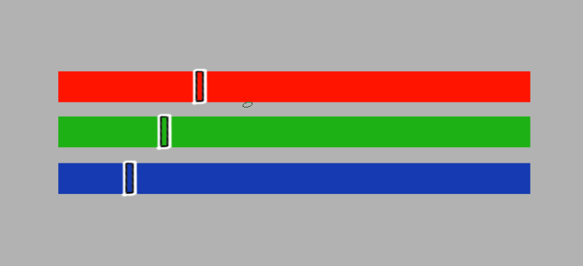
You get the idea.
#Ergonomics_matters
Thank you for the RGB color slider, but please, delete the tiny arrows under the sliders and replace them with a white/black indicators ontop of the bars, just as shown below.
You get the idea.
#Ergonomics_matters
I agree about the bars but, one problem is that it lacks accuracy of the arrow. May be the bar can be just one line?
A priori, it looks that way. But it’s not with the following explanation.
The inner part of the indicator can be considered a line. And it becomes precise again. ![]()
I think either would be fine since selecting a precise value from the sliders is kind of a non-starter anyway. Just a line would be pretttier imo and work better at the ends of the slider. As long as the area to drag the widget is larger than one pixel wide.
Both would be an improvement on the arrows.
I guess pigmento is ergonomic with the line then.