I am preparing a comic project to make a -potential- first chapter of a comic book. I have made a script, and sketched 28 pages. I settled with a manga style template, and I can say that I am rather experienced with krita. Now I intend to colorize them. I am not yet aiming to earn anything with it, it’s more like a test to see if I can truly handle this. Nevertheless I’m dead serious about ending with a result that is presentable, worthy of continuing and, who knows, publishing. I want to do this right.
So to the more eperienced comic artists:
-What would you warn me for, before I start? What did YOU forget to decide beforehand?
-Am I nuts for making this at 600 dpi? The page dimensions would be A5, so that would be around 3500/5000 pixels. Yes my computer can handle this.
-What color space should I use? I know this is often more important than newbies tend to think. Should I really go on a colour space course first?
-how do you decide the margin around the content? I assume to be safe as I can adjust this later for all pages in one go.
-Did you spend a lot of time finding the right font? Could I hand-write the text or is it not-done?
So back in May I worked on a 40 page comic for my school, here’s some tips I gathered from my experience
Make sure to have some other people read your script before starting anything. This will help you have feedback on your story. Also have people review pages when you are still sketching to see if the reading flow is okay.
Not all your panels will be perfect. This is normal. Dont waste time trying to make the perfect panel. Comics require a lot of drawing and sometimes you cant make all of them at the best quality. Just try to make them look good enough.
Save and Backup! Always useful, you dont want to lose work. Personnaly when working on my comic each time I finsihed something (like the skecth, lineart, colors, shading, etc) I would immediatly save a .png copy to Google Drive.
Comics require a lot of skill, and when you are making them you will quickly notice where you lack skill. Don’t let it discourage you. Do some small studies before starting, and remember your primarly goal should be finishing your comic, not making the best pages, not telling a story,etc. Even if those are also important, you should prioritize actually completing your project. Having this in mind helps with motivation.
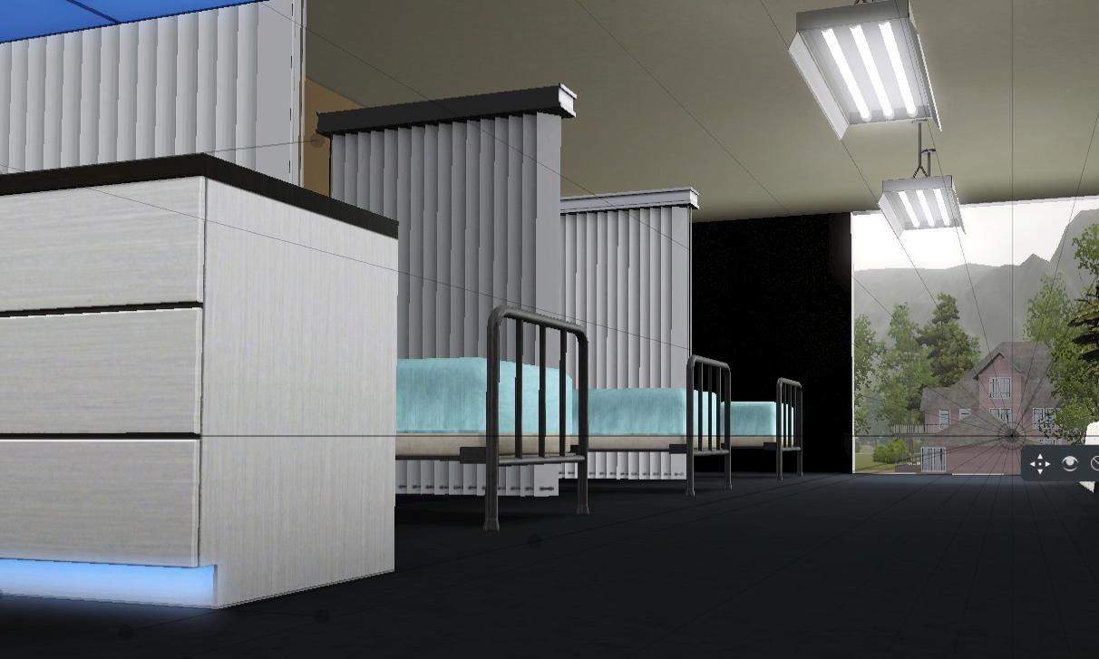
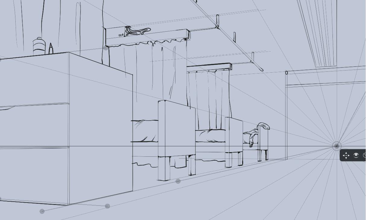
Quick tip on Perspective, Krita has guides with vanishing points that are very useful, but you could also use a screenshot from a 3D environment. You can make a quick mockup on Blender, or if you have the Sims (wether it’s the Sims 2, 3 or 4) you can try to replicate a room with the various objects available, and once you are done, you go into free camera mode (tab key) and take a screenshot. Here’s an exemple using the Sims 3:
The bigger the resolution the better. It will scale better overall and you’ll have more detail.
-There’s no recommended color space. I personnaly use 16 bit sRGB for better editing and less artifacting in general.
-Fonts are up to personel preference. Try to test different fonts and see wich one looks the best. If none fit your taste, just handwrite everything. I advice you to take Truetype fonts, they are better in general and allow you more options when editing your text. You should also write all the text on specialized software like Scribus or Indesign, they’re specially made for dealing with text.
600 dpi should be good for lineart. I’ve heard that for colors, 300-450 dpi is fine, too. But if you want to do everything in 600 dpi, it’s ok as well.
Color space - if someone tells you to use CMYK from the get go, please first check this post: Is working in CMYK worth it?
Actually there’s something to be said about not having a super high resolution; higher resolutions do take longer to draw, even with zooming in/out. I don’t know what causes this, just something I noticed.
The prime reason for high DPI is printers, but color printers can’t go about 250~ dpi, and 600DPI is usually intended for black and white comics without anti-aliasing. I would rather spend that on the bitdepth. If you want to choose a different colorspace than oldfashioned sRGB, you should make some test images and decide what you find most comfortable. If you have a wider gamut than sRGB using 16bit per channel is recommended. More important is trying to get a cmyk profile that your print house prefers. You need to discuss this with them.
Margins is up to your own taste, but more important is the bleed(which is like, the margin from which the image is cut). This doesn’t need to be bigger than 5 mm.
As for the font, I made my own font, because I noticed they’d be the right proportion to my lines.
She’s referring to banding that can come up with mixing and layering colors in 8bit. We’ve fixed this for the color-smudge brush(by doing the mixing in 32 bit) and are trying to fix it for the pixel brush(we’re still deciding how we want to tackle this, it needs dithering but we haven’t decided what would be the fastest), but overal higher bitdepths have less maths errors because the precision of the involved numbers is higher, so also less artifacts when mixing and layer colors.