Hi everybody.
I’ve made a merge request for a screentone generator I’ve made (you can see it here: https://invent.kde.org/graphics/krita/-/merge_requests/372).
I’m pasting the text I’ve written for the MR here also to save you some time:
This is an implementation of screentone filling as a generator. It allows to fill areas with different dot/line patterns, which added to the capability of the generator layers of being painted to set a mask on it, let’s the user to reproduce the classical screentone process which consisted of cutting transparent sheets with dots and stick them in the drawing (example video 1, example video 2).
The patterns are generated completelly procedurally, so the user can change the configuration at any time, and they are fast.
The generator has options to change the pattern, the foreground/background colors and opacity and the geometric transformations (position, size, shear and rotation).
You can download a testing package here (thanks to Dmitry Kazakov): krita-5.0.0-prealpha-screentone-dk1.zip — Яндекс Диск
And here are some example images (you can download the .kra files in the MR message and play with the screentone generator using the testing package):
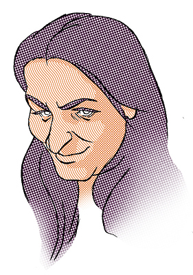
This image uses the generator as the traditional screentone sheets.
This image uses the screentone generator to make a halftone effect (mixed with blending modes and levels filter) and shows the potential of the generators to be used as the base to make the texture of a halftone filter.
I’m looking forward to hear what you think.


