Isn’t the point of out of gamut warnings to show which colors will change (upon conversion) BEFORE actually converting to CMYK? I’m not sure why I’d ever see warnings AFTER converting my design to CMYK. (Especially since I was soft proofing with the same settings as the actual conversion.) Should I ignore them and only pay attention to the warnings that show BEFORE converting my design to CMYK?
Softproofing design (with or without BPC) BEFORE converting to CMYK, there are no out of gamut warnings. (Because I previously removed them all by adjusting colors.)
Softproofing design (with or without BPC) AFTER converting to CMYK(with BPC CHECKED), there are still no out of gamut warnings.
But, softproofing design (with or without BPC) AFTER converting to CMYK(with BPC UNCHECKED), all of a sudden there ARE out of gamut warnings.
If it helps any, the entire time, I was converting my design from sRGB-elle-V2-srgbtrc.icc ~> U.S. Web Coated (SWOP) v2 with relative colorimetric rendering intent and soft proofing using U.S. Web Coated (SWOP) v2 with relative colorimetric rendering intent.
The simplest BPC explanation I could find that I understand well is: BPC scales the source colors so that the darkest point in the source profile maps to the darkest point in the output profile. If the source black point is darker than the output black point, BPC will lighten the colors to compensate for this difference.
If I had only seen the alarms going off when soft proofing(with BPC) after the conversion(without BPC), then I would assume the warnings are showing the differences between having BPC on and off…but they still showed up even when soft proofing(without BPC) which doesn’t make sense to me since I used the same soft proofing settings as the actual conversion. All of this makes me think that turning BPC on or off when soft proofing doesn’t actually do anything and that turning BPC on or off when actually converting color profiles DOES do something.
Edit: Sorry, I must have been tired and/or out of focus or something because I misunderstood what was actually happening on my end and totally described it wrong. I’ve now updated my original message to better reflect what I know.
BPC controls blackpoint compensation, in particular, because printers aren’t printing with something like vantablack, their blacks then to be grayer than a monitor screens’
Which means that if you converted with bpc, and then are softproofing without bpc, the gamut warnings are going to be right where the blacks mismatch between the monitor and the printing device described by the cmyk profile.
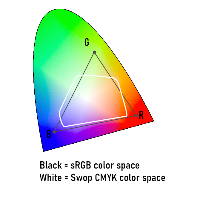
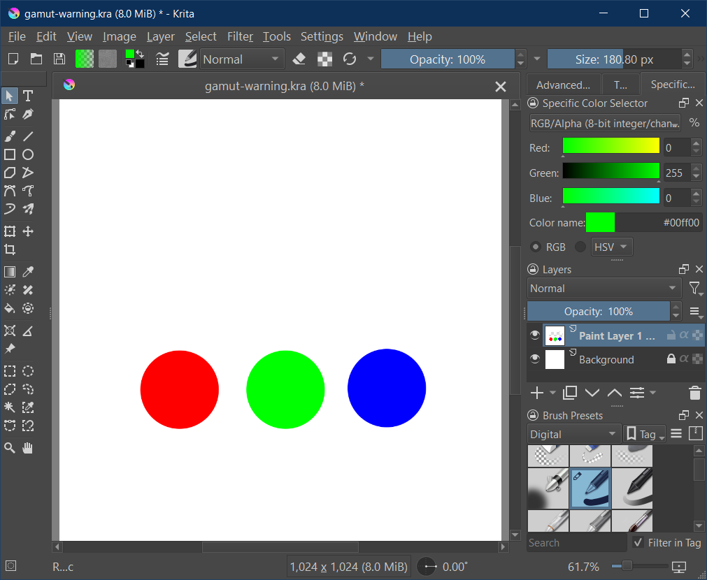
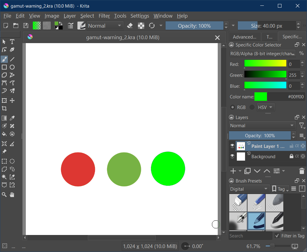
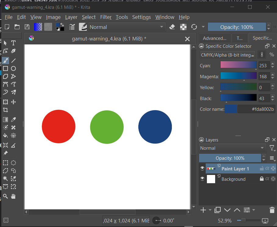
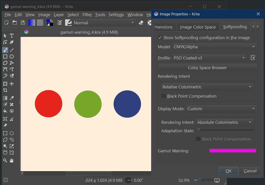
Obviously the pure red, green and blue of sRGB are not available in Swop. Meaning Swop can not print, reproduce etc. those saturated colors.
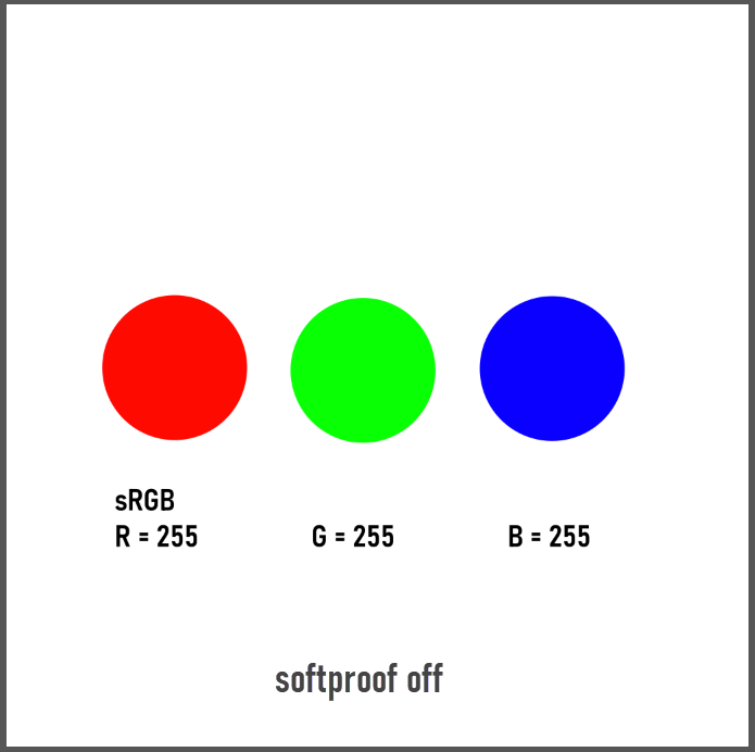
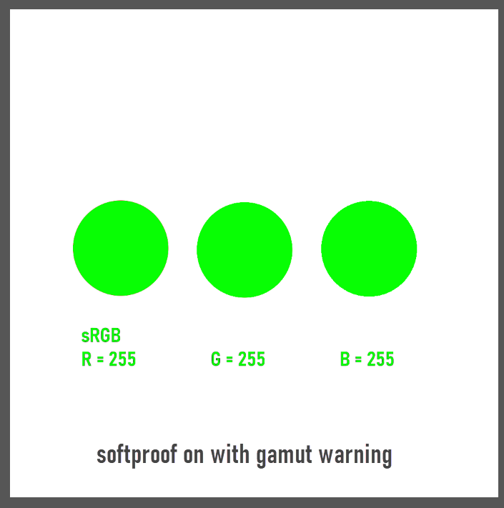
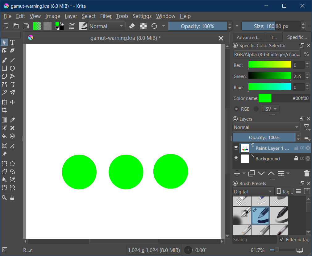
If I now make an sRGB image in Krita with 255 red, 255 green, 255 blue and activate only softproof (Ctrl + Y), then Krita converts the colors with respect to the settings (in this case it is moving the pure colors of sRGB to the best fit it can find in the Swop gamut).
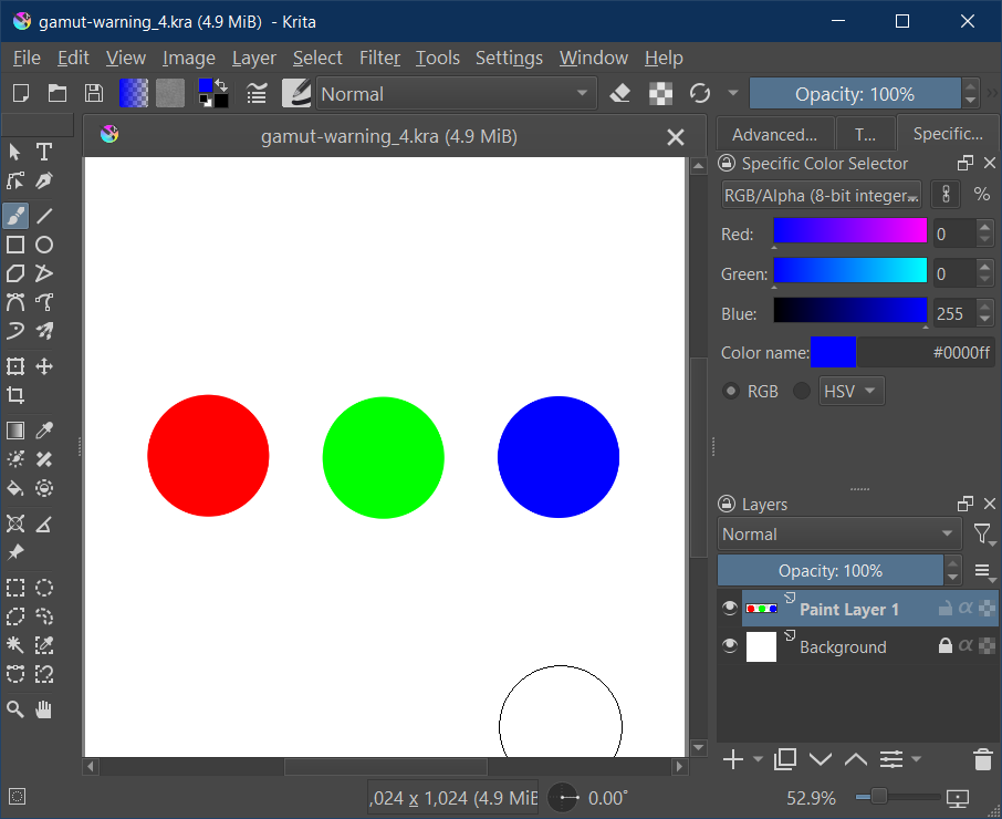
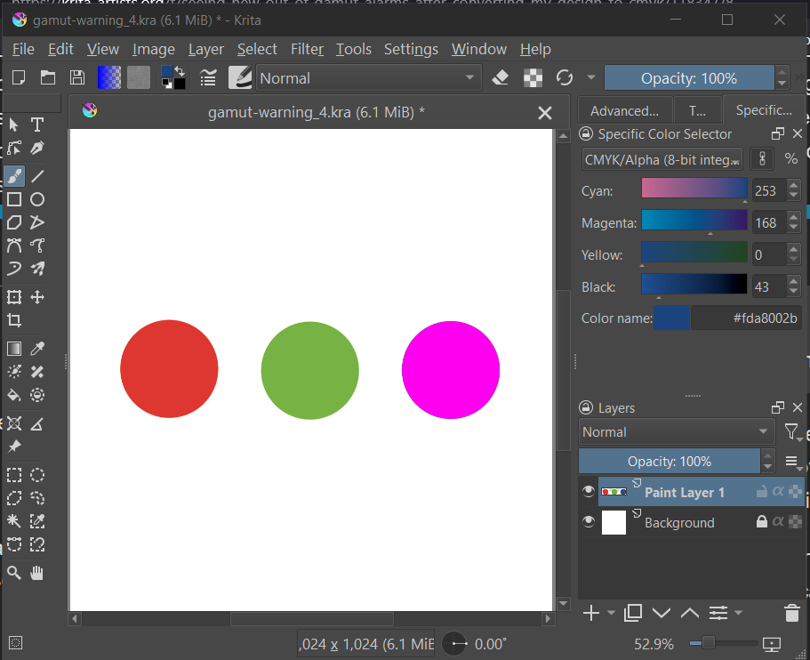
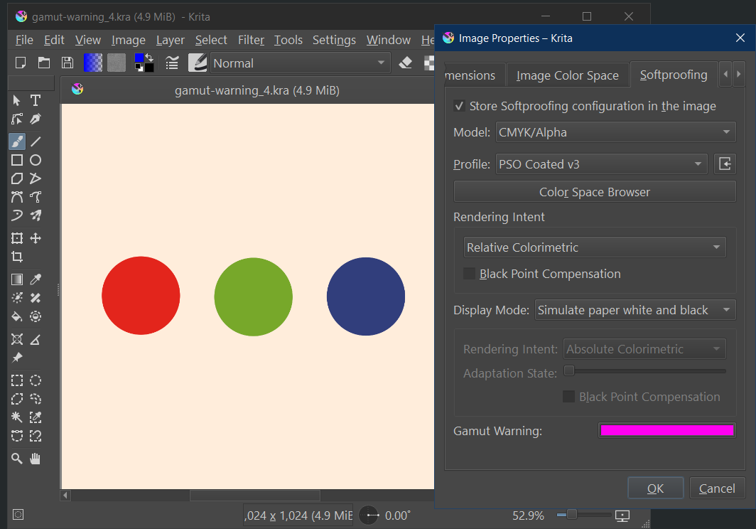
I save the document, open it and activate softproof with gamut warning again. Now the softproof is evalutating Agfa Swop against Agfa Swop and not sRGB against Agfa Swop. So there should be no warning - but there is a warning in the blue patch:
EDIT:
One note to consider:
ICC profiles can have different sets of conversion tables / cuves. Those ones used for softproofing can be different from those used for a real conversion. In some cases the values can be quite different. It can happen that a softproof gives different results than the real conversion. I tried for example PSOcoated_v3.icc instead of Agfa Swop and get gamut warnings for two patches (green and blue) in that case. So I am not sure if all this is an issue in Krita or better in the lcms lib (little color management system) Krita is using or in the icc profiles themselves.
But in all tests I get the gamut warning before the conversion, which seems to be different to the experience of @jofudachi
Er, if you’re going to try and find bugs in Krita’s softproof mechanism, do so in 5.3, as I overhauled softproofing in january so that the intent and BPC is handled correctly (hence there being two intents in 5.3: the proofing and the display one).
For what its worth, littlecms ignores the proofing curves and uses the actual curves.
@jofudachi That was towards @cgidesign, but in your case you can give it a go as well. I can’t reproduce it with 5.3 with uncoated-fogra-47L in any case. (sRGB image to CMYK with relative colorimetric and bpc on, softproofing will have it in gamut. If I use perceptual for the second proofing it’ll go out of gamut, but I think what might be going on here is that it converts back to lab and then to the cmyk profile again for softproofing… The reason it doesn’t show up on relative colorimetric is because those transforms are a lot less lossy)
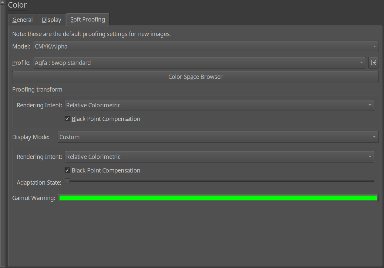
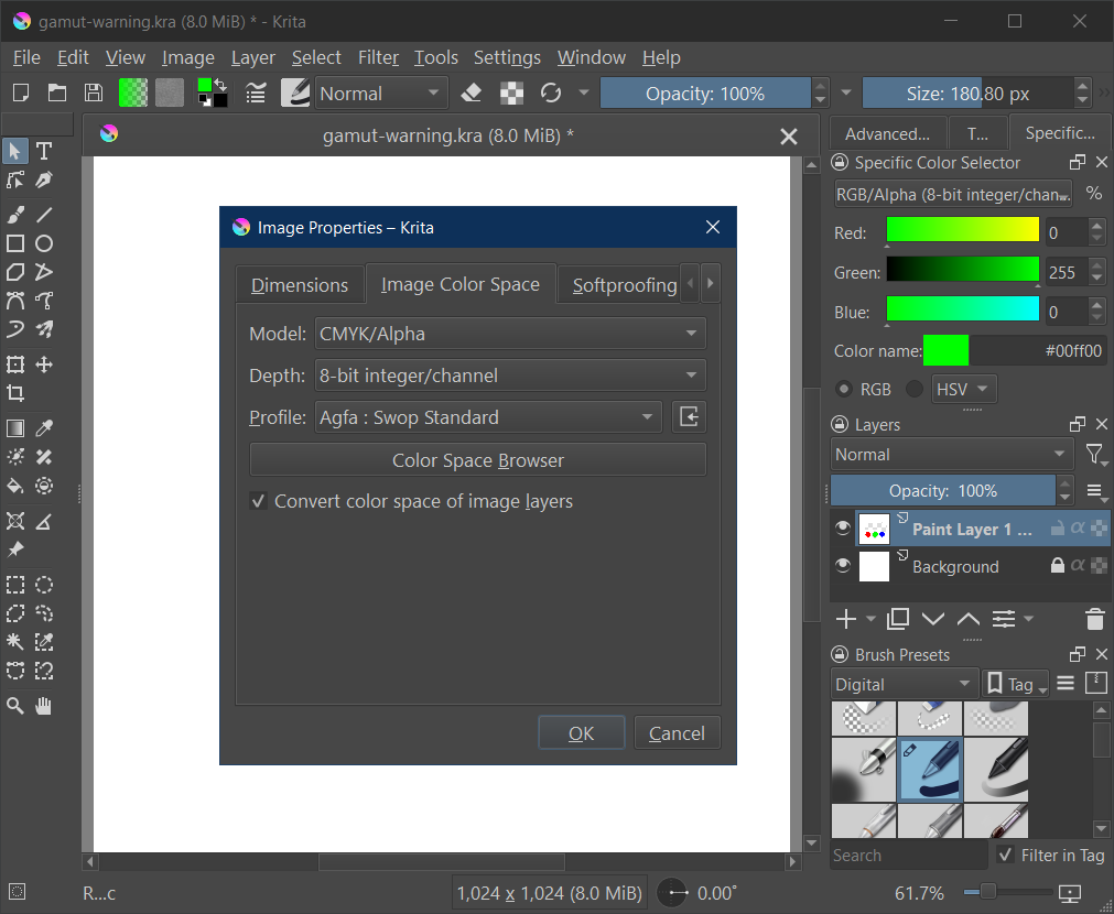
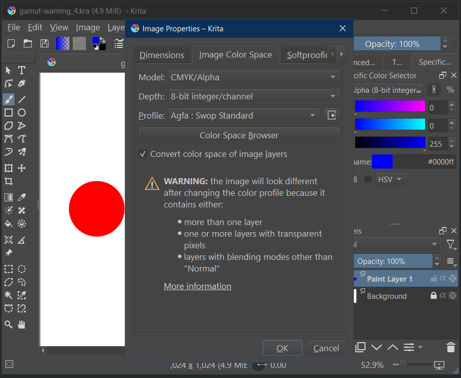
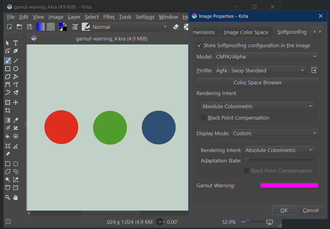
EDIT: Btw, Krita’s softproofing settings are in image->properties->softproofing. The ones in the preferences are the “default softproofing settings”. This is because the softproofing settings are saved into the image (as you’d want it unique per project). I am mentioning this because I know people think it works the same as certain other software where there’s only one global softproof setting.
Yes that’s great, but please put a text in the general settings mentioning this. I was testing over and over to understand weird results and noticed the “image->properties->softproofing” around half an hour before your post
I was changing the general settings all the time and got totally unclear results, which now is clear because the “save with image” is active by default.
Nonetheless:
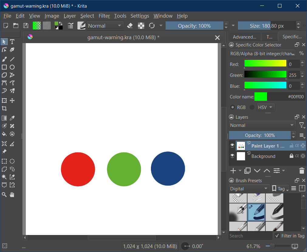
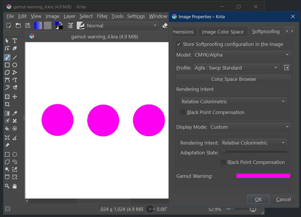
Even with now using the image properties instead of general settings, there still appears an out of gamut warning after conversion to Agfa Swop.
My best guess is that the conversion LUTs in the afga swop profile have the tiniest error in those blues, meaning that that blue, which are at the edge of the color gamut (because it clipped from a truly out-of-gamut color), during softproofing (which goes from cmyk back to lab and then to cmyk again for the first conversion) rounds out to be just outside of the color profile. There’s not much that can be done about that.
That one is because of the white-point difference between your screen and the paper. Consumer screens are typically at d65, the paper is at a different white point, the standard is d50 for ICC, but the paper might be slightly different from that. Anyway, with absolute colorimetric on the second transform (display), it needs to correctly show that paper white unadapted, meaning that if it is d50, it is going to be warmer (yellower) than your screen (which I assume is going to be d65ish).
EDIT:
I was writing while you where to - so my post is similar to yours
Maybe I can answer this myself. As far as I remember it, all icc conversions are internally done with D50 whitepoint reference (which is warm yellowish). This whitepoint becomes relevant in absolute intent. There was something called “chromatic adaption”. If my memory is right, this is used to compensate in situations where one whitepoint differs from this internal one. The display will have D65 (if set to sRGB and not a custom icc profile). So I guess your “adaption state” is exactly that compensation slider.
Sorry for the wait, our power went out for a couple days due to the storm. I don’t know if you had a chance to look at it yet but I updated my original post because I got a bunch of things wrong.
It sounds like whether because you were using Krita 5.3 or because you were converting to uncoated-fogra-47L, you got wildly different results than I did. I also did add to my original post that I converted to US Web Coated (SWOP) v2 (as that’s what my manufacturer prefers to use currently.)
I did do another quick test and found out that converting the design with perceptual (over relative colorimetric) doesn’t seem to make any new out of gamut alarms (with or without BPC)…so that’s interesting. But with that said, if I still want/need to use relative colorimetric, do I need to worry about those alarms I get(when converting using relative colorimetric but without BPC)?
It seems weird that they would show up under this one situation only, but even still, I don’t know why ANY warnings would ever show if I’ve already converted my artwork to the color profile I’m soft proofing in. I thought the alarms are made for use BEFORE changing color profiles. If it’s just technical stuff that won’t have an effect on the final print, or is fixed in 5.3, then maybe I can just safely ignore the alarms and move on since I know they didn’t show up when soft proofing before the conversion?
The other option I have is to convert with BPC on. But due to my superficial understanding of BPC and the fact that I don’t see much of a difference with it on vs off, I don’t really know if I should keep it on or off in general.
What is probably going on is that those colors are on the boundary and thus the color management system can get confuse them for being slightly out of gamut.
Ok, that makes sense. I had read the message but (like usual) got caught up with all the words I’m not familiar with so ultimately didn’t realize it had already answered my question. Thanks!
While on the topic of gamut warnings, I recently saw a somewhat older video by a YouTube channel (Sid V Photo) explaining that (at least in Photoshop), a common misconception about how out of gamut warnings work is that they indicate which colors WILL change values upon CMYK conversion, but in actuality, the changed values are ALREADY reflected when soft proofing (with the gamut warnings off).
They said, due to this, you may or may not want to spend all the time removing the warnings and that it really depends on whether the image already looks good enough or not after turning soft proofing on.
Is all this true? If so, is it true in Krita as well?
Yes, sort of, what out-of-gamut warnings represent are the colors that get clipped because the new colorspace doesn’t contain them. So the reason you use them is because they alert you to places where contrast may have been lost.
For example, black is nearly always out-of-gamut, but most of the time it’s not that big of a deal because it was just line-art, and that in itself can be done with whatever black is available. But if you have a very moody piece, like something for halloween, maybe some dark-greys get crushed into the same color as black during conversion. The gamut alarms would alert you of that so you can lighten them and keep the contrast.