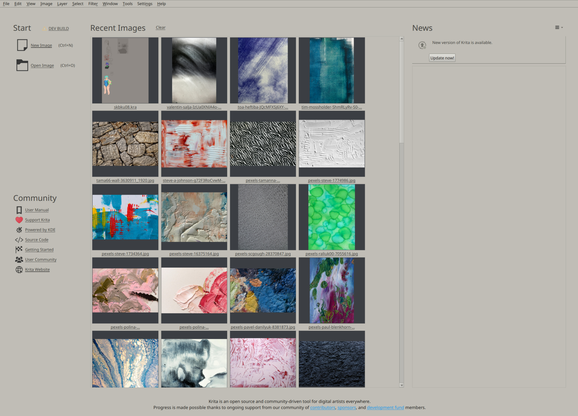
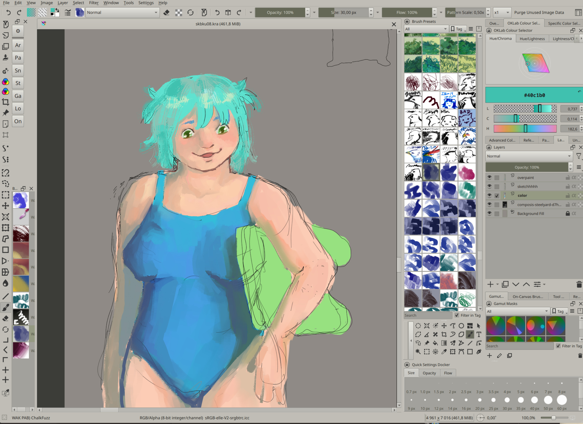
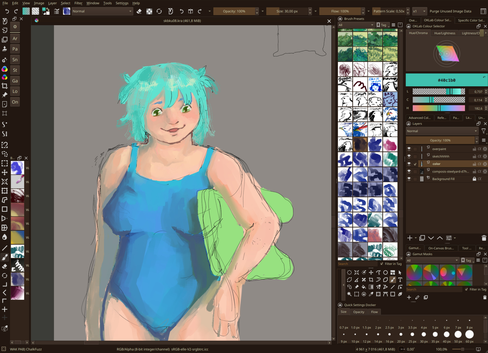
Recently, I’ve read a bit about a general Krita setup from Deevad, and read a bit about color theory.
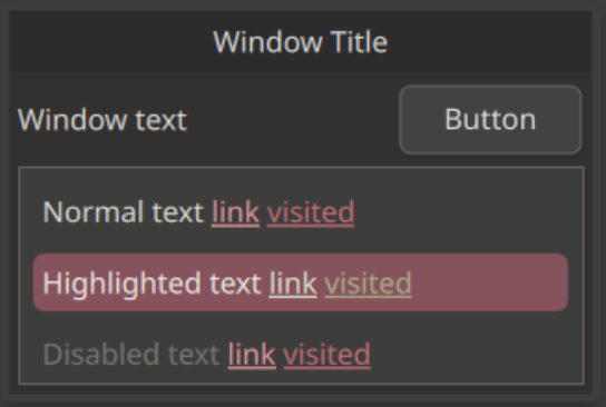
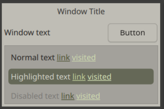
While I do like my previous themes, I consider these ones to be the much more “neutral”. I’ve been using Salinas almost everywhere recently, and Lowco-Olive is a more recent one where I’m trying to give light themes a shot again.
These are mostly lower in contrast, but I did my best so that they’re still okay at being readable.
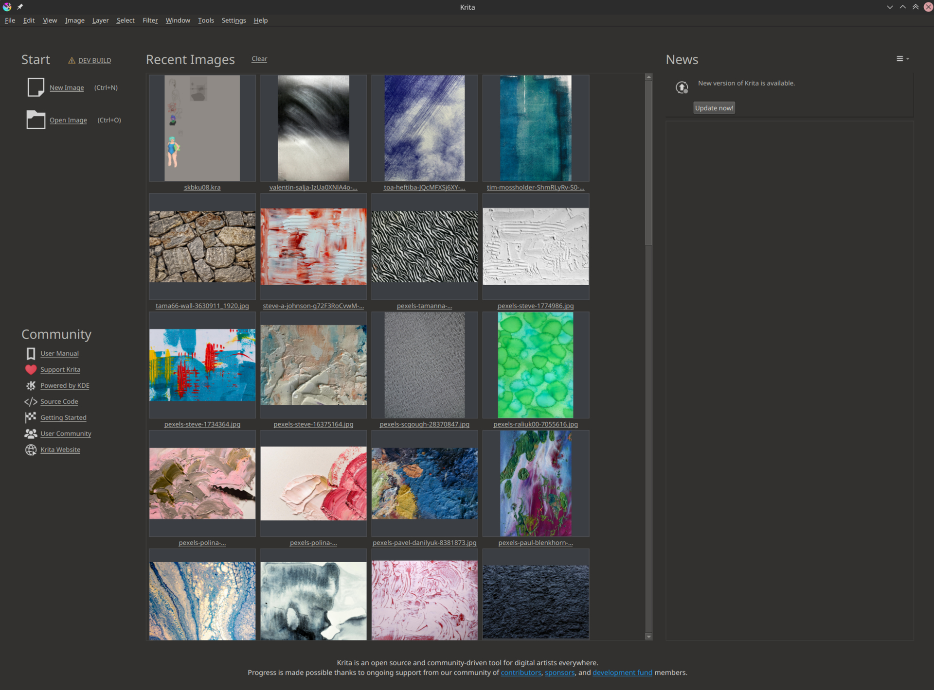
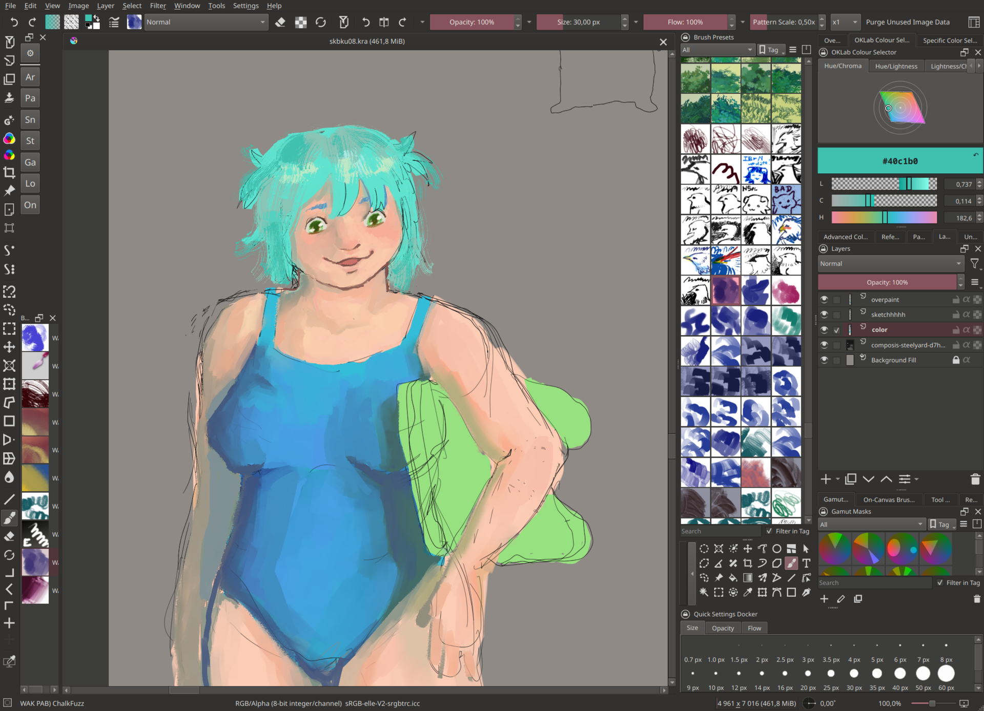
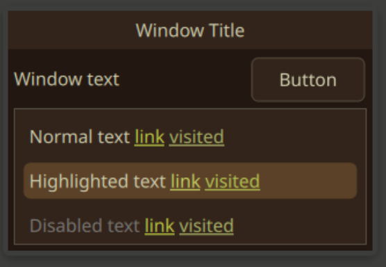
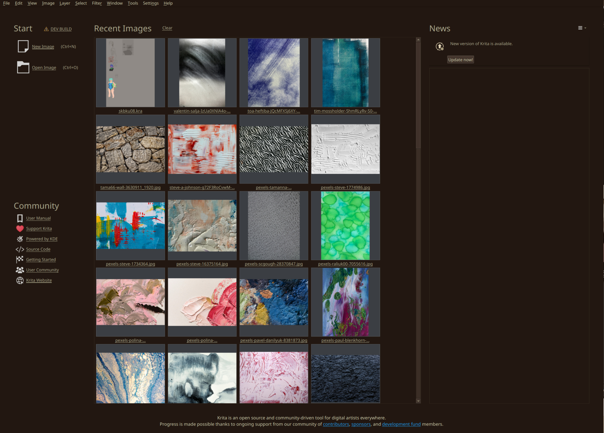
The WAK_Forest also got a big update & I consider it to be finished! Previews below:
Hoping to add some more themes in this style in the future while I experiment a bit with color combos; still, I do not like using pure grays – I like warmer undertones in my dark/light themes, even if they make my art less color-accurate in a way, because I can at least stare at the screen without pain : P
Woa!! i love the first one i will use. But also that is some gorgeous art may i ask what brushes are those? if it is okay, where can i download all those brushes that are visisble in the image with the teal haired character? like those foliage, sketchy, dark blue brushes? sorry if it’s alot!