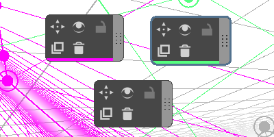
I have been doing a study of fish eye lens perspective of some buildings, which required making multiple copies of the fish eye lens assistant for different objects in the scene. I set them a Custom Colour to help keep myself organised and make it easier to recognize what ruler I have active but I had another idea:
Currently, the number of rulers is a bit overwhelming but sometimes complicated images require a lot of assistants.
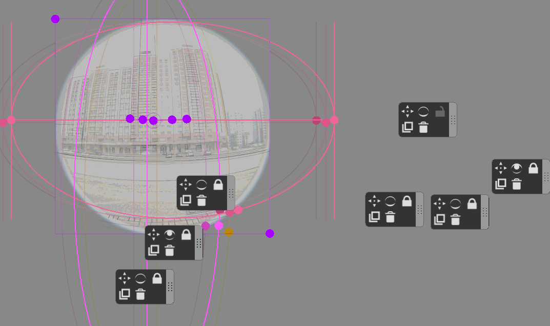
The docker currently looks like this, with no information about the colour on it. Sometimes it’s hard to tell which docker belongs to which ruler, unless you click on it individually and check the Custom Colour.
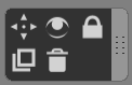
It would be useful to have an indicator of what the colour is on this bar (but not the ability to change it - just as a way of telling rulers apart).
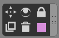
Another way could be to colour part of (but not the entire) docker so it’s obviously not a colour selector region, but also doesn’t interfere with the perception of icons. So it would be more like a decoration but still carry some useful information.
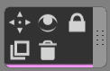
Either way I think having a custom colour on the dialog could save some trouble with hunting down the right perspective assistant and could be a simple UI adjustment that could help with organisation.