This has been bugging me for a long time ever since I noticed - in small font sizes (and independent of the font used) random bits of words have inconsistent spacing between letters, while in other programs such as ms paint that is not an issue.
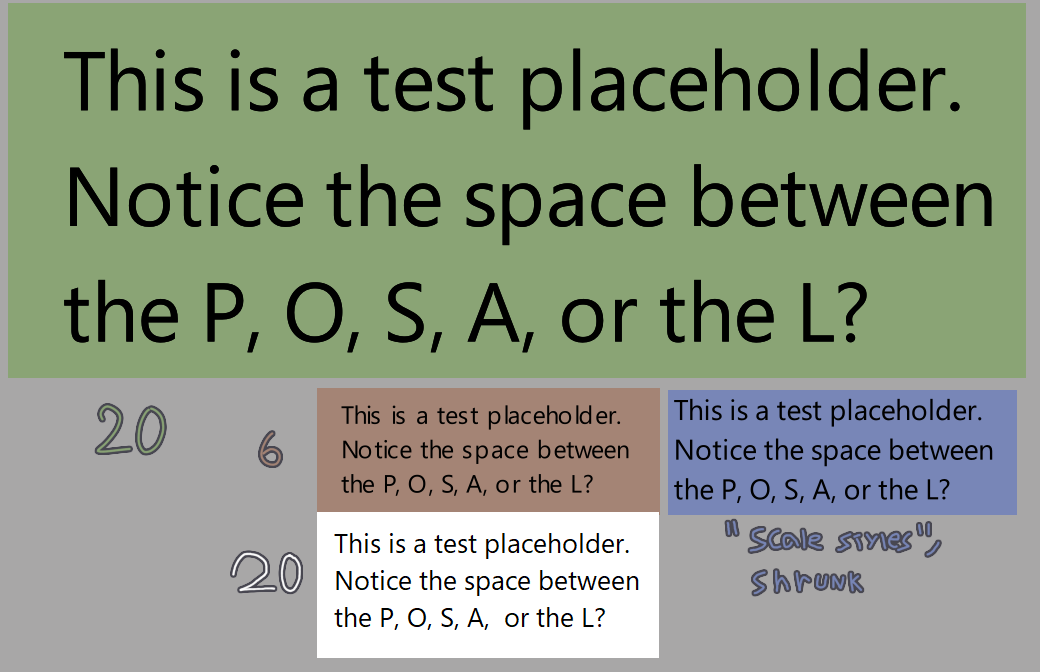
In the image below: green and brown boxes are text done in krita in a 2500x2500 canvas (but cropped for the screenshot) with their respective font sizes, and in the white box the same text done in ms paint. In the blue one, the same text as the green box, but downsized with the ‘scale styles’ option to be in similar size to the brown box text (while technically still having a 20 font size).
Interesting. I usually do the longer text part (like comics dialogs) in Inkscape and then export to Krita. Maybe that’s why I didn’t notice this problem before…
Does this still happen in 5.2 pre-alpha? Otherwise it might be caused by font-hinting, which scarifices kerning for better legibility (it basically snaps letters to the nearest pixel) and is always on for the previous text layout.
Ok, then it is caused by font-hinting and will be optional on 5.2+ (Without font-hinting was easier to implement for me, but most programs have font-hinting because some folks find unhinted “blurry and unreadable”)