Well, that’s what I was trying to say in the first reply I did: There is a difference between Krita and Scribus softproofing atm, which both have the same color management system, and I currently am too busy with the text tool to have time to figure out what is going on there.
As for simulating coating, the only thing that can be done there is using the black point compensation (which is already a toggle), but outside of that, different paper coatings just have different color spaces, so there’s no reasonable simulation you can do.
Its also not like you feed a paper and ink type into Krita and it calculates how color would look on it. For every material combination (paper (if it even is paper) and ink) someone somewhere had to print it out, and scan colors with a colorimeter and create color profiles for software to use. That’s why you can not simply make a toggle for coated vs uncoated, and why everything is just a different color profile.
Additionally, because of the difference how colors are mixed in light vs pigments, there will always be some difference in how the colors look on your screen and in print, this can also already be completely messed up by the ambient light color in your atelier (I fell in that trap).
Okay, then. I’ll just deal with it as it is for now and hope you can get to it in the near future.
It’s very possible that I just missed it at some point but I feel like this original question might not have been answered: Which method more accurately shows printed colors, soft proofing, or actually converting my artwork?
If converting my artwork is somehow more accurate, I might consider converting and unconverting (my artwork) as opposed to soft proofing it.
I don’t really know until you confirm it but I’m guessing that soft proofing is more accurate based on the fact that the fadedness seems to be intentional in order to simulate printer black.
I don’t have any uncoated CMYK color profiles installed to check if there is already a difference (between coated and uncoated profiles), but I just mean a close approximation. I’m no expert in this stuff, but I can’t help but feel like there is some way both kinds could be simulated (approximately at least) at some point.
And as I said before, I’m very aware that there are lots of factors that can change how the colors look, whether digital or printed. I just want to get my design’s colors as close as possible while keeping it easier (and inexpensive) for now.
Instead of converting or soft proofing, you can also create a second view (even in a second window if you want) and use the LUT Management docker to change the color profile for just one view. I did this in the past, for grayscale however. That lets see the artwork in both profiles simultaneously, and work in both views. However, I don’t know if it also uses the same LUT as the soft proofing does, or the same it would have when converting.
Okay, I’ll try to set that up to save me the effort of going back and forth. And I’ll probably put in an order for my design and compare the real thing to my screen(with soft proofing and then with conversion) to see which one is more accurate for my manufacturer.
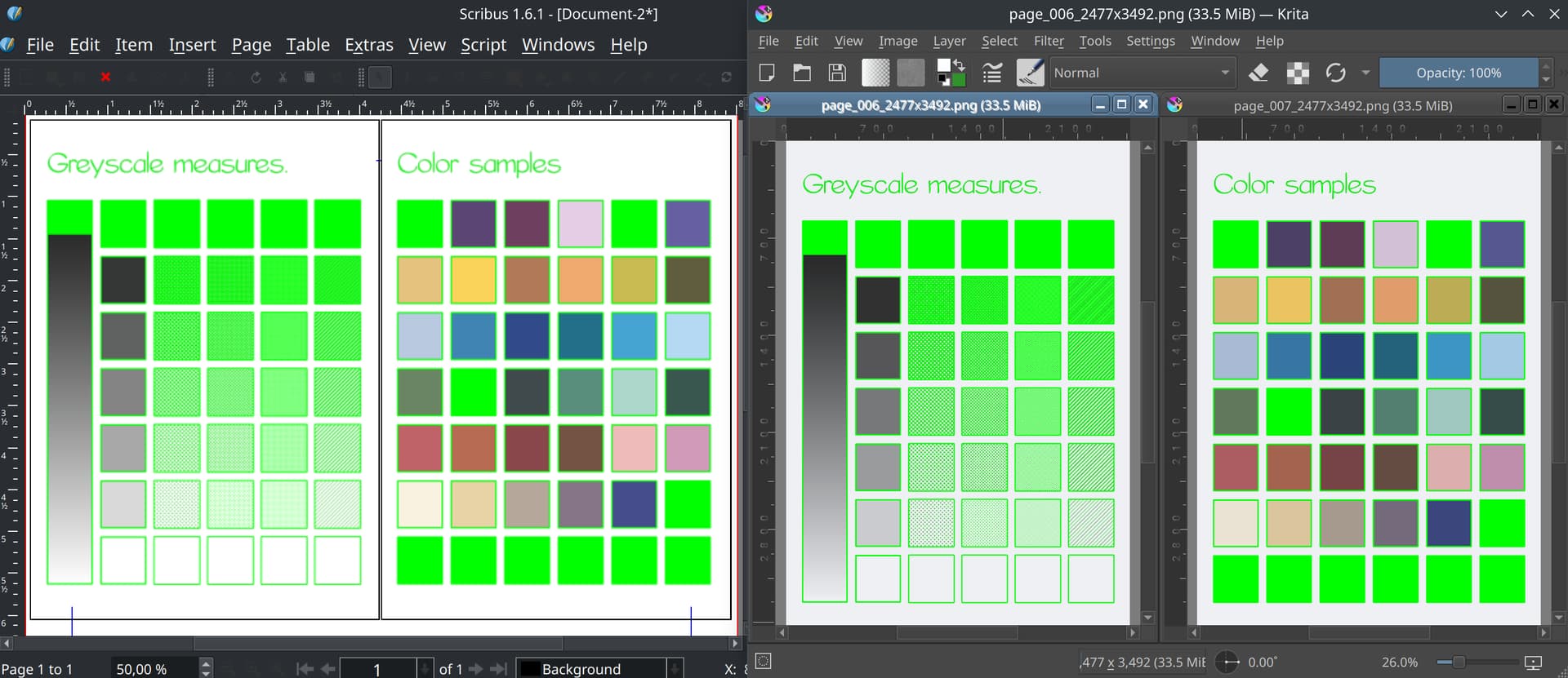
For future reference, I actually took some time to look at what Krita might be doing differently from scribus… and the answer is that it isn’t doing anything different from scribus and whoever told me that was probably confused:
(Both images softproofed with the same profile, with the same gamut warnings. As you might be able to tell from the bright green gamut warning on the black, the blacks are also faded in scribus)
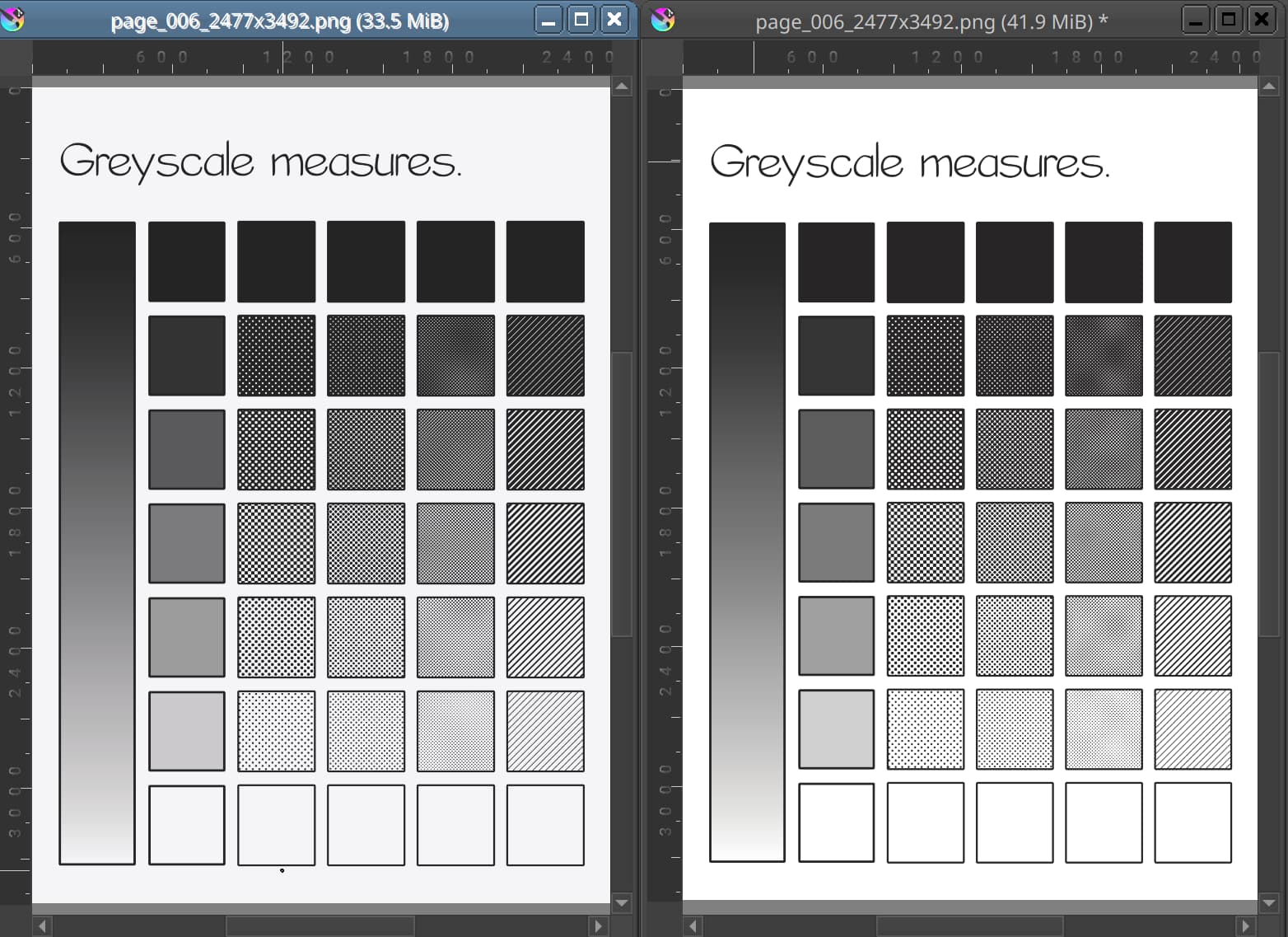
EDIT: To clarify: The softproof is two transforms (image → softproof → monitor) while the regular one is only one transform (image → monitor). For the second transform, softproofing doesn’t turn on blackpoint compensation. So the result is identical if you turn off black point compensation in the settings (and fiddle with the monitor profile briefly, because apparantly the display transform doesn’t get changed when bp compensation is toggled, this one is a bug).
One of these is converted to CMYK chemical proof, the other only soft-proofed. Blackpoint compensation has been turned off in the display color management settings.
It’s kind of embarrassing to admit this, but this sort of stuff kind of goes right over my head. I don’t really understand what any of it means (or even how it connects to what I’ve asked) and I’m not sure I will. I’ve understood the majority of what has been talked about on this topic (by you and by everyone else) but this particular stuff sounds very technical to me. It’s likely due to your knowledge in this stuff being far more vast than mine. (Mine is adequate at best.)
I’m sure it’s helped others here but I think this is just too complicated for me to understand personally. With that said, I really appreciate all the help and time you’ve given up to enlighten me the last, almost month and a half now. Thanks again!