Soft Proofing Doesn't Match Converted Image

I’ve been comparing numerous images (cartoon style art, photography, and more) and have noticed that the resulting images when soft proofing them don’t match the resulting images when actually converting them.

For every comparison I did, I made sure that the soft proofed artwork and converted artwork used the same destination color profile and rendering intent. I also chose to use BPC(Black Point Compensation) whenever using the Relative Colorimetric and Saturation rendering intents.

As far as I know, the bit depth is always set to 8-bit integer/channel when I use Krita. And whenever soft proofing, I always kept the Adaptation State slider as far to the right as it could go(I haven’t really played around with this too much). I’m currently using a macbook pro and do have a side monitor connected, but I made sure that for every comparison made, the pair of images was compared on the same screen.

I tested all the images in (Chemical Proof), (Generic CMYK), and my printshop’s preferred profile, (US Web Coated (SWOP) v2).

Using (Chemical Proof), the resulting images always looked different to some noticeable degree.

Using (US Web Coated (SWOP) v2), the resulting images also always looked different to some noticeable degree.

However, when using (Generic CMYK), the resulting images always looked the same(except when using absolute colorimetric). And also 2 particular times(when using relative colorimetric) when I almost didn’t even notice a slight color change in a few areas of the images.

Is this a known bug or something? I’ve done a ton of research about color management and I think the soft proofing should match the conversions. Maybe I’ve been wrong in thinking that? I’ve stopped designing for almost a month now due to uncertainty of which method to color check with and also due to fear of this messing up the colors when I get products made.

Here is an example comparison with an image I found online. (I’m not that good at art yet, haha!) Both images were set to US Web Coated (SWOP) v2 with perceptual rendering intent. The top image is just using soft proofing and the bottom one has actually been converted.

[Images deleted by a moderator]
2 Likes

In what viewer did you look at the exported images? Windows default image viewer for example doesn’t support color profiles and in some cases even completely messes up embedded color profiles instead of simply ignoring them (in any case, the colors are wrong). Pretty much the same for all current web browsers.

2 Likes

I also just saw this message. Thanks, I’ll take a look at them too. :slightly_smiling_face:

As I already wrote, what image viewer did you use to compare the exported image? Because most preinstalled consumer grade image viewers don’t support (embedded) color profiles, hence the difference.

Windows generally doesn’t even have real color management by itself (i think they have it in Windows 11 now but not sure).

I guess I misunderstood you here, but it sounded to me like you were accusing me of passing the images off as my own original creation(sorry for that). Can you post an example of a “reference photo” so I can see exactly what you’re talking about? I just don’t understand how the two photos I originally posted aren’t reference photos. I mean, I’ve literally been using them both as references for checking that the color is working correctly (in order to determine how to proceed with picking colors/painting next) on my own artwork. At least to me, that seems to fit the description you gave here:

As I don’t want to get content removed again and another strike against my account, I don’t want to risk posting what I think I might be permitted to post. Instead, let’s just pretend that the two images I originally posted WERE NOT AI-made. Then, would the artist’s page link (that I provided) have been enough proper credit to allow me to post the two images safely?

Also, to check if I’ve understood correctly, I AM permitted to upload the two images to my google drive, then post the photo links on this forum(so that people can open the links to compare the photos)?

I haven’t responded to you yet because I was hoping to resolve this removed content event as the images would have done a better job explaining my response to you but seeing as it has already been awhile, I’ll just try my best to explain and hope you understand.

I never exported the photos. The issue I’ve been seeing is directly inside of Krita. When I open two instances of Krita(each one with the same image), and enable soft proofing on one but convert the other one, both resulting images don’t match each other like I think they should. (Even when using the same exact destination color profile and rendering intents.)

Ok, so as the person who implemented the softproofing: There is indeed a difference between converting to a profile and softproofing by itself. They use different LUTs inside the ICC profile, and afaik, the softproofing one tends to use LUTs that also demonstrate the differences in black level (meaning the blacks look more faded when softproofing is on)

There were some reports that softproofing in Scribus is different from Krita (even though they use the same library), but I’ve had 0 time to investigate that, being too busy with text tool work.

5 Likes

I’m not super familiar with ALL the technical terms, but I definitely noticed the visual difference when testing with different images.

But I’m not sure what to do about it exactly. I want to use soft proofing…but since it seems to make everything look different than when actually converting the design, making it look how I want with soft proofing would probably just result in the design changing (to colors I might not want) when actually converting the design at the end. Correct me if I’m wrong but I think that kind of defeats the point of soft proofing.

While using soft proofing (to color check) would be way easier/faster than converting and unconverting the design (each time I want to color check), wouldn’t it be more accurate in the end to convert and unconvert the design (when color checking) anyways?

Also, when soft proofing, are you supposed to turn it on and then immediately turn it back off before working on the design? Or can you work on the design while soft proofing is left on? How do most people use it?

(Sorry for responding so late. I’ve been pretty busy and wanted to do a bit of research before replying. I’m not sure how exactly it affects the colors, but maybe the Adaptation State slider could make a difference. Though I believe it only made a visual difference when using one particular rendering intent.)

You want to have a design that works both with soft proofing off and soft proofing on. This is because usually, you may want to have an image that can be printed using different printers. The softproofing here is primarily to give you feedback of how it might look in a limited color device.

Usually people create a design, and then use softproofing to find the trouble areas in their design, which are usually things like colors being indistinguishable or contrasts being weaker than expected. They then try to correct those errors, which could be as simple as adjusting the resulting colors or as hard as redrawing bits of the image.

2 Likes

Without a screen that is calibrated to the exact same color profile and you having the color profile of the printer it is going to be printed on, it will look different anyway. Normally you don’t even convert the color profile of the image ever. The print shop is going to do this to whatever they need. I didn’t have to work in CMYK or anything other than sRGB in years. Most print shops don’t even want CMYK anymore because that is basically just the profile for cheap office printers nowadays. Professional printers have different ones. Soft-Proofing is really just to check that it isn’t absolute garbage when you can’t do normal proofing (which is actually printing it and looking what it looks like).
Sometimes you can ask the print shop for their icc profiles and they send it to you so you can use it in Krita for soft-proofing.

Nowadays I use soft-proofing mostly in Grayscale mode to check the values of my paintings, since I don’t print my stuff that often anymore. But as wolthera wrote, it is still mostly to check that it doesn’t look too ugly in a different color model.

2 Likes

So it’s simulating the worst possible print outcome? Does that mean that the fadedness I’ve been seeing will most likely NOT be visible from most printers?

And is it safe to assume that if my design looks good with soft proofing on, that my design will pretty much ALWAYS look good when printed? Or will it only “always” look good if using the same color profile?

Am I supposed to correct the errors while soft proofing is on or off?

Is there an easy way to make sure my design looks good in all the common CMYK color profiles? Or do I potentially have to recolor the artwork when changing to a different print shop(that prints with a different color profile)?

Yes, I’m aware of this. I produced a decent number of designs and they all came out good so I was unaware there could even be a drastic change of color sometimes and had to find out the hard way. (I’m not looking for perfect colors at all. I just don’t want them to look totally different.)

One day, I decided to start a new design. I finished about a month and a half later. I liked the finished piece so much, that when I got done, I decided to make two more variations of it. The second one probably took around three weeks and the third probably two to three weeks. During this time, I had gotten the first of these three designs produced. To my surprise, the colors were all off and didn’t look very good like all my previous designs had. At this point, I knew something was wrong and then spent a good time researching to learn about how RGB and CMYK works. Long story short, I’ve now learned about how most of the color conversion stuff works and how soft proofing can help. I probably need to recolor two of the three designs because many of the colors are too saturated to print even semi-accurately.

I already talked to my print shop. They said they either let the printer do its own conversions to the artwork to recreate the colors as best as it can(while not being limited to a color profile) but it can come with unexpected/inconsistent results, OR they print with their preferred color profile, US Web Coated (SWOP) v2 (which obviously limits the colors) but can produce more consistent results. I have no idea how they determine which method to use when printing but I’m going to ask.

FWIW (slightly off topic): what I did for my photo prints is that I installed the color profiles of all printer/paper combinations to see what they would look like on screen. Then I had the same photo printed on all the paper types that were available to see how they would turn out in reality, and to see how far the soft-proofing feature reflects real life (in my case reasonably close). I let the printer handle the color space conversion.

It’s a small investment, but I now also use these prints to have clients select their paper of choice when they want something printed for themselves.

3 Likes

Honestly, you can’t even be sure that with the exact same print profile the artworks come out exactly the same. I even had multiple cases where the print shop had to send me a print three times before they got it right, from the same file, same paper, same print process, however there were some slight differences with their machines apparently, at least that what they told me (and then later had in their websites FAQ). That’s why you normally send a test file and they send you proofs or they have proof sheets (those things with color squares and numbers for their values) you can get per mail, so you can take that into account but I used a “budget print shop” so, no surprises there.

So, what you use soft proofing for is to mitigate the risks of these errors but it’s not perfect obviously.

Some print shops offer pre-processing for an extra fee, I used this a few times, when available, when I made a design for bags. So they gave my artwork to their designer to make color corrections (and in my case making sure that lines were not too thin) and make sure that everything will look good and works with their machine (limited color palette in my case too). It will not be the exact same as what you gave them but it will look good.

It’s a back and forth process. You check stuff in soft proofing, (turn out of gammut warnigns on) to see how it looks and if there are no unprintable colors, you make the corrections and than switch back to normal view. Perhaps now something else looks off, perhaps the values are not good anymore or a color changed too much. Now you correct this and you do this until satisfied in both views. It’s pretty much about finding a compromise and you will end up with two imperfect images, since you can’t use both color spaces to the fullest.

No, not really. You can only get “close enough”. This isn’t only a limitation of CMYK or soft-proofing, it is also the case when you design for the web (aka, screens). I have two calibrated screens for art, on both it looks the same. I have another one for video games, all the colors are off because it doesn’t have full sRGB coverage. On my phone it looks different again and on my sisters 15 year old laptop it is different again. So I check my artworks on different screens to make sure it isn’t too bad, even on a bad screen, and the same can happen with printers. It’s Sisyphus work.

Some professionals I know found print shops too inconsistent and print in their own offices/ateliers now, but for me (just an amateur) who prints only a few pieces per year the 10000 € (minimum) investment for such a professional grade printer is not worth it. But it has the ultimate advantage of being able to perfectly calibrate screen and printer and use the icc profile for soft proofing. They also don’t work in classic CMYK (like your typical we-have-ink-jet-at-home printer) since these printers have more colors to make colors that are difficult to mix with just cyan, magenta and yellow and to get closer to the vibrant colors RGB offers. Printing is really a whole area of expertise in itself.

5 Likes

Sorry for taking so long to respond. Thanks for all the help so far. It’s been super helpful and descriptive.

Is the goal to get rid of all the out of gamut warnings? Or is there a point where I should draw the line and leave the colors as they are?

So it’s simulating the worst possible print outcome? Does that mean that the fadedness I’ve been seeing will most likely NOT be visible from most printers?

How am I supposed to see past the faded colors of soft proofing? They make images look pretty bad so I’m not sure if I’ll be able to see the soft proofed design as “good enough.”

Is there a CMYK color profile that is generally recommended to soft proof in that will provide good results even when printing in another color profile? Or do all the common color profiles generally all support the same colors anyway? For example, my current manufacturer prefers US Web Coated (SWOP) v2 but another manufacturer I’ll also be using prefers Japan Color 2001 Coated. (How do I choose which of the two color profiles to soft proof my design in?)

Ideally, after I finish a design(that I soft proofed along the way), I can just send it to pretty much any company and get a good result, and then move on to a new design.

This could help me out. I’ll be sure to give it a try.

As for doing the test prints on different materials, I’m probably not going to do that right now but I’ll keep that in mind for the future.

Thanks for this! :slight_smile:

1 Like

The fadedness is a simulation of the printer black compared to your monitor. Computer screens are capable of much darker blacks than any printer, usually by virtue of of having a glossy screen. If you go to a magazine rack in your nearest grocers, check out the photos. You will notice that the pictures in the magazines with a glossy finish have much darker blacks than the pictures in the crossword puzzle magazines (which are not glossy because that’d be annoying to write on).

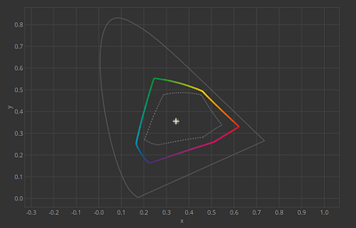
Which also answers your other question: Usually a CMYK profile that is marked for glossy (“coated”) paper has the widest gamut and deepest blacks. Here’s a picture comparing Fogra 39L(coated, big) and Fogra 29L(uncoated, small):

Different profiles have different inks associated with them, so if a print shop says they can support profile A and profile B, that means that they have printers that are calibrated to match either profile and give a satisfying result (like, they have tested if the colors are matching within a certain color difference).

Folks who do this for a living usually adjust their images per-printer, and then print a number of images to sell. For overall design its best to test against several printing profiles, and to ensure that your design doesn’t fall completely apart if 75% grey becomes 80% grey, and then if you want to print, you adjust the image for the given profile for the given image. Many artists can easily spend a month adjusting their designs, because for them, bad prints is bad reputation.

2 Likes

All this info should go into a wiki or a manual page. The color managed workflow page is pretty good already but I believe here is some pretty useful extra information. Color management is frequently asked about in the forums.

2 Likes

I’m open to it if someone wants to contribute it (I’ll be in charge of proofreading it), it’ll take a while before I have enough free time to write it myself though.

Thanks for the detailed information. It really helps a lot.

(Assuming that the fadedness is simulating printer black when using uncoated profiles): if coated paper profiles(aka the color profiles that I’m currently using) CAN produce richer and deeper blacks, then shouldn’t there be a way to view that so I can get a better idea of what that will look like once printed?

If it’s not already a thing that I’m unaware of, maybe a way to change the black levels to simulate uncoated OR coated color profiles could be a useful feature? Or do all coated profiles already reflect the extra deep/rich blacks?