Hello! Help me to understand. I convert the image to CMYK and convert it to a specific color profile. It is also set as a proofing profile in Krita settings. I use black point compensation. Why, when I have already recalculated this image in the CMYK and view the color proof profile in the soft proof mode, do I get colors outside the color gamut? After all, the system had to recalculate the colors in accordance with the specified profile? What am I doing wrong?
Check if the softpoofing colour profile matches the CMYK profile your document has.
Yes! of course! I wrote about it in topic :“I convert the image to CMYK and convert it to a specific color profile. It is also set as a proofing profile in Krita settings”.
If the file is already converted to CMYK profile it should not show gamut warning since all the colours are already conformed to the profile of the document. It should only show gamut warning in case the document profile and the soft proofing profile is different.
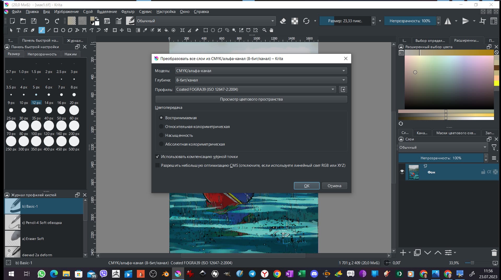
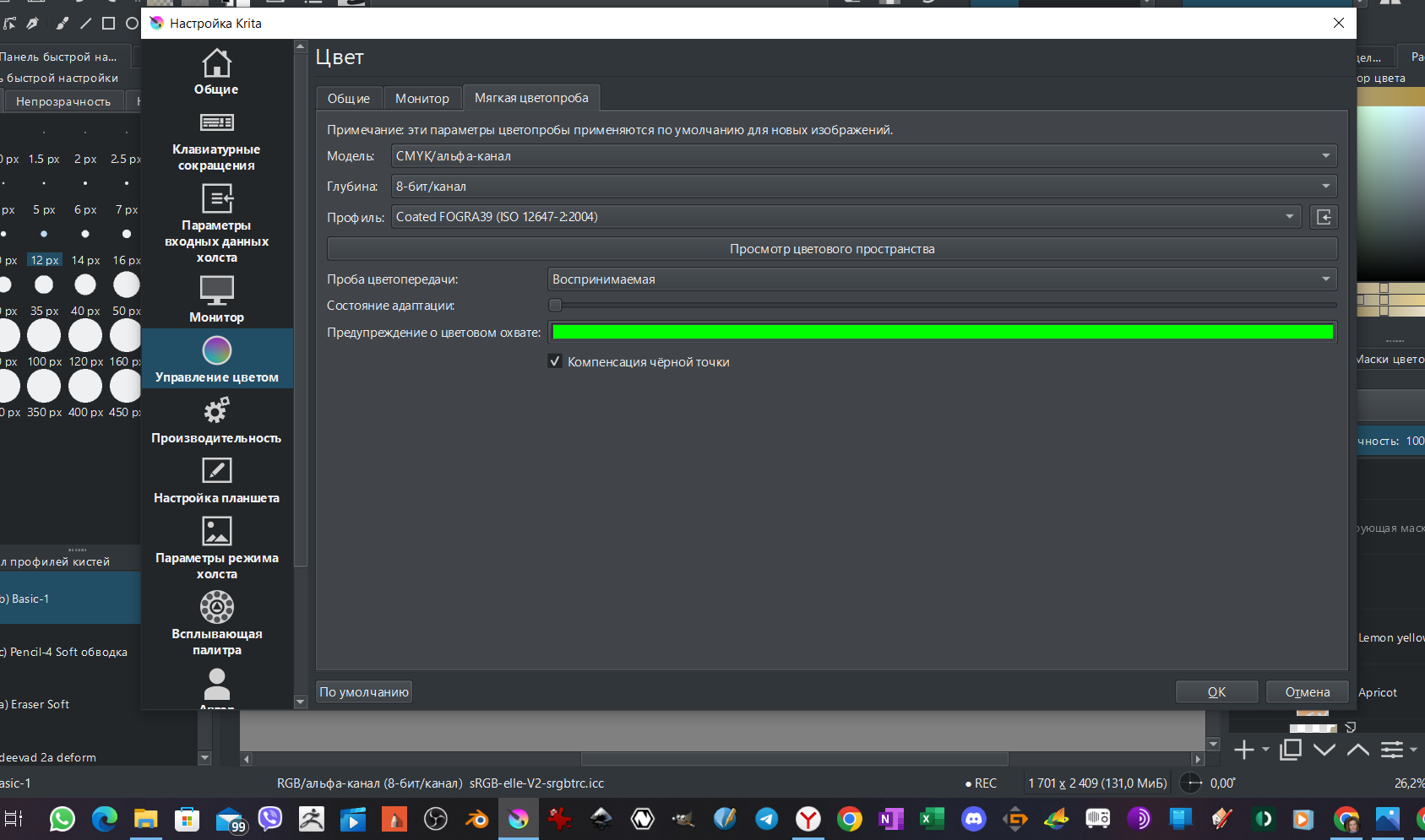
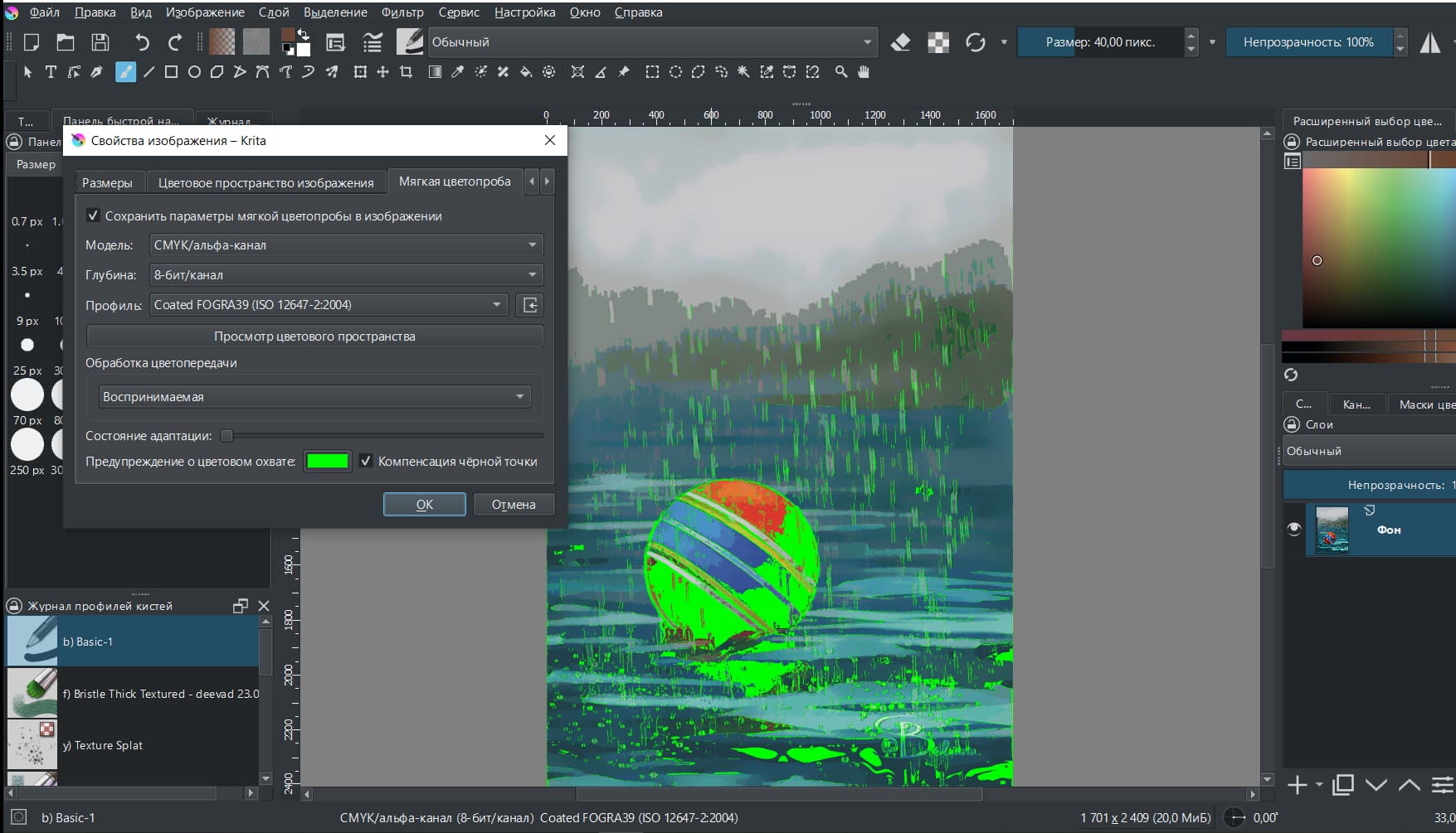
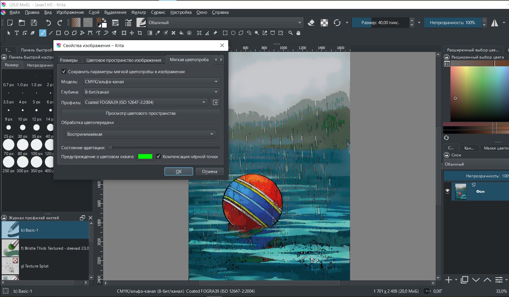
Just to be sure can you check Image > Properties of the document and show us the screenshot of the entire window along with the softproofing tab in this dialog
1 Like
Look please. It is really important for me/ What is wrong? I do not have any idea(((
I checked this file in Scribus. And it also gives out colors out of the color gamut. It turns out that Krita does not recalculate the occupation of colors for the desired profile?
Maybe ask David Revoy? Unfortunately, I don’t know his pseudonym. But he is on this forum and printed his comics, which he drew in the Krita
yes I just tested with a different CMYK profile and for me too it shows gamut warning even after I convert it to a target colour profile it still shows some parts of the image as out of gamut. Although this part is lesser than what it showed before conversion. From what I understand convert to a colour profile should change all the colours in the document and confine it to the target colour profile’s gamut range. This might be a bug
may be it is better to ask the people who know more so pinging @wolthera and @Deevad
2 Likes
Hey, so if I understand the issue you did that:
- Your final artwork is a CMYK Coated Fogra 39.
- You activate soft-proofing on top of it CMYK Coated Fogra 39.
- Soft-proofing returns out of gamut warning (green), and you wonder why.
Your base conversion of the CMYK artworks used the first bullet option in your screenshot; so I’ll assume it is the first position as in English and it is “Perceptual Rendering”. I see you disabled 'allows little CMS optimization.
On your Softproofing panel, your Adaptation State (the slider above the color green checkbox) is set to the minimum: so you ask for the white point of the CMYK profile here. I’m not sure if you are in Perceptual / Relative Colorimetric / or Absolute Colorimetric (because of the translation on the screenshot), but I’ll assume Absolute Colorimetric because you set this slider to an unusual value. It is for use with Absolute Colorimetric. If it is the case, the CMYK profile has a very different white point than any screen because it tries to look for the white of real world paper.
All in all, Soft Proofing will work on the ‘Projection’ (as far as I know, I might be wrong here) of what is already here on your Krita canvas screen. It’s a resulting group of RGB pixels going from 0 to 255 (whatever color profile/space underneath).
It brings no benefits to you use Soft Proofing on an already converted CMYK artwork because of that, imo. It was only designed to check CMYK color (and warn about out-of-gamut) when working on RGB color space. So, don’t worry about the result of the soft proofing: you can’t be out of gamut if your pixels are already converted in the CMYK gamut.
If you look for a good preview of what your artwork should look like once printed you need this: calibrate and profile your monitor and fill the ICC in the setting of Krita. You can also compare the size of the gamut of your color space on screen and overlap it with the CMYK colorspace. You might realize CMYK also has colors that your monitor can’t render (unless you have a 100% AdobeRGB monitor −or wide gamut − color coverage, this one usually englobe most of classic CMYK color space by design). It will help you to imagine that ‘out of gamut’ can be also in this direction.
Anyway, nothing replaces having a single color proof printed; or a sample from your printer (eg. ask them something they already printed and the CMYK file). Assuming they’ll do the color perfectly on their side is also wrong most of the time in my experience.
If you can’t access to a sample of printer, check that:
- Are the pure area of yellow a bit greenish? If yes, make them goes slightly to golden yellow unless you want a “lemon yellow”. Some printing system makes really bad lemon yellow (small cyan dots in a sea of yellow dots).
- Deep blue sky, electric green, red laser light , ultraviolet ; all this extreme of RGB will always fail.
- Big gradient going from black to very dark will always mixup Black cartridge with a soup of CMY cartridge and always look bad printed, better to contrast this area and not expect subtle rendering here.
And you should be good to go. In my career I rarely got the perfect color balance at printing. Always was slightly yellowish, slightly blueish depending the printer paper and the quality of ink or if they were diluted a bit abusively. Most of the time it is OK.
Good luck with your printing!
5 Likes
Thank you very much dear David! I will definitely use your advice.
1 Like
This topic was automatically closed 4 days after the last reply. New replies are no longer allowed.