Thank you! It’s taken a lot of work to get it to look like this but I’m very happy with it.
I’ve been thinking of sharing my copy of Krita 5.2.14 publicly with these UI/UX improvements along with other features that Photoshop users may appreciate like shift for angle snapping lines. If you’re on Windows and interested in trying it out first, feel free to message me.
Related to the propsal, here’s more observations I’ve noted while I’ve been tinkering with Krita.
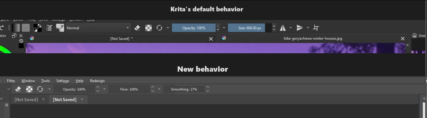
- Tabs for are always expanded to its maximum width instead of only whats necessary to show the full file name. Having tabs look like browser tabs (Which PS and CSP do) is much more intuitive.
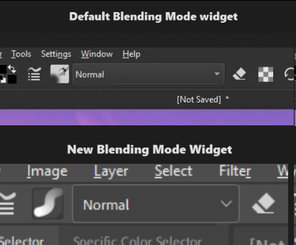
- Blending mode in the toolbar takes more horizontal space than necessary. In most cases artists are using the “Normal” mode with their painting. In edge cases when someone is using “Lambert Lighting (Gamma 2.2)” for their blending mode, perhaps auto expand the blending mode widget or truncate the name instead.
- Active and inactive parts of the UI are both colored. The designers of Krita’s UI didn’t question “What’s more important for the artist to see while painting?” and more so went with “How can we make this UI unique?”.
art in screenshots by @Sad_Tea
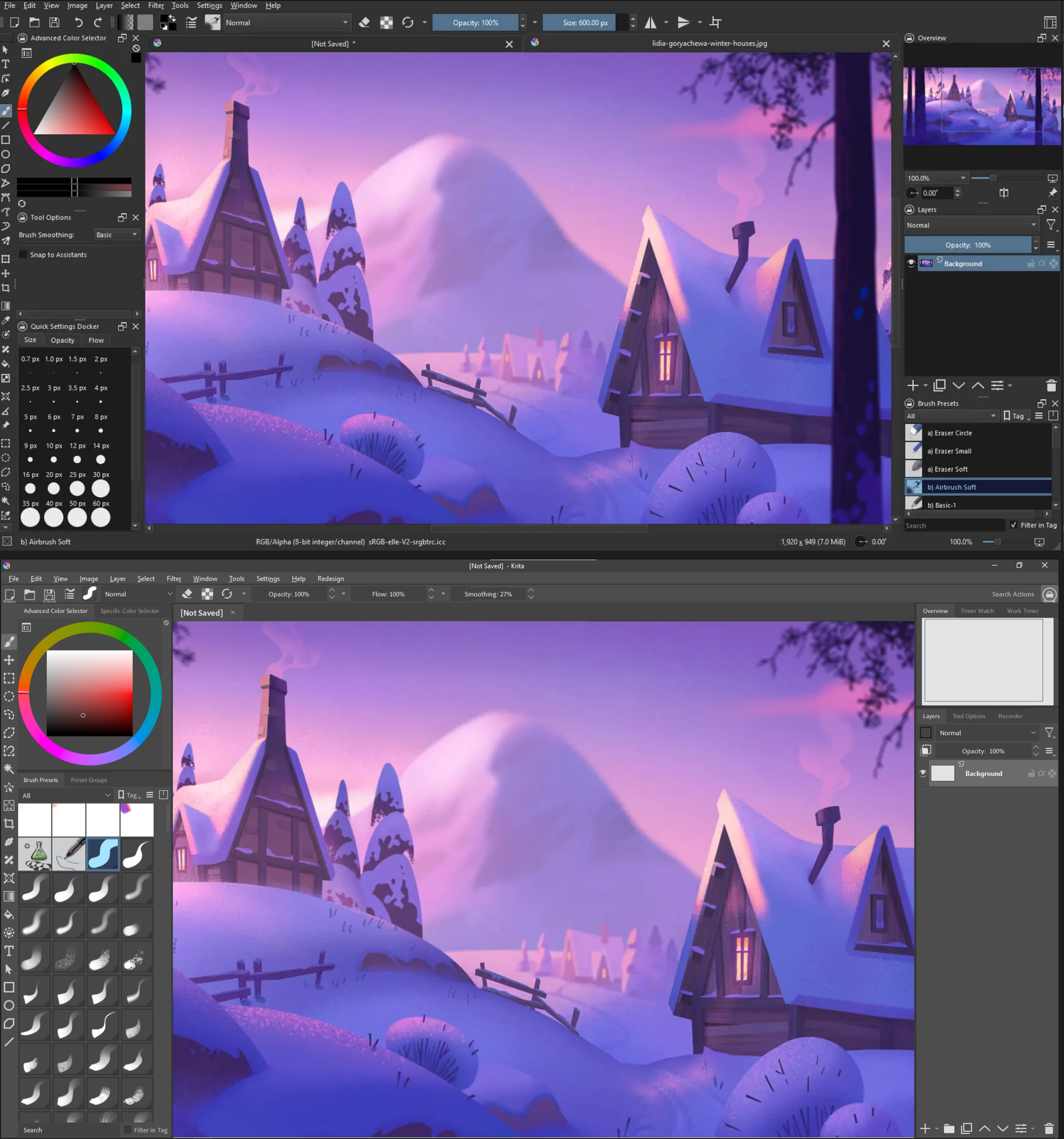
When you select a brush preset that preset’s icon is highlighted blue which makes sense since you need to see which brush you’re currently using. However, if you look at your Opacity and Flow sliders in your toolbar you aren’t always dragging and moving them around yet they’re always blue.
You could argue that it’s part of Krita’s identity and it’s always done this but I think this only serves as a distraction and gets in the way of more important visual cues an artist needs to see when they’re painting. It’s like trying to put highlights everywhere in a painting, it loses meaning and significance.
This combined with Krita’s logo appearing on every tab makes the program unnecessarily showy and cramped.